• Cornish Afternoon •
The great British beach experience is based on our long history of holidays by the sea. The beach views that come with it are worth pursuing too.
(Click image to view large).
Work up a great coastal vista shot.
Beach views can be magnificent and there is always something worth photographing. Sea makes a magical subject in almost any weather. In the right place the views can be magnificent. Here are a few ideas for you to help you get a great photo from your visit to the seaside.
Beach views :: great vista shots
Photographers should be aware of the opportunities for great vista shots. Here are three tips to help you get the shot and the right light…
1. Spotting a rugged coast: Scout out the maps near your destination. Most good maps will show contours and the coastal shape. If you are looking for interesting coastline check out the height of the land beside the sea. Cliffs and hills indicate harder, more resistant rocks. This helps build up a range of rugged landscapes. Also, the more jagged edges the map shows along the sea/beach line the more likely the coast will have an interesting viewpoint.
If you are looking for a place to try out, Google Maps is useful. The Google maps are not very good at showing contours or heights. But the jaggedness of a coast line is shown. If you convert the map to the Google “Earth” view you can get a satellite view of the coast. From that you can get quite a good idea of the terrain.
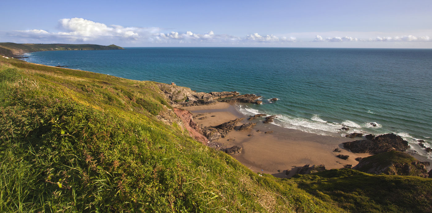
• Whitsand Bay Cornwall •
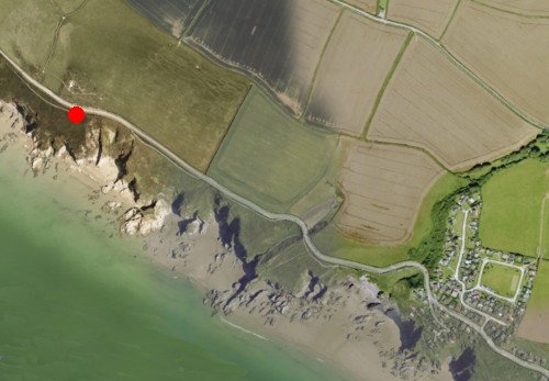
The photo at the top of the page was taken from the position of the red dot. The view was taken along the rugged coast there. You can see from the Google Satellite view how rugged the coast is along there. It’s ideal for lots of different Beach views.
2. Beach views :: Checking out the light:
There are two times a day when the light is best for landscapes and vista shots. These are the Golden Hour just before sundown and the hour around sunrise. There is great light and low sun position at these times of the day. Why is low-sun position good? Because that causes long shadows to be cast off the rocks. Strong contrasts between the dark and light help define edges, shapes and form of the rocks and features. Shadows provide the defining depth in a picture too. Well defined shadows help the eye to see objects as more three dimensional.

• The Okta •
The symbol for cloud cover on good weather maps. A useful symbol to tell you the light conditions when checking for good beach views.
(Attribution: Wikipedia.org ![]() )
)
Of course we are not always able to take our photos at the best times of the day. So how do you check to see what the light will be like when you are there? Of course the starting point is the weather. Most good weather forecast web sites will tell you the amount of cloud cover. You can usually tell how much cloud cover is expected by the number of Oktas (or Octas) shown. The more cloud cover the more diffused the light will be. The actual types of clouds make a difference too – if they are dark and ominous they will make a great backdrop to your beach views. Seascapes really look great with heavy storm clouds. Make sure you have a tripod to hand. Dark clouds mean longer exposures.
3. Sun position: If it is a sunny day you might find the sun position is important. If the sun is up high, cliffs can still be in shadow. It depends exactly where in the sky the sun is at the time you want to take photos. There are websites to help with that too. Check out The Photographers Ephemeris ![]() . This really useful website “is a map-centric sun and moon calculator: see how the light will fall on the land, be it day or night, for almost anywhere on earth”. There is a web-based version. But usefully, there are versions for your mobile phone too. You will be able to work out where the sun will be at any time of the day. This will help you work out how to fit your beach view shot into your day.
. This really useful website “is a map-centric sun and moon calculator: see how the light will fall on the land, be it day or night, for almost anywhere on earth”. There is a web-based version. But usefully, there are versions for your mobile phone too. You will be able to work out where the sun will be at any time of the day. This will help you work out how to fit your beach view shot into your day.
Putting depth into your beach views shot
The shadows you are able to capture will help your beach views appear to have depth. But a longer distance view, especially in mid-day daylight, will need to have other perspectives. Here are a few ideas for you to introduce a feeling of depth into your shots…
- Overlaps: When you are looking down a long beach you often find features of the beach itself will overlap in your sight. Mounds of beach stones; sand dunes; different rock layers at beach level; cliff top undulations; variations in the cliff face itself and even local vegetation all help. The ways that these features relate to one-another in the scene give you clues to depth in the photo.
- Contrasts in colour: The colour of the beach stones, rock, sand and even vegetation can often be used to show variation. As you shoot down the length of the beach these can help to show depth to the eye.
- Texture variation: The cliffs, dunes, rocks and any seaweed revealed by a low tide provide great variations in texture. Look for ways to bring all these into the shot. Textures often come out by slightly underexposing the shot. That may make the scene look darker than it actually is, but it will bring out the light and dark aspects effectively.
- Lines of perspective: Strong lines are not often associated with beach views. However there are some strong ones that people often miss. The sea line itself is a strong line. You can look down the length of the beach and use the surf or water line where it meets the beach. Looking down on the beach from cliffs you can use wave lines (see below). If you are on the beach itself you beach views are often enhanced by cliff top lines. Although they often undulate they perspective is still distinct against the sky. On the beach itself, fences and other man-made features (groynes, buildings, paths, roads, beach walls etc.) provide lots of points of perspective you can use.
- Distant points: If you have something in the distance that your viewer knows to be large they have a distance perspective. In the picture at the top of the page you can see a cloud line. These tiny clouds in the distance give a perspective for the viewer. Other things can be large shops towns on the coast, and even buildings.
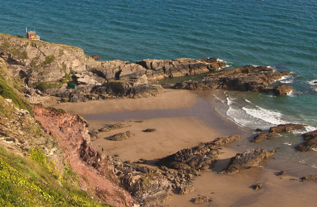
• Cornish beach view •
This view of the beach shown at the top of the page loses some perspective because the distances are reduced. The wave lines in the sea and the rock protruding from the cliffs gives back some of the perspective. The nearness of the grass close-up and smallness of the person and buildings also give depth to the shot.
(Click image to view large).
Check out other pictures of the location for your beach view
The most effective way to plan for your picture is to look up your destination and look for pictures done by other photographers. Try putting your intended location into Google Images. You will be able to pick out features in advance to help you give depth and perspective. You will also be able to see some good places to take shots. Here is the page for the bay where my pictures above were taken. You can see my shots are quite different from the others shown there. There is lots of scope to help you pick out some ideas.
Google Images: Beach views Whitsands Bay Cornwall ![]() .
.
Comments, additions, amendments or ideas on this article? Contact Us
or why not leave a comment at the bottom of the page…
Like this article? Don’t miss the next — sign up for tips by email.
Photokonnexion Photographic Glossary – Definitions and articles.
Golden Hour
Google Images: Beach views Whitsands Bay Cornwall
The Photographers Ephemeris
Other links of interest:
The fifteen second landscape appraisal
The simplest way to add depth to your pictures
The easy way to give depth to landscapes

Damon Guy (Netkonnexion)
See also: Editors ‘Bio’.
By Damon Guy see his profile on Google+.