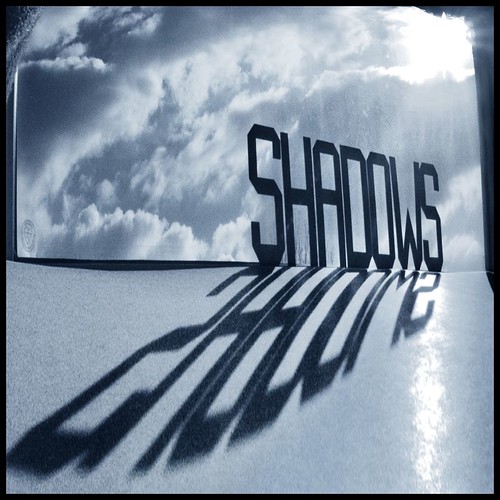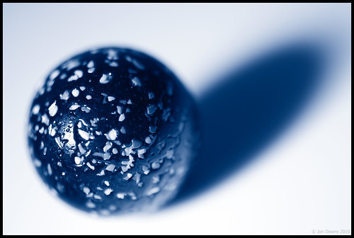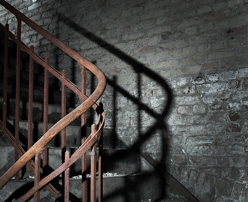

• Low flying aircraft •
Click image to view large
• Low flying aircraft • By Netkonnexion on Flickr ![]()
Every picture has its merits. However is there enough in the picture to interest and invigorate the attention of your viewers? Sometimes, like this picture, if you don’t have a point worth making then you should not really bother with it.
A picture is a wonderful communication.
But like speech if there’s no point there is no impact. To help you see if you have made a great picture here are some guiding points.
We are going to consider…
• What you are communicating:
• Presentation:
• Camera technique:
• Technical Quality:
• Visual Awareness, Visualisation, Seeing and aesthetics:
Looking critically at your own picture
When you make a picture your previsualisation of what you want to achieve is critical to the outcome. If you don’t know what you are trying to make how can you make it convincing? So try to have a mental image of what your picture it going to look like when you make it. If you can see the image before you make it you should have a good point in mind – a reason for making it. All too often snappers see something and just ‘snap’. That being the case, few of the images will have real meaning or impact.
When looking at your own picture you must see if there is really something there. Are you really saying anything? Are you really communicating with the viewer of your picture? Or, is what you have just made only a simple picture? To have real impact is to create in the viewers mind an image. An image that means something to them. So look at your picture and honestly ask yourself what is the viewer going to get from it? What will it mean to them? If you find that you have really said something in the picture then the first criteria for success has been passed.
To this end you should consider how successfully each of these things has contributed to the success of the image…
- Personal input: have you understood and connected with the subject
- Appropriate communication the message, mood, ideas, and information you want to pass to your viewer
- Complementary use of the photographic media (mounting, projection, printing, texture of print etc.)
- Appropriate imagination and creativity / suitable timing for the shot
What about the other things?
• Presentation: It is important to have a good presentation for your picture. Have you edited out distractions and sensor/lens spots, removed the errant sweet rapper littering the foreground etc. In other words, have you done the little tidying up tasks that make the image stand up as clean representation of your original vision for it? If it is a print, is it well mounted in a non-distracting way. Is the printing immaculate or are there streaks and spots; over-run and smear.
• Camera technique: Is the sharpness the way you want it – deliberate softness is fine as long as that is making an artistic point in a way you intended. Is the depth of field right for the composition? Have you emphasised the point or simply missed the point. Is the digital noise too high, or the contrast too low. What you are looking for here is to see if your prowess with the camera has come through. Did your technique work or were there any errors or mistakes that detract from the delivery of your point? Some of the other things to consider are…
- Viewpoint to the subject – exciting, interesting, different, right?
- Choice of lighting – does it complement or complete the subject or is it at odds with your point?
- Accurate focusing – accurate choice of focus for the subject.
- Appropriate quality and choice of exposure.
- Suitable use of depth of field (aperture).
- Appropriate shutter speed for the subject (and shot timing).
- Highlights and shadows (ensuring detail is retained)
- Appropriate quality and choice of exposure – does the balance of light and dark complement or detract from the subject?
- Is the quality of the light effective or bland; does is make a statement or is it of little consequence?
• Technical Quality:
In this category you should consider exposure, colour and tonal control…
- Absence of processing faults (dust, spots, hairs, processing artefacts, image damage by sharpening etc.)
- Appropriate adjustments of colour temperature; hue, saturation, colour balance etc.
- Appropriate tonal use and control of the range of tones.
- Good image finishing: removal of distractions, removal of abrupt or discordant features.
- Appropriate use of levels, curves, colour management, filters, overlays etc (post processing)
In this category you are looking to make sure that the image is digitally developed properly. Is the exposure even or has it been obviously enhanced and changed. Is the light effective to make the point or has the exposure not been fine tuned. It is easy to take a picture, but all these thing go into making an image. Think about what you are trying to achieve and does this picture achieve it with its colour and technical delivery/
• Visual Awareness, Visualisation, Seeing and aesthetics:
Do you think that your shot, the one you have in front of you sees anything different? Are you reporting what you saw or expressing a point, message, communication, feeling… does this picture have IMPACT?
- Is the composition, design and cropping of the image an effective aesthetic construction?
- Appropriate simplification (minimising complexity and clutter)
- Distractions / intrusions should not divert the viewers eye
- Good use of light, mood, texture and colour
- Good use of masking/manipulation where appropriate
What you are doing…
Each time you want others to look at your picture you want to impress them, to lift them, to… well, get out your message or point for the picture. The type of questions I have asked above are aimed at getting you looking at your images with a critical eye. If you are honest, you will find that none of your pictures will be satisfactory in all of the above. But if you find you are gradually improving your standard of delivery you will see that the above get closer to ideal with every new picture. Critically reviewing each picture before you publish print or show it to other people helps make sure you are producing something worth showing.
You won’t be right every time. But you will see as you develop, your comments will begin matching those of other people. You will than have a benchmark that tells you if your work is measuring up to peoples view of it. Or, more importantly to see if your picture is measuring up to your original vision of how you wanted the shot.
Comments, additions, amendments or ideas on this article? Contact Us
or why not leave a comment at the bottom of the page…
Like this article? Don’t miss the next — sign up for tips by email.
Photokonnexion Photographic Glossary – Definitions and articles.
previsualisation
digital noise
Definition: Exposure
Definition: Aperture
Definition: f number
Definition: ISO
Definition: Shutter Speed
Composition resources on Photokonnexion
Light and Lighting – Resource pages on Photokonnexion
By Damon Guy (author and Photokonnexion editor)

Damon Guy (Netkonnexion)
See also: Editors ‘Bio’.