Tag Archives: Darkness

Twelve Simple tips for atmospheric candlelight shots

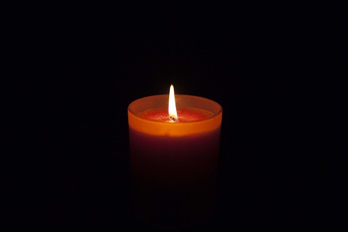
Candles put out a wonderful light…

Everyone feels the atmospheric impact of candlelight. The colour and the low light seems to draw you in. Capturing that light is easy with a few simple hints. Lets look at what is needed…

Tripod…

There is nearly always low light associated with candle photography. That means working with longer exposures. A tripod is excellent for that. Indoors, beware of a wooden floor, any move you make can be transferred to the tripod. Floor vibrations can ruin a shot or make it soft. For sharpness remember to use the camera timer for the shot or a remote shutter release.

Lighting…

The best way to view candles is by their own light. Because they don’t use a tripod many people are tempted to use flash. Unfortunately flash will over-power the candlelight. It will take out the colour from the light and tend to create hard, sharp shadows. It will ruin the atmosphere of the candlelight. Make sure you switch off your flash. If you need more light the you can use as many candles as you need to raise light levels. They don’t need to be in the shot, but they will keep the light the same throughout the shot.

Composition…

First decide if your candle or candles are the subject or are props. This decision will affect your focus and how you lay out your scene. Candles can create a strong bright spot in the scene. If it is too bright the flame will form a burnt out white spot. Once you have arranged your scene, ensure that the candle will only draw the eye a small amount unless it is the subject. You should consider the placement of the candle in a way that might minimise the impact of the bright flame spot.

Positioning…

If all your candles are close together the light will tend to act as one light source. This will tend to act as a hard light creating more defined shadows. If you want the light to be softer and the shadows with less well defined edges set your candles further apart. If the light is to be cast on a face then soft light will be more flattering.

Movement…

One of the peculiarities of working with candles is that the flames are subject to the slightest air movement. Unfortunately candle flicker is attractive to the eye in real-time; but looks like a loss of sharpness in a still image. It is quite useful in close focus shots with a candle to use an air break of some kind nearby to stop air movement. In a table-top study use a large sheet of card to one side out of shot. That will help prevent air movements. If not, keep an eye on the flames when shooting. Try to capture the flame upright or, if using more than one flame, make sure they are all going the same way. They look more natural that way.

Since candle light is low intensity, make sure you also prevent other sources of movement in the shot. They will inevitably be blurred as the shot will be using a long exposure. This will look like a distraction against still flames.

Can you write? Of course you can!
Write for Photokonnexion...

We would love to have your articles or tips posted on our site.
Find out more…
Write for Photokonnexion.

Light intensity…

The light from a candle can be made much more intense if you use something to catch the light from the candle. A face, hand or other objects bring alive the picture and complements the candle. The presence of the object acts to reflect the candlelight. Light flesh tones are particularly good in this respect since the flesh colour is tonally close to the candlelight hues and they act as a reflector to bring out the light.
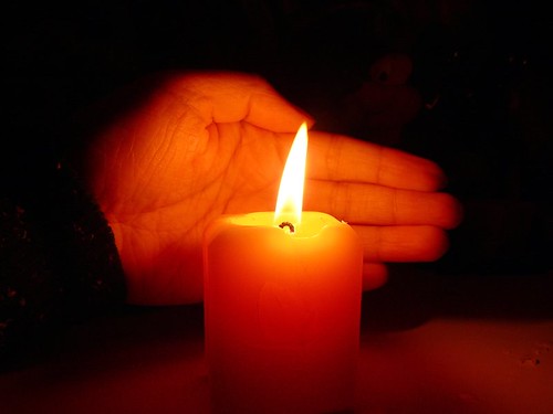
From

From “Candle Series” by Spicedfish
From “Candle Series” by Spicedfish on Flickr External link - opens new tab/page

Using reflectors in a candle scene is a great way to raise the light intensity. You can find other types of surface than the one in this picture in most scenes. Walls, ceilings and even off-shot reflectors are all good. Be careful to use neutral colours. Colour reflectors will affect the colour of the scene. If you are using a big card out-of-shot make it white. This will reflect the same colour light back into the scene, filling in the light.

Shadows…

The other side of light intensity is the shadows. The darker tones and strong contrasts of candle shots create most of the atmosphere. Spend time studying the shadows created in your scene. Strong contrasts are great subjects. If you create shadows that fall badly across your scene it will impact on the overall effect. The best use of shadows is often to the edges of the shot. If the light fades out to edges this holds the scene into the shot – naturally focusing the eye. Work with shadows to ensure the mood is harmonious.

Additional lights…

If you want to use fill light in the scene try to match the quality of light from your candles. Use soft light sources and natural light with hues matching the candles. Natural light will fill the scene well but tend to neutralise the colour of the candle light. The warm glow of candles is a great mix with evening, low-intensity light.

Some people use light with gels to give a warm glow. Warming gels can also be used with a flash. However, beware the power of flash. The candles will lose their soothing effect if all the shadows are taken away around the base of the candle and harsh shadows are introduced from one side. Typically use a diffused flash on the lowest setting – it also helps to be a distance away from the candles as well.

Multiple candles…

When working with one candle as subject the main focus of the shot is clear. However, there is a lot of scope for creativity. Consider two main issues. How to layout your candles and how to use the overall light with the layout. Using candles for making patterns is great fun and can produce excellent shots.

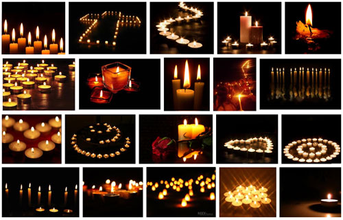
Patterns with candles

Making patterns with candles
Click to view Google Images “Candle Light” search

Try to keep the scene simple. Overlapping candles or indistinct objects in the pattern are confusing. Work with the sharp contrasts and keep your pattern well defined.

Exposure…

How long should you make your exposure? This depends, like any scene, on your light levels. To get more light in the exposure a long shutter speed is suitable for most candle shots. A range of 1/15 second down to 2 seconds is a good starting range with an ISO of 100. Camera settings vary significantly with reflectors, multiple candles or fill lights. Experiment to get it right. Aim to make the shot moody or atmospheric while providing detail for the eye to look at around the candle flame(s).

The main exposure concern with dark or shadowy shots is digital noise. If ISO is too high you will get more noise. It is better to use a low ISO, say 100 and have longer shutter opening. This reduces noise and means more detail is visible.

Lenses…

A fast lens allows a wider aperture. Faster lenses will allow a quicker exposure than a smaller aperture. Nevertheless, when experimenting check the depth of field. With big candle patterns, or larger subjects, a very wide aperture will give a very shallow depth of field. Too shallow and you will lose a lot of detail. On the other hand, lots of candles in the background with a shallow depth of field will produce pleasing bokeh. For choosing your lens, more than other aspects of your set-up, you need to have a clear vision of what you want your final shot to look like. Then do some “Chimping” to check results.

Prime lenses, especially the 50mm, will give an approximation to the human eyes. To capture the mood of a scene a 50mm will help. A wide angle lens close-up can provide great exaggerations of candle tallness or broadness – depending on lens orientation. There is great scope for artistic interpretation. Also remember that zoom lenses tend to foreshorten, reducing the apparent depth of the shot. With a zoom lens place your candles to give an impression of depth.

White balance…

The warm glow of candles is attractive. If you change the white balance you will change the characteristics of the warm glow. Candlelight shots are about moodiness and atmosphere. It is worth playing with the white balance to influence the shot and increase moodiness, but be careful you don’t remove it. You only need to adjust white balance when shooting in *.jpg as it will be fixed once the shot is taken. If you are shooting in RAW you have more flexibility with settings in post processing to control colours and the final exposure. If you cannot shoot in RAW then, again, make sure you do some “chimping” to get the colours right.

Being safe…

Although fun, candles are naked flames. It is all too easy in low light to leave something close to the candle. Fires start quickly and spread fast too. Feel free to experiment but make sure you don’t accidentally knock over candles, touch wall paper with one or do something else to set off a fire. Never leave candles alight and unattended. Always blow them out and wait for the smoke stop raising before leaving.

find out more...Photokonnexion tips by email
If you enjoyed this article please sign up for our
daily email service.
                                                 Find out more
#11030#

By Damon Guy (author and Photokonnexion editor)

Damon Guy - Netkonnexion

Damon Guy (Netkonnexion)

Damon is a writer-photog and editor of this site. He has run some major websites, a computing department and a digital image library. He started out as a trained teacher and now runs training for digital photographers.
See also: Editors ‘Bio’.

The nature of shadows – ideas and inspiration

Shadows are most important in photography.

Without shadows the everyday shapes we see would be ill-defined. It’s shadows that help to give shape to the objects we view. They can also be the very essence of the picture. In this post I am going to look at different aspects of shadows as the subject of the picture. They can be extraordinary elements, message carriers, central attractions or complementary features. They are major influences in our art, sight and our everyday lives. I hope you will be inspired by shadows and appreciative of them as a strong compositional element in your photography.

What is a shadow?

Shadows help us to see. They are not an absence of light (darkness). It is the reduced light in a shadow that creates the contrasts that the eye picks out. In fact the camera does too. Where shadows are well defined, and contrast to the other light around them, we see a lot better than when there are few shadows and very bright light. Brightness makes it difficult to see things because the contrasts are absent and we can’t make out edges or three dimensions either. The variations in light intensities across an object tell us about its shape. If everything was in uniform brightness shapes would disappear.

Aesthetics and shadows

Shadow, and its counterpart light, are the medium of our vision. Decoding the light/shadow relationship is as stimulating as the pleasure of touching a sensuous surface; the electric excitement of a tantalising taste; being immersed in a powerful smell, or mellowing in the caress of a musical experience. Little wonder that as one of our five senses our understanding of light and shadow is also a deep part of our understanding of beauty and ugliness.

Seeing shadow

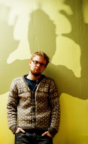
Of course our eyes sometimes misinterpret shadows and we make mistakes about them as with anything else. So it’s fun to consider the implications of false statements in shadow. In this first picture the shadow as the carrier of a message, but also the shadow as illusion. Shadow views of this sort bring out dark emotions and “shadowy” thoughts, but are also great fun artistically…

366 • 65 • Shadow monster by Pragmagraphr, on Flickr

366 • 65 • Shadow monster by Pragmagraphr, on Flickr
366 • 65 • Shadow monster by Pragmagraphr, on Flickr External link - opens new tab/page

In his notes on this picture the author says… “I have a lot of school work hanging over me like a shadow.” The visual pun is interesting and conveys a great message.

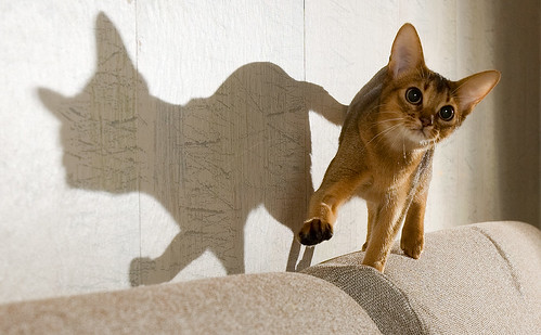
We love it when something appears as one thing and turns out as another. One of the endearing attributes of shadow is the other side of the visual story. In this next picture the lovely shape and bright eyes of this animal convey it’s essential “catness”. But the shadow is something different. The author says… “Her shadow makes me think about a French bulldog – with a tail” … shadows easily take on different meanings.

Flibberty and Her Shadow by peter_hasselbom, on Flickr

Flibberty and Her Shadow by peter_hasselbom, on Flickr
Flibberty and Her Shadow by peter_hasselbom, on FlickrExternal link - opens new tab/page

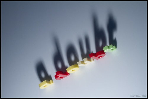
Of course shadows can be so much more than just a passive message. In this next picture the message is clear and the visual pun means so much to an English-speaking person. A clever use of shadow as the subject.

Shadow of 'a doubt' by Jon Downs, on Flickr

Shadow of ‘a doubt’ by Jon Downs, on Flickr
Shadow of ‘a doubt’ by Jon Downs, on FlickrExternal link - opens new tab/page

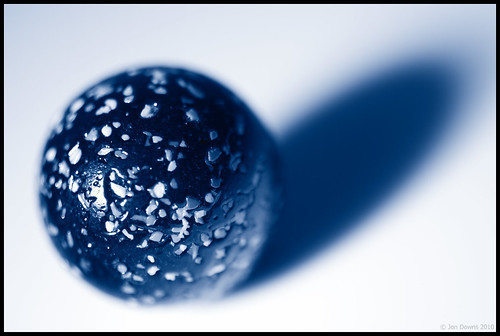
While the subject of a picture may not be the shadow there is still an important complimentary part to play by the shadow. The cobalt blue of the shadow in the next picture creates a wonderful tonality. The shape of the object is defined by the shadow, but it is the blueness that makes the statement. The author acknowledges that fact by his title…

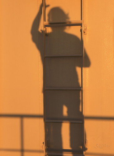
If you can write a visual story with your photograph you pull the viewer directly into the shot. In this next picture the shadow and its disembodied juxtaposition on the ladder brilliantly conveys a set of meanings that we, the viewer, impose. The interest is the simplicity of the picture and yet the complexity of the possible meanings… fireman, escapee, workman, who is he? The interpretations are endless…

Shadow Climbing the Ladder at Sunset by S@ilor, on Flickr

Shadow Climbing the Ladder at Sunset by S@ilor, on Flickr
Shadow Climbing the Ladder at Sunset by S@ilor, on FlickrExternal link - opens new tab/page

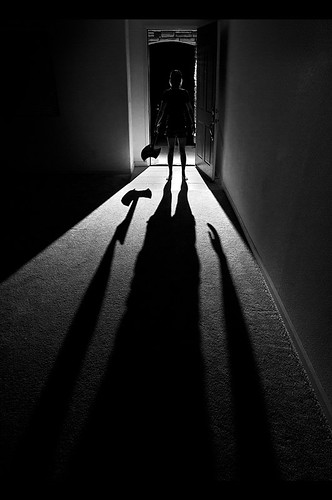
Shadow and silhouette are closely related. The dark-side of a silhouette is the result of blocked light, as is the shadow. Normally the statement made by a silhouette is in its shape. I like this next picture because the silhouette is betrayed by the darkness behind it. The hard light and low light-source has lengthened and strongly defined the shadow creating a strong subject. It has become all the more threatening because the silhouette is only partially seen. What is there – is there a threat? Are we being menaced by our imagination misinterpreting the shadow… This is a clever interplay of light and of mood. Nicely done…

Shadow. by David Giron, on Flickr

Shadow. by David Giron, on Flickr
Click image to view large
Shadow. by David Giron, on Flickr External link - opens new tab/page

Shadows can convey much more than just mood. They create a picture themselves, but in a minimalist way. The two dimensional aspect of shadow is only partially compensated for by shape. We know that we can so easily misinterpret a shadow. So it is a relief when the meaning is implied without threat or misinterpretation.

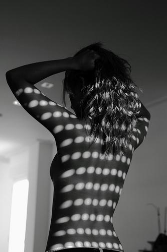
Shadows and intimacy are frequently associated. Above, the closeness of the characters shows intimacy. In the next picture the intimacy of the boudoir is so strong that the viewer is relieved by the pattern of shadows to redirect the mood.

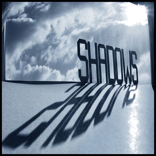
Shadows by Pablo Miranzo

Shadows by Pablo Miranzo.


The author says this is one of a series of pictures intended to contrast light and dark and is in black and white to simplify the composition. Oddly enough the composition is simplified by that, but complicated by the opposing mood settings. An interesting picture of mixed tensions.

The interplay between textures is important. While the shadow is a major part of many subjects, sometimes it is not the only subject. Look out for pattern shots that are uniform across the shot until you allow yourself to be drawn in. Often pattern shots have some compositional element to break the pattern, something that draws the eye. Wood grain and the subtle variations in the rhythm of its lines create micro textures and variation providing relief from the pattern, for example. It is that which draws you in.

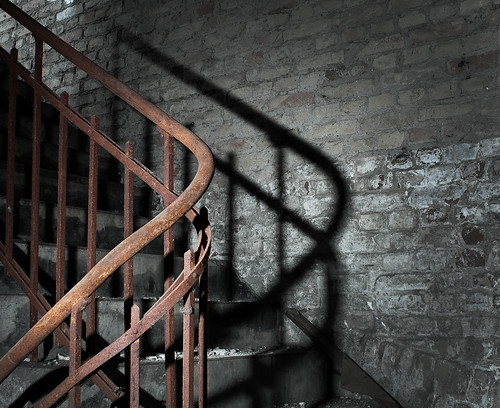
Texture is an exciting aspect of any picture. It is created by the subtle tonal variations of light and shadow at the micro-level in the picture. If you see a texture and it convinces you that you would feel the texture if you touched it then the picture has convincingly been created as an image in your mind. In this next picture the image I see is all texture. The wonderful curve of the stair rail and its counterpart, the twisted shadow, combine to create great depth in this picture. The combination gives you the feeling that you can reach in and touch… A great image.

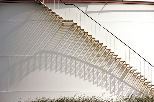
The stairs in the next image are pretty minimalist in themselves. However, the elaborate pattern of light and shadow created by them is exquisite. It is a wonderful example of how shadows transform a picture. In this case the shadows have turned the purely mechanical geometry of the stairs into a complex of pattern and curves. It is a wonderful play-off between the simplicity of one and complexity of the other…

Pulling it all together

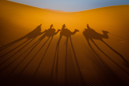
The shadow as a subject is clearly a compositional feature. It adds to the texture of the shot too. The clever use of shadow can also add a message and/or impart mood as well. Sometimes though, it all just comes together. If you can combine mood, subject, story, composition and texture you have really made the grade. Your picture comes alive in the mind of the viewer. You have truly created an image. To do all this using just shadow is a clever and precious creation. I think this next image is one such example…

Using shadow as a subject is challenging but worthwhile photographic pursuit. Shadow gives you all the essential elements of a good photograph but supplies it with simplicity and meaning if done well. There are untold interpretations and subjects out there for you to tackle. I hope that I have inspired some new thinking on the subject.

find out more...Photokonnexion tips by email
If you enjoyed this article please sign up for our
daily email service.
                                                 Find out more
#11030#

By Damon Guy (author and Photokonnexion editor)

Damon Guy - Netkonnexion

Damon Guy (Netkonnexion)

Damon is a writer-photog and editor of this site. He has run some major websites, a computing department and a digital image library. He started out as a trained teacher and now runs training for digital photographers.
See also: Editors ‘Bio’.

A quick tip to help you see the light (or darkness)

What is the nature of darkness?

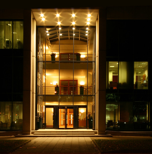
• Tall Entrance •
What is the nature of darkness?
Click image to view large.
• Tall Entrance • By Netkonnexion on Flickr External link - opens new tab/page

Of darkness and the essence of photography.

Dark is an obvious candidate to be the opposite to light. But is it in real terms the opposite of light? Darkness clearly makes for significant food for thought. Here are some ways to think about darkness with respect to cameras.

Darkness is the absence of light…

Er… no. It is easy to say that dark is the opposite of light. However, it clearly is not, because a shot like the one above successfully portrays the light as well as the dark in close proximity. Well… that depends how you see it. Or rather, that depends on how the camera sees it.

I cheated – slightly. The image was underexposed in the digital developing to accentuate the essence of the lights in the entrance. That prevented them blowing out, over-exposing the area surrounding them. It would have been easy to blow out large areas of the internal walls with bright patches of white. The cream colour in the entrance allowed me to keep the brightness down and still preserve the true colours. This would have been difficult in a long exposure with whites as the wall colour. The whites would have made the range of brights-to-darks too much for my camera. Details would have been lost at the ends of the light range (in the blacks and whites).

The cream paint in the entrance, and the tungsten lights gave me flexibility. It allowed me to keep most of the light and dark areas within the dynamic range of the camera. In other words, the camera could see both blacks and whites without losing detail in the important part of the image. Remember a camera will normally only work within a narrow range of light. Typically a (good) camera will be able to see (at maximum) across a range of between 8 and 12 stops of light. Not all that will be visible in the final photo – some detail will be lost depending on the display media. Using RAW will help you bring out lost detail but depending on the camera you may get digital noise. Nevertheless, about twelve stops of light will be retained in the data. Which allows a certain amount of editing freedom (in RAW).

What you need to do is make sure that the exposure captures the light intensity you intend as the focus of your image. I could have exposed to brighten the side windows. That would have made the entrance too bright (and blown out). However, I chose to expose for the brighter central entrance area, but lost the brightness in the side windows. I did that because I had a picture in my head of what I wanted to be the visual focal point of my picture – the entrance.

This picture shows us that darkness in photography is different to that which we see with our eyes. Understanding the nature of exposure helped me to spot that the light in the entrance could be contained within the range my camera could see. Although, a lot of detail has still been lost in the blacks. The darkness in this picture is an artificial creation of my cameras inability to see a wide range of light. Even to our eyes, darkness is relative to our eyesight and its ability to see contrasts.

The essence of photography is…

With this type of shot you need a clear idea in your head of what you want to produce. Also you need an idea of what the camera can do – it does not see the scene as you do. So, before you press the button you need to have clearly formulated your vision of the finished shot. You need to think your image into existence before pressing the button.

Great images are produced long before the shutter button is pressed. The ultimate aim of photography is to conjure up a vivid representation of the scene in the viewers mind. The essence of the act of photography is to create that before you take the shot. If you can do it you will truly be making images instead of taking pictures.

Simple ways to add contrast to your black and white images

Changing colour images to B&W often has surprising results.

You may not get what you expected. Often this is because the contrast in colour shots is quite low. B&W conversion requires contrast to work well. This is how you can increase the contrast…

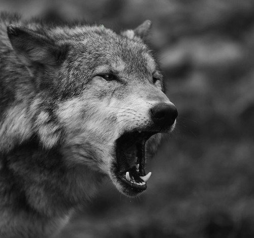
Wolf - the range of black and white tones can really add to the dramatic impact

Wolf – the range of black and white tones can really ad to the dramatic impact.
Click image to view large.
Wolf – By Netkonnexion on Flickr External link - opens new tab/page

The objective

We are trying to increase the range of greyscale tones in the picture. Grey is a fickle colour – it fades from tone to tone almost unnoticed. In a high contrast shot we want to stretch the grey and express tones from deep blacks to whitest whites. This is something we avoid in colour because deep black or blown-out white is a distraction. In black and white they can be too, but if well controlled the balance helps emphasise the pictures’ strong elements. So we must add the contrast. That can be done by applying one or more techniques in post-processing:

  1. Add deeper tones to the darker areas, whites to the lighter areas
  2. Create darker/lighter tones over the whole image – moody effect
  3. Use an overlay technique to apply contrast

I am not going to go into depth with these. Just some simple ideas.

Add deeper tones to the darker areas, whites to the lighter areas
This is essentially a manual technique. Using photoshop or a similar editor, you need to activate the ‘burn’ tool. Originally burning was a way of making film processing darken the print. In digital editing it spreads a soot-like effect where applied. Normally you can just paint it on. Set it so the ‘exposure’ level is low and set for ‘shadow’ in the settings. Then paint away. You will darken the dark shadows without darkening the lighter areas. Higher exposure will darken more. If you set for ‘highlights’ you will be able to paint out whites – great for toning down strong white burn!

You can do the same for whites with the ‘Dodge’ tool. Select ‘highlights’ and a low ‘exposure’ then paint over bright areas and they will brighten slightly. Higher exposures brighten more. Set the tool for shadow and you can lighten darker areas.

In both tools ‘mid-tone’ will brighten or darken the mid-range tones depending on which tool you are using.

Create darker tones over the whole image – moody effect

You can use a ‘contrast’ control in most image editors to affect the lightness and darkness proportions across the image. However, too much of this control tends to give sickly greys an outing. Faces especially look ill if you apply too much of the contrast control.

In most image editors there is usually a ‘gamma’ control somewhere. This uniformly affects the blacks right across the image. Often the toning down of blacks is enough to shift the image to the moody or dramatic side. Gamma gives you great control over this. So look up in your help files how to adjust your Gamma.

In Photoshop the control is in the exposure adjustments panel. If you have not got gamma control in your editor you can use it in Irfanview (free download). Irfanview has a great gamma control. You can find both gamma and contrast with other colour controls in the menus. Go to Image; Colour Corrections… The dialoge box there is worth playing around with.

Gamma is not so good for adding brightness, but in small measure it is OK. So you can either whiten or darken the image using the gamma setting. It actually is great for toning down all sorts of white errors.

Use an overlay technique to apply contrast

In the image editing applications that use layers and overlay there are literally hundreds of ways to adjust contrasts. I have seen one ‘grunge’ technique use 16 layers and 35 steps to create a contrast-widening effect. While grunge is a popular look in image processing it is an artistic process that you really need to practice a lot before it is effective. And, like many processes can be overdone. So, to help you out I have researched the technique below. It is quick and easy. It is possible in several of the full blown applications for image editing. Best of all it takes a few seconds to apply and you can see the results straight away. So watch this short video and I bet you will be itching to have a go…

Uploaded by Larry Lourcey on Dec 16, 2010 http://www.PhotoEducationOnline.com

An important note…

Remember that all of these techniques work better in RAW. Attempting to use them in .jpg is a lost cause and may just look a mess. Although, to be fair, that does depend on the image. Take my advice and shoot in RAW. For 99.8% of the time the results will be better after processing. Remember not to do post processing on your only image. Keep an original and only work on copies.

Three little known facts about shadows

What is shadow? Why is it so important in photography?

What is shadow? Why is it so important in photography?

Shadow is difficult to understand… it’s, well, shadowy.

To a photographer the nature of shadow is the second most important concept we work with, but most don’t understand what it is. Here is a look at three ideas to help you know shadow.

First, you may ask, what is the most important concept to a photographer before shadow? Light… it’s the very centre of photography. It is also the reason we have shadow.

Fact no. 1 – It’s all in the difference

Light and shadow are in fact the same thing. They are not opposites. Dark is the absence of light – a pretty rare thing in modern times. But, shadow is the difference between a particular light intensity and a lower light intensity next to it. Shadow is created by an object intercepting the light from a light source. Light passing the object will be brighter than the light where the beam has been blocked.

Fact no. 2 – It’s not dark in the shadow because…

Light is pretty fickle stuff. It travels in straight lines (direct light) unless it bounces off something. In fact light will bounce off almost anything – even the atmosphere. We see everything around us because light has bounced off things and then entered our eyes. Places with a lot of light bouncing around from different objects and in many directions is said to have diffused light. Some of that light will be bounced into shadow areas. It lightens the shadows. Some light is produced by big light sources like a photographer’s umbrella. This causes a less direct or soft light. The soft light source creates shadows with poorly defined edges. The shadows have a gradual transition from light to the darker shadow areas. Where soft light and diffusion occurs you get less shadow and it is poorly defined.

Fact no. 3 – Direct light and little diffusion equals hard light

Direct light, where there is little diffusion, creates sharp edges on the shadows. The shadow abruptly stops and the brighter light starts. This is called hard light and is normally created by a small light source. Because there is little diffusion the shadow is more intense. This is because there is no diffused light bouncing into the shadow area to lighten it. Hard light and little diffusion creates well defined shadows.

Where does this lead us

The photographer works mainly with light intensity, direction, colour and hardness. Together these components create the quality of light that is so important for successful photography. We intuitively understand intensity and direction. Colour in light is something that we gradually learn to see (harsh blue of mid-day to the golden glow of dusk).

Most photographers don’t immediately see the difference between hard and soft light, and what the effects are on shadow formation. However, shadows are of great importance because they define what we see many ways. More intense shadows stand out more. As they catch our eye we are better able to see what is causing them. As we do so we become aware of the shapes and forms that are sculpting the shadows. In other words, shadows help to give definition to the objects and world around us.

Photography is a two dimensional media. We are very experienced at seeing the world in three dimensions. When we see a flat representation of the world we are able to interpret it in three dimensions because we understand how shape and form are portrayed by the light/shadow relationship. So get to know shadows, hard and soft. Become skilled at capturing them in your images. You will be better able to create a three dimensional world for your viewer – even within a two dimensional medium.

Six tips for photographing silhouettes

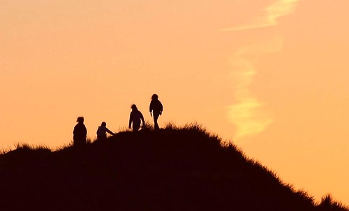
"Figures on the dunes"

“Figures on the dunes” – the art in silhouettes is about shape
Click the image to view large

Shooting silhouettes is about photographing contrasts

The only difficulty with silhouettes is seeing them. Our eyes often see detail in scenes that the camera cannot. We take a shot at something and a silhouette comes out – what’s happening? The difference between the brighter and darker areas of the shot creates a silhouette.

1. How a silhouette is created

Humans, and cameras, see a silhouette when there is a foreground-object placed in front of a strongly lighted background. The foreground-object looks black if it is not lit from the front. The strong back-light just looks bright behind the black and this creates the silhouette. In other words, the contrast between the bright background and the dark foreground object is so large the camera image sensor, cannot resolve details in it, leaving it black. In photographic terms, if there is more than two stops difference in the light between the foreground object and the background lighting there will be a silhouette.

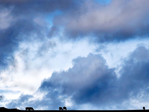
"Cows Grazing" - Creating silhouettes is fun and easy.

“Cows Grazing” – Creating silhouettes is fun and easy.

In the picture above the tiny cows on the brow of the hill are black (dark) objects because they are not lit from the front. The sky behind them is relatively bright compared to them. So, a silhouette is created.

Clarity of the image is everything. So, in addition to ensuring the edges of your silhouette are well defined and not confused with clouds and other objects, make sure they are sharp. The shape is important, so is the focus. The simplicity and purity of the silhouette is lost if the sharpness is not there to support it.

2. You can ensure something becomes a silhouette

A silhouette will be created every time a dark foreground object is placed against a brighter background. However, sometimes you can still see some detail in the foreground object, which is not a true silhouette. There are some things you can do about this.

  1. Lower the foreground lighting to darken the foreground object
  2. Brighten the background increasing contrast between front and back.
  3. Underexpose the foreground making it go black so the background stands out.
  4. Overexpose the background so it darkens the foreground object.
  5. Post-process the image to blacken the silhouette and brighten the background

In effect the techniques increase the contrast between the front and back. That blows out or brightens the background. This relatively underexposes the foreground object so detail is lost making it black. If you do any of these, or more than one of them, you are controlling the light to create a silhouette. You can do these to a lesser or greater extent with a scene you create, or one you see when you are out and about.

3. The art in is in the shape

The silhouette art form has been used to strongly characterise shape since the time of the Greeks. The stark and well defined edges in a silhouette are simple and attractive. Dating from around 1750 onwards, the method of making silhouettes was to cut them from thin black cardboard and mount them on a white background. This established a strong tradition of high contrast silhouette art. In the last 150 years the cut-out form of the art has mostly been replaced by photography silhouettes.

A powerful silhouette is about shape. The more graphic you can make it the more the image stands out. The best silhouettes are two dimensional although modern photographic techniques allow for the scene to have depth and apparent texture. The trick in producing a successful image as a silhouette today is therefore to provide a clear image, a traditional shape-format for the silhouette shape itself, and a great photograph in which the silhouette has context.

4. Sunset and sunrise

These are ideal times for creating silhouettes. The darkening sky still has sufficient intensity of light for making a photograph. The sky often has great colours too. Highlighting objects of interest against the sky at these times gives not only the drama of high contrast in the image, but also dramatic or attractive colours. Any great sunset or sunrise can be used for a silhouette. The best ones are against a clear sky because the colours are more intense and there is no cloud to confuse the edges of the silhouette.

When working at these times you will need to be working with longer exposures to compensate for the darker tones and colours. Make sure you set out with a tripod. Also read up on night photography because the same settings and techniques apply in these low-light conditions.

5. Bright sunny days

The hottest mid-day light is often a disaster for the photographer. The sun beats down from above and drives out the colours as well as flattening the shadows. Everything looks flat. However, guess what? This is a great time for silhouettes.

Photographing objects against strong, blue, mid-day sky creates great silhouettes. You can lie on the ground shooting straight up at things, or just pick out objects in the environment. Just make sure the contrast between the silhouette object and the background is high. This usually means exposing your shot for the sky itself.

To expose for the sky get the camera to focus on the brightness of the sky. Point it so your focus point in the viewfinder is in the bright area but your silhouette shape is still in the frame. If the sky is very bright, or featureless, the auto-focus may ‘hunt’ and fail to focus. Auto-focus works by matching contrasts of tones. If it does not see a contrast it has nothing to focus upon. So try to find something that can be used. You can try to put your focus point near the silhouette subject, but not on it. That sometimes works. Or, you can focus on a cloud, bird or other object that is still mainly very bright. Once you have managed to get your camera to focus on the sky the silhouette subject will be relatively darker and you have your silhouette. The darker your subject the better it will be in silhouette.

The picture with the cows on the brow of the hill above was taken at about 1.30pm on a bright sunny day. When a few dark clouds passed over the hill nearby I exposed for the clouds. They came out with lovely detail. The cows were little black silhouettes as they were underexposed.

6. Wind and movement

Wind is the enemy of the silhouette – outside anyway. There is nothing worse than your tree waving its branches when you are doing a longish exposure. Even a slight wind can ruin things. The image will look blurry and there will be ill defined edges for the actual shape. So look carefully at everything around you and make sure that you have no movement. If you do have wind blowing, find something solid and immovable with which to do your silhouette. For the same reason, it is not easy to do silhouettes of anything moving, like cars or people.

Do you have any great tips to add to this? Please enter a comment below and we will write them up!

Shooting very long night exposures

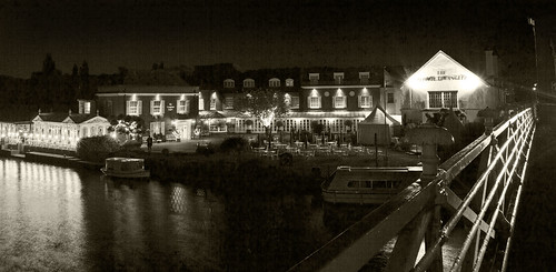
Lights from any building generate a surprising amount of light at night.

“The Compleat Angler” – This hotel, pictured from Marlow Bridge, Buckinghamshire UK generates a surprising amount of light. Click image to view large.

Shooting by moonlight or other dim lights

It’s true. You can shoot in almost total dark with a digital camera. You make exposures of many minutes and use really dim lights – the moon, stars and low-level hand-held lights are enough for the camera to pick up.

Previously…

In other articles about night photography we looked at Planning and Preparing for a Night Shoot and Out on a Night Shoot – Night Composition. We also looked at Six things you must know for night shoots including the basics of controlling the camera and the sort of settings used. It is worth following up on these articles before proceeding.

Night light

Out of town, away from the urban lights, dark is really dark! Many urban dwellers don’t realise that unless the moon and stars are out our eyes are pretty poor in complete dark. Yet, when the moon is out, and the stars, we can see pretty well. In fact our eyes are not well adapted to this darkness. However, the digital camera can pick up amazingly small amounts of light. In the photograph above the EXIF data is…

Model – Canon EOS 5D Mark II
ExposureTime – 10 seconds
FNumber – 11
ExposureProgram – Manual control
ISOSpeedRatings – 100
Flash – Flash not fired
FocalLength – 25 mm
ExposureMode – Manual
White Balance – Manual – Cloudy
SceneCaptureType – Standard

Ten seconds is a reasonable time with all that light knocking around. Remember that an exposure is like filling a bucket with water. As light enters the camera it fills the exposure, making it brighter and brighter as the shutter is open longer. So, in very low light situations you can take photos with very long exposures.

One thing to consider is how to set the length of exposure. Most cameras cannot time your exposure if it is going to be longer than thirty seconds. You can buy automatic ‘intervalometers’ – devices which count intervals of time. They will be able to set your camera off for longer exposures than thirty seconds. However, on the camera there is normally a setting called ‘bulb‘. This will allow you to time a period yourself and close the camera shutter when you are ready. You can find out more about the bulb setting (B setting) in: What is the ‘Bulb’ Setting?

The video

In the following video, Mark Wallace takes us through the process of taking a photograph by moonlight. He is using a two minute exposure. Besides nearly getting eaten by coyotes (OK I exaggerate) he gets some well lit shots. Remember he is out in the country where there are no lights and is just using the ambient moon/star light.


Uploaded by snapfactory External link - opens new tab/page on May 1, 2011

By Damon Guy (author and Photokonnexion editor)

Damon Guy - Netkonnexion

Damon Guy (Netkonnexion)

Damon is a writer-photog and editor of this site. He has run some major websites, a computing department and a digital image library. He started out as a trained teacher and now runs training for digital photographers.
See also: Editors ‘Bio’.