Tag Archives: Aesthetics

Abstract photography – three abstract insights

When Science Meets Art - Fabian Oefner. (About abstracts in art)

• When Science Meets Art – Fabian Oefner •
Abstract art is all around us. Some projects get deep into special ideas. Others are more about the abstracts we all miss right in front of our eyes.
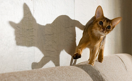
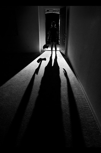
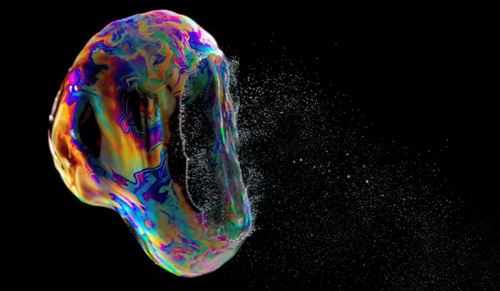
{Image taken from a video below}

Art is not straight forward

Abstract photography is often about how an artist views things rather than what is shown. Abstracts bring out the artists unique view of the world. The photog isolates the special characteristics of the subject.

The nature of abstracts is…

The photographers vision of the world is often about emotion. We are able to see into a subject because we become attached to it, understand it. We try to feel its impact on ourselves and to find a way to translate that into a picture. Often such “seeing” comes from a personal study of composition and aesthetics. It helps to understand the elements of art too. These are not requirements for making abstracts. They are a base for abstract seeing. They help artists analyse and know “abstract”. However, they contribute little to creating one.

The real issue is the way that an individual artist approaches making an abstract.

Abstract art comes to those who observe more than the “whole” of something. The minute detail through to the overall view of a subject is important. Abstract artists are aware of form and shape, texture and colour and a myriad of other detail. This awareness is different in everyone. Certain details catch the eyes of some people and not others. Some forms or patterns stimulate some and not others. This uniqueness is the key to “seeing” abstracts.

By ignoring some details or components of a scene or subject, and by building up others, it’s possible to construct the ‘abstract’. This is a new entity emphasising these details and elements.

Success in making abstract photos grows with experience of, and a personal view of, the subject matter. That might be made up of a deep study of the material and behaviour of the subject. It might also be a deep response to cultural and artistic baggage in the artists character. It could be both and more.

The mystery of creating abstracts?

The emotions that commit artists to a creative act are not easy to analyse. The act of creating abstracts is difficult too. By knowing a little of our own background, interests and experience we can see how to approach their creation.

Our own creativity can develop from learning about it in others. One route to knowing an abstract artist is via their enthusiasm and commitment. In the videos below you see into the artists themselves. They may help your view of the process of making abstracts.

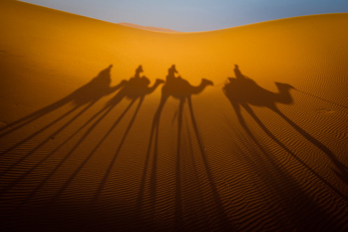
The first artist is Fabian Oefner. His interest is in abstracts through science. He shows a number of his projects. He explains how they came about and what was involved.

Fabian Oefner: Psychedelic science  External link - opens new tab/page

Lester Hayes was an early maker of abstract photos. He knew very little to start. He talks about becoming involved and why he saw abstracts. Clearly there is a deep emotional commitment for him in making abstracts.

Abstract Photographer Lester Hayes Uploaded by Anthony Mournian  External link - opens new tab/page

Next, we visit the world of Sergio Muscat. His abstracts have an organic quality. He shows his wonder of nature. He explains where he gets his vision with quotes and written comments between pictures. I became wonderfully connected to his thinking while watching.
Sergio Muscat  External link - opens new tab/page
In the quote below he shows that photos reflect reality. But they interpret the world. His insight into abstracts is about the same plastic reality on which photography is based.

Unlike other media, a photograph is always based on a real, material origin. Rather than looking at this as a disadvantage, we should understand that this same fact makes photography the ultimate surreal medium – simply because photography, although based on reality, is very far from the truth.
Sergio Muscat – Abstract Photography – YouTube

Photos never truly show what the eye sees. This is a deep part of the ideas in abstracts.

Seeing is not knowing

We may come to know the nature of the ‘abstract’. Yet, abstracts are a fragile gossamer. Each has its own essence. Catch it and you may destroy it.

Knowing a little of the artist helps. With that we may know a little of their approach to abstracts. That way we may learn to bring it out in our own work.

Further reading on abstracts

In other articles I have looked at the nature of abstracts. For more interest, follow up on these…

Comments, additions, amendments or ideas on this article? Contact Us
or why not leave a comment at the bottom of the page…

Like this article? Don’t miss the next — sign up for tips by email.

Damon Guy - Netkonnexion

Damon Guy (Netkonnexion)

Damon is a writer-photographer and editor of this site. He has run some major websites, a computing department and a digital image library. He started out as a trained teacher and now runs training for digital photogs.
See also: Editors ‘Bio’.
By Damon Guy see his profile on Google+.

How many types of blur are there in photography?

Blur by Netkonnexion - types of blur

Blur by Netkonnexion
Click image to view large
Blur By Netkonnexion on Flickr External link - opens new tab/page
There are many types of blur in photography.

Not all blur is equal.

There are various types of blur. It sounds odd. In fact there is a lot more to blur than most people realise. It is quite a varied subject. It is used in nearly all aspects of photography. From abstracts to zooming, we will find some aspect of blur. Lets take a look…

Okay bokeh…

First up, and one of the best known types of blur, is Bokeh. This Japanese word means haze or blur. It originally referred to the quality of blur. Today we use it to describe the actual blur. A sharp subject and a blurred background is created by a blur of tiny circles where each of the tiny points of light are not focused, that is bokeh. It is created by the lens and aperture.

When you use a wide aperture, say f4.0 (or wider) you get a shallow depth of field. The depth of field is the sharp part of the picture. The rest, the out-of-focus part, is blurred. That blur is the bokeh.

Bokeh can add a whole range of composition effects. It is also has its own aesthetic quality. The quality of the little ‘circles’ varies as does the true circular shape of the circles themselves. Photographic lenses with apertures that are more circular produce the best bokeh. Some apertures are more like regular polygons (say a hexagonal). Polygon bokeh is not as pleasing to the eye as circular bokeh. Fewer sides on the polygon forms a less circular bokeh circle. It may even form an obvious bokeh polygon. Manufacturers go to some lengths to make the bokeh pleasing. One way to make the bokeh more circular is to add blades to the aperture diaphragm. That can raise the cost of the lens.

Subject-movement types of blur

When a subject moves in front of your stationary camera the resulting image has a blurred subject. This is movement blur. The types of blur which include movement can be varied. In the picture above the motor bikes are moving at around 90 miles per hour. When taking this shot I was panning with the far bike resulting in that bike being sharp. The pan meant that my camera was not paced at the same speed as the nearest bike. As a result its movement was relatively out of synchronisation with my camera. The nearest bike was in relative movement and thus blurred.

In “The Barber”, below, I have set my camera to capture the blur of his working hands. As with any movement shot, you want some of the shot blurred and some sharp. If it is all blurred it just looks badly taken.

The Barber

• The Barber By Netkonnexion in 365Project •
Click image to view large
The Barber By Netkonnexion in 365Project External link - opens new tab/page
The movement of the hands is blurred to simulate his hair cutting work. Types of blur created in-camera are most effective.

Movement of the subject is controlled by shutter speed. To get it right you have to practice with the speed of that subject. Try the subject at slow speed first. Once you have an idea of the settings, speed the subject up. As you develop a feel for the speed-of-movement versus the shutter-speed you will be able to get a sharp background but a blurred subject.

More types of blur… Camera movement

When a subject is moving pan your camera with it. I did that in the bike picture at the top of the page and got a sharp bike placed against a blurred background. That is not bokeh in the background. As the camera panned with the bike it captured a stationary background. However, as the camera was moving it created a movement blur on the background.

Movement blur of the background normally occurs when panning. If you hold a stationary camera out of a car window and take a long exposure and the same type of blur will result. However, nothing will be sharp in that case (unless something next to you is travelling at your exact speed).

Done right background blur from camera movement has great impact. In the motorbikes above it gives a race feel. It looks really fast.

Some blur is not so good

Hand movement during a shot causes all sorts of blur. You get blurred shadows, blurred faces, possibly jerky tracks… not good at all. However, you can have some fun with this sort of movement. Some famous pictures have been created by deliberate hand movements. There are lots of shots, like tree shots  External link - opens new tab/page, where the movement of the camera creates a surreal or abstract view of the subject. Some people have tried throwing their camera and triggering it in mid-air – some bizarre results can be obtained (including a smashed camera).

Out of focus types of blur

Of course it is possible to completely blur a shot quite deliberately. Some pleasant aesthetic effects can be achieved. Wedding and romantic photographers love the “soft focus” shot. This is a deliberate very slight lack of sharpness. It emphasizes the romantic, soft nature of something… kittens, brides, the first kiss, baby and so on. Google images of soft focus shots provides quite a good range of possibilities for this type of blur.

The soft focus shot can be created different ways. Each give slightly different types of blur. You can literally set the lens to manual focus. Then when properly focussed pull the focus slightly back. so as to create a small amount of blur. Another way to do it is to use a soft focus filter. These are simply screwed to the end of the lens and give the same effect. When I was first starting out in photography many wedding photographers carried a flesh coloured or white nylon stocking. Pulled tight over the lens while the photograph is taken it creates a soft focus effect. Others like a skylight (ultraviolet) filter with a tiny amount of grease smeared on it. All these work, but give you a slightly different soft focus effect. Experiment… have fun!

Zoom blur

One of the less well known types of blur – zoom blur. You need a steady hand or better, a tripod. It makes the picture look like the world is rushing toward you very rapidly.

Adjusting the zoom during exposure creates zoom blur. Set your camera to have a long exposure – around one second is good. Balance the shutter speed with the ISO and aperture to get a proper exposure. You will need to use manual focus to adjust the zoom in the shot. Press the shutter button and rotate the zoom focus ring. A short turn or through its full arc – the amount of turn gives different effects. With a bit of practice you can reduce hand-shake blur. A smooth zoom throughout the exposure creates some great effects. Look through this page of zoom blur images on Google for some ideas…  External link - opens new tab/page.

Artificial blur

Most image editors have software filters to create types of blur. In fact there are a variety of different software filtersavailable. Gaussian blur is one common type. It softens or smooths the image, but also causes loss of detail. There is also rotational blur (self explanatory); linear blur or movement blur – you choose the direction of the blur. Other editng packages will have other blur types too.

Artificial types of blur do not have the same effect as blurs created in-camera. Artificial blur tends to lack depth. Whereas, blur using depth of field gives depth to a picture. The bokeh and movement blurs both have the impact of realism and depth as they vary throughout the depth of the image. Applying a uniform artificial blur can affect the realism. Applied with care and artful work you can make artificial blur look real. It is all about care and attention.

Are there more blurs?

There are probably other types of blur. They may fit into one or more of the categories above. Why not let us know about others. I would like to hear of new ideas and types of blur.

Comments, additions, amendments or ideas on this article? Contact Us
or why not leave a comment at the bottom of the page…

Like this article? Don’t miss the next — sign up for tips by email.

By Damon Guy (author and Photokonnexion editor)

Damon Guy - Netkonnexion

Damon Guy (Netkonnexion)

Damon is a writer-photog and editor of this site. He has run some major websites, a computing department and a digital image library. He started out as a trained teacher and now runs training for digital photographers.
See also: Editors ‘Bio’.

What Pinterest can offer photographers

Photokonnexion Pinterest Account

The Photokonnexion Pinterest Account

Viewing great images helps you make them…

Learning to read we are encouraged to read widely and develop our vocabulary. Reading classics and exploring interests helps inspire and teach us the foundations. It’s the same with photography. Great images, classic photographs – these help provide clues to the foundations of successful image-making. It helps us learn what works, what stimulates, what creates an image in the viewers mind. When learning photography our insight is improved with wide access to all the things that make images great and to the images themselves.

Developing photographic insight

In a previous post, “50 ways to improve your photography – every day”, I encouraged readers to constantly review other peoples photographs. Exposing yourself to images of all sorts help you to understand pictures better. Exposing yourself to great images helps you to improve by providing standards to aspire to in your photography.

Keen photographers may already look at lots of images a day. Unfortunately, newspapers, magazines and many websites use poor quality images or ones selected for purposes other than their aesthetic quality. In this situation it helps to have a place where you can create a haven, a place of quality images you respect, admire, aspire to, even adore. It should be a place you create where you can return regularly to cultivate your own taste in imagery with the images from your own portfolio, the best from websites you use and shared images from others with similar interests. For me that place is the website “Pinterest”.

How does Pinterest work?

Pinterest has established itself as…

…a virtual pinboard. Pinterest allows you to organize and share all the beautiful things you find on the web. You can browse boards created by other people to discover new things and get inspiration from people who share your interests.
http://pinterest.com/about/help/

When you open a “Pinterest” account you are helped through the process of choosing some images from the general pool of images. This gives you a learning opportunity and the chance to set up a range of “boards”. These are individual containers of images in a category you choose. You set up a “board” for each category of image you are interested in. You can change all this later too. I have one board with photography tips from this site. I also have these boards:

  • Great images;
  • Black and White
  • Works of the Greats
  • Trees and forests
  • Extraordinary Landscapes

and more. The top boards on Photokonnexion Pinterest home page  External link - opens new tab/page is shown above. Other boards line up underneath.

You can post an image to any of your boards any time in three ways. You can:

  1. Add a pin – enter a web address and select the image you want to pin.
  2. Upload a pin – select images from your computer to pin.
  3. Re-pin – select a pin from another persons board to pin.

You can also follow someone’s entire account, or you can follow a specific board from their account. You can comment on any image too. Accounts and boards you follow are accessible from your account so you can search your ‘follows’ for more images you like later. You can also search the boards of people who follow you by clicking their icons.

Each of the images are presented on one of your “boards” is in a small size. You can click through to the image in it’s largest size. If the image is presented on a web page clicking through again takes you to the page. This means you can use images a ways to get Pinterest users and your followers to visit your website too.

What Pinterest offers you

A Pinterest account provides a categorised storehouse for images you admire. These can be your images, or ones from other places or other Pinterest accounts. In short you can pick from the cream of online images and keep the image to go back to time and again. There are literally billions of images online. You will never run out of options to like, share and refer to at any time.

What Pinterest offers you, as a photographer, is a library of images that reflect your taste and interests. It is a great way to keep tabs on images you aspire to producing yourself. Your account can act as inspiration, a standard for you to work to, way to extend your photography interests; somewhere to store ideas for your future projects. It could also be a showcase of your own images for others to view and comment upon. Pinterest is a great way to make sure you see great images every day and share your interests with other people too.

What could possibly go wrong?

Every social networking site has down sides. The general interface is a bit ugly – it looks very busy on most pages. The saving grace is that the images you want to view in larger size are presented as single images so you can see them without all the other images around them.

There is an opportunity for copyright abuse since any images you post can be reposted many times. Your image will go to places you cannot control. So think carefully about images you post – as you should with any social networking site.

The comments system seems underused by the users – comments tend to be limited to explanations about images. The social networking side of the site is therefore a bit limited although as you get a following your communication with regular re-pinning-followers could develop as it would on other types of sites.

Photokonnexion on Pinterest

The idea of keeping all the images you admire in one place provides a great resource for improving your image viewing. However, if you don’t choose wisely the images you pick for your boards will not improve your vision. Of course you should choose images you like. However, when you view an image in its large size you can see how many times it has been repined. Images that are re-pinned many times provide a guide to the popularity of that image. So there is “popular guidance” of sorts. It is not expert opinion on the composition and aesthetic quality of an image of course. The best guide to what makes a good image is best learned by informed discussion with experienced photographers or other artists. Pinterest provides a place for such discussions to start, so you can make the most of the opportunities on the site with your friends.

I invite you to visit the Photokonnexion Pinterest Account. You are welcome to see how we use the account and the sort of images we like and link. If you join up be sure to surf on over and follow us. You can get our daily photography links as well as some idea of what we consider great images. Look forward to seeing you there.

The nature of shadows – ideas and inspiration

Shadows are most important in photography.

Without shadows the everyday shapes we see would be ill-defined. It’s shadows that help to give shape to the objects we view. They can also be the very essence of the picture. In this post I am going to look at different aspects of shadows as the subject of the picture. They can be extraordinary elements, message carriers, central attractions or complementary features. They are major influences in our art, sight and our everyday lives. I hope you will be inspired by shadows and appreciative of them as a strong compositional element in your photography.

What is a shadow?

Shadows help us to see. They are not an absence of light (darkness). It is the reduced light in a shadow that creates the contrasts that the eye picks out. In fact the camera does too. Where shadows are well defined, and contrast to the other light around them, we see a lot better than when there are few shadows and very bright light. Brightness makes it difficult to see things because the contrasts are absent and we can’t make out edges or three dimensions either. The variations in light intensities across an object tell us about its shape. If everything was in uniform brightness shapes would disappear.

Aesthetics and shadows

Shadow, and its counterpart light, are the medium of our vision. Decoding the light/shadow relationship is as stimulating as the pleasure of touching a sensuous surface; the electric excitement of a tantalising taste; being immersed in a powerful smell, or mellowing in the caress of a musical experience. Little wonder that as one of our five senses our understanding of light and shadow is also a deep part of our understanding of beauty and ugliness.

Seeing shadow

Of course our eyes sometimes misinterpret shadows and we make mistakes about them as with anything else. So it’s fun to consider the implications of false statements in shadow. In this first picture the shadow as the carrier of a message, but also the shadow as illusion. Shadow views of this sort bring out dark emotions and “shadowy” thoughts, but are also great fun artistically…

366 • 65 • Shadow monster by Pragmagraphr, on Flickr

366 • 65 • Shadow monster by Pragmagraphr, on Flickr
366 • 65 • Shadow monster by Pragmagraphr, on Flickr External link - opens new tab/page

In his notes on this picture the author says… “I have a lot of school work hanging over me like a shadow.” The visual pun is interesting and conveys a great message.

We love it when something appears as one thing and turns out as another. One of the endearing attributes of shadow is the other side of the visual story. In this next picture the lovely shape and bright eyes of this animal convey it’s essential “catness”. But the shadow is something different. The author says… “Her shadow makes me think about a French bulldog – with a tail” … shadows easily take on different meanings.

Flibberty and Her Shadow by peter_hasselbom, on Flickr

Flibberty and Her Shadow by peter_hasselbom, on Flickr
Flibberty and Her Shadow by peter_hasselbom, on FlickrExternal link - opens new tab/page

Of course shadows can be so much more than just a passive message. In this next picture the message is clear and the visual pun means so much to an English-speaking person. A clever use of shadow as the subject.

Shadow of 'a doubt' by Jon Downs, on Flickr

Shadow of ‘a doubt’ by Jon Downs, on Flickr
Shadow of ‘a doubt’ by Jon Downs, on FlickrExternal link - opens new tab/page

While the subject of a picture may not be the shadow there is still an important complimentary part to play by the shadow. The cobalt blue of the shadow in the next picture creates a wonderful tonality. The shape of the object is defined by the shadow, but it is the blueness that makes the statement. The author acknowledges that fact by his title…

If you can write a visual story with your photograph you pull the viewer directly into the shot. In this next picture the shadow and its disembodied juxtaposition on the ladder brilliantly conveys a set of meanings that we, the viewer, impose. The interest is the simplicity of the picture and yet the complexity of the possible meanings… fireman, escapee, workman, who is he? The interpretations are endless…

Shadow Climbing the Ladder at Sunset by S@ilor, on Flickr

Shadow Climbing the Ladder at Sunset by S@ilor, on Flickr
Shadow Climbing the Ladder at Sunset by S@ilor, on FlickrExternal link - opens new tab/page

Shadow and silhouette are closely related. The dark-side of a silhouette is the result of blocked light, as is the shadow. Normally the statement made by a silhouette is in its shape. I like this next picture because the silhouette is betrayed by the darkness behind it. The hard light and low light-source has lengthened and strongly defined the shadow creating a strong subject. It has become all the more threatening because the silhouette is only partially seen. What is there – is there a threat? Are we being menaced by our imagination misinterpreting the shadow… This is a clever interplay of light and of mood. Nicely done…

Shadow. by David Giron, on Flickr

Shadow. by David Giron, on Flickr
Click image to view large
Shadow. by David Giron, on Flickr External link - opens new tab/page

Shadows can convey much more than just mood. They create a picture themselves, but in a minimalist way. The two dimensional aspect of shadow is only partially compensated for by shape. We know that we can so easily misinterpret a shadow. So it is a relief when the meaning is implied without threat or misinterpretation.

Shadows and intimacy are frequently associated. Above, the closeness of the characters shows intimacy. In the next picture the intimacy of the boudoir is so strong that the viewer is relieved by the pattern of shadows to redirect the mood.

Shadows by Pablo Miranzo

Shadows by Pablo Miranzo.


The author says this is one of a series of pictures intended to contrast light and dark and is in black and white to simplify the composition. Oddly enough the composition is simplified by that, but complicated by the opposing mood settings. An interesting picture of mixed tensions.

The interplay between textures is important. While the shadow is a major part of many subjects, sometimes it is not the only subject. Look out for pattern shots that are uniform across the shot until you allow yourself to be drawn in. Often pattern shots have some compositional element to break the pattern, something that draws the eye. Wood grain and the subtle variations in the rhythm of its lines create micro textures and variation providing relief from the pattern, for example. It is that which draws you in.

Texture is an exciting aspect of any picture. It is created by the subtle tonal variations of light and shadow at the micro-level in the picture. If you see a texture and it convinces you that you would feel the texture if you touched it then the picture has convincingly been created as an image in your mind. In this next picture the image I see is all texture. The wonderful curve of the stair rail and its counterpart, the twisted shadow, combine to create great depth in this picture. The combination gives you the feeling that you can reach in and touch… A great image.

The stairs in the next image are pretty minimalist in themselves. However, the elaborate pattern of light and shadow created by them is exquisite. It is a wonderful example of how shadows transform a picture. In this case the shadows have turned the purely mechanical geometry of the stairs into a complex of pattern and curves. It is a wonderful play-off between the simplicity of one and complexity of the other…

Pulling it all together

The shadow as a subject is clearly a compositional feature. It adds to the texture of the shot too. The clever use of shadow can also add a message and/or impart mood as well. Sometimes though, it all just comes together. If you can combine mood, subject, story, composition and texture you have really made the grade. Your picture comes alive in the mind of the viewer. You have truly created an image. To do all this using just shadow is a clever and precious creation. I think this next image is one such example…

Using shadow as a subject is challenging but worthwhile photographic pursuit. Shadow gives you all the essential elements of a good photograph but supplies it with simplicity and meaning if done well. There are untold interpretations and subjects out there for you to tackle. I hope that I have inspired some new thinking on the subject.

find out more...Photokonnexion tips by email
If you enjoyed this article please sign up for our
daily email service.
                                                 Find out more
#11030#

By Damon Guy (author and Photokonnexion editor)

Damon Guy - Netkonnexion

Damon Guy (Netkonnexion)

Damon is a writer-photog and editor of this site. He has run some major websites, a computing department and a digital image library. He started out as a trained teacher and now runs training for digital photographers.
See also: Editors ‘Bio’.

The left side of the face is the most pleasing

Party Reveller - the left side is more pleasing.

• Party Reveller •
Most people’s left side of the face is more pleasing.
(Image by Netkonnexion).

Focus on the left side – it’s more expressive

The most important thing about portraiture is to capture the essence of the person. Your subject is the key to success. Showing the most expressive part of their face helps you to capture their expressions. It seems that the left side of the face is the most pleasing to the eye. According to a study by Kelsey Blackburn and James Schirillo from Wake Forest University (USA) the left side of the face shows more expression.

Their research shows that the left side of the face is thought more pleasant than the right side of the face. They looked at how viewers rated photographs of each side of the face. They used grey-scale pictures to take out the complication of colour. They asked viewers to rate the side they found the most pleasing to look at. The research results show a preference for the left side. This may be because the left side of the face more actively expresses emotion.

Artists seem to have been ahead of the game on this one. It is interesting that great paintings and portraits by the old masters tend to show the left side of the face. Artists are known for their aesthetic eye. It seems on this point they are ahead of science on the importance of the left side.

So, there you have it. Scientific research helps your photography. Your portrait is best taken with the left side of the face shown off to an advantage.

Don’t forget to consider the whole person too. Sometimes disease, injury or the affects of age impact one side of the face more than the other. So be sensitive.

As with all principles in photography this is not a hard and fast rule. You should always discuss with your sitter what they consider to be their best side. Some people have a fixed idea about that. It is better to get their view on it than be slavish to research. If you satisfy your sitter, that is more important than following research for the sake of it.

Netkonnexion

Damon Guy (Netkonnexion)

Damon is editor of Photokonnexion. He has professional experience in photography, writing, image libraries, and computing. He is an experienced web master and a trained teacher. Damon also trains digital photographers.
See also: Editors ‘Bio’
By Damon Guy :: Profile on Google+.

Simple ideas about perspective in photography

Perspective is all about using visual clues to emphasise dimension

Perspective is all about using visual clues to emphasise dimension. Your picture needs to use defined edges, lines and direction to give the eye something follow into the image.
• Perspective • By Netkonnexion on Flickr External link - opens new tab/page

The concept of perspective is related to visual clues.

What we see in the world around us is created in our heads. We see things in the environment and from that build up a picture. Here we look at the sense of perspective.

Visual clues

Previously in ‘The easy way to give depth to landscapes’ and Easy introduction to ‘visual elements’ in photographs I introduced ‘visual elements’. These are strong signals in the world that help us see. They are mostly edges, lines, curves, shapes, form and so on. We see things because the edges of objects have a detectable contrast with something beside it. Our eyes spot that change and, in doing so, see depth. Edges give us strong clues about the nature of our world so our eyes are trained to follow them.

The nature of perspective

Our innate sense of perspective has always been there to enable us to function as biological animals. Perspective in art is a different matter. In terms of human history reproducing perspective has been a late arrival (see: Perspective – compositional ideas). What made the difference was understanding the relationship between lines, or in natural terms, edges.

Three dimensional geometry explained the way lines created depth. This geometric depth also mimicked form in nature. On mastering the idea of a cube or other geometric forms we see how the lines work. If you look at a cube corner you see three edges trending away from you. You are looking at depth created by the edges.

Parallel lines provide strong perspectives. In the picture above there are lots of parallel lines which give depth to the picture. The main red line – the bus lane – is a vanishing point perspective or ‘single point’ perspective. It is notable by its coming together (convergence of the lines) near the horizon. By experience we know this is a long distance away. The convergence has created distance into the picture.

In the bridge there is ‘two point’ perspective. You can see depth because the darker underside is defined by its lighter up-edge (the wall of the bridge). This two-point perspective exists for us even though we cannot see the roof or the other side to confirm ‘form’ (3D) rather than shape (2D).

Of course the glass stairway to the bridge has three point perspective. Like the cube we can see depth – the top edge of the building, the bottom edge of the building both converge (two point). The convergence imparts depth. However, the width of the building (shown by the top and bottom edges), and the height gives us the three dimensions. Our visual clue for this. on the front-face. is the non-convergence of lines in the width/height plane. Although this front-face is a curved glass wall we can still see it does not have a distance perspective away from us.

All the clues are there

You now have the clues, or visual elements to determine depth through perspective. Converging lines with distance from the eye impart a feeling of distance away from you. Parallel lines with no convergence give you flatness or non-distancing when they face you. This works with both height and width.

I chose the picture above for the strong perspectives that it imparts. The powerful lines make it easy to see the almost exaggerated proportions that contribute to perspectives. Sometimes its not so easy in nature. Have a look at the picture below…

Looking up the River Thames from Marlow, Bucks, UK

Looking up the River Thames from Marlow, Bucks, UK. The perspectives are not as clear as direct straight lines. Yet the picture has depth because we are adept at seeing ‘edges’ and trends in lines when we look at nature.

Click image to view large.
• Looking up the River Thames • By Netkonnexion on Flickr External link - opens new tab/page

The edge on the right hand side looking up river barely exists – it disappears off the side of the shot. Yet the small part that is there at the top implies there is a bank all the way down the right. The left bank on the other hand is not well defined as a line. However, our eyes are trained to see it as a ‘trending’ line. The line of trees (left) and the implied line (right) therefore creates a converging pair of lines in the distance to where the river rounds the bend.

Despite there being no strong lines in this picture we can see a converging point perspective. Dimensionality is added by the height of the trees and the width of the river. The width diminishes between the two banks as we look progressively up stream, more evidence of distance and convergence. The height and width we intuitively know because our eye determines sizes by measuring them against boat and people sizes (known element sizes). Perspective is all in the visual elements.

Understanding is not precise

We do not all understand perspective in the same way. Some notable art schools have denied our innate understanding of perspective and space. The Cubists are an example of this, notable among them Pablo Picasso  External link - opens new tab/page the famous Cubist painter. Nevertheless, we all understand depth in the world around us. We don’t live in a two dimensional world. However, in our images we have to create the sense of depth in a two dimensional medium.

The second picture, the river scene, shows us how to define depth. We need, as photographers, to become observers of lines and trending lines. Similarly, we should be able to spot shapes and forms that are both defined and ill-defined. Then we need to be able to view them as if a geometric model. If we can see these lines, in nature and in man-made things, then we can find ways to compose our picture to bring them out. It is this last part that is the most important part of the composition process.

If we give the viewer a perspective in our shots, we create a world. We want it to be a three dimensional world that the viewer can imagine going into. When we choose compositions that emphasise these lines we dispose of the two dimensional picture and create an image to look into.

By Damon Guy (author and Photokonnexion editor)

Damon Guy - Netkonnexion

Damon Guy (Netkonnexion)

Damon is a writer-photog and editor of this site. He has run some major websites, a computing department and a digital image library. He started out as a trained teacher and now runs training for digital photographers.
See also: Editors ‘Bio’.

The Rule of Odds – Uneven Composition

The rule of 'odds' - a rule grounded in our concepts of pattern and chaos.

The rule of ‘odds’ is grounded in our concepts of pattern and chaos. We find it easy to pick out a pattern. If the pattern is broken or shows anomaly it is more interesting. The eye is drawn into the picture. Odd numbers are just a little off the comforting pattern of evens. They draw the eye too. Click image to view large.

It’s a little ‘odd’ – but ‘even’ is not as interesting!

The rule of odds relies on the human sense of pattern to capture the attention the viewer. Our brains work well with pattern. We see pattern in almost everything in the world. So it is natural to see it as a central part of composition. When there are small groups of objects or people the rule of odds becomes a valuable attraction for the eye.

Why does the rule of odds work so well? There are several reasons. The eye is pleased by symmetry. Evenness represents symmetry. It represents balance… it’s about plainness and organization. On the other hand an odd number steps out of the realm of organization and plainness. When we see an odd number it is natural and compelling for our eye to seek the missing component to even it up again. We look into the picture to try and satisfy the pattern.

Some pictures, like the one, above obviously have nothing in them to fulfill evenness. There is no fourth dice here. However, the number three creates another simple pattern. The Triangle is also attractive to us. Placed in a position that creates a triangle three objects form an implied shape that attracts the eye. It is symmetrical, yet it is odd.

The rule of odds is not just about ‘threes’. The eye is drawn to odd numbers in small groups where we can see the oddness of objects at a glance. Five, seven, even nine are all numbers that pull the eye toward them. Once objects become too numerous to be immediately and obviously odd in number the appeal is lost. The eye does not search to fulfill the pattern. So the rule of odds works because of the simplicity of low numbers – it relies on quick recognition of the situation to draw the eye into the picture and keep it working to find the balance.

The rule of odds plays out its role in composition in many ways. If you are looking to make a bigger impact then find a way to place an odd number of objects into your picture. An odd number provides more interest, more reason for the eye to search the picture. Remember, the ultimate aim is to draw the eye of the viewer into the shot and keep them looking and finding interest.

By Damon Guy (author and Photokonnexion editor)

Damon Guy - Netkonnexion

Damon Guy (Netkonnexion)

Damon is a writer-photog and editor of this site. He has run some major websites, a computing department and a digital image library. He started out as a trained teacher and now runs training for digital photographers.
See also: Editors ‘Bio’.