Tag Archives: Vocabulary

Have you got a low photographic hit rate?

Hit Rate - How Many Do You Keep?

What’s your photographic hit rate? How many shots do you keep?

A good measure of your success…

The hit rate is something that we often artificially inflate. In fact it is common for learners to have a low hit rate. Knowing how to calculate it can help you understand your improvements.

What is it?

So what is the “hit rate” in mathematical terms? Simply put, it is the total successful shots divided by the total exposures for a given shoot. It is expressed as a percentage. You can see the full formula in the graphic below.

Hit Rate Calculation

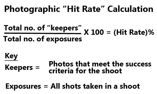
• Hit Rate Calculation • What’s your hit rate?
The math is simple, deciding what is relevant to your pick of successful photos from a shoot is a value judgement made on your expectations for the shoot or from a brief in the case of a shoot for a client.


A more detailed look at the math, and the assumptions, can be found in “Photographic Hit Rate” in our Glossary pages. The examples there will help you to understand the meaning of “keeper” and how that relates to the hit rate percentage.

It’s all about choice

The full mathematical explanation of hit rate really is as simple as the graphic suggests. However, it is important to understand that the whole calculation is based on a value judgement. What you pick as success criteria for your shoot determines how harshly you edit out or accept the successful pictures you choose for “keepers”. Of course you may keep most of your shots, but the really good ones you should call your keepers (actually I call my keepers picks… it’s your choice).

My keepers, or picks, get separated out into a folder of their own for later use or for giving to the client. I keep the originals but I normally find I have a hit rate of around 25% to 35% depending on the shoot. Each shoot is different depending on the brief and the technical difficulty of the shots. You will have a low hit rate for the really fast action shots. You might have a higher number of keepers for the party and event shots for example.

Ansel Adams, the iconic landscape photographer, said…

Twelve significant photographs in any one year is a good crop.
Ansel Adams

Of course he is right. Truly great shots come at a very low hit rate. However, we don’t have the luxury of only relying on twelve shots a year for most personal and professional purposes.

How harsh should you be?

When deciding on keepers you can decide to be as harsh or slack as you wish. What is important is your ultimate goal. If you want improvement your picks should be the very best shots. Each shot should be taken at a high standard and only the best should be published. I tend to think that learners should be quite harsh on themselves and work to exceed their own standards. You may want to set yourself a slower pace. It is your choice. Just make it fun.

Why bother?

OK, this is the main point. If you are consistent over time in editing your shots you will begin to find you can push up your hit rate. Professionals tend to have a consistently higher hit rate than amateurs. After all they have to make a living from their shots. On the other hand if you keep tabs on the numbers you may find you are taking less shots because the ones you do take are returning more keepers as you improve. That saves time and especially editing energy.

What measuring your hit rate does is give you a feel for improvements and consistency in your photography. Don’t ruthlessly measure everything. Look back over your shots. Get a feel for your hit rate. It will help you to get a picture of your success rate overall.

I found that knowing my hit rate was a confidence booster when learning and an essential tool for my professional life. Give it a go. You might find it a great help too.

Comments, additions, amendments or ideas on this article? Contact Us
or why not leave a comment at the bottom of the page…

Seeing what you want to create

• Mushrooms •

• Mushrooms •
Photographers learn many techniques to achieve a particular outcome or ‘look’ in their images. They go beyond reality to create a specific previsualised final image.
Click image to view large
• Mushrooms • By Netkonnexion on Flickr External link - opens new tab/page

Visualise the image you want to make.

Producing a picture can be as simple as point and shoot or as complex as a long planned production. To produce great images you often have to go beyond an elementary snap-capture. The best images are made from a careful thought process. The photographer has a goal in mind, a visualisation of what they want the final image to be.

What is visualisation?

People who use visualisation techniques seek to perform challenging tasks to achieve the visualised goal. The existence of a previsualised goal gives them a clear sense of being able to achieve the goal while trying to achieve it. Users of the technique report they gain an internal boost from having the outcome already in mind.

In sports users of the technique are taught to visualise an explosive use of energy through which they then see themselves complete a record breaking event or win a race. In business the user visualises a goal for their business and continues to enrich the detail and nature of the successful outcome in their mind while working toward attaining it in the real world.

In cinematography whole scenes are previsualised and committed to storyboard form. This creates for the director a clear, detailed mock-up of the scene(s). The storyboards augment and crystalise their mental visualisation of the scene. The latter provides a shared vision for the production team with which to pursue the quality cinematic outcome.

In still photography there has been a long tradition of visualisation. Ansel Adams and several of his contemporaries used the technique. Adams himself defined the use of visualisation as…

…the ability to anticipate a finished image before making an exposure.
Ansel Adams, The Camera, 1980

“.
Adams continued to write about visualisation in photography throughout his life and clearly attributed much of his own success as a photographer to being able to see the finished print in mind before he took the picture.

Adams came to understand the nature of the visualisation through the creation of one of his most important pictures. While working in Yosemite making a picture of the “Half Dome  External link - opens new tab/page” he was using yellow filters to darken the sky. This was a common practice at the time used to simulate in black and white the depth of colour in a sky. However, Adams imagined that the yellow filter would provide an insufficient depth of sky tone to show the drama of the scene before him. Instead he imagined the final print would look better with a darker sky-tone. Applying a red filter instead, he created in the final print the dramatic outcome he had visualised before setting up the camera.

This proved an important moment. He became aware the camera did not simply record a scene. Instead it could be set up to achieve an outcome he had imagined before making the exposure. This visualisation became his guide to the production of the image rather than the absolute reality in the scene.

This realisation enabled Adams to see past the literal and technical capture of the plain camera and lens combination. Instead he was able to create something “expressive” that was a manifestation of the vivid image he had visualised in his imagination.

Today photographers learn many different techniques to achieve a particular outcome or ‘look’ in their images. We see deliberate under or over exposure scenarios created from daylight scenes, or dramatic blood-red sunsets over-saturated to emphasis the power of the retiring sun. The use of visualisation allows the photographer to see in their minds-eye what they want the final image to look like.

Visualisation does not ensure the success of an outcome but it does provide a powerful guide in the process of achieving success. As the photographers visualisations become more detailed and their artistic talents develop so does the visualisation.

Where visualisation is used the technique can only be successful if the appropriate technical steps are deployed. The successful rendering of the visualisation can only come out of a quality photographic process. However, there must also be an interdependence.

Visualisation can be achieved artistically without knowledge of the photographic process. And, the act of visualisation is improved with practice. At the same time, the scene conjured in the minds-eye must also be achievable by the available photographic skills. As skills develop their visualisation skills are more likely to respond to the growing range of techniques the photographer knows. In other words, as a photographers experience grows what is achievable through visualisation also develops. The strength and quality of the visualisation will also be better in areas where the photographer has practised and polished skills.

So, we can reliably infer that visualisation and skill set work together. Landscape photographers will tend to produce better sunset visualisations and images because that is their area of practice and expertise. At the same time fashion photographers will see an outcome for an image that shows off an article of clothing or a delicate facial bone structure because that is how they spend the majority of their time. Each has their specific photographic skill set and technical process. Each photographer also has their own artistic and observational skills that help build expressive visualisations for the type of images they want.

Practice and development

Visualisation is a dynamic and evolving skill. As you become familiar with new techniques your ability to achieve a particular visualisation develops. Visualisation is a skill that develops with awareness of the potential and an ability to imagine a great image before you produce it. The earlier you start to try deliberate visualisation and planning for its fulfilment the more likely you are to take control of your development as a photographer.

By Damon Guy (author and Photokonnexion editor)

Damon Guy - Netkonnexion

Damon Guy (Netkonnexion)

Damon is a writer-photog and editor of this site. He has run some major websites, a computing department and a digital image library. He started out as a trained teacher and now runs training for digital photographers.
See also: Editors ‘Bio’.

find out more...Photokonnexion tips by email
If you enjoyed this article please sign up for our
Tips by email service.
                                                 Find out more

Three rules of lighting… simple, but effective

• Three Rules of Lighting •

• Three Rules of Lighting •

The simple explanations are the best.

Here at Photokonnexion we try hard to provide simple explanations for the things we all want to learn about our favourite subject. If you think anything is too complicated let us know on our Contact Us page or leave a comment below the article.

Well, here is a video in the spirit of simple explanations. I really do not need to explain before you see it… just watch and enjoy.

More after this…

find out more...Photokonnexion tips by email
Enjoying this article? Please sign up for our
Tips by email service.
                                                Find out more
#11030#

Three Rules of Lighting for Photography

“We talk about the three important rules regarding the behaviour of light. As photographers we can use these rules to achieve the type of lighting we want, including the look of soft light.” – Ed Verosky
© Ed Verosky 2012  External link - opens new tab/page

For more background on lighting

Don’t forget to check out our Light and Lighting resource pages and especially the links on Hard Light and Soft Light. These are essential to the understanding of light.

All our resources can be found in the menu at the top of the page.

By Damon Guy (author and Photokonnexion editor)

Damon Guy - Netkonnexion

Damon Guy (Netkonnexion)

Damon is a writer-photog and editor of this site. He has run some major websites, a computing department and a digital image library. He started out as a trained teacher and now runs training for digital photographers.
See also: Editors ‘Bio’.

Can you write? Of course you can!
Write for Photokonnexion...

We would love to have your articles or tips posted on our site.
Find out more…
Write for Photokonnexion.

The simple secrets behind good food photography

Food for Her World Vietnam magazine.

Food for Her World Vietnam magazine.
Food styling by Dang Phuong
Photography by Mads

Food for the World Vietnam magazine. Photography by Mads • on FlickrExternal link - opens new tab/page

We all love good looking food…

Food photography? So, what makes it look really good? I love to cook and make tasty food. But, great cooks also have a skill with presentation. It is the presentation which really makes great food shots too.

Food photography seems to be centred on three things – good looking food composition; great light and picking the right focus/centre of interest. Duh! Wait a minute, isn’t that pretty much photography summed up all over? OK, I jest. There are some specific ideas and techniques involved. Good food photography seems to require a particular approach.

Here are some introductory points for good food photography. You should look to achieve…

  • Experience with small-sized and table-top compositions.
  • A working knowledge of lighting at the table-top scale.
  • Simple natural light from one source (window).
  • Able to use reflectors/black cards to shape the light.
  • Simple centre of interest in the shot.
  • Carefully chosen depth of field.
  • Very simple, but rich backgrounds.

And with the food itself…

  • Natural and where possible bright colours.
  • The colour mix should work together.
  • Avoid odd clashes of colour.
  • The food combinations should be simple and few.
  • Focus on the main interest.
  • Avoid highlight bokeh spots where possible.
  • Try to emphasis the texture of the food (lighting).
  • Use simple but eye catching cutlery and plates.
  • Avoid cluttering the shot with too much food.
  • Give the food a big/deep background.

More after this…

Book recommendation:

Food Photography:
From Snapshots to Great Shots

Simple advice on lighting including great diagrams. The pictures include camera settings. Excellent advice on setting up a table-top studio which was also inexpensive to do. Lots of tricks and techniques like the pros use. Great presentation ideas.


Food Photography Tips – Video

In this video we look a range of ways to look at and shoot food. It is a great introduction to food photography basics. The video uses graphic images for a broad introduction to the art of angles, framing and creating drool inducing food photos.


Damon Guy - Netkonnexion

Damon Guy (Netkonnexion)

Damon is a writer-photographer and editor of this site. He has run some major websites, a computing department and a digital image library. He started out as a trained teacher and now runs training courses in digital photography.
See also: Editors ‘Bio’.

Can you write? Of course you can!
Write for Photokonnexion...

We would love to have your articles or tips posted on our site.
Find out more…
Write for Photokonnexion.

The secret to world travel – but staying at home!

• Winchester Cathedral Chroma key image•

• Winchester Cathedral •
Chroma key work is quite easily done in Adobe PhotoShop and a range of other quality photo-editors.

When you want to be somewhere else…

There are places we would rather be than where we are now. I would like to be on an island paradise …not going to happen! But you can do it photographically. The secret is something called Chroma Key photography or green screening.

Chroma Key Substitution

In chroma key, often known as “green screen” photography, the subject is photographed against a uniformly lit green background. Then, in post production the subject is easily selected out from the green background. The selection can then be pasted into any other photographic background.

Any uniform colour can be used as a backdrop for the chroma key shot. The picture above is selected from a blue background and pasted into a picture of Winchester Cathedral in SE England. The two pictures were taken on different days.

To make the selection of the subject from the background it is important to light the background evenly. When the colour is even the selection is easy and can be completed in one operation. Colour variations from uneven light make it more technical to isolate the subject.

Green is the most frequently used colour in chroma key photography. The colour is very easily separated from human skin tones. Where the subject has green tones, blue is often used as the chroma key alternative. Blue is a common colour for clothing. It is therefore less suitable than a strong bright green which is not so popular as a fashion colour. However, green does have other advantages. The human eye is able to see more shades of green than any other colour. This makes it easy to see variations in the green when setting up the lighting. Green sensitivity is also built into software applications to match the abilities of the eye. This helps us to work with the background when doing awkward selections.

Fun and games

The substitution of a subject into any other photographic background provides great opportunities for doing fun things. Film stars can be placed in your garden. You can apparently travel the world without leaving your front room. Just find the right pictures and substitute yourself into the background of your choice.

Of course there are also opportunities for advertising, graphic art, product photography, still life, portraiture, action shots and many other false situations. Of course we should be careful not to be immoral about such things! Feel free to have fun though. You can really make it look like you have traveled the world.

How is it done?

Basically you need a chroma key background, lighting to illuminate it evenly, a camera and a subject. On a small scale this is easy to do. A lot of people doing chroma key work for the first time start with still life or table-top photography to get the technique right. Probably the most common use of the technique is for portraiture. Take a picture of yourself or your friends and then start playing. For this you need a larger screen…

The video is a complete introduction to the use of chroma key photography. You can take the same techniques and scale them to any size. The video introduces the ideas you need to grasp and shows how to set up the lights and the equipment. It also shows one of the software applications. After the video I will briefly look at that software for you.

How to Green Screen (Chroma Key) with Photography!

markapsolon  External link - opens new tab/page

Software

There is a whole range of software that is capable of doing chroma key. In essence chroma key software has two jobs. The first is to select the subject off the green background (or whichever colour you are using). The second is to successfully blend the abstracted subject with the new background.

The software from the video is called PhotoKey from FXHome  External link - opens new tab/page. It has been produced specifically for chroma key compositing. It is not alone in the market. However, there are not many applications specifically aimed at this work. Instead there are plenty of applications that do chroma key blending as part of a general suite of editing tools. There are also plugins for the same process to go into your favourite image editor.

The actual process for producing the final blended image is relatively quick and easy in most of these chroma key applications. The tools are usually quite self explanatory if you have some editing experience. As with any editor, you normally find the blending tools manage colours, contrasts, edging and so on. Ultimately you are creating a blend of the two images, but the best chroma key tools go further. At the end of working through the blending process you can make further changes in a good software suite or plugin. If you are satisfied with it you should be able to export your image to make a .png, .jpg or .tiff image.

The way to do it in Adobe PhotoShop

The general photographer is most likely to have use of a quality image editor like PhotoShop, Elements, GIMP, PaintShopPro and others. All these are able to do the type of work that PhotoKey can do. Admittedly it takes longer. But for beginners it is better to save your money for more general photography kit. For those who are interested, here is a short video explaining the Photoshop method of doing a chroma key composite. It is a simple technique using standard photoshop tools.

Isolating with a Chroma Key Background

This tutorial is aimed at Photoshop intermediate level users.

Overall…

Chroma key work is fun. There is quite a lot to learn, but it adds flexibility to your photographic work and post processing. The use of up to date quality image editors is probably better than splashing out on expensive specialist applications. Nevertheless specialist applications do a great job, saving time in post processing.

Can you write? Of course you can!
Write for Photokonnexion...

We would love to have your articles or tips posted on our site.
Find out more…
Write for Photokonnexion.

find out more...Photokonnexion tips by email
If you enjoyed this article please sign up for our
daily email service.
                                                 Find out more
#11030#

A hidden compositional element to pull the eye into your images

• Honiston Pass in the English Lake District •

• Honiston Pass in the English Lake District •
Overlapping elements in the picture promote a strong sense of distance.
Click image to view large
• Honiston Pass in the English Lake District • By Netkonnexion on Flickr External link - opens new tab/page

Add depth to your images.

Look at the scene and find ways to show depth. If you want a scene to be convincing you should consider all the compositional angles. In particular the depth. A flat image is not convincing. One of the ways to achieve depth is to incorporate overlap in the scene elements.

What is overlap?

In composition overlap is where one element of the scene is partially obscures another. It is a simple concept and one that creates a marker for the eye. If we see something that is obscured by another thing we have learned from experience that there is a distance between them. The relative sizes of the objects help us to guess what distance separates them.

We cannot immediately tell the relationship between far away or small objects if objects don’t overlap. We don’t have a reference point between them. We can project some sort of guessed perspective and under some circumstances we can guess by the effect of atmospherics (like haze, fog or dust in the air). However, in most cases that takes thinking and time to do. When a viewer is looking into an image they will not take the time to do that sort of guesswork. We need to make the depth immediately obvious, or we will lose the viewer.

The picture above is an example. There are several overlaps. The foreground road and grass verge slightly overlaps the large foreground rock. The latter forms a strong overlap with the wall. The mountain pass disappears into the distance around three spurs that inter-space with one another giving a strong sense of overlap right to the horizon.

Overlap is the key to the immediate recognition of depth in a lot of situations. Landscapes, and often in strange environments like tiny-scale close-ups, are good examples. When you are looking to help the viewer understand the image try and find ways to provide some overlaps so that the image clearly shows relative distance between objects throughout the distance into the shot.

Overlap the villain

Overlap is not always the good guy in an image. There are occasions when it is a source of confusion. For example the image below…

• Overlapping - the deer problem •

• Overlapping – the deer problem •


The picture shows three deer. You might need to take a second look. I did, and I took the picture. You see? Overlap has killed the image.

The most difficult overlaps you will find are the ones where there is little distance between the overlapping elements. In the case of the deer above the merge effect is almost absolute and the resolution of the second deer is spoiled. Its outline merges with the third one at the back. The legs are completely visually entangled. This is a clear confusion for the viewer.

The general rule with overlaps that do not work is clear…
         Avoid overlapping objects that are similar and close.

Unfortunately that often includes people. When they overlap there is frequently confusion. This is especially the case when the clothing is similar (say, all black suits). Another example of problematic overlaps is with silhouettes. The outlines have to be very clear to carry a true sense of character. Otherwise, you cannot tell where one person ends and another begins.

Judgement call

As with so many good things there is a bad side. While overlap is a great help in establishing distance for the eye it can also be the villain. The trick is in understanding how much the eye interprets the similarity of the overlapping element and how much distance lies between them. Your judgement call, as a photographer, is to look at your composition and ask yourself if the viewer will interpret the overlap as help or confusion.

By Damon Guy (author and Photokonnexion editor)

Damon Guy - Netkonnexion

Damon Guy (Netkonnexion)

Damon is a writer-photog and editor of this site. He has run some major websites, a computing department and a digital image library. He started out as a trained teacher and now runs training for digital photographers.
See also: Editors ‘Bio’.

Can you write? Of course you can!
Write for Photokonnexion...

We would love to have your articles or tips posted on our site.
Find out more…
Write for Photokonnexion.

Inexpensive Close-Up Photography – Tips and Tricks

• Oil and water •

• Oil and water •
These bubbles of oil in water were shot with a
Canon 50 mm f/1.8 and a +10 close-up filter
Click image to view large
Oil and water • by ArchaeoFrog

Easy, budget macro.

Macro or close-up photography is accessible without investing in a pricey macro lens. The first three articles in this series covered techniques for inexpensive macro-level results: close-up lenses, reverse rings, and extension tubes. In this article, I offer suggestions for achieving great-looking results using any of these three techniques.

Choose Your Depth of Field

Depth of field is a term that refers to the area of the image that is acceptably sharp and in focus. Depth of field is a function of many things. Our interest is in three factors. These are aperture, the distance between the camera and the subject, and the orientation of the subject relative to the camera.

Aperture has a direct influence on the depth of field. A wide aperture (smaller f number, such as f/1.8) creates a shallow depth of field. Areas of the image outside of the zone of sharpness fall out of focus quickly. Wide apertures can be used to create bokeh – unsharp sections of the image.

A narrow aperture (larger f number, such as f/22) creates a deep depth of field. The majority of the image is in focus. Narrow apertures are often used by landscape photographers to capture front-to-back sharpness throughout an image.

The distance between the camera and the subject also influences the depth of field. Generally, the closer that you are to your subject, the narrower the depth of the field becomes. This is particularly important when using macro and close-up photography techniques where you need to be physically close to the photographic subject.

• Bokeh penny •

• Bokeh penny •
By ArchaeoFrog
Penny shot with a Canon 50 mm f/1.8 lens and a full set of three, generic extension tubes (7, 14, and 28 mm). The plane of sharpness lies parallel to the flat of the lens. If the plane is not parallel the focus is quickly lost.
Click image to view large

It is also important to consider the orientation of the subject relative to the camera. The depth of field can be thought of as a plane that is parallel to the camera lens. If you can orient yourself so that the subject is parallel to the flat of camera lens, more of your subject will be in focus than if it is at an angle to the camera. In the penny shot above, I tilted the camera lens slightly away from the parallel position. The loss of focus from right to left is obvious.

• Flowers and Depth of Focus •

• Flowers and Depth of Focus •
Click image to view large

The flower photographs show how depth of field influences an image. Both were taken with the same lens (Canon 50 mm f/1.8), the same aperture (f/1.8), and the same technique (reverse ring). Both images have a shallow depth of field (wide aperture) and are close to the subject. The appearance of the depth of field is very different. The yellow flower (left) is sideways to the camera. Only the closest edges of the petals are within the depth of field and are in focus. The purple flowers center is shot parallel to the camera. The entire center of the flower is within the depth of field and appears in focus.

If you want more of your subject in focus use a narrower aperture. Increase the distance between yourself and the subject, and set the camera (and thus the depth of field) parallel to the subject. If you want less of your subject in focus, you can use a shallow aperture, get in closer to your subject, and orient the camera and depth of field perpendicular to the subject. Try it many different ways and see what works best for what you envision!

The Tripod: With and Without

It is possible to achieve acceptably sharp macro results hand-holding the camera. The majority of images in these articles were shot hand-held. If you have a stationary subject using a tripod will greatly improve the sharpness of your image. A tripod allows you to use longer shutter speeds. This helps you get crisper images in lower light. It also allows a narrower aperture to gain a deeper depth of field. The steadiness of the tripod will significantly reduce hand movement.

If available, also use the Live-View function on your camera to fine-tune your focus. Live-View lets you use your display screen rather than the viewfinder. Many cameras allow you to zoom in on a portion of the image to check the focus.

Without a tripod a good stance improves stability while hand-holding. Create your own tripod with your body by bracing yourself or your camera. In the diptych image below, I am using my elbows for support. The elbows in combination with my feet create a similar a three-point stability like a tripod. In the extension tube article, I demonstrated a similar human-tripod by bracing my elbows on my knees while shooting.

• Simultaneous diptych •

• Simultaneous diptych •
These two images were taken at the same time and show my hand-holding position as well as the image captured. The flower was shot with a reverse-mounted Canon 50 mm f/1.8 lens.
Click image to view large

This three-point position allows me to lean in and out very slightly with the camera. I can manually find the exact focus that I want in the photograph. Focusing with body movement allows me to place the depth of focus exactly where I want it relative to the subject.

More after this…

find out more...Photokonnexion tips by email
Enjoying this article? Please sign up for our
daily email service.
                                                Find out more
#11030#

When you are hand-holding practice breathing slowly and pushing the camera shutter button gently, without imparting additional motion to the camera. (More tips on stance)

Play, Combine, and Find What Works for You

You can use extension tubes in combination with either a reverse ring or close-up lens for even more detailed images. However, the working distance between the lens and the subject is narrow and the depth of field is incredibly shallow. With the pennies below, I found it impossible to keep both Mr. Lincoln and the columns of his memorial in focus together, as the columns are slightly raised relative to the surface of the penny.

• Penny diptych •

• Penny diptych •
These pennies were both taken with a Canon 50 mm f/.18 lens and a set of three, generic extension tubes (7, 14, and 28mm). In the left-hand image a +10 close-up lens was added, and in the right-hand image the lens was instead reverse mounted.
Click image to view large

Close-up lenses can also be screwed in to each other for greater magnification. I used both a +4 and +10 close-up lens for the snowflake image below. There is some distortion visible in the image particularly around the edges. I also found it more difficult to focus when looking through both lenses.

• Macro snowflake •

• Macro snowflake • By ArchaeoFrog •
This snowflake was shot with a Canon 50 mm f/1.8 lens
and a +4 and +10 close-up lens.
Click image to view large

The final curtain

The varieties of subjects for macro and close-up photography are endless. I have tried to highlight a variety of them during this series. Flowers, insects, and falling water are perennial favourites, as are coins, Lego figures, and other small objects. Your imagination and creativity are your only limitations. Enjoy!

• Macro snowflake •

• Lego water crown •
This Lego mini-figure and falling water crown were shot using a
Canon 50 mm f/1.8 lens and a +4 close-up lens.
Click image to view large

Articles on Close-Up and Macro Photography
by Katie McEnaney

Part 1 of this series focused on using close-up lens, Part 2 covered reverse rings, and Part 3 explained extension tubes.

Inexpensive Close-Up Photography – close-up rings
Inexpensive Close-Up Photography – Reverse Rings
Inexpensive Close-Up Photography – Extension Tubes
Inexpensive Close-Up Photography – Tips and Tricks (this article)

By Katie McEnaney (contributing author)

Katie is an elementary school teacher in Wisconsin, USA. She is an avid photographer with wide interests. She is always interested in learning more and growing in her photography.
By Katie McEnaney (Archaeofrog)

Can you write? Of course you can!
Write for Photokonnexion...

We would love to have your articles or tips posted on our site.
Find out more…
Write for Photokonnexion.