Tag Archives: Dodge.

The simple secrets of dodge and burn – post processing

• Dodge And Burn •

• Dodge And Burn
Important techniques for affecting the light and dark in an image. (Video below).
lynda.com on YouTube  External link - opens new tab/page

Dodge and burn – powerful light/shadow effects

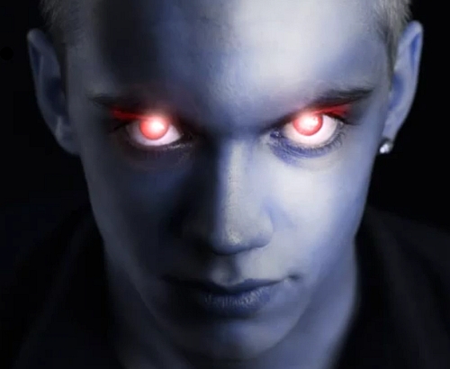
Two of the oldest techniques in the photographic skill set are dodging and burning. In the old days of chemical baths and film developing they were the most effective way of changing the image out of camera. Simple stuff really. During the development of your film you allowed parts of the developing film to become overexposed. Other parts of the film you allowed to become underexposed. The effect on the final print was to increase the brightness in some areas of the film and darken others.

In modern post-processing we still use these techniques. Most post processing software packages have ways to create dodges (whitening or brighten) or burns (darkening or blacking). The aim of this? Well its simple really. If you have a picture and you want to do any of these things you need these techniques…

  • Increase/decrease the intensity of shadowy parts of the image
  • Increase/decrease the intensity of brighter parts of the image
  • Brighten the bright spots and darken the dark spots to increase contrast
  • Darken down intensely bright spots in the image to prevent distractions
  • Brighten the darker areas in the image to bring out detail
  • Pick out highlights

More after this…

find out more...Photokonnexion tips by email
Enjoying this article? Please sign up for our
daily email service.
                                                Find out more
#11030#

Dodge and burn

Although this tutorial is based in PhotoShop, most of the techniques shown in this video can be used in most editing software. If your software does not have the same tools as those found in PhotoShop check your help files for more information.

You may have to do some trial and error experiments to get these techniques working – after all, the practice will give you control of your software. Trying out these skills will give you the basic command of light and dark in the post processing context. Dodging and burning are really important techniques. Watch the video for how the techniques are used.

Photoshop dodge and burn

lynda.com on YouTube  External link - opens new tab/page

By Damon Guy (author and Photokonnexion editor)

Damon Guy - Netkonnexion

Damon Guy (Netkonnexion)

Damon is a writer-photog and editor of this site. He has run some major websites, a computing department and a digital image library. He started out as a trained teacher and now runs training for digital photographers.
See also: Editors ‘Bio’.

Can you write? Of course you can!
Write for Photokonnexion...

We would love to have your articles or tips posted on our site.
Find out more…
Write for Photokonnexion.

Simple ways to add contrast to your black and white images

Changing colour images to B&W often has surprising results.

You may not get what you expected. Often this is because the contrast in colour shots is quite low. B&W conversion requires contrast to work well. This is how you can increase the contrast…

Wolf - the range of black and white tones can really add to the dramatic impact

Wolf – the range of black and white tones can really ad to the dramatic impact.
Click image to view large.
Wolf – By Netkonnexion on Flickr External link - opens new tab/page

The objective

We are trying to increase the range of greyscale tones in the picture. Grey is a fickle colour – it fades from tone to tone almost unnoticed. In a high contrast shot we want to stretch the grey and express tones from deep blacks to whitest whites. This is something we avoid in colour because deep black or blown-out white is a distraction. In black and white they can be too, but if well controlled the balance helps emphasise the pictures’ strong elements. So we must add the contrast. That can be done by applying one or more techniques in post-processing:

  1. Add deeper tones to the darker areas, whites to the lighter areas
  2. Create darker/lighter tones over the whole image – moody effect
  3. Use an overlay technique to apply contrast

I am not going to go into depth with these. Just some simple ideas.

Add deeper tones to the darker areas, whites to the lighter areas
This is essentially a manual technique. Using photoshop or a similar editor, you need to activate the ‘burn’ tool. Originally burning was a way of making film processing darken the print. In digital editing it spreads a soot-like effect where applied. Normally you can just paint it on. Set it so the ‘exposure’ level is low and set for ‘shadow’ in the settings. Then paint away. You will darken the dark shadows without darkening the lighter areas. Higher exposure will darken more. If you set for ‘highlights’ you will be able to paint out whites – great for toning down strong white burn!

You can do the same for whites with the ‘Dodge’ tool. Select ‘highlights’ and a low ‘exposure’ then paint over bright areas and they will brighten slightly. Higher exposures brighten more. Set the tool for shadow and you can lighten darker areas.

In both tools ‘mid-tone’ will brighten or darken the mid-range tones depending on which tool you are using.

Create darker tones over the whole image – moody effect

You can use a ‘contrast’ control in most image editors to affect the lightness and darkness proportions across the image. However, too much of this control tends to give sickly greys an outing. Faces especially look ill if you apply too much of the contrast control.

In most image editors there is usually a ‘gamma’ control somewhere. This uniformly affects the blacks right across the image. Often the toning down of blacks is enough to shift the image to the moody or dramatic side. Gamma gives you great control over this. So look up in your help files how to adjust your Gamma.

In Photoshop the control is in the exposure adjustments panel. If you have not got gamma control in your editor you can use it in Irfanview (free download). Irfanview has a great gamma control. You can find both gamma and contrast with other colour controls in the menus. Go to Image; Colour Corrections… The dialoge box there is worth playing around with.

Gamma is not so good for adding brightness, but in small measure it is OK. So you can either whiten or darken the image using the gamma setting. It actually is great for toning down all sorts of white errors.

Use an overlay technique to apply contrast

In the image editing applications that use layers and overlay there are literally hundreds of ways to adjust contrasts. I have seen one ‘grunge’ technique use 16 layers and 35 steps to create a contrast-widening effect. While grunge is a popular look in image processing it is an artistic process that you really need to practice a lot before it is effective. And, like many processes can be overdone. So, to help you out I have researched the technique below. It is quick and easy. It is possible in several of the full blown applications for image editing. Best of all it takes a few seconds to apply and you can see the results straight away. So watch this short video and I bet you will be itching to have a go…

Uploaded by Larry Lourcey on Dec 16, 2010 http://www.PhotoEducationOnline.com

An important note…

Remember that all of these techniques work better in RAW. Attempting to use them in .jpg is a lost cause and may just look a mess. Although, to be fair, that does depend on the image. Take my advice and shoot in RAW. For 99.8% of the time the results will be better after processing. Remember not to do post processing on your only image. Keep an original and only work on copies.