Tag Archives: Lines

Visual toolbox for photographers

Sharpen up your creative photography…

It’s easy when starting photography to over emphasis the importance of gear. In fact it’s ‘photographers eye’ that really makes the difference. Your vision and insight into a scene are critical to producing a wonderful image.

Sage advice from a world master

The Visual Tool Box by David duChemin is all about the skills of composition. He goes into depth around the background ideas which help you look at a scene. The ultimate success in photography is to make your image a pleasure to view. Aesthetics rule – it’s as simple as that. This book is dedicated to teaching you the tools you need to develop the ‘eye’.

David duChemin says,

These are the lessons I wish I’d learned when I was starting out.
The Visual Tool Box by David duChemin

This is my kind of book. He writes superbly, in simple, readable form. His examples are excellent and the pictures are just amazing. But most of all the book is organised for learners to extend their knowledge in easy, well structured steps. This book is all about putting new tools in your photographic tool box and it achieves that with an ease that any beginner will find a joy.

Composition

The book is packed with examples of the sort of compositional ideas that really work – for anyone. Just look at some of the topics covered…

  • Manual
  • Optimize Your Exposures
  • Master the Triangle
  • Slower Shutter Speed
  • Learn to Pan
  • Use Intentional Camera Movement
  • Use Wide Lenses to Create a Sense of Inclusion
  • Learn to Isolate
  • Use Tighter Apertures to Deepen Focus
  • Use Bokeh to Abstract
  • Consider Your Colour Palette
  • Lines: Use Diagonals to Create Energy
  • Lines: Patterns, Lead my Eye, Horizons
  • See the Direction of Light
  • Light: Front Light, Side Light, and Back Light
  • Quality of Light: Further Consideration
  • White Balance for Mood
  • Light: Reflections, Shadow, Silhouettes, Lens Flare
  • People
  • Experiment with Balance and Tension
  • Use Your Negative Space
  • Juxtapositions: Find Conceptual Contrasts
  • Orientation of Frame
  • Choose Your Aspect Ratio
  • Use Scale
  • Simplify
  • Shoot from the Heart
  • Listen to Other Voices (Very Carefully)

And there is plenty more content to complement and extends these ideas. What’s not shown in a list is the excellent and sage advice throughout the book. I will let David duChemin have the last word…

Pace your-self. Anyone can master a camera; that just comes with time. It’s the other stuff — learning to think like a photographer — that takes so much work and allows this craft to become the means by which you create art.
The Visual Tool Box by David duChemin

And it is thinking like a photographer that you will quickly learn from reading this book.

How to buy this great book

This book was originally published as an ebook. However, it is no longer available in that form. The book has moved into the real world. It will be available on Amazon as a Paperback From 31 Mar 2015.
The Visual Toolbox: 60 Lessons for Stronger Photographs (Voices That Matter)You can per-order the book from Amazon.

Comments, additions, amendments or ideas on this article? Contact Us
or why not leave a comment at the bottom of the page…

Like this article? Don’t miss the next — sign up for tips by email.

Damon Guy - Netkonnexion

Damon Guy (Netkonnexion)

Damon is a writer-photographer and editor of this site. He has run some major websites, a computing department and a digital image library. He started out as a trained teacher and now runs training for digital photogs.
See also: Editors ‘Bio’.
By Damon Guy see his profile on Google+.

The power of light and shadow

Facial shadows

• Facial shadows •
Image taken from the video.

Great portraits rely on shadows

Shadows define a portrait. So it is no surprise that good lighting to get the shadows right is a wonderful idea. But what most people don’t realise is that, almost every time, more lights make things more complicated. One light is almost all you will ever need to get a face right. The rest can be done with a reflector.

Shadow work

In the video Mark Wallace shows us how the face can be properly illuminated, how to do it and more important how to make it look beautiful. He looks at ugly shadows and hard light and explains how to remove them and subdue them using soft light. In all, this is one of the best best portrait lighting tutorials I have seen on video. Enjoy it. There is some really useful stuff presented in a simple and understandable way.

Adorama TV  External link - opens new tab/page

Comments, additions, amendments or ideas on this article? Contact Us
or why not leave a comment at the bottom of the page…

Like this article? Don’t miss the next — sign up for tips by email.

By Damon Guy (author and Photokonnexion editor)

Damon Guy - Netkonnexion

Damon Guy (Netkonnexion)

Damon is a writer-photog and editor of this site. He has run some major websites, a computing department and a digital image library. He started out as a trained teacher and now runs training for digital photographers.
See also: Editors ‘Bio’.

Engaging portraits – it’s all in the hands

• It's all in the hands •

• It’s all in the hands •
The hands are very important for directing the eye around a portrait
Click image to view large
• Portrait 4 • Kayte Allen on Flickr External link - opens new tab/page

Make your portraits draw the eye…

Here is a quick tip with lots of examples. To make your portraits flow and to help direct the eye to the right places use the hands to help direct the viewers eye.

Up and down loses the eye

The typical beginners full length portrait shows the subject standing upright, arms limp and lifeless at their sides and a sort of half grimace on their faces. Coupled with a portrait-aspect crop this disaster is a straight-through for the eye.

Despite what charms lie below the face, we look there first. We seem to be programmed to do it. Then we follow the rest of the body down with our eyes. IF everything points downward our eyes continue to the feet and then we lose the eye out of the bottom of the frame.

The hands can use the power of lines to redirect the eye

The eye is trained to follow lines and edges – these are places where contrasts are the most obvious and there the eye can see the differences in light and pick out detail. This is the power of lines in Composition – they literally create tracks that the eye follows.

The power of the lines in upright, long portraits is to direct the eye downward and out of the picture. That will always happen unless some form of stopper can be used to direct the eye to where the main interest lies. No better way to do that than with arms and hands. They can be used to stop the eye progressing downward by placing them across the body or they can be used to direct the eye back to the face by pointing upward. They can even be used to direct the eye around to follow the curves of the face and head as in the portrait above.

Some long shots

In the next few pictures you can see how the eye is directed out of the picture by the vertical lines, the portrait crop and the stance of the subject…

• The Photographer •

• The Photographer •

Mum - the loving supporter

Mum – the loving supporter

• Portrait by Virotutis on Flickr •

• Portrait by Virotutis on Flickr •
While this is an interesting picture and has a fun aspect to it, the whole image works to force the eye downward. It is a great picture, but the direction to the eye is almost undeniable.
Click image to view large
• Portrait by Virotutis on Flickr •External link - opens new tab/page

The hands can change everything…

Consider now the way the subtle lines and positions of the hands and the arms redirect the eye back to the face in these shots. These portraits have so much more to offer the eye because the hands bring us back – prevent us from going out of the image.

• Portrait with the hat •

• Portrait with the hat •
The hat acts to stop the eye getting lost upwards. The arm and hand
act to keep the eye returning from the lower end of the shot. The enigmatic smile
provides wonderful interest. A thoroughly engaging portrait.
Click image to view large
• Portrait with the hat • by DeusXFlorida on Flickr External link - opens new tab/page

• Portrait by GummyPiglet on Flickr •

• Portrait by GummyPiglet on Flickr •
The wonderful light, the great use of the arm and hand and the lovely expression create a circle for the eye. Out down the arm and back to the face. A great shot.
Click image to view large
• Portrait by GummyPiglet on Flickr •External link - opens new tab/page

• Portrait by Benjamin Ballande, on Flickr •

• Portrait by Benjamin Ballande, on Flickr •
The strong framing with the darker top and hood act to allow the eye to stray downward after the face. But the upward arm and the hand around the face creates an endless cycle of interest around this lovely portrait.
Click image to view large
• Portrait by Benjamin Ballande, on Flickr •External link - opens new tab/page

• Portrait by natali Antonovich on Flickr  •

• Portrait by natali Antonovich on Flickr •
The technique works on men too. The eye naturally comes down the shoulder, and is drawn back up the arm to the face again. An interesting character in this one.
Click image to view large
• Portrait by natali Antonovich on Flickr •External link - opens new tab/page

Portrait workshop, I by Vicco Gallo

• Portrait workshop, I by Vicco Gallo •
The sweep of the hair, the collar and hint of jewellery act to take the eye out of the picture. In the nice of time the thumb sweeps up the eye and the fingers divert us back to the face again. Engaging!
Portrait workshop, I by Vicco Gallo, on Flickr External link - opens new tab/page

The hands and the arms rule the lines

We have an almost pathological need to go to the face or hands with our eyes. The rest is almost incidental. Used properly you can cycle the viewers eye endlessly in the portrait. It is a great technique and one that really satisfies the eye.

Comments, additions, amendments or ideas on this article? Contact Us

find out more...Photokonnexion tips by email
If you enjoyed this article please sign up for our
Tips by email service.
                                                 Find out more

Can you write? Of course you can!
Write for Photokonnexion...

We would love to have your articles or tips posted on our site.
Find out more…
Write for Photokonnexion.

By Damon Guy (author and Photokonnexion editor)

Damon Guy - Netkonnexion

Damon Guy (Netkonnexion)

Damon is a writer-photog and editor of this site. He has run some major websites, a computing department and a digital image library. He started out as a trained teacher and now runs training for digital photographers.
See also: Editors ‘Bio’.

This one peculiar idea can transform your photography

Compositional elements :: Look at a large number of photographs every day

Everything you see in a photograph is a composition. Looking at lots of photos every day, particularly good ones, helps you appreciate good images. The article shows you how to identify simple Compositional elements.

Involve yourself to improve

Every day, expose yourself to great images. The mind soaks up the goodness. But to make it effective you should also be seeing into the image. It is surprising, but the the good things about a photograph are seen with the first glances. Compositional elements in a photo jump out at you, even if you can’t tell me about them. I am going to show you how to find them with a simple exercise.

What is in an image? Compositional elements

When we look at an image it is often difficult to see what is good about it. Obviously our personal taste plays a part. Often however, other people who do not share our taste, also like it. The common appeal comes from the compositional elements of the image. Often these elements are very simple structural lines or edges. They help the eye through the image or lead the eye to the key subject. Composition is all about helping the eye to appreciate the main point of the image.

How do we pick out the compositional elements?

Knowing about composition is important. The “Rule of Thirds” and other simple rules help you to analyse a scene. You can use them to understand ways the eye uses compositional elements in a scene. Find out more about composition from our page: “Composition resources on Photokonnexion”. There are lots of posts there to help you with composition.

You can already spot basic compositional elements

The main compositional elements can be picked out by eye. Anyone can do it. This is what you do…

  1. Take a small piece of paper – postcard size is ideal.
  2. You are going to draw on the small piece of paper…
  3. Pick out a photo – any picture.
  4. Study it for five seconds.
  5. Put the picture out of sight.
  6. Using simple curved and straight lines make a skeleton sketch of the picture. Do it from memory take no more than thirty seconds.

That’s it. You have simply isolated the elements of the compositional structure.

Here is an example. Click this link and follow the short procedure above. to create the skeleton sketch.
Test Picture

Here is a good example of what you should see when you have finished your sketch: Test Picture Compositional Skeleton. It was done by my wife, who is not a photog or artist. Despite that, she has successfully isolated the major compositional elements in the picture. It shows how effectively this exercise can work

More after this…

find out more...Photokonnexion tips by email
Enjoying this article? Please sign up for our
daily email service.
                                                Find out more
#11030#

Analysis

The test image is of Honister Pass in the English Lake District. All the lines lead the viewer to one point. The exit in the hills in the distance is dynamically off-centre. That keeps your search for symmetry. You feel like you know where the road is going. It draws the eye into the picture. Your eye does not exit upward – the clouds hold the eye into the valley. You are drawn along the road into the image, giving it depth. The picture has a 3d structure and a strong mood.

The strong lines and balance of this picture make it simple to pick out compositional elements. With practice this procedure will help you analyse complex examples. With a few practice examples you will be able to pick out compositional elements by eye. If you do this in your head you’re on the way to doing compositional analysis through the viewfinder.

As you learn new compositional ideas you will pick out more compositional elements. Use them as tools of analysis. They will help you understand and compose in the frame while taking a shot. Soon you will compose to draw the viewer into the picture.

Rules don’t make things beautiful

Rules of composition are limited in many ways. They are more guidelines than rules really. So do not fear to break them. Instead, know the things that work well for the eye. Develop harmony and balance, learn to appreciate beauty. Look at as many great images you can every day. Knowing a little about why they are attractive will help you to create more beautiful and effective images of your own.

By Damon Guy (author and Photokonnexion editor)

Damon Guy - Netkonnexion

Damon Guy (Netkonnexion)

Damon is a writer-photog and editor of this site. He has run some major websites, a computing department and a digital image library. He started out as a trained teacher and now runs training for digital photographers.
See also: Editors ‘Bio’.

Can you write? Of course you can!
Write for Photokonnexion...

We would love to have your articles or tips posted on our site.
Find out more…
Write for Photokonnexion.

Nine simple guidelines for great interior shots

• Dining Room • For great interior shots follow the guidelines

• Dining Room • For great interior shots follow the guidelines
Click image to view large
• Dining Room • By Netkonnexion on Flickr External link - opens new tab/page

Photographing interiors is easier with simple rules.

We have all taken interior shots at some time. Indoor subjects are wide ranging. What about when you want to take a picture of the room itself? Here are some simple rules to help you get it right.

Why would you want to take a picture of the room?

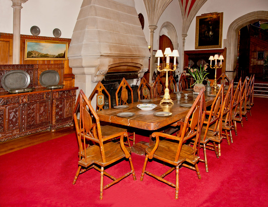
Actually there may be many reasons. In the picture above the shot was taken because of the historical interest. It is a record shot. Of course there are lots of other types of shots you might want to take in an interior. Here are some examples…

  • Historical interest
  • Insurance record
  • Design interest
  • Before and after shot
  • House or room for rent
  • Hotel room for holiday snap
  • Hotel room for advertising
  • Colour and décor sampler for decorating plans
  • Sales and marketing photo for building sale purposes
  • Comparison with other places
  • Artistic impressions or interpretation

You get the point. Rooms can have a lot of reasons to be the subject of a photograph.

Some simple guidance…

1. Give yourself a clear purpose for the shot(s): Without such a purpose how will you know the best approach, what to include and exclude and how much of the room to take in. So know why you are doing it and what you hope to gain from the photograph. It helps to write it down.

2. Minimise distractions: As with any type of photography your primary purpose can be affected by distractions in the shot. Think carefully about the purpose of the shot. Remove anything that is discordant or will not add value to that purpose or will distract the eye. Take out objects that are too bright, nothing to do with the shot; something that may confuse the purpose of the shot.

3. Work on the brightness: Remember, the normal lights in a room will probably have a colour cast which will have an impact on the overall colour. If possible use daylight adjusted lights or off camera flash units. Use the flashes to light up specific areas of the room. Highlights like that add to the atmosphere in a room. Be consistent with the natural lighting and any artificial lights that may be in evidence as permanent fittings so the lighting does not look out of place. If you only have the on-camera flash make sure you have it set to a sufficient power to light the whole room. Arrange the furniture so that the light coming from the camera does not leave harsh shadows on the floor in front of you. Flash is inclined to leave such shadows which make the room look very angular and uncomfortable. Rooms that have soft, bright and well lit aspects are more welcoming and give an air of comfort.

4. Windows and doors: These are important parts of a room. Depending on your purpose you may need to show them. If they are looking out onto a bright exterior, or directly to the outside you may have a problem. The outside is quite likely to be much brighter than inside. More than two stops of brightness will almost certainly burn out. This creates a very bright white area of the shot. That’s very distracting. It will take the viewers eye straight away from the subject. One way to counter-act that is to raise the internal light levels so the contrast from inside to out is not so large. That will probably require some additional flash units or other lighting around the room. Alternatively, you could lower the incoming light by closing curtains or the door. However, you light the room remember to use the appropriate white balance settings on your camera. Colour casts can spoil the shot. It is also better to shoot in RAW so you can adjust the colour balance in post processing.

5. Straight lines and verticals: Rooms and interior spaces often look odd in pictures because the straight lines are not straight and the verticals are converging. You must prevent this if your purpose for the shot is to make the room look normal. Use a lens that minimises distortion and set your camera on a level for the shot so it minimises convergence in the upright lines. If you are unable to prevent the lines from bending or converging then make sure you can straighten them in an editing application in post processing. Of course if you are making this photograph for artistic reasons, anything goes.

Langley Library

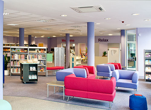
Use furniture to give the impression of depth.
Place pieces so they look like there is a succession into the depth of the room.

6. Impart depth to the room: Taking just any old shot you will find that the room often looks flat, or lacking in depth. The effect of zoom lenses and maybe an on-camera flash will exaggerate that effect. You can do three things to off-set that effect…

  • Use lines in the room to give the impact of depth as they trend away from you (eg. the table in the top shot above).
  • Create a foreground, mid-ground and far point of the room. Taking a shot with a piece of furniture directly in front of you, something mid-way into the room and something on the far wall will do the trick.
  • Strategic placement of lights down the length of the room will draw the eye down the room too.

7. Adjust comfort levels to suite your purpose for the shot: Every room has what I call a comfort level. It the room is cold and uninviting the comfort level is low. If you intend your room to look like a medical clinic then find ways to give it a low comfort level. Harsh lights, angular furniture, sparse layout… anything that will make it look uncomfortable.

If you want to sell a new home to a home-loving family then you need to raise the comfort level in the room. Soft lights, soft furnishings, rounded corners, bright and inviting cushions… these things help people to feel comfortable. Your pictures should reflect the reason you are taking the picture.

8. Use appropriate lenses: Different lenses have different effects. If you use wide angle lenses they will distort the long dimensions. Use it in portrait view and the lens will appear to make the room look high. If you use a wide angle lens down the length of the room it will make it look long and thin. If you use a zoom lens it will have the effect of foreshortening the room. A 50mm lens will tend to show the room much as the eye would see it. Every room or interior space is going to be interpreted in different ways. The best guidance is to look for a lens that will best exaggerate sizes, or complement dimensions to suit your stated purpose for the shot.

9. People: The inclusion of people in a room can be either a good or bad thing. It all depends on how you want to portray the space and the purpose of the shot. In an entertainment space lots of people enjoying themselves will make the shot good. In a warm, homely room one or two people chilling out and enjoying the comforts will also sell the shot. On the other hand, a record shot should really be about the room, factual and un-distracted.

If it is solely the room you intend to show then it is probably better not to include people.If you do include people then make sure it complements the purpose for the shot.

Interiors are satisfying to photograph

There may be lots of reasons to take pictures of rooms, but that makes it important that you think about what you are trying to portray. If you have a clear purpose for the shot then you can match the layout, furnishings, lighting etc to meet the purpose you have set. Think about layout, depth and finishings. Think about people. There is a lot to consider. However, interior shots can be very satisfying indeed. Practice makes perfect, so work on the points above.

find out more...Photokonnexion tips by email
If you enjoyed this article please sign up for our
daily email service.
                                                 Find out more
#11030#

By Damon Guy (author and Photokonnexion editor)

Damon Guy - Netkonnexion

Damon Guy (Netkonnexion)

Damon is a writer-photog and editor of this site. He has run some major websites, a computing department and a digital image library. He started out as a trained teacher and now runs training for digital photographers.
See also: Editors ‘Bio’.

Five simple composition tips for great snow images

Snow in the deep South - Vestavia Hills

Snow in the deep South – Vestavia Hills
Loosing detail in the whites is a big problem in snow photography. Lack of contrast is the main cause. Look for subjects that have contrasts or ensure you have an exposure that pulls all the detail out of the whites.
Snow in the deep South – Vestavia Hills – IMG_5382 by Bahman Farzad, on FlickrExternal link - opens new tab/page

Snow images requre special compositions.

As you can see from the photo above, snow photography can present special problems. In the case of this photograph the lack of contrast could have spoilt the image. Loosing detail in the whites is a big problem in the snow.

In the photograph (above) the author has made a good exposure and the whites are well defined and detail is not lost even with a white building in the scene. However, be careful with your snow compositions. You can lose a lot of detail and normal compositional features because of the way the snow obscures many of the normal features in the landscape that we use to draw the eye.

# Tip one: Contrasts – Make sure you are able to see the details. Too much white and the detail is lost. Too little white and the snow looks grey. Use exposure compensation or full manual mode to make sure you have the right whiteness without losing the detail. See: Correct snow scenes using exposure compensation. (Photo above).

# Tip Two: New compositional and curvey lines – Find a scene where strong lines are well defined. Snow often covers major lines in the scene. Look for new lines. Snow is great for creating curvy lines. As it settles on a fence or wall top, the snow creates great shapes presenting different lines to the ones you normally see. Search out new types of snow defined lines and tracks to help define your composition. “Fencing” By tgroeger_canada  External link - opens new tab/page.

# Tip three: – When you have a strong line make the most of it. Try to make the scene simple so it stands out without confusing things with other features. Snow is a notoriously soft environment to compose a shot within so try to work with soft compositions. Gentle curves and easy lines are inviting to the eye and promote a sense of peace and well-being.

“Snow”
Click image to view large
“Snow” by Kathy~, on FlickrExternal link - opens new tab/page

# Tip four: – Rule of thirds Of course the general principles of composition apply in snow. The rule of thirds and the rule of odds are both strong contenders to helping to improve your snow shots. Just because everything is lost under the snow don’t lose sight of these old compositional tools.

# Tip five: Tonal variations – With snow being so white it is easy to make the picture too bland. In fact the light you shoot in has a big effect on snow. There is nothing more exciting than a snow scene in a golden sunset. Sunset and Snow External link - opens new tab/page. Snow is especially good at reflecting tonal changes in light. One way to bring those out is to look for changes in light locally. A road disappearing into the trees, or snowy mountainsides with different angles to the light both cause exciting variations in the colour and tone of the snow.

Snowy morning, golden light

Snowy morning, golden light
Click image to view large
Snowy morning, golden light by Mike Thomas, on FlickrExternal link - opens new tab/page

Finally, try to make your composition as different as possible. Don’t just do landscapes. Snow changes the shapes of everything. So try to find things that are barely recognisable under snow because the snow has created unusual or unexpected shapes. Then you will have the viewer guessing… that will draw them into the picture.

Have fun! Snow photography is not something we can all do daily so make the most of the great opportunities.

find out more...Photokonnexion tips by email
If you enjoyed this article please sign up for our
daily email service.
                                                 Find out more…
#11030#


By Damon Guy (author and Photokonnexion editor)

Damon Guy - Netkonnexion

Damon Guy (Netkonnexion)

Damon is a writer-photog and editor of this site. He has run some major websites, a computing department and a digital image library. He started out as a trained teacher and now runs training for digital photographers.
See also: Editors ‘Bio’.

Simple ideas about perspective in photography

Perspective is all about using visual clues to emphasise dimension

Perspective is all about using visual clues to emphasise dimension. Your picture needs to use defined edges, lines and direction to give the eye something follow into the image.
• Perspective • By Netkonnexion on Flickr External link - opens new tab/page

The concept of perspective is related to visual clues.

What we see in the world around us is created in our heads. We see things in the environment and from that build up a picture. Here we look at the sense of perspective.

Visual clues

Previously in ‘The easy way to give depth to landscapes’ and Easy introduction to ‘visual elements’ in photographs I introduced ‘visual elements’. These are strong signals in the world that help us see. They are mostly edges, lines, curves, shapes, form and so on. We see things because the edges of objects have a detectable contrast with something beside it. Our eyes spot that change and, in doing so, see depth. Edges give us strong clues about the nature of our world so our eyes are trained to follow them.

The nature of perspective

Our innate sense of perspective has always been there to enable us to function as biological animals. Perspective in art is a different matter. In terms of human history reproducing perspective has been a late arrival (see: Perspective – compositional ideas). What made the difference was understanding the relationship between lines, or in natural terms, edges.

Three dimensional geometry explained the way lines created depth. This geometric depth also mimicked form in nature. On mastering the idea of a cube or other geometric forms we see how the lines work. If you look at a cube corner you see three edges trending away from you. You are looking at depth created by the edges.

Parallel lines provide strong perspectives. In the picture above there are lots of parallel lines which give depth to the picture. The main red line – the bus lane – is a vanishing point perspective or ‘single point’ perspective. It is notable by its coming together (convergence of the lines) near the horizon. By experience we know this is a long distance away. The convergence has created distance into the picture.

In the bridge there is ‘two point’ perspective. You can see depth because the darker underside is defined by its lighter up-edge (the wall of the bridge). This two-point perspective exists for us even though we cannot see the roof or the other side to confirm ‘form’ (3D) rather than shape (2D).

Of course the glass stairway to the bridge has three point perspective. Like the cube we can see depth – the top edge of the building, the bottom edge of the building both converge (two point). The convergence imparts depth. However, the width of the building (shown by the top and bottom edges), and the height gives us the three dimensions. Our visual clue for this. on the front-face. is the non-convergence of lines in the width/height plane. Although this front-face is a curved glass wall we can still see it does not have a distance perspective away from us.

All the clues are there

You now have the clues, or visual elements to determine depth through perspective. Converging lines with distance from the eye impart a feeling of distance away from you. Parallel lines with no convergence give you flatness or non-distancing when they face you. This works with both height and width.

I chose the picture above for the strong perspectives that it imparts. The powerful lines make it easy to see the almost exaggerated proportions that contribute to perspectives. Sometimes its not so easy in nature. Have a look at the picture below…

Looking up the River Thames from Marlow, Bucks, UK

Looking up the River Thames from Marlow, Bucks, UK. The perspectives are not as clear as direct straight lines. Yet the picture has depth because we are adept at seeing ‘edges’ and trends in lines when we look at nature.

Click image to view large.
• Looking up the River Thames • By Netkonnexion on Flickr External link - opens new tab/page

The edge on the right hand side looking up river barely exists – it disappears off the side of the shot. Yet the small part that is there at the top implies there is a bank all the way down the right. The left bank on the other hand is not well defined as a line. However, our eyes are trained to see it as a ‘trending’ line. The line of trees (left) and the implied line (right) therefore creates a converging pair of lines in the distance to where the river rounds the bend.

Despite there being no strong lines in this picture we can see a converging point perspective. Dimensionality is added by the height of the trees and the width of the river. The width diminishes between the two banks as we look progressively up stream, more evidence of distance and convergence. The height and width we intuitively know because our eye determines sizes by measuring them against boat and people sizes (known element sizes). Perspective is all in the visual elements.

Understanding is not precise

We do not all understand perspective in the same way. Some notable art schools have denied our innate understanding of perspective and space. The Cubists are an example of this, notable among them Pablo Picasso  External link - opens new tab/page the famous Cubist painter. Nevertheless, we all understand depth in the world around us. We don’t live in a two dimensional world. However, in our images we have to create the sense of depth in a two dimensional medium.

The second picture, the river scene, shows us how to define depth. We need, as photographers, to become observers of lines and trending lines. Similarly, we should be able to spot shapes and forms that are both defined and ill-defined. Then we need to be able to view them as if a geometric model. If we can see these lines, in nature and in man-made things, then we can find ways to compose our picture to bring them out. It is this last part that is the most important part of the composition process.

If we give the viewer a perspective in our shots, we create a world. We want it to be a three dimensional world that the viewer can imagine going into. When we choose compositions that emphasise these lines we dispose of the two dimensional picture and create an image to look into.

By Damon Guy (author and Photokonnexion editor)

Damon Guy - Netkonnexion

Damon Guy (Netkonnexion)

Damon is a writer-photog and editor of this site. He has run some major websites, a computing department and a digital image library. He started out as a trained teacher and now runs training for digital photographers.
See also: Editors ‘Bio’.