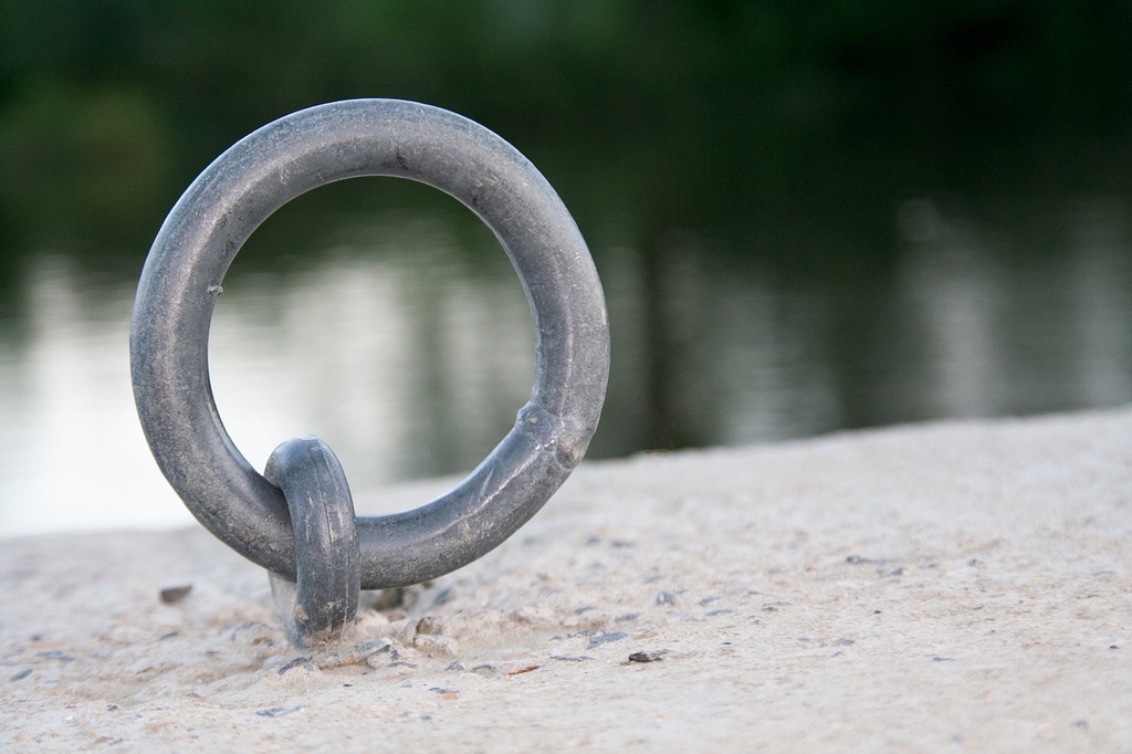
Tag Archives: Principles of composition

Is your composition in photography up to scratch?

Composition in photography :: Image: River Bokeh

• River Bokeh •
There is more to composition in photography than simply placing the subject on a third. The concept of “composing” pulls in many aspects of Photographic work.

Composition in photography – science or art.

Many photographers struggle with composing a picture. Composition in photography seems seems difficult to define. Starting with a few simple ‘rules’ helps. If you want to develop your work you must go beyond the rules and understand some of the other principles in photographic art.

A lifelong adventure

The Definition: Composition (photographic aesthetics) in our Photographic Glossary is up to date and helps to explain the idea of the Elements of photographic art. It would help to read that definition before the rest of this article.

Construction or deconstruction

I have thought about the traditional elements and principles of art for a long time. I find myself dissatisfied with the traditional view with respect to photography.

Composition from a photographers viewpoint is, I think, a different situation to say a painters viewpoint. We could be side-by-side with a painter and both create an image of the scene which is broadly alike. Alternatively we could produce something totally different. They could be worlds apart.

I think there is something different in the approach to a scene for a photographer compared to an artist. A painter constructs a picture from scratch. They can create something that is like the scene they see. They my paint something that differs from that scene so completely it is unrecognisable. Whichever it is, they are able to construct the scene, element by element.

In this “construction” mode an artist has used their knowledge of the “elements of composition” and done an analysis of the scene. Then, using their imagination they put the elements together using the principles of art to create a rounded composition which is aesthetically pleasing, well proportioned, organised and representative of the scene.

A photographer has to approach the scene from a different perspective. The scene has attributes which are elements of art. While the photographer sees the textures, proportions, colours and other elements the way these are used differs to the ‘construction’ work of the artist. A photographer has to take a ‘viewpoint’ in using composition in photography. We look at a scene and are faced with less artistic license in the placement of the elements or how to colour, texture or use them. Instead the photographer has to consider what not to include in the picture – to make it simple. Photographers consider using the natural attributes of the scene to pick out the compositional elements. We use the principles of art. But we consider them in an existing context to create an aesthetic outcome. This is done through our viewpoint of the scene.

In other words, photographers tend to work in a “deconstructive” mode. Simplification and point-of-view are compositional tools. They derive from the principles of photographic art. This helps make it easier to express the desired outcome. But essentially our efforts at composition in photography are about ignoring elements of the scene (leaving them out of the image). And also to emphasise others (or keep them in the frame) in order to develop the message or ‘point’ of the picture.

Complexity

All art is complex. So there is plenty of ways that this analysis can be knocked down by a whole range of “what if” arguments. Nevertheless I feel that photographic art does have this deconstructive approach to a scene compared to other creative arts. To a lesser or greater extent it applies to all scenes. There will be more construction in a still life; less in a landscape. So this is not a simple concept to be applied in all situations.

However complex a scene, however it is approached, the outcome will be unique to the photographer or the artist. It is in this variation and infinite use of interpretation that photography is an art. The use of our knowledge of composition in photography allows an analysis of the scene which may seem like the same analysis made by an artist. I question that the principles of art are the same as the principles of photographic art. I think they are deployed differently.

Think about the contrasting models of the artist and photog. Construction (artist) verses deconstruction (photographer) is one way to bring out how a scene can be approached. This analysis is one more way to think about composition in photography.

Background

You may feel that you need more background on the subject of composition in photography. If you do, here is a slide show to provide some insight into the basics of composition in photography. Please also read the Definition: Composition (photographic aesthetics) and look up the Composition resources on Photokonnexion

Comments, additions, amendments or ideas on this article? Contact Us
or why not leave a comment at the bottom of the page…

By Damon Guy (author and Photokonnexion editor)

Damon Guy - Netkonnexion

Damon Guy (Netkonnexion)

Damon is a writer-photog and editor of this site. He has run some major websites, a computing department and a digital image library. He started out as a trained teacher and now runs training for digital photographers.
See also: Editors ‘Bio’.

This one peculiar idea can transform your photography

Compositional elements :: Look at a large number of photographs every day

Everything you see in a photograph is a composition. Looking at lots of photos every day, particularly good ones, helps you appreciate good images. The article shows you how to identify simple Compositional elements.

Involve yourself to improve

Every day, expose yourself to great images. The mind soaks up the goodness. But to make it effective you should also be seeing into the image. It is surprising, but the the good things about a photograph are seen with the first glances. Compositional elements in a photo jump out at you, even if you can’t tell me about them. I am going to show you how to find them with a simple exercise.

What is in an image? Compositional elements

When we look at an image it is often difficult to see what is good about it. Obviously our personal taste plays a part. Often however, other people who do not share our taste, also like it. The common appeal comes from the compositional elements of the image. Often these elements are very simple structural lines or edges. They help the eye through the image or lead the eye to the key subject. Composition is all about helping the eye to appreciate the main point of the image.

How do we pick out the compositional elements?

Knowing about composition is important. The “Rule of Thirds” and other simple rules help you to analyse a scene. You can use them to understand ways the eye uses compositional elements in a scene. Find out more about composition from our page: “Composition resources on Photokonnexion”. There are lots of posts there to help you with composition.

You can already spot basic compositional elements

The main compositional elements can be picked out by eye. Anyone can do it. This is what you do…

  1. Take a small piece of paper – postcard size is ideal.
  2. You are going to draw on the small piece of paper…
  3. Pick out a photo – any picture.
  4. Study it for five seconds.
  5. Put the picture out of sight.
  6. Using simple curved and straight lines make a skeleton sketch of the picture. Do it from memory take no more than thirty seconds.

That’s it. You have simply isolated the elements of the compositional structure.

Here is an example. Click this link and follow the short procedure above. to create the skeleton sketch.
Test Picture

Here is a good example of what you should see when you have finished your sketch: Test Picture Compositional Skeleton. It was done by my wife, who is not a photog or artist. Despite that, she has successfully isolated the major compositional elements in the picture. It shows how effectively this exercise can work

More after this…

find out more...Photokonnexion tips by email
Enjoying this article? Please sign up for our
daily email service.
                                                Find out more
#11030#

Analysis

The test image is of Honister Pass in the English Lake District. All the lines lead the viewer to one point. The exit in the hills in the distance is dynamically off-centre. That keeps your search for symmetry. You feel like you know where the road is going. It draws the eye into the picture. Your eye does not exit upward – the clouds hold the eye into the valley. You are drawn along the road into the image, giving it depth. The picture has a 3d structure and a strong mood.

The strong lines and balance of this picture make it simple to pick out compositional elements. With practice this procedure will help you analyse complex examples. With a few practice examples you will be able to pick out compositional elements by eye. If you do this in your head you’re on the way to doing compositional analysis through the viewfinder.

As you learn new compositional ideas you will pick out more compositional elements. Use them as tools of analysis. They will help you understand and compose in the frame while taking a shot. Soon you will compose to draw the viewer into the picture.

Rules don’t make things beautiful

Rules of composition are limited in many ways. They are more guidelines than rules really. So do not fear to break them. Instead, know the things that work well for the eye. Develop harmony and balance, learn to appreciate beauty. Look at as many great images you can every day. Knowing a little about why they are attractive will help you to create more beautiful and effective images of your own.

By Damon Guy (author and Photokonnexion editor)

Damon Guy - Netkonnexion

Damon Guy (Netkonnexion)

Damon is a writer-photog and editor of this site. He has run some major websites, a computing department and a digital image library. He started out as a trained teacher and now runs training for digital photographers.
See also: Editors ‘Bio’.

Can you write? Of course you can!
Write for Photokonnexion...

We would love to have your articles or tips posted on our site.
Find out more…
Write for Photokonnexion.

The easy way to give depth to landscapes

'Reflections on a lake' - Landscapes need to have depth to be effective. Layering them is the key.

• ‘Reflections on a lake’ •
Landscapes need to have depth to be effective. Layering them is the key.
Click image to view large.
“‘Reflections on a lake'” By Netkonnexion on Flickr External link - opens new tab/page

Everybody loves an autumnal landscape.

Come autumn we are all making great images of the colours and the changes. To be successful a landscape has to look like it has some depth. In this post we are going to look at the simple way to impart depth to a landscape.

Layers

The easiest way to create depth with a landscape is to trick the eye. You are not trying to defraud your viewer. You are simply convincing the eye there is more than two dimensions. This is easy to do because your eyes expect to see depth. What you need to do is to enable the eye to actually pick up significant markers that would lead them naturally into a landscape.

There are lots of markers that you can use in composition. In fact in Easy introduction to ‘visual elements’ in photographs we identified lots of compositional markers called visual elements. When you compose a landscape using layers you are working with lines that create the markers for depth. The lines themselves are visual elements in the picture. They create boundaries for the layers in the picture.

The example picture above is chosen for its simplicity. In the immediate foreground there is a patch of rock strewn grass. Not of great interest in itself, but it provides two elements. The larger boulder provides a bit of interest drawing the eye into the picture. It also seeks to divide the picture providing a visual balance either side. I will come back to this later.

The grass-lake boundary is the first line we cross. It is a major visual element in the scene. Its existence creates the foreground layer out of the grass and marks the mid-ground layer as the lake.

The lake itself is the central interest. In this picture it’s also the mid-ground layer. Great reflections always draw the eye. Then, on the far side of the lake is the next significant element/marker – the far lake shore line. This is the demarcation for the background layer – the trees. It is where the reflections originate.

The three landscape layers, foreground, mid-ground and background create depth. As the eye, in 100ths of seconds, penetrates the picture your eye/brain system sees the lines marking the boundaries of these clear zones. Immediately, the visual elements become markers for the eye to measure its travel into the picture. Depth has been established. You now see into an image, rather than at a picture. Visually creating layers in your composition, like these, will impart depth to your landscape shots.

More after this…

What’s next?

Once the eye/brain system has seen depth it remains in the minds eye. Of course if you want to sustain the viewers interest you have to find other things of interest. In this picture there are other ways the eye works through the image. The colours and tonal range are important, especially in autumn. The eye loves reds and russets. So that helps, as does the eye working to sustain an interpretation of the reflections. The ‘principle‘ there is the visual harmony between the reflections and the background layer.

Two other compositional elements control the eye. Normally a central feature of a picture, like the boulder, would draw the eye and hold it there if it was substantial enough. In this case our boulder is of small visual weight. It is not a major compositional feature, but more of a visual element (a ‘form’). You will recall from Simple ‘Principles’ of photographic composition that the ‘Principles’ control the way the eye uses the visual elements. Here the eye flows into the picture by being drawn through the middle, having established depth the eye does not go out the other side of the picture. The trees hold the eye in the picture – they form a barrier. Naturally, the eye is now drawn to cycle around the reflections. Eventually the eye will pick up the next clue.

This spot was chosen for aesthetics as well as the point of view for the shot because a central entry for the eye established the emphasis of both depth and a major point of focus on the middle ground. If you look carefully the lines that create the lake sides are narrower at the left side than the right. This funnel-effect will eventually channel the eye out of the picture on the right. The eye has a natural tendency to follow trending diagonals – no matter how slight – toward the wider ‘escape’ end. Yet, the boulder maintains a balance in overall visual terms between left and right. Eye movement is therefore under a tension to stay central as well as wishing to follow the flow to the right. This tension keeps the eye focused around the centre of the lake.

Fickle!

Yes, it is not a surprise that composition is a fickle thing. This is how I see my picture. In reality we all see it different ways. I have shown you how I rationalised the shot when it was taken. It may not work that way for you. If you have a different view why not discuss it in the comments. I would love to hear your interpretation.

By Damon Guy (author and Photokonnexion editor)

Damon Guy - Netkonnexion

Damon Guy (Netkonnexion)

Damon is a writer-photog and editor of this site. He has run some major websites, a computing department and a digital image library. He started out as a trained teacher and now runs training for digital photographers.
See also: Editors ‘Bio’.