Tag Archives: Lines

The easy way to give depth to landscapes

'Reflections on a lake' - Landscapes need to have depth to be effective. Layering them is the key.

• ‘Reflections on a lake’ •
Landscapes need to have depth to be effective. Layering them is the key.
Click image to view large.
“‘Reflections on a lake'” By Netkonnexion on Flickr External link - opens new tab/page

Everybody loves an autumnal landscape.

Come autumn we are all making great images of the colours and the changes. To be successful a landscape has to look like it has some depth. In this post we are going to look at the simple way to impart depth to a landscape.

Layers

The easiest way to create depth with a landscape is to trick the eye. You are not trying to defraud your viewer. You are simply convincing the eye there is more than two dimensions. This is easy to do because your eyes expect to see depth. What you need to do is to enable the eye to actually pick up significant markers that would lead them naturally into a landscape.

There are lots of markers that you can use in composition. In fact in Easy introduction to ‘visual elements’ in photographs we identified lots of compositional markers called visual elements. When you compose a landscape using layers you are working with lines that create the markers for depth. The lines themselves are visual elements in the picture. They create boundaries for the layers in the picture.

The example picture above is chosen for its simplicity. In the immediate foreground there is a patch of rock strewn grass. Not of great interest in itself, but it provides two elements. The larger boulder provides a bit of interest drawing the eye into the picture. It also seeks to divide the picture providing a visual balance either side. I will come back to this later.

The grass-lake boundary is the first line we cross. It is a major visual element in the scene. Its existence creates the foreground layer out of the grass and marks the mid-ground layer as the lake.

The lake itself is the central interest. In this picture it’s also the mid-ground layer. Great reflections always draw the eye. Then, on the far side of the lake is the next significant element/marker – the far lake shore line. This is the demarcation for the background layer – the trees. It is where the reflections originate.

The three landscape layers, foreground, mid-ground and background create depth. As the eye, in 100ths of seconds, penetrates the picture your eye/brain system sees the lines marking the boundaries of these clear zones. Immediately, the visual elements become markers for the eye to measure its travel into the picture. Depth has been established. You now see into an image, rather than at a picture. Visually creating layers in your composition, like these, will impart depth to your landscape shots.

More after this…

What’s next?

Once the eye/brain system has seen depth it remains in the minds eye. Of course if you want to sustain the viewers interest you have to find other things of interest. In this picture there are other ways the eye works through the image. The colours and tonal range are important, especially in autumn. The eye loves reds and russets. So that helps, as does the eye working to sustain an interpretation of the reflections. The ‘principle‘ there is the visual harmony between the reflections and the background layer.

Two other compositional elements control the eye. Normally a central feature of a picture, like the boulder, would draw the eye and hold it there if it was substantial enough. In this case our boulder is of small visual weight. It is not a major compositional feature, but more of a visual element (a ‘form’). You will recall from Simple ‘Principles’ of photographic composition that the ‘Principles’ control the way the eye uses the visual elements. Here the eye flows into the picture by being drawn through the middle, having established depth the eye does not go out the other side of the picture. The trees hold the eye in the picture – they form a barrier. Naturally, the eye is now drawn to cycle around the reflections. Eventually the eye will pick up the next clue.

This spot was chosen for aesthetics as well as the point of view for the shot because a central entry for the eye established the emphasis of both depth and a major point of focus on the middle ground. If you look carefully the lines that create the lake sides are narrower at the left side than the right. This funnel-effect will eventually channel the eye out of the picture on the right. The eye has a natural tendency to follow trending diagonals – no matter how slight – toward the wider ‘escape’ end. Yet, the boulder maintains a balance in overall visual terms between left and right. Eye movement is therefore under a tension to stay central as well as wishing to follow the flow to the right. This tension keeps the eye focused around the centre of the lake.

Fickle!

Yes, it is not a surprise that composition is a fickle thing. This is how I see my picture. In reality we all see it different ways. I have shown you how I rationalised the shot when it was taken. It may not work that way for you. If you have a different view why not discuss it in the comments. I would love to hear your interpretation.

By Damon Guy (author and Photokonnexion editor)

Damon Guy - Netkonnexion

Damon Guy (Netkonnexion)

Damon is a writer-photog and editor of this site. He has run some major websites, a computing department and a digital image library. He started out as a trained teacher and now runs training for digital photographers.
See also: Editors ‘Bio’.

A composition trick from classical art in under seven minutes

The ‘Rule of Thirds’ is beaten into second place.

The improvement in a picture set to the rule of thirds is amazing. Suddenly the picture becomes dynamic and the proportions appear pleasingly laid out. The Golden Ratio is the Rule of Thirds on steroids and is the subject of the video today.
More after this…

The Golden Ratio

The Golden Ratio (GR) has been around for a long time. Modern artists and photographers use the GR as a simple principle for their composition. The particularly aesthetic proportions are universally recognised. Some of the worlds greatest artworks are composed using the principle. The Greeks also used GR proportions in their architecture. As we learn from the video there is also a natural history associated with the GR going back millions of years. Our very DNA  External link - opens new tab/page is set in the same proportions. The GR appears throughout nature too. To our eyes, it represents a wonderfully aesthetic proportion that appears in so many things around us that we barely see it. You will be astonished where it appears. And, it is a great help when doing your photographic composition.


“The golden mean” Uploaded by angigreek

Simple ways to create photographic abstracts

Photographic abstracts

• Photographic abstract •
See the world a different way by looking for non-representational images to make.

The key to photographic abstracts is observation

The material for photographic abstracts is in the world all around us. With a little practice it is easy to see them. Your view will unfold with a through looking at the component parts of things.

Abstracts can be almost anything. Most often they are the properties, attributes or component parts of something else. Where we see the whole of something – the abstract is found in the parts. Where we see a car, the abstract is found in the pattern of rust. Where we see a fence, the abstract is found in the texture of the wood. It may be found in the pattern of the fence too. The photographic abstracts shows the essence of something. It’s not always the whole of it. Or, it might be the whole of something, but a part of something else wider, larger, or more inclusive. In the reality of abstraction we are looking for something that is not necessarily the actual picture shown. Most often that means making an image that does not represent something. These non-representational images bring out form, shape, colour, hue, light, shadow – almost any attributes of the world of imagery. But, this is the point, the image tends not to be about what is represented, but what is the experience of the image itself.

photographic abstracts bring out things that are found in patterns, colours, shape form, lines, angles. These and other things contribute to the essence of a thing. The inner beauty of something is often not in seeing the whole, but appreciating its parts. And, it is also about knowing that the whole is more than the sum of the parts. Photographic abstracts show that extra view.

Training your eye to see photographic abstracts in the world around you takes time. Once you start looking for non-representational imagery you will find them quickly and everywhere. Look out for the experience of what you see in the textures and forms, colours and hues – do not look to show a straight forward subject.

Insight into photographic abstracts

If all that sounds difficult then you need to give your eye some experience. Examine some of the abstracts available online. Here are some links to look at photographic abstracts…

Simple ways to produce abstracts

To get into making successful abstract images you need to make a simple start. The complexity of many images can easily confuse the eye. So to get started, open your eyes to the simple things you see.

Take a bicycle. Complex in its whole, but photograph just the shadow from the back wheel on a sunny evening. A whole new world of angles, light and tone is revealed. The subject may be clear – it may not. The point I am making is, the interest lies in the result of the wheel creating a shadow. The power of the image is not in the bicycle itself, but the impact of its relationship between the sun and the actual structure. Check out these examples for some insight Bicycle wheel shadow images on Google | External link - opens new tab/page.

The key word I just used is “relationship”. Often abstracts explore relationships. A non-representational image is about understanding the relationship of the parts to the whole. That, and expressing the feeling that it imparts to the viewer. The power of an abstract is to connect to the emotions of the viewer and provide something deeply appealing, but which examines the relationships of the parts. Producing an abstract is about finding ways to explore the relationships of the parts in ways that are not a plain, representation of the subject.

So, try looking for ways to show the subject of your interest without showing the subject itself. Try some of these ways of looking…

  • Looking for a part shot of the whole.
  • Show it as a shadow.
  • Light it in a unique way.
  • Explore only parts of the subject.
  • Show the shape or form, but do not show the whole.
  • Look at the graduation of colour, shadow or light.
  • Go really close – just for a part.
  • Show the image in part through something else.
  • Show something that looks like something else.
  • Explore the texture of your subject.
  • Spotlighting just a part of your subject.
  • What is the relationship between tone and colour?
  • Show one thing in relation to another – an unusual pairing

You can probably think of many more approaches to making an image. To get your creative juices flowing take a few days to review other peoples ideas about abstracts. Look through some of the example links I have given here.

As you can see some of the ideas in the list above are starting to get more complex. Explore with simplicity first. Then later explore more complex mixtures of ideas about your subject.

Trying to show the essence of something needs thinking about in new ways. Look at this list of the Elements of Art

  • Form
  • Line
  • Colour
  • Space
  • Texture
  • Light value (lightness/darkness)
  • Shape

Each of these attributes of your subject can reveal new insights. Try exploring only one or two of these at a time. This will reduce the complexity of your approach. Your image will reveal a great deal about your subject but from a new, simple perspective. Describe your subject using the simplest possible elements of what you can see in it. Then you will have picked out a true abstract.

Finding out more about photographic abstracts

Abstracts fascinate photographers. The idea of expressing something without actually showing it in its complete form is really satisfying. Abstracts allow you to express yourself and say something new about your subject that no-one else has ever said. Abstract photography is one of the few ways you can really get a deep insight into your subject yourself, at the same time give a deep insight to your viewer. It gives you a license to express yourself more than almost all other aspects of photography.

If you want to find out more about the subject there are few good books on the market. One of the real insights into this subject is The Edge of Vision: The Rise of Abstraction in Photography. It is a really interesting book, with historical insights and well positioned photographic insights too.

I recommend this book to help you get a feel for the subject of photographic abstracts. As a photographer you will enjoy the pictures as well as the understanding you will gain by reading it. For me it helped an understanding of the context of photographic abstracts in popular art culture. But it also released me from it. In modern terms abstracts are an open subject. Today photographers have largely escaped the cultural context and are free to use the techniques without the strong cultural constraints of the past. So read the book and get into the ideas. Use it to expand your horizons.

Comments, additions, amendments or ideas on this article?
Contact Us or leave a comment at the bottom of the page…

Like this article? Don’t miss the next — sign up for tips by email.

Damon Guy - Netkonnexion

Damon Guy (Netkonnexion)

Damon is a writer-photographer and editor of this site. He has run some major websites, a computing department and a digital image library. He started out as a trained teacher and now runs training for digital photogs.
See also: Editors ‘Bio’.
By Damon Guy see his profile on Google+.

10 ways to bring out the point of interest

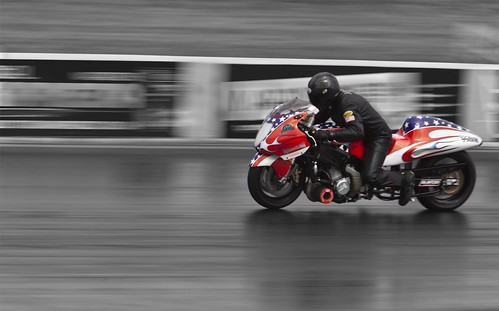
"Drag bike" Selective colouring is a great way to bring out your point of interest in the shot

“Drag bike” – Selective colouring is a great way to bring out your point of interest.
Click image to view large

Focus the attention of your viewer using these great techniques.

The most important thing about your image is the part that you want your viewer to see. A great image needs to concentrate their attention and hold it in the shot.

Next time you are ready to take a photograph – pause for a second. Think about composing your picture so you direct the viewer at the most important part of your image. The ‘point of interest’, ‘focus of attention’ or a ‘focal point’ is where the viewer finds satisfaction from looking at the image. It makes sense that you use one or two techniques to point the viewers eye right at the reason you are taking the shot.

10 Techniques directing the eye to the point of interest
  • Crop: The cropped shape of the picture is an important way to help the viewers eye find the ‘point of interest’. Letterbox shaped crops help the viewers eye to run across the width of the picture; square crops help direct the reader to the centre of the shot; landscape views are so common that they help the reader be unaware of the crop; Portrait views alert the reader to the vertical things of interest. A crop is a great way to help the readers eye, especially when used with other techniques below.
  • Position: Where you place your point of interest in the shot can affect how prominent it is or how the eye is drawn to it. A good introduction to positioning is to look up the Rule of Thirds. That is a basic rule of composition that gives the eye a dynamic reason to look at the point of interest.
  • Size: A large subject or point of interest is a great way to make people look at it. Big and bold and your viewer will hardly miss it!
  • Focus: The use of depth of field is really effective. The human eye naturally sees what we directly look at in focus. So we tend to concentrate our viewing in the area of sharpness in a picture.
  • Movement blur: Capturing movement creates blur. In my picture above the bike is travelling very fast. To capture it like that I have panned my camera. The background is out of focus. The sharpness and blur create a contrast that draws the eye to the sharpness. Alternatively, you can photograph something moving that you want to become blurred as the focus of attention. Classic movement blur is often created at the fair in the evening. Fast movement with brightly coloured lights wonderfully blurs the merry-go-round in a longer exposure. The strangeness and strong colours draws the eye to the patterns.
  • Colour: Using colour is a great way to draw the eye. Strong primary colours (red, green, blue etc.) are especially good at catching the eye. One bright colour against other lesser colours also directs the eye. Contrasting colours can be a good way of highlighting a particular point of interest too. Colours are best used to make the point of interest stand out from the background.
  • Selective colour: The absence of colour in part of a picture and the selection of one colour or an object in colour is a great contrast in the picture. That difference – greyscale to colour – will strongly make the point of interest stand out. An example is the picture above.
  • Shape: The use of shape is a way to draw the eye too. Again you can use a contrast. One round object in a group of square objects really captures the attention. A strong geometric shape in a picture where there is no other strong, well defined shapes pulls the eye.
  • Pattern: Where there is pattern there is focus. Our eyes are good at picking out patterns. Sudden, clear formation of pattern in a picture where there is no otherwise clear pattern focusses the attention on the pattern. The opposite is true too. Where there is a breakdown in a pattern the eye is drawn to the difference and questions why the change or break in the pattern.
  • Lines: The eye naturally follows lines in a picture. So, you can use lines both as the actual point of interest, and as a way of pointing at the focus of attention. Implied lines can be useful in the same way. A line that strongly points to something else is another way to capture the attention.

It is important too, you are careful not to make the picture too complicated or cluttered. To much to catch the attention will have the eyes whizzing around the picture and not able to settle on your point of interest. Likewise, it is best to use just one or two of the above techniques. Too many and the eye is confused with what direction they should follow. Composing your picture is about subtle messages and directions to help the eye. The last thing you want to do is to confuse or misdirect your viewer.

By Damon Guy (author and Photokonnexion editor)

Damon Guy - Netkonnexion

Damon Guy (Netkonnexion)

Damon is a writer-photog and editor of this site. He has run some major websites, a computing department and a digital image library. He started out as a trained teacher and now runs training for digital photographers.
See also: Editors ‘Bio’.

Can you write? Of course you can!
Write for Photokonnexion...

We would love to have your articles or tips posted on our site.
Find out more…
Write for Photokonnexion.

How can hidden lines help your pictures?

Geometetry in your pictures works to help you see patterns. It draws the eye into the picture.

Geometetry in your pictures helps you see patterns. It draws the eye into the shot.

Look for patterns and geometry in your shots… capture the eye

The human brain is an extraordinary filter. We see things in the world around us that capture our attention all the time. Often it is a pattern that fires our imagination. We may not even be aware of it. We are programmed to see patterns in the world, and we are very good at finding them.

When composing, look for lines to associate.

When composing, look for lines to associate. If you can get lines to hold a pattern with strong geometry your composition will have a more compelling impact.

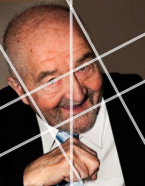
The geometry in a picture is not always obvious. First of all look to join up points of interest. Lines can be made by the eyebrows, the eyes themselves, the mouth, the nose, the connection with other aspects of the picture… in fact a lot of things. So what you are looking for to create strong lines is anything that has a prominent part of the picture. In the portrait here, we are looking at lines with the eyes/eyebrows. The eyes are always strong. The mouth is a strong feature too. So if you can line up these things with other prominent features of the picture you are revealing the strong points. That’s right, its simple. Lines are strong in a picture because they catch the eye. I have identified the eyes and mouth, the sides of the head and the lines from the hand to the mid-point of the eyes as strong aspects of the picture. There is no mystery here. You need to look for prominent points and edges. The way they create implied lines, join up or connect is what creates a pattern.

The use of geometry is a very old technique in composition of paintings. It can also enhance our photographs.

In the second picture (above) I show how the portrait has been dissected by lines that pull out the geometry. Of course in a photograph we don’t have the luxury of perfect alignment. Painters can map out thier work ahead of the actual painting. Photographers have to look at the subject-scene and do their best to analyze how it holds together, or work the scene to achieve a well proportioned pattern.

In the case of the portrait I have shown three sets of lines. First it is unusual to get a dynamic relationship out of a centre line. However, in this picture the mid-line of the face, the knuckles and tie all line up. So to emphasize it I have featured this in a central position.

Of course a more dynamic relationship comes out in pictures with strong diagonals. Faces on the diagonal are quite powerful. Our eye is trained to know faces very well after years of social interaction. So when they are not in an upright position our eye has to work harder to resolve them. This is good. The eye lingers and goes around the face. It takes into account the different aspects of the face and the way it is inclined within the frame.

Not only have we got a face on the diagonal but we have a close relationship to the rule of thirds. In this portrait it is not a perfect correspondence. However, the proportions are reasonable and there is a pattern.

There is nothing perfect about applying geometry to photographs. The photographer usually has to guesstimate the lines, thier association and the way they may work to give impact to the picture. However, it is up to you to find ways to do that.

Geometry in mathematics is all about perfection and calculation. In photography it is about finding ways to pull out pattern and emphasize the strengths in the picture. Our eyes look for patterns and when we find well proportioned geometric relationships we are pleased and intrigued. It is another way to bring more impact to our pictures.

By Damon Guy (author and Photokonnexion editor)

Damon Guy - Netkonnexion

Damon Guy (Netkonnexion)

Damon is a writer-photog and editor of this site. He has run some major websites, a computing department and a digital image library. He started out as a trained teacher and now runs training for digital photographers.
See also: Editors ‘Bio’.

Getting Started With Cloning

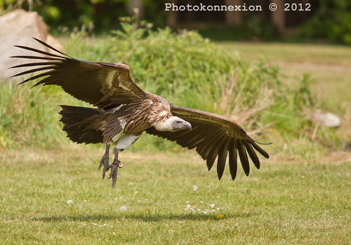
Vulture Landing - not a bad photo; some final adjustments are required

Vulture Landing – not a bad photo; some final adjustments are required. A little cloning work needed to tidy up loose ends. Click to view large.

Cloning allows you to clear up small problems – here’s how

Every picture starts its life with the composition. Once you have composed you take the shot. In those two simple actions is a world of experience and knowledge. It does not finish there – there is a third stage – post-processing (or just processing). Simplicity in your image is one of the keys to good photography. Often to achieve simplicity you need to remove unwanted elements of the picture. This is where cloning comes into play. In what follows I am going to look at simple cloning techniques using my photograph above.

Removing stuff

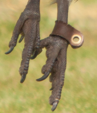
In this post we will concentrate on an essential technique… that of cloning in small strokes or spots. The essential element of any cloning job is the copying of the texture/pattern/colour (whatever) at the source point onto the destination point. The destination point is where you are hoping to remove something. Here is the first picture. It is an enlargement of the legs on the main image at the top of this article. The aim of this cloning work is to remove the leg harness from the bird.

The problem... an enlarged view shows the offending leg harness.

The problem… an enlarged view shows the offending leg harness.

Two simple points of technique underlie about 75% of the work of cloning. First the spot technique.

The success of cloning usually depends on collecting the source texture or pattern from near to the destination point. This is because there is a better chance that the colours, textures and patterns are going to match if they come from close to each other.


Lets get started

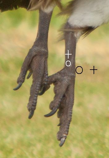
First, set up the source point. How the source point is selected depends on the application you are using. You will need to check the instructions. The idea is that there will be a cursor icon for sensing the source and a painting icon for where the cloning will be done. In the next picture you can see how I have cloned a little from the harness from the surrounding area. The round icon is the painting tool, the cross-hair is the source tool. As you move the painting tool the cross-hair moves with it.

To replicate textures, use near-by similar surfaces

You will see that I have done some cloning in two places. The cursor is currently cloning over the area of the harness, collecting the source from the surrounding green bokeh.

Placing your clone tool sensor

You can place the sensor cursor at any angle or distance to the painter cursor. You will see if you look carefully, that I have also done some cloning on the leg. Part of the harness has been removed there. You will notice that the leg has a scaly texture. I had to work close to the harness with the cross-hairs north of the area I was cloning. This allows me to pick up the texture and deposit it on the harness area. If you run over the same area as you have just cloned you get a repeating pattern. So, use short strokes. Change the sensor cross-hairs after each stroke or spot you clone.

The source point can be anywhere. In this image I have shown the positions I took the clone from for the leg and the harness part off the leg.

The source point can be anywhere. The image shows the positions for the clone from the leg texture and the harness part sticking out from the leg.

Three common problems

When just starting it is easy to just clone away until the job is done. However, when you stand back there are frequently three things wrong – lines are not straight any more; repeating patterns show up; big clone spots show up. To counter all three of these errors it is best to work in very close to the area you are working on. Make tiny changes each stroke. They are less likely to be noticed. They blend in together better and have less impact on the picture as a whole.

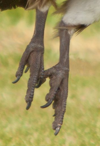
As you can see from the black icons in the image the painting circle is very close to the leg edge. To get lines back you have to work with the edge of the circle, as I have done here. Just skim it along the line to straighten it from one side. Then, working from the other side (in this case on the leg) work that side too. Work from side to side. Gently skim it into a straight line. Keep working until you are satisfied your work will not be noticed when you zoom out. Here is the finished leg.

Now the tools are out of the way, you can see how the lines, shades, textures and colours are all blended and maintained.

Now the tools are out of the way, you can see how the lines, shades, textures and colours are all blended and maintained.

Working zoomed-in is critical

One of the easy mistakes to make is to do your cloning large, at the image normal size. If you look carefully at the leg you will see that, even zoomed out, you can see some texture and areas of darker and lighter shading. However, you cannot see the detail of the cloning spots/strokes. If you work at normal image size you will find it very difficult to replicate those shades, tones and textures. They are delicate and subtle. But life is delicate and subtle. If you want it to look realistic you have to put those subtle differences in. Working in a highly zoomed state allows you to do that.

If you click here  External link - opens new tab/page, you can see the finished full sized image on a new page. Look carefully. The slight colour variations and texture changes look natural and fit in well. The variations are poorly integrated, clumsy and unrealistic if you work in at 100% image size.

What we have covered
  • Make Small changes. They are less likely to be noticed. Also, work zoomed in and with small tool sizes. They blend in better and have less impact on the picture as a whole.
  • A pattern/texture source close to the clone destination is more likely to match than distant sources.
  • A continuous clone stroke will be noticed. Work with small spots and short strokes changing your clone source frequently.
  • Avoid running over an area you have cloned already with your sensor. It creates highly visible repeating patterns.
  • When working with lines/edges skim them gently from both sides until straight.

If this all sounds like quite a lot of time consuming work… well, it is. As you can see it is worth it. A good image improved in a natural way. And, like all your photography skills, it takes time and practice. It is fun and absorbing however, so enjoy your processing!

Useful links after the jump…

Irfanview – A free image viewer and basic image editor.

GIMP  External link - opens new tab/page – a full featured, open source, free image editor – download and install.

Photoshop (by Adobe) – Adobe Photoshop CS6 (PC) External link - opens new tab/page – Industry standard post-processing professional software

Adobe Lightroom – Adobe Lightroom 4.0 (Mac/PC) External link - opens new tab/page – Professional photographers workflow and post-processing software

Adobe Elements – Adobe Photoshop Elements 10 (PC/Mac) External link - opens new tab/page
– Powerful editing system for amateur/semi-professional photographers.

Google listing for ‘online image editor External link - opens new tab/page

Damon Guy - Netkonnexion

Damon Guy (Netkonnexion)

Damon is a writer-photog and editor of this site. He has run some major websites, a computing department and a digital image library. He started out as a trained teacher and now runs training for digital photographers.
See also: Editors ‘Bio’.

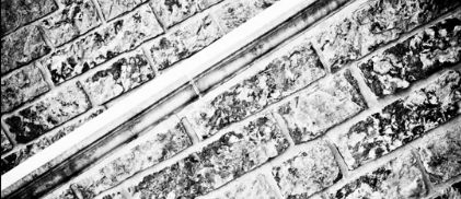
Patterns… break the pattern

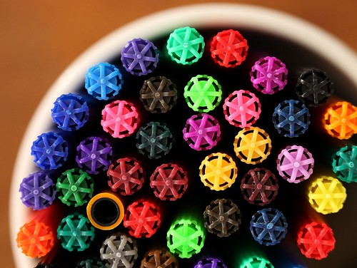
Pens... When you have an established pattern, break it.

Pens... When you have an established pattern, break it. The whole point is not to bore your viewer, but to draw them in. Make them think about it, let them see it for what it is, and what it is not.

Break the pattern – capture the eye

Pattern is a funny thing. The human eye is great at picking out patterns. We see them in everything. It is probably one of the elements that makes us human. However, when we see a pattern our eye is quickly satisfied. We lose interest. So, do you want your viewer to lose interest in your pattern?

Photographers love to work pattern shots because they know patterns are eye catching. I look at a lot of images every day; sometimes hundreds. When I see a good pattern shot it draws me into the shot. The geometry, the symmetry, the perspective, the lines… well, all these things, and more are appealing. If the pattern is uniform I almost immediately lose interest. To keep the attention of the viewer you have to give them some reason to keep looking into your pattern. So give them a puzzle. Often, and for good reason, it is best to break the pattern. If the eye sees a pattern the work is done. If there is an incomplete pattern, or an anomaly then the pattern is broken. Why? What happened? What’s wrong? How did that occur? Suddenly the viewers mind is in turmoil. The questions follow and they look around the pattern for confirmation, answers, insights… whatever. The point is they are drawn into the picture. You have made them engage with it and internalize it.

Photographers forget they are working for the viewer. There is no other reason to take a photograph, even if it is a pure record shot. Hopefully, at least one day, someone is going to view it. If you never look at the shot again, and no-one else does either, you have not succeeded in communication in our image language – photography.

Communication is about engaging an audience. Pattern shots are a category of image where you can force your viewer to question what is going on in the shot. At once you can catch the eye, show a subject, appeal to the viewer, engage them and intrigue them. On the other hand you have lost their attention if they glance and move on.

So, when looking at a pattern look deeper than the pattern itself. Look at the variations, the subtle differences. Check the light, examine the graduations. Count the tones, identify the differences. Know that pattern inside out. Look for where it is the same. Look for the obvious ways it can be different. When you know your pattern inside-out, arrange the shot. Optimize the pattern, maximize where it breaks. One single instance of a difference is enough to stop the eye. And that is the aim – stop the eye; create a question. THEN, you will be showing the true meaning of that pattern to the eye of the viewer.