Category Archives: Composition

composition: aesthetics, arrangement, balance, beauty, combination, concord, configuration, consonance, constitution, content, design, distribution, form, formation, harmony, layout, make-up, placing, proportion, relation, rhythm, shape, spacing, structure, style, symmetry, weave

Break the pattern – draw in the eye

Break The Pattern - interest the eye

• Break the pattern – interest the eye•
When you break the pattern your texture, pattern or background takes on a new perspective. The eye is drawn in to explore the changed symmetry.
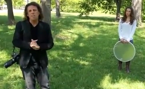
(Image of Brian Peterson taken from the video).

The eye loves pattern and texture…

Detail in the world around us can be attractive to the eye. But often we miss this detail if the eye is not drawn to it. Break the pattern and our eye is drawn in.

Break the pattern – break the monotony

Pattern attracts the eye because it is uniform and predictable. However, pattern is also spoilt for the same reason. When we see a pattern we are not threatened by it. We quickly know it. We feel comfortable with it. In fact the eye quickly becomes bored.

There is a good reason for this quick loss of interest. As we move around in our environment pattern allows us spot safety or danger; predator or prey. When we see something break the pattern we need to explore it. Is there danger here? Is there prey here? We find the things we seek when we see a break in the expected pattern.

Seek the difference

Our eye-brain system is really good at recognising pattern. But it is the ‘slightly different’ we really want to know about. We quickly lose our focus on the pattern – unless we see it is no longer uniform at some point. An edge that is different; or colour, or form, alerts the eye. Then, our eye-brain system spends time comparing and contrasting. We explore.

If you think about what really fascinates the human spirit it is all about things that break the pattern. When something is not as we expect it all sorts of questions are raised. We could almost say that understanding “pattern and inconsistency” is behind the scientific revolution. We look to understand the world by finding pattern. When something breaks the pattern it is a source of endless curiosity.

So it is in photography…

Images provide this same interest. By creating a pattern we make it easy to know the picture. When we break the pattern we introduce the same endless quest to explore. You have won the viewers eye when you make them explore your image. Ultimately, you interest them when they want to know more, or to know why.

Pattern Texture: You Keep Shooting with Bryan Peterson

In this short video Brian looks at a simple, predictable texture. He very simply shows how to break the pattern to attract the eye. Another tip after the video…
Adorama External link - opens new tab/page

More than one dimension

If you break the pattern you interest the eye. However, composition has more than one dimension. If we want to interest the eye a break the pattern – yes. But, we can do it in a boring way and lose the eye quickly. If the flower in Brian’s shot was placed dead centre the effect would be lost. When central the picture suddenly becomes about the flower. Actually we want the picture to be about how we broke the pattern. So, if you re-run the video you will see that not one of the photos had the break at dead centre. Each one was on, or near, a “third”. Yes folks… the good old Rule of Thirds.

If you off-set the break to a “third” you break the pattern again. You raise another question in the viewers mind. Why there? Why not the centre? Why not where it was expected? At the same time you give the pattern in the picture a strength that would not be there if the flower were central.

Vision

Seeing, in the photographic sense, is all about understanding vision. Knowing pattern and why we look at it is a large part of understanding what attracts the eye. At the same time, understanding why we seek patterns, is also why we are fascinated by any break in the same pattern.

Comments, additions, amendments or ideas on this article? Contact Us
or why not leave a comment at the bottom of the page…

Like this article? Don’t miss the next — sign up for tips by email.

Netkonnexion

Damon Guy (Netkonnexion)

Damon is editor of Photokonnexion. He has professional experience in photography, writing, image libraries, and computing. He is an experienced web master and a trained teacher. Damon also trains digital photographers.
See also: Editors ‘Bio’
By Damon Guy :: Profile on Google+.

On-camera flash… advice for taming the beast

Taming on-camera flash

• Taming on-camera flash •
Left: harsh light and highlights are so unflattering!
Right: properly controlled you get proper skin tones and no highlights.
•••••||•••••
On camera flash can be a pretty tough nut to crack – learn how.
(Images taken from the video)

On-camera flash is pretty harsh…

In fact it’s often the source of ruined pictures from otherwise great dinner parties and family events. Dealing with with these little beasts takes a little work. You can make them do you bidding, you just need to know how.

A small powerful light source

The power of the little flash on your camera is misleading. For such a small light it puts out a lot of power. The learner is often caught off-guard. A great scene can be ruined by very unpleasant light, colour leached from faces, shiny reflections on faces and really hard-edged shadows. The whole thing is pretty ugly.

Here is some news. There are ways to control these little beasts and make them do your bidding.

Two of the most useful techniques for dealing with the problems are explained more fully in: Find out more about diffusing your on-camera flash. The other way is to help your flash work better in the room. Use the room itself as a way to bounce light around. Point your flash at a wall or ceiling so the light is reflected everywhere. It will make harsh flash into soft light – make it a more wrap-around light. This is always more flattering and shows the gentle curves of the face much better. It also means the light works its way around the back of the subject reducing harsh shadows cast onto the wall.

Practical use of the on-camera flash

For those quiet evenings where you are chatting with your friends and family here are some easy techniques. You can use your on-camera flash to good effect without the harsh shadows. You can escape the electric shock faces and startled expressions too. Have a look at the video and follow the sage advice of Mike Browne at a dinner party…

Using on-camera Flash Indoors – With Mike Browne


Mike Browne  External link - opens new tab/page

Using the proper tools is best

Let’s face it. On-camera flash is always going to be a bit difficult. As good as it looks in the video controlled results are always going to be difficult from such a little light source. Here is what Mike himself has to say about on-camera flash…

I’d suggest a speedlight is better because you can fit a diffuser and better still, turn the flash head in any direction and bounce the flash off a wall or ceiling.
Mike Browne  External link - opens new tab/page.

Have a look at some off-camera ideas. These are probably the most flexible options for moving your photography forward, especially for small intimate surroundings. Check out these options…

Off camera flash units

Canon Speedlite 430EX II Flash Unit – a great branded flash for general use  External link - opens new tab/page

Nikon SB-600 Speedlight – a great quality mid-range Nikon flash unit  External link - opens new tab/page

Special pick…

This high quality own-brand flash unit performs like branded units but is much more affordable. The unit provides a range of functions as well as being compact, light and robust. Great value for your money. YN560 III 2.4Ghz Wireless Flash Speedlite Support RF-602/603 YN560-III For Canon Nikon Pentax Olympus  External link - opens new tab/page

 
All these units will fire as normal when mounted on the camera. They will require an off-camera flash cord or wireless radio triggers for off-camera flash units  External link - opens new tab/page to connect to the camera when shooting off-camera.

Comments, additions, amendments or ideas on this article? Contact Us
or why not leave a comment at the bottom of the page…

Like this article? Don’t miss the next — sign up for tips by email.

Netkonnexion

Damon Guy (Netkonnexion)

Damon is managing editor of Photokonnexion.com with professional experience in photography, writing, image libraries, and computing. He is also an experienced, webmaster and a trained teacher. Damon runs regular training for digital photographers who are just starting out.
See also: Editors ‘Bio’
By Damon Guy :: Profile on Google+

Autumn photography – 50 things to think about

Autumn Cherry Leaves

• Autumn Cherry Leaves •
As Fall is upon us. Think of new ways to pull in the eye of the viewer.
Autumn Cherry Leaves by Netkonnexion on Flickr

Autumn is a great time of year.

There is so much to see and photograph. Being out in the open air and lovely locations is part of the attraction. Here are some other important and photographic things to consider.

Locations
  • Don’t always go to the same spot. Find somewhere new every Autumn.
  • Fall colours depend on the species, which may not be shown on maps.
  • Check with park information centres to see if the colours are right.
  • Information centres are great at giving directions to the best locations.
  • Watch weather forecasts to see when the best light is likely to show up.
  • Check websites for the area near the location for useful information.
Colours

What makes Autumn particularly exciting is the lovely russet and golden colours. Making those come out is not always easy. Think about these points…

  • Even slight greyness in the sky can dampen the colours.
  • Bright colour can be lost against a bright sky, exaggerate colour contrast.
  • Shoot yellows against a darker background so they don’t get lost.
  • Golden colours are best with a red dusk. Aim for times in the Golden Hour.
  • Don’t use a pop-up flash. It will flatten the colour and depth.
  • Use off-camera flash from the side to make leaves translucent and bright.
  • Use side light as much as possible to emphasis shadows and define shapes.
  • Use any greens you can as a back-drop for golden colours.
  • Low sunlight peeping under clouds often brings out yellows.
  • Take pictures after rain – the wetness often revitalises colours.
  • Consider a filter on your camera to exaggerate natural colours.
  • Try shots with as many mixed colours as possible.
  • Try shots with lots of similar colours across the picture.
Equipment

Every shoot demands its own approach. But here are some ideas to help the Autumn shots work for you…

  • A tripod is essential. A fuzzy shot of a great scene is horrible!
  • Most people forget the wide angle shots.
  • Remember that zoom lenses flatten perspective – consider prime lenses.
  • Consider using white boards and gold reflectors to help bring up colours.
  • You can’t make great images if you are cold/wet. Wear proper clothing.
  • Beware of changing lenses in damp air!
The shots

Found a great place to rejoice in colour and texture? Now you need to think about composition and ideas for your shots…

  • Check out our resources on composition.
  • Before going spend two hours looking at images by others (Google)  External link - opens new tab/page.
  • Work out a list of, say, 25 shots you would like to try out.
  • Concentrate your efforts on a few ideas.
  • Use your trip to try at least one type of shot new to you.
  • Practice your chosen shots before you go.
  • Remember to work the scene at the location.
  • Remember The fifteen second landscape appraisal.
  • Have a go at this old sailors trick to improve landscapes.
  • People often look up when in trees. Look down, there is plenty there.
  • Get really low.
  • Get really close.
  • Experiment with Depth of Field:.
  • Light leaves from behind. Translucent leaves are wonderful.
  • Consider backlighting to bring out shapes.
  • Hold up something interesting and photograph it with your hand.
  • Dogs look great in leaves! Capture your pet having fun!
  • Take a macro lens or macro tubes. Get really close.
  • Look for golden, yellows and reds in reflections… they look great!
Try going to manual (M) settings…

There is nothing more exciting. Get great images knowing they came out the way you intended. Avoid ‘auto’ shots programmed by a boffin at the camera factory.

Autumn and you…

Don’t be so intense that its not fun! Love your trip, enjoy the moment and if possible share it with a friend. Make some great images along the way.

Have a great Autumn.

Comments, additions, amendments or ideas on this article? Contact Us
or why not leave a comment at the bottom of the page…

Like this article? Don’t miss the next — sign up for tips by email.

Netkonnexion

Damon Guy (Netkonnexion)

Damon is managing editor of Photokonnexion.com with professional experience in photography, writing, image libraries, and computing. He is also an experienced, webmaster and a trained teacher. Damon runs regular training for digital photographers who are just starting out.
See also: Editors ‘Bio’
By Damon Guy :: Profile on Google+

Rare black and white pictures – great examples

Rare historical pictures in black and white

• Rare historical pictures in black and white •
Great pictures go beyond the capturing of great events…
These are excellent examples of monochrome photography too.
[Image from the slide presentation]

Quality black and white photography is an art.

Early photography taught us there is more to an image than conveyed by colour. Black and white Photography can be emotionally powerful and visually satisfying. Sometimes colour reduces that impact.

Why is there so much impact in black and white?

The use of colour has seduced the eyes of the users of modern media and screens. The realism is amazing and the quality excellent. What people forget is that colour can reduce your awareness to the meaning in a picture. It is all too easy to lose the impact of a story when the picture is so vivid.

The underlying impact of an image is more powerful with simple presentation. Black and white or monochrome images simplify the message beautifully. They create a stark reality in an image. That reduces distractions and focusses the eye on the story.

This is a great lesson for modern photographers. Reduce the image down to a simple, powerful message. Make sure it also has great visual impact. Add a great story and you have captured the attention of the viewer.

What makes black and white visually powerful?

Here are some things to consider when thinking about making a black and white image…

  • Try to use a wide contrast range from darkest blacks to whitest whites.
  • Make sure that the darkest and brightest areas of the picture are not too large or they will distract from the greyscale in between.
  • Try to ensure there is a good spread of different greys between the darkest and brightest.
  • Using only deepest black or whitest white will tend to be too harsh for the eye except where there is a good pattern for the eye to follow.
  • Harsh shadows from hard light will distract the eye. Look to use soft light and graduated shadows.
  • Try to include as much detail as possible to bring out the subject of the image.
  • Work hard to bring out textures. This will throw up the subject without distracting the eye. It will help develop depth too.
  • Be especially sensitive to layers in the image (foreground, mid-ground and distance). Low levels of texture and poor layering will make the image look flat and lifeless.
Some great examples of successful black and white images

As you go through the great images in the slide show below consider the points above. You will find food for thought for your own black and white images.

Want to see regular historical black and white images?

As a lover of black and white pictures I signed up to Retronaut  External link - opens new tab/page. This great site is not exclusively about black and white images, but most of the historical material there is of that type. I get a daily email with some great images. It’s pretty instructive because black and white images are a personal interest. Why not give it a try? Enjoy.

Comments, additions, amendments or ideas on this article? Contact Us
or why not leave a comment at the bottom of the page…

Like this article? Don’t miss the next — sign up for tips by email.

Netkonnexion

Damon Guy (Netkonnexion)

Damon is managing editor of Photokonnexion.com with professional experience in photography, writing, image libraries, and computing. He is also an experienced, webmaster and a trained teacher. Damon runs regular training for digital photographers who are just starting out.
See also: Editors ‘Bio’
By Damon Guy :: Profile on Google+

Background check – simple is best, then check it

Creating Perfect Backgrounds

• Creating Perfect Backgrounds •
Bryan Peterson looks at one of the simplest lessons in outdoor photography – but one that gets effective results.
[Image taken from the video]

Perfect backgrounds…

It’s easy to spoil a great subject by picking the wrong background or using one with distractions. Taking the time to look around is worthwhile – then do a background check. Here are some pointers to help.

Great images include great backgrounds

A wonderful subject is not the only thing that makes a successful image. It is the whole image that the eye sees. With a great subject but a distracting background you will lose the viewers eye to the background. Equally if the background is too cluttered it will draw attention away from the subject. Strong contrasts, clashing colours, peculiar events or something ugly in the background all take their toll.

Simplify, simplify, simplify…

Try to find interesting textures, colours and scenes for the background. Keep the contrasts to a minimum. Make sure no one is going to walk into the shot or create another type of distraction. In other words make it as easy as possible for your viewer to concentrate on the subject. It is all about showing off the best – and that is what you want the subject to be.

What to look for at the back of your shot

A certain amount of uniformity helps. If what lies in the back of the shot is too diverse the eye looks to see what the background is all about. Therefore, it becomes a distraction. Then the subject is lost to the eye.

If it is too consistent the same is true. You risk losing the viewer because there is no background interest to off-set your subject. So there is a balanced artistic decision required. But with practice your eye will begin to see when something draws the eye once you become alerted to the impact of the background.

The background check

No, it’s not about identity papers. The background check is all about looking around your viewfinder to see what you think of the back of the scene. When you frame up the shot it is easy to think of the composition and placing the subject in an interesting position. But forgetting to check the quality of the background is fatal. Parked cars, flying balls, litter blowing in the wind – a whole range of distractions – can all suddenly appear. Worse, they can be there all along and you have just not seen them.

The background check is simple. Look around the edge of the frame. Make sure no odd items are sticking into the shot. Look for an interesting texture and colour range. Make the colours complementary and well defined, but not too contrasting. Check to see there are no very bright or dark zones. Brightness drags the eye off the subject. Darkness tones down the interest in the shot.

Clean, tidy and well composed…

When you have checked everything, the back of the shot should be clean, tidy, well composed and not distracting. Then you can do one last quick check on your subject. If all is well press the Definition: Shutter Button. Presto – a great shot.

Creating the Perfect Background with Bryan Peterson

By way of example Bryan talks us through a situation in a park where he makes the best of the back of the shot – checking for problems and emphasising his subject.
Adorama Photography TV  External link - opens new tab/page

Comments, additions, amendments or ideas on this article? Contact Us
or why not leave a comment at the bottom of the page…

Like this article? Don’t miss the next — sign up for tips by email.

Shutter speeds – An easy guide

Shutter Speeds Cheat Sheet

• Shutter Speeds Cheat Sheet •
Click on image to download full .pdf cheat-sheet.

Shutter speed is easier with a start point.

One of the difficulties with shutter speeds is knowing what sort of setting to use with various speeds of an event in the real world.

Here is a short guide to get you started :: A guide to shutter speeds.

There are no rules about shutter speed

The actual speeds of real world events vary a great deal. In a race one car may move at 90 miles per hour (mph) and another at only 70mph. You should vary the shutter speeds depending on the objects speed, light intensity and the aperture you are using. Remember, the download cheat sheet is a guide not a set of rules. It’ll get you started, then it’s down to good old experimentation.

There is no substitute for experience

I do a lot of panning with race vehicles. I have learned to assess the speed and light then make quick guesses to set my camera up for a few test shots.

Once I took an experienced bird watcher to a drag race event. He was used to panning fast moving birds in flight. It took him time to adjust his eye for working with cars at up to 250mph. The best way to get good at doing shutter speed settings is to practice with a wide variety of moving objects so that you can get a general feel for the shutter speeds at each speed of your object.

Experience is the best master. So practice different settings a lot to get the settings and speeds for your interest properly fixed in your mind. This gives you a head start when setting up for a new subject.

Test shots

If you are going on a shoot where shutter speed is important, practice at the likely shutter speed for a few days before going. Try out different light conditions too. This will get your eye into the subject and help you know what variations you can use to get the best shots on the day. This post might help too… How to overcome frozen movement in panning.

The difference between freeze and blur

If you freeze the action you show some amazing stuff the eye does not normally see. Facial expressions and body movements as well as other details can be stunning. It can also look a little artificial. It is strange to see, for example, water droplets fixed in mid-air or a fast car with its wheels not blurry.

You can lower the shutter speed off the peak-action speed for freezing until you get some very slight blur in critical areas. Wheels on moving vehicles or propellers on aircraft are typical examples. They look artificial as frozen features, but give life and movement to an otherwise sharp rendering of high speed action.

Work your blur in naturally and show it as you would see it. Be especially careful where you have a lot of blur. Ensure there are still sharp elements in the picture. If everything is blurred it looks like a bad case of hand-shake.

The key

The key to controlling blur or freezing and other shutter speed effects is… practice! Lots of it. So, just get out there and have a go. Gradually you’ll forget the cheat sheet, you will have it in your head from practice.

Comments, additions, amendments or ideas on this article? Contact Us
or why not leave a comment at the bottom of the page…

Like this article? Don’t miss the next — sign up for tips by email.

By Damon Guy (author and Photokonnexion editor)

Damon Guy - Netkonnexion

Damon Guy (Netkonnexion)

Damon is a writer-photog and editor of this site. He has run some major websites, a computing department and a digital image library. He started out as a trained teacher and now runs training for digital photographers.
See also: Editors ‘Bio’.

Abstract photography – three abstract insights

When Science Meets Art - Fabian Oefner. (About abstracts in art)

• When Science Meets Art – Fabian Oefner •
Abstract art is all around us. Some projects get deep into special ideas. Others are more about the abstracts we all miss right in front of our eyes.
{Image taken from a video below}

Art is not straight forward

Abstract photography is often about how an artist views things rather than what is shown. Abstracts bring out the artists unique view of the world. The photog isolates the special characteristics of the subject.

The nature of abstracts is…

The photographers vision of the world is often about emotion. We are able to see into a subject because we become attached to it, understand it. We try to feel its impact on ourselves and to find a way to translate that into a picture. Often such “seeing” comes from a personal study of composition and aesthetics. It helps to understand the elements of art too. These are not requirements for making abstracts. They are a base for abstract seeing. They help artists analyse and know “abstract”. However, they contribute little to creating one.

The real issue is the way that an individual artist approaches making an abstract.

Abstract art comes to those who observe more than the “whole” of something. The minute detail through to the overall view of a subject is important. Abstract artists are aware of form and shape, texture and colour and a myriad of other detail. This awareness is different in everyone. Certain details catch the eyes of some people and not others. Some forms or patterns stimulate some and not others. This uniqueness is the key to “seeing” abstracts.

By ignoring some details or components of a scene or subject, and by building up others, it’s possible to construct the ‘abstract’. This is a new entity emphasising these details and elements.

Success in making abstract photos grows with experience of, and a personal view of, the subject matter. That might be made up of a deep study of the material and behaviour of the subject. It might also be a deep response to cultural and artistic baggage in the artists character. It could be both and more.

The mystery of creating abstracts?

The emotions that commit artists to a creative act are not easy to analyse. The act of creating abstracts is difficult too. By knowing a little of our own background, interests and experience we can see how to approach their creation.

Our own creativity can develop from learning about it in others. One route to knowing an abstract artist is via their enthusiasm and commitment. In the videos below you see into the artists themselves. They may help your view of the process of making abstracts.

The first artist is Fabian Oefner. His interest is in abstracts through science. He shows a number of his projects. He explains how they came about and what was involved.

Fabian Oefner: Psychedelic science  External link - opens new tab/page

Lester Hayes was an early maker of abstract photos. He knew very little to start. He talks about becoming involved and why he saw abstracts. Clearly there is a deep emotional commitment for him in making abstracts.

Abstract Photographer Lester Hayes Uploaded by Anthony Mournian  External link - opens new tab/page

Next, we visit the world of Sergio Muscat. His abstracts have an organic quality. He shows his wonder of nature. He explains where he gets his vision with quotes and written comments between pictures. I became wonderfully connected to his thinking while watching.
Sergio Muscat  External link - opens new tab/page
In the quote below he shows that photos reflect reality. But they interpret the world. His insight into abstracts is about the same plastic reality on which photography is based.

Unlike other media, a photograph is always based on a real, material origin. Rather than looking at this as a disadvantage, we should understand that this same fact makes photography the ultimate surreal medium – simply because photography, although based on reality, is very far from the truth.
Sergio Muscat – Abstract Photography – YouTube

Photos never truly show what the eye sees. This is a deep part of the ideas in abstracts.

Seeing is not knowing

We may come to know the nature of the ‘abstract’. Yet, abstracts are a fragile gossamer. Each has its own essence. Catch it and you may destroy it.

Knowing a little of the artist helps. With that we may know a little of their approach to abstracts. That way we may learn to bring it out in our own work.

Further reading on abstracts

In other articles I have looked at the nature of abstracts. For more interest, follow up on these…

Comments, additions, amendments or ideas on this article? Contact Us
or why not leave a comment at the bottom of the page…

Like this article? Don’t miss the next — sign up for tips by email.

Damon Guy - Netkonnexion

Damon Guy (Netkonnexion)

Damon is a writer-photographer and editor of this site. He has run some major websites, a computing department and a digital image library. He started out as a trained teacher and now runs training for digital photogs.
See also: Editors ‘Bio’.
By Damon Guy see his profile on Google+.