Tag Archives: Light

Visual toolbox for photographers

Sharpen up your creative photography…

It’s easy when starting photography to over emphasis the importance of gear. In fact it’s ‘photographers eye’ that really makes the difference. Your vision and insight into a scene are critical to producing a wonderful image.

Sage advice from a world master

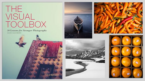
The Visual Tool Box by David duChemin is all about the skills of composition. He goes into depth around the background ideas which help you look at a scene. The ultimate success in photography is to make your image a pleasure to view. Aesthetics rule – it’s as simple as that. This book is dedicated to teaching you the tools you need to develop the ‘eye’.

David duChemin says,

These are the lessons I wish I’d learned when I was starting out.
The Visual Tool Box by David duChemin

This is my kind of book. He writes superbly, in simple, readable form. His examples are excellent and the pictures are just amazing. But most of all the book is organised for learners to extend their knowledge in easy, well structured steps. This book is all about putting new tools in your photographic tool box and it achieves that with an ease that any beginner will find a joy.

Composition

The book is packed with examples of the sort of compositional ideas that really work – for anyone. Just look at some of the topics covered…

  • Manual
  • Optimize Your Exposures
  • Master the Triangle
  • Slower Shutter Speed
  • Learn to Pan
  • Use Intentional Camera Movement
  • Use Wide Lenses to Create a Sense of Inclusion
  • Learn to Isolate
  • Use Tighter Apertures to Deepen Focus
  • Use Bokeh to Abstract
  • Consider Your Colour Palette
  • Lines: Use Diagonals to Create Energy
  • Lines: Patterns, Lead my Eye, Horizons
  • See the Direction of Light
  • Light: Front Light, Side Light, and Back Light
  • Quality of Light: Further Consideration
  • White Balance for Mood
  • Light: Reflections, Shadow, Silhouettes, Lens Flare
  • People
  • Experiment with Balance and Tension
  • Use Your Negative Space
  • Juxtapositions: Find Conceptual Contrasts
  • Orientation of Frame
  • Choose Your Aspect Ratio
  • Use Scale
  • Simplify
  • Shoot from the Heart
  • Listen to Other Voices (Very Carefully)

And there is plenty more content to complement and extends these ideas. What’s not shown in a list is the excellent and sage advice throughout the book. I will let David duChemin have the last word…

Pace your-self. Anyone can master a camera; that just comes with time. It’s the other stuff — learning to think like a photographer — that takes so much work and allows this craft to become the means by which you create art.
The Visual Tool Box by David duChemin

And it is thinking like a photographer that you will quickly learn from reading this book.

How to buy this great book

This book was originally published as an ebook. However, it is no longer available in that form. The book has moved into the real world. It will be available on Amazon as a Paperback From 31 Mar 2015.
The Visual Toolbox: 60 Lessons for Stronger Photographs (Voices That Matter)You can per-order the book from Amazon.

Comments, additions, amendments or ideas on this article? Contact Us
or why not leave a comment at the bottom of the page…

Like this article? Don’t miss the next — sign up for tips by email.

Damon Guy - Netkonnexion

Damon Guy (Netkonnexion)

Damon is a writer-photographer and editor of this site. He has run some major websites, a computing department and a digital image library. He started out as a trained teacher and now runs training for digital photogs.
See also: Editors ‘Bio’.
By Damon Guy see his profile on Google+.

Circular Polarising filters

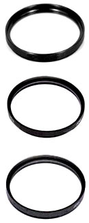
Polarising filter range

• Polarising filter Range •
The polarising filter is one of the more useful filters in the kit bag.

The polarising filter – one of the more useful filters

Strong Sun, low in the sky, can cause problems. Direct rays of light into the camera, specular highlights and washed out colours create photographic distractions in the image. Here is how to reduce the problem.

Watch for highlights – gain some benefits

Bright spots, difficult reflections and big highlights are a very strong draw for the eye in an image. Try to check around the frame when composing. Find ways to reduce these strong areas in the shot.

If you cannot reduce the reflections, highlights or washed out colours from bright light you should consider using a polarising filter. They are relatively inexpensive and have an incredible impact on the shot. If you use them right polarising filters can…

  • Reduce strong reflections: this gives a deeper, richer appearance to water, allows you to see into water and through glass and brings out strong images reflected in shiny surfaces like mountains etc.
  • Reduces the “washed out” effect of bright light: Colours that are whitened or lose their intensity in bright light can be made richer and more saturated. Skies and water in particular will get more depth of colour.
  • Reduces the intensity of bright light: Polarising filters reduce the total light entering the camera because they reflect/absorb some of the light. This helps bring down the overall levels of light.
Fitting polarising filters

Most polarisers are bought as circular screw tread attachments that screw into the front of your photographic lens. The filter part is mounted in a ring that freely rotates on top of the screw thread. It can turn without tightening or loosening the mount when it rotates. Screw the filter directly to the front filter-screw thread on the lens.

A polarising filter come in multi-filter kits. These can be fitted to the front of your lens. A frame is fitted onto the lens filter screw. Various filters can be slotted into the frame, including polarising filters.

Gentle rotation

To gain a benefit from your polarising filter you need to adjust it to suit the light. You can twist the filter part in the mounting in either direction The rotation of 90° is enough to see the full effect. Twist it gently until the full or desired impact is seen in your viewfinder. You should see slight darkening, increase in colour saturation and reduced highlights, particularly from shiny surfaces.

With a little practice you can easily see the full benefit of the filter. However, some highlights are still strong enough to create white spots and distractions. So still be careful when composing.

As a guide, if your sunglasses are polarised you can look at a scene quickly and see an immediate effect. If they help you to see more colours and reduce reflection and highlight impact then get your polarising filter out and screw it on the lens. Sunglasses help you to make the decision to get out the filter, but obviously they do not have a photographic impact. They will be of a different strength to your filter too. So you will still need to compose and adjust the filter.

How they work

Polarising filters act to filter the incoming light. They allow some specifically aligned light waves to pass through and not others. In so doing the filter effect does two things. First, they reflect or absorb some of the light where the waves are not aligned. Secondly, they allow the aligned light through. This light reduction and alignment is enough to ensure the glare, brightness and strong highlights are weakened.

For a more informed look at the detail of polarisation filters you can get more information here.

Buy now!

If you don’t have a polarising filter for your favourite lens then buy one now. You’ll see an amazing difference.

Buy the correct filter size. Check the thread size of your lens – normally found at the front edge of your lens. A mid-range size would be 58mm. My small lens is 52mm and my largest 88mm. Look for that size on the filter you order.

Have a look at the what’s available…
Circular polarising filters – buy one now!  External link - opens new tab/page.

Recommendation!
Hoya 58mm Circular Polarizing Filter
These are great value polarising filters. Check out the one seen here then search for one the size of your lens.


Comments, additions, amendments or ideas on this article? Contact Us
or why not leave a comment at the bottom of the page…

Like this article? Don’t miss the next — sign up for tips by email.

By Damon Guy (author and Photokonnexion editor)

Damon Guy - Netkonnexion

Damon Guy (Netkonnexion)

Damon is a writer-photog and editor of this site. He has run some major websites, a computing department and a digital image library. He started out as a trained teacher and now runs training for digital photographers.
See also: Editors ‘Bio’.

Can you write? Of course you can!
Write for Photokonnexion...

We would love to have your articles or tips posted on our site.
Find out more…
Write for Photokonnexion.

The power of light and shadow

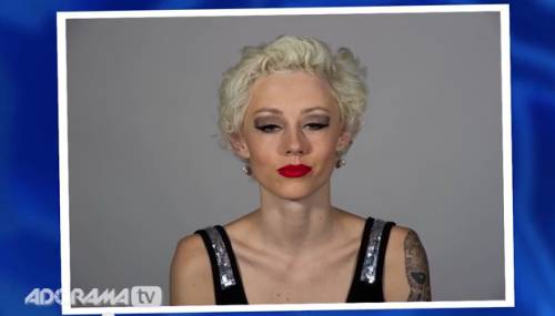
Facial shadows

• Facial shadows •
Image taken from the video.

Great portraits rely on shadows

Shadows define a portrait. So it is no surprise that good lighting to get the shadows right is a wonderful idea. But what most people don’t realise is that, almost every time, more lights make things more complicated. One light is almost all you will ever need to get a face right. The rest can be done with a reflector.

Shadow work

In the video Mark Wallace shows us how the face can be properly illuminated, how to do it and more important how to make it look beautiful. He looks at ugly shadows and hard light and explains how to remove them and subdue them using soft light. In all, this is one of the best best portrait lighting tutorials I have seen on video. Enjoy it. There is some really useful stuff presented in a simple and understandable way.

Adorama TV  External link - opens new tab/page

Comments, additions, amendments or ideas on this article? Contact Us
or why not leave a comment at the bottom of the page…

Like this article? Don’t miss the next — sign up for tips by email.

By Damon Guy (author and Photokonnexion editor)

Damon Guy - Netkonnexion

Damon Guy (Netkonnexion)

Damon is a writer-photog and editor of this site. He has run some major websites, a computing department and a digital image library. He started out as a trained teacher and now runs training for digital photographers.
See also: Editors ‘Bio’.

Review your own photographs

Low flying aircraft

• Low flying aircraft •
Click image to view large
• Low flying aircraft • By Netkonnexion on Flickr External link - opens new tab/page
Every picture has its merits. However is there enough in the picture to interest and invigorate the attention of your viewers? Sometimes, like this picture, if you don’t have a point worth making then you should not really bother with it.

A picture is a wonderful communication.

But like speech if there’s no point there is no impact. To help you see if you have made a great picture here are some guiding points.

We are going to consider…
• What you are communicating:
• Presentation:
• Camera technique:
• Technical Quality:
• Visual Awareness, Visualisation, Seeing and aesthetics:

Looking critically at your own picture

When you make a picture your previsualisation of what you want to achieve is critical to the outcome. If you don’t know what you are trying to make how can you make it convincing? So try to have a mental image of what your picture it going to look like when you make it. If you can see the image before you make it you should have a good point in mind – a reason for making it. All too often snappers see something and just ‘snap’. That being the case, few of the images will have real meaning or impact.

When looking at your own picture you must see if there is really something there. Are you really saying anything? Are you really communicating with the viewer of your picture? Or, is what you have just made only a simple picture? To have real impact is to create in the viewers mind an image. An image that means something to them. So look at your picture and honestly ask yourself what is the viewer going to get from it? What will it mean to them? If you find that you have really said something in the picture then the first criteria for success has been passed.

To this end you should consider how successfully each of these things has contributed to the success of the image…

  • Personal input: have you understood and connected with the subject
  • Appropriate communication the message, mood, ideas, and information you want to pass to your viewer
  • Complementary use of the photographic media (mounting, projection, printing, texture of print etc.)
  • Appropriate imagination and creativity / suitable timing for the shot
What about the other things?

• Presentation: It is important to have a good presentation for your picture. Have you edited out distractions and sensor/lens spots, removed the errant sweet rapper littering the foreground etc. In other words, have you done the little tidying up tasks that make the image stand up as clean representation of your original vision for it? If it is a print, is it well mounted in a non-distracting way. Is the printing immaculate or are there streaks and spots; over-run and smear.

• Camera technique: Is the sharpness the way you want it – deliberate softness is fine as long as that is making an artistic point in a way you intended. Is the depth of field right for the composition? Have you emphasised the point or simply missed the point. Is the digital noise too high, or the contrast too low. What you are looking for here is to see if your prowess with the camera has come through. Did your technique work or were there any errors or mistakes that detract from the delivery of your point? Some of the other things to consider are…

  • Viewpoint to the subject – exciting, interesting, different, right?
  • Choice of lighting – does it complement or complete the subject or is it at odds with your point?
  • Accurate focusing – accurate choice of focus for the subject.
  • Appropriate quality and choice of exposure.
  • Suitable use of depth of field (aperture).
  • Appropriate shutter speed for the subject (and shot timing).
  • Highlights and shadows (ensuring detail is retained)
  • Appropriate quality and choice of exposure – does the balance of light and dark complement or detract from the subject?
  • Is the quality of the light effective or bland; does is make a statement or is it of little consequence?

• Technical Quality:
In this category you should consider exposure, colour and tonal control…

  • Absence of processing faults (dust, spots, hairs, processing artefacts, image damage by sharpening etc.)
  • Appropriate adjustments of colour temperature; hue, saturation, colour balance etc.
  • Appropriate tonal use and control of the range of tones.
  • Good image finishing: removal of distractions, removal of abrupt or discordant features.
  • Appropriate use of levels, curves, colour management, filters, overlays etc (post processing)

In this category you are looking to make sure that the image is digitally developed properly. Is the exposure even or has it been obviously enhanced and changed. Is the light effective to make the point or has the exposure not been fine tuned. It is easy to take a picture, but all these thing go into making an image. Think about what you are trying to achieve and does this picture achieve it with its colour and technical delivery/

• Visual Awareness, Visualisation, Seeing and aesthetics:
Do you think that your shot, the one you have in front of you sees anything different? Are you reporting what you saw or expressing a point, message, communication, feeling… does this picture have IMPACT?

  • Is the composition, design and cropping of the image an effective aesthetic construction?
  • Appropriate simplification (minimising complexity and clutter)
  • Distractions / intrusions should not divert the viewers eye
  • Good use of light, mood, texture and colour
  • Good use of masking/manipulation where appropriate
What you are doing…

Each time you want others to look at your picture you want to impress them, to lift them, to… well, get out your message or point for the picture. The type of questions I have asked above are aimed at getting you looking at your images with a critical eye. If you are honest, you will find that none of your pictures will be satisfactory in all of the above. But if you find you are gradually improving your standard of delivery you will see that the above get closer to ideal with every new picture. Critically reviewing each picture before you publish print or show it to other people helps make sure you are producing something worth showing.

You won’t be right every time. But you will see as you develop, your comments will begin matching those of other people. You will than have a benchmark that tells you if your work is measuring up to peoples view of it. Or, more importantly to see if your picture is measuring up to your original vision of how you wanted the shot.

Comments, additions, amendments or ideas on this article? Contact Us
or why not leave a comment at the bottom of the page…

Like this article? Don’t miss the next — sign up for tips by email.

By Damon Guy (author and Photokonnexion editor)

Damon Guy - Netkonnexion

Damon Guy (Netkonnexion)

Damon is a writer-photog and editor of this site. He has run some major websites, a computing department and a digital image library. He started out as a trained teacher and now runs training for digital photographers.
See also: Editors ‘Bio’.

Learn to shoot while controlling the depth of field…

Depth of Field

• Depth of Field •
Work with Depth of Field in mind. It will help you to control the blur that provides soft and un-distracting backgrounds.
(Image taken from the video.)

Shooting with Depth of Field

The controlled use of Depth of Field (DoF), when done skilfully, is a central pillar of artistic success in photography. To learn how to properly control its use will help you to master many challenging situations.

Getting the measure of Depth of Field

Following the great response from “Understanding depth of field” yesterday, here is another video. In this one Mark Wallace shows how the three basic controls of DoF actually affect the clarity and blur in fields where depth of field is visible. It is important to watch the settings as he takes the pictures. Follow how the blur changes as the settings change.

SnapFactory  External link - opens new tab/page

Comments, additions, amendments or ideas on this article? Contact Us
or why not leave a comment at the bottom of the page…

Like this article? Don’t miss the next — sign up for tips by email.

By Damon Guy (author and Photokonnexion editor)

Damon Guy - Netkonnexion

Damon Guy (Netkonnexion)

Damon is a writer-photog and editor of this site. He has run some major websites, a computing department and a digital image library. He started out as a trained teacher and now runs training for digital photographers.
See also: Editors ‘Bio’.

Understanding depth of field

Pebbles

• Pebbles •
Depth of field helps the background lose distinguishing features which makes the subject stand out.

It is an important artistic tool.

Depth of field (DoF) provides a way to isolate the subject from the background. Sharpness inside the DoF is of critical importance to our image. The blur outside the DOF helps divert the eye to the sharp subject. So how does DoF work?

Depth of field defined…

The depth of field (DoF) is an easy concept to remember. The DoF is the sharp part of a picture. It is defined by the out of focus parts of the picture on either side of it. A lens can only focus at one point. It is at that point that the image is sharpest. However, on either side of the sharp point is a zone where, to the naked eye, the sharpness is still good enough to be convincing.

The eye can distinguish sharp detail inside the DoF and we want to ensure our subject is in that zone. However, we also want to compose our picture so the unimportant parts of the picture are out of focus. To achieve these things we need to know how to control the DoF. In fact there are three ways to control it…

  • Change the size of the Aperture.
  • Change the focal length
  • the distance of the subject from the lens

As the aperture changes size so does the zone of sharpness we call the DoF. As we open up the aperture wide the DoF gets shallow. As we make our aperture smaller the DoF gets wider and eventually we get sharpness all through to the horizon. Similarly changes to the distance from the subject affects DoF. If I walk away from a subject (and do not change the aperture) the depth of field gets wider (and visa versa). Focal length changes affect the DoF in a similar way.

A Simple Guide to Depth of Field

In this video Dylan Bennett provides the best explanation I have seen on why the DoF changes with the three factors I mentioned above. He uses a simple explanation and some great diagrams to show what is involved.

Dylan Bennett  External link - opens new tab/page

Just to clear up a point…

The analogy that Dylan Bennett uses, “toothpaste squeezed in a tube”, works well for most people learning the idea of DoF. What really causes the DoF to elongate is related to something called the Circle of Confusion (CoC). For more detail you can see information in: “Definition: Circle of Confusion”.

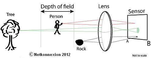
The CoC projected onto the sensor is (notionally) a tiny point of light representing one point of light from the subject. When that part of the subject is in focus the CoC is very small and individually indistinguishable from those around it. Like this it’s a sharp representation of the subject point of light. However, at a point outside the DoF an individual point of light can no longer be represented by a sharp point on the sensor and begins to blend with points around it. It has lost its sharpness. This is because the lens focuses points outside the DoF slightly before the sensor or slightly after it.

Diagram showing various sizes of Circles of Confusion (CoC).

Diagram showing various sizes of Circles of Confusion (CoC) on the sensor sized according to the focus (not to scale). Only CoCs projected from within the Depth of Field are sharp. Our eyes cannot perceive them well as they form sharp points. Ones projected from outside the depth of field are unsharp to our eyes.

Here is the reason why the DoF widens as the aperture gets smaller. When the aperture is small the angle of light that can pass through it from the subject is also small. As a result the CoC for each point of light is relatively small. This is because it can only originate from a small angle of light.

A very small aperture means that the circles of confusion are never big enough for our eye to see. This allows the lens to focus at infinity (say f11 and smaller). When the aperture is wide open the reverse is true. The circles of confusion can be much bigger. Only those rays that the lens will naturally focus will be sharp (a shallow depth of field).

Comments, additions, amendments or ideas on this article? Contact Us
or why not leave a comment at the bottom of the page…

Like this article? Don’t miss the next — sign up for tips by email.

By Damon Guy (author and Photokonnexion editor)

Damon Guy - Netkonnexion

Damon Guy (Netkonnexion)

Damon is a writer-photog and editor of this site. He has run some major websites, a computing department and a digital image library. He started out as a trained teacher and now runs training for digital photographers.
See also: Editors ‘Bio’.

Know how to use a gobo? You have probably used them…

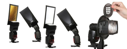
A gobo can be used to fit on off-camera flash units

• A gobo can be used to fit on off-camera flash units •

A simple idea – but so useful!

A gobo is used to block or shape light – normally using black screens of some sort. They’re commonly used in the movie industry, and more recently photography. Find out all about them here…

Of light and shadow

It sounds like a grand and mysterious name. In fact the term gobo is a rather straight forward. Here is what the Oxford English Dictionary (OED) Gobo - Oxford English Dictionary | External link - opens new tab/page says…

gobo, (noun); gobos (plural)
Etymology: Unknown. Originally from the U.S.
1930 – Gobo, portable wall covered with sound-absorbing material.
1936 – A ‘gobo’ is a small black screen used to deflect light.
1970 – A gobo is anything that goes between, e.g., the light and the set.
OED (online) Seen 08/08/2013  External link - opens new tab/page

So, this wonderful little word seems to have been a compound word from “go between”. Hmmm! I would like to see some proof of that. The side entry in the OED says in red “This entry has not yet been fully updated (first published 1972)”. Seems a long time without full qualification.

What is the Gobo really about? Manipulation of light and shadow. Our more technical definition in the Photographic Glossary (gobo) goes into more depth about how it is used in five broad ways in modern photography…

  • To block light or create shapes or patterns of light and shadow together.
  • A mask with a shape cut out of it fixed to the light and used to project a light shape (eg. a logo).
  • Cards/screens to create shaped shadow or deeper shadow in a scene.
  • A jury rigged light modifier on a light to shape or direct the light.
  • A mask placed in the light beam which shapes the light/shadow in the scene.
  • A light modifier allowing some light through and casts a specific shadow or diffusion shape

It is interesting that both the Hollywood studios and the OED use the term to manipulate and absorb sound. Of course in photography sound is less important. You can see however, that gobos are used to shape light and shadow in various ways.

How do gobos affect you?

If you have ever held your hand, a hat or a piece of card up to shade your lens to prevent flare or lens reflection you have used a ‘flag‘. Originally a gobo was the term used for protective devices to keep a lens out of incidental light. Now days the more specialist term, flag, is used for shield or blocking of light especially when it relates to the protection against lens flare. Understandable the two terms are easily mixed up. A flag seems to be used mainly for blocking light out. A gobo more for manipulating light, especially where that involves creating shadows.

Today I was photographing a white van in very bright overhead light. I keep a black blanket in my equipment for this type of situation. My assistant held up the blanket behind me to create a broad shadow across the corner of the van I was photographing to cut out the strong sun light. This is one form of gobo. It was not cutting out the light completely. I was reducing the very bright sunshine to an area of pure white so I could more easily pick out the details.

In a studio you might use a a black screen to intensify the darks in one area of a scene. It is a mood enhancer in this situation.

On another day I was working on business portraits. The office was a bright, but grey colour. We used plants on a trellis with a light behind it to create a shadow-pattern of leaves and diamond shapes onto the wall giving added interest to the background, breaking up the grey. This is a gobo too – being used to enhance the light/shadow ambiance.

More after this…

A solid light of the same colour and intensity across a still life is boring. Use cards or diffusion surfaces to vary the light and create slight shadows or graduate the light. One side of the still life use a black card to darken and block light. On the other side use white card to intensify and diffuse it.

A gobo is often used to shield the camera from light too, but it is not a flag. In A quick shoot using water? Tips to get you started… from yesterdays post a gobo could have been placed in front of a flash unit on the table. This would prevent the light getting directly back to the camera lens, but still project the light onto the back wall. A two in one gobo.

There is one further really fun use of gobos that is growing in photography. The recent growth of interest in light painting has renewed the interest in projecting shapes onto surfaces to be photographed. A black card with a logo or shape cut out of it can be placed directly in front of a light source. The light shining through the shape projects it onto a far surface. Then, in the dark, light painters can photograph the projection. Light painting is the intrepid art of photographing deliberately manipulated bright lights in the dark. It’s great fun!

What have we learned

A gobo is a term that describes the manipulation of the light shadow relationship. We use a range of blocking and masking techniques to manipulate the light and the gobos are the instruments of that manipulation. A flag on the other hand is a pure blocker of light.

Have fun thinking this one over. It is a useful concept and one that has infinite uses for mood, variation of shadow and creating settings.

Comments, additions, amendments or ideas on this article? Contact Us
or why not leave a comment at the bottom of the page…

Like this article? Don’t miss the next — sign up for tips by email.