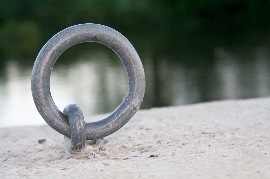
Tag Archives: Composition

Cliché in photography – are you guilty and what to do about it

• Hat Selective •

• Hat Selective •
Click image to view large
Hat Selective By Netkonnexion on Flickr External link - opens new tab/page
It is one of the things we have a go at… selective colour. But, is it really effective?

Clichés are fun but can blow your credibility.

Everyone wants to try some well tried ideas in photography. They help you learn the basics with great examples. Beware, some things have been done so often they are clichéd. It is not wrong to do them. It might be right to keep them to yourself in some situations. Here is some advice about cliché in photography.

Advice

Caring, sharing websites around the web help you get honest, fun and supportive comments made. They are great places where learners can safely post clichés and enjoy doing it. In fact it is a good thing to do. You learn by doing the photos that other people have done, and by example. You get the obvious shots out of your system then move on to more creative photography.

Developing photographers cultivate observational skill helping them get past the cliché. I think the lifetime challenge for a photographer is to see what everyone else failed to see and were amazed they missed. Work to get past the cliché and publish the inspirational.

Photographs create the beautiful and – over generations of picture-taking – use it up. Certain glories of nature… have been all but abandoned to the indefatigable attentions of amateur camera buffs. The image-surfeited are likely to find sunsets corny; they now look, alas, too much like photographs.
Susan Sontag, “On Photography”, London, 1979

In a competition once I heard a judge say… “Ah, N – A – B – S – S!”. He didn’t say what he meant until he encountered the third sunset that evening. Several audience hands shot up to ask. He recounted the story of a judges seminar. They had seen so many sunsets the acronym stuck for “Not Another Bl..dy Sun Set! Taking a sunsets for the sake of it is not an achievement. It is a disappointment – unless something inspirational is included. Sunsets should set the scene, not be the scene.

If you publish a cliché on some websites, or in a personal gallery, you had better watch out for your credibility ratings. What else should we cut out from our online portfolio?

What are these clichés?

Bathroom mirror selfies: Doing “selfies” is fun. They’re examples of things we need to purge from our system. Lets face it most bathroom selfies are boring – of interest mostly to the person making them. Consider doing a mirror selfie in a truly palatial rest room (try the Palace of Versailles, Paris  External link - opens new tab/page).
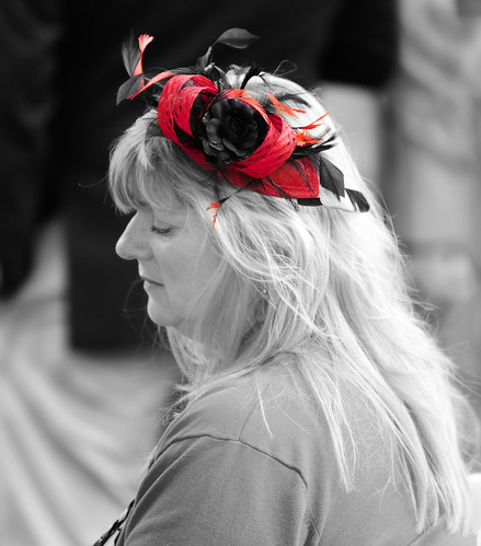
Selective colour: I happen to enjoy some of these. But really, most of them are out of context. It is fine with a clear artistic point. Quite often there is not.
Black and white (B&W): Making a picture B&W does not make it artsy. A naff picture remains naff when converted to B&W. There are some well documented, excellent reasons to use B&W. It can ruin a shot, or doesn’t add anything. Use the technique. I love a contrasty B&W capture. However, make sure it works before publishing. The long history of B&W photos in street photography make a modern B&W look clichéd if done only for effect. It is NOT a “street photography” shot just because it lacks colour. There should be something else there that justifies that approach.
Flower: Your prize bloom is of extreme interest to you and your family. Most other people have seen stunning photos of blooms in magnificent gardens or with exquisite photography. These are the ones that capture the eye. If you have a truly inspired view of your blooms and a top technique, then publish.
“Perspective shots” in tourist spots: We have all seen them – pinch the Eiffel Tower between two fingers, Kiss the Sphinx, catch the sun between your hands; hold up the Leaning Tower of Pisa  External link - opens new tab/page. These are fun. We should all have one in the home album. Online they are definitely a cliché.
Fake lens flare: Flare is great when used to good artistic effect. Faux flare is just a disaster and easily spotted. Do it right with a proper shot or not at all.
Vintage iPhone apps: They’re not great because everyone else does them. Several years ago they were fun and different. Now, I think “Phone apps” look tired and frankly embarrassing. Over done or what!
Naff borders: Powerful borders filled with character, exotic flushes or effects make strong statements. If your picture needs that then it’s probably lacking in some way. Don’t publish it.
Over-saturated HDR: HDR has been vastly overdone. We are beginning to see HDR photographs that are not super-saturated, heavily rimmed and tonally wrecked. That’s good. HDR is a post-processing technique that is beginning to mature. If you use HDR, try it as it should be used, to enhance contrast depth. If you really notice HDR – it has been over cooked!
Your car on holiday: After 1000 pictures of the Grand Canyon the vista is not improved by the presence of your car in the last shot. Great shot for the hard drive. Not one to publish.
Fake gang signs, peace signs, bunny ears and naughty middle fingers: These have been over done. If you find them funny keep them to yourself. Remember, employers often use social network sites to check on prospective employees. Do you want a potential boss checking out your gangster signs and middle fingers shots!
Duck face: The average snapper gets quite a few of these. The silly poser with the pouting smackeroonie kiss lips! Just not good photography.
Making heart-shaped hands at sunset, weddings, engagements: These are usually just embarrassing. If you feel an occasion is romantic there are a multitude of soft focus, colour casts and posing angles that do the job so much better. There are a few other wedding clichés too…

  • Brides garter around the grooms head.
  • Posing to cut your partners throat with the cake knife.
  • Selective colour on confetti, wedding cakes, brides shoes etc.
  • “Bloke shots” – doing silly things in lines, with beer and mock genitals etc.

A few years ago there were thousands of shots of rings standing upright in open books. The ring casts a shadow heart-shape. They are good in the right place – the wedding ring ceremony. Certainly learn about the light/shadow relationship and have a go at a classic. Otherwise it’s an idea with a limited time and place. For examples: Google Image Search = Heart Ring Book  External link - opens new tab/page.

It is not just the amateur

Professional photographers are guilty of creating cliché in their work too. Take two minutes to enjoy this video poking fun at “Stock” photographers.

The Clichéd Stock Photo Song


GerritAndKit

Inspirational is good.

Are there any more of these cliché shots? Yes, hundreds… some websites are filled with nothing but these types of shots. So how do you avoid the mistake?

The cliché is something we can all spot – we’ve seen it so often it’s tiresome. Quietly have a go at the techniques – learn – move on. Don’t infest your online gallery with it. Cliché tends to come and go. In 20 or 30 years the retro effect will re-birth today’s cliches! That’s the time to release ones safely stored on the hard drive.

Your time as a photographer is best spent looking for inspirational images and developing a unique communication with your viewers. You will learn more by ignoring the cliché and working on your unique vision of the world.

Comments, additions, amendments or ideas on this article? Contact Us
or why not leave a comment at the bottom of the page…

Like this article? Don’t miss the next — sign up for tips by email.

Can you write? Of course you can!
Write for Photokonnexion...

We would love to have your articles or tips posted on our site.
Find out more…
Write for Photokonnexion.

By Damon Guy (author and Photokonnexion editor)

Damon Guy - Netkonnexion

Damon Guy (Netkonnexion)

Damon is a writer-photog and editor of this site. He has run some major websites, a computing department and a digital image library. He started out as a trained teacher and now runs training for digital photographers.
See also: Editors ‘Bio’.

Is your composition in photography up to scratch?

Composition in photography :: Image: River Bokeh

• River Bokeh •
There is more to composition in photography than simply placing the subject on a third. The concept of “composing” pulls in many aspects of Photographic work.

Composition in photography – science or art.

Many photographers struggle with composing a picture. Composition in photography seems seems difficult to define. Starting with a few simple ‘rules’ helps. If you want to develop your work you must go beyond the rules and understand some of the other principles in photographic art.

A lifelong adventure

The Definition: Composition (photographic aesthetics) in our Photographic Glossary is up to date and helps to explain the idea of the Elements of photographic art. It would help to read that definition before the rest of this article.

Construction or deconstruction

I have thought about the traditional elements and principles of art for a long time. I find myself dissatisfied with the traditional view with respect to photography.

Composition from a photographers viewpoint is, I think, a different situation to say a painters viewpoint. We could be side-by-side with a painter and both create an image of the scene which is broadly alike. Alternatively we could produce something totally different. They could be worlds apart.

I think there is something different in the approach to a scene for a photographer compared to an artist. A painter constructs a picture from scratch. They can create something that is like the scene they see. They my paint something that differs from that scene so completely it is unrecognisable. Whichever it is, they are able to construct the scene, element by element.

In this “construction” mode an artist has used their knowledge of the “elements of composition” and done an analysis of the scene. Then, using their imagination they put the elements together using the principles of art to create a rounded composition which is aesthetically pleasing, well proportioned, organised and representative of the scene.

A photographer has to approach the scene from a different perspective. The scene has attributes which are elements of art. While the photographer sees the textures, proportions, colours and other elements the way these are used differs to the ‘construction’ work of the artist. A photographer has to take a ‘viewpoint’ in using composition in photography. We look at a scene and are faced with less artistic license in the placement of the elements or how to colour, texture or use them. Instead the photographer has to consider what not to include in the picture – to make it simple. Photographers consider using the natural attributes of the scene to pick out the compositional elements. We use the principles of art. But we consider them in an existing context to create an aesthetic outcome. This is done through our viewpoint of the scene.

In other words, photographers tend to work in a “deconstructive” mode. Simplification and point-of-view are compositional tools. They derive from the principles of photographic art. This helps make it easier to express the desired outcome. But essentially our efforts at composition in photography are about ignoring elements of the scene (leaving them out of the image). And also to emphasise others (or keep them in the frame) in order to develop the message or ‘point’ of the picture.

Complexity

All art is complex. So there is plenty of ways that this analysis can be knocked down by a whole range of “what if” arguments. Nevertheless I feel that photographic art does have this deconstructive approach to a scene compared to other creative arts. To a lesser or greater extent it applies to all scenes. There will be more construction in a still life; less in a landscape. So this is not a simple concept to be applied in all situations.

However complex a scene, however it is approached, the outcome will be unique to the photographer or the artist. It is in this variation and infinite use of interpretation that photography is an art. The use of our knowledge of composition in photography allows an analysis of the scene which may seem like the same analysis made by an artist. I question that the principles of art are the same as the principles of photographic art. I think they are deployed differently.

Think about the contrasting models of the artist and photog. Construction (artist) verses deconstruction (photographer) is one way to bring out how a scene can be approached. This analysis is one more way to think about composition in photography.

Background

You may feel that you need more background on the subject of composition in photography. If you do, here is a slide show to provide some insight into the basics of composition in photography. Please also read the Definition: Composition (photographic aesthetics) and look up the Composition resources on Photokonnexion

Comments, additions, amendments or ideas on this article? Contact Us
or why not leave a comment at the bottom of the page…

By Damon Guy (author and Photokonnexion editor)

Damon Guy - Netkonnexion

Damon Guy (Netkonnexion)

Damon is a writer-photog and editor of this site. He has run some major websites, a computing department and a digital image library. He started out as a trained teacher and now runs training for digital photographers.
See also: Editors ‘Bio’.

Composition for impossible photography

Video

Video

Working in two dimensions is easy.

The trick is to make our photograph look like 3D. Well, Erik Johansson has taken this one step further. He likes to trick the eye with his photography. His subtle constructions in the pictures make you look, think and look again. Most of his pictures are actually impossible. But the images are constructed so as to realise the reality in impossibility.

If that sounds convoluted, so are his pictures. In the video Johansson not only talks around the way he conceived the pictures, be also describes the compositional theory behind them. It’s very simple, but it is also illuminating for our general ideas about perspective and reality.

Enough from me. This short video (6mins.22secs) will fill you with ideas and give you some new perspectives… enjoy!

Erik Johansson: Impossible photography


Filmed Nov 2011 • Posted Feb 2012 • TEDSalon London Fall 2011
TED – Ideas worth spreading  External link - opens new tab/page

Comments, additions, amendments or ideas on this article? Contact Us
or why not leave a comment at the bottom of the page…

By Damon Guy (author and Photokonnexion editor)

Damon Guy - Netkonnexion

Damon Guy (Netkonnexion)

Damon is a writer-photog and editor of this site. He has run some major websites, a computing department and a digital image library. He started out as a trained teacher and now runs training for digital photographers.
See also: Editors ‘Bio’.

find out more...Photokonnexion tips by email
If you enjoyed this article please sign up for our
Tips by email service.
                                                 Find out more

A fast and simple introduction to portrait photography

How to make a digital camera

A rapid but full introduction to portraiture


When I introduce a new idea or a concept in these pages I often provide a video to help put the point across. Well, here is a video that stands up on its own. It is a light and simple introduction to portraiture. It bombs along at a great rate and has plenty to say about good principles in portrait photography. So, without further ado here it is. It’s 4mins 15secs long.

How to take great portrait photos


VideoJug  External link - opens new tab/page
Portraiture – Resources on Photokonnexion.com

Comments, additions, amendments or ideas on this article?
Contact Us
or why not leave a comment at the bottom of the page…

The simplest way to add depth to your pictures

• Young Knights battle at the gates to the castle •

• Young Knights battle at the gates to the castle •
Click image to view large
• Young Knights battle at the gates to the castle • By Netkonnexion on Flickr External link - opens new tab/page
The foreground interest fools the eye into seeing depth. In this case the path line and undulations in the mid-ground also help.

Understanding the power of the foreground…

Is the first step to creating a sense of depth in your pictures. Our eyes use markers like foreground, lines and background to gauge depth in the landscape. If we provide these in a two dimensional picture we fool the eye into seeing depth there too.

Foreground Interest – Video

Bryan Peterson explains in the video how to take a position that brings out the foreground interest. It’s easy. Make sure you shoot past something close when shooting into the scene so you can see a progression of depth… foreground, mid-ground and background. Simple.

adoramaTV  External link - opens new tab/page With Bryan Peterson

Scale

In fact you can use this landscape trick in the studio, or even a small room. Position yourself close to a foreground object and shoot past it into the room or scene. For example, use a chair or a table to occupy a part of the near end of the picture. That gives you a close marker allowing the eye to gauge a distance into the room. Here is an urban shot using the same principle…

Monument

• Monument •
The presence of the coffee cup on the table gives an immediate scale marker to the eye. The rest of the scene has depth because the eye can match the scale differences progressively as it looks into the scene.


The very well known scale of the size of a coffee cup in the picture is the clue to the depth of the rest of the shot. The eye/brain system does the rest. Simple principle – simple composition.

Comments, additions, amendments or ideas on this article? Contact Us
or why not leave a comment at the bottom of the page…

By Damon Guy (author and Photokonnexion editor)

Damon Guy - Netkonnexion

Damon Guy (Netkonnexion)

Damon is a writer-photog and editor of this site. He has run some major websites, a computing department and a digital image library. He started out as a trained teacher and now runs training for digital photographers.
See also: Editors ‘Bio’.

find out more...Photokonnexion tips by email
If you enjoyed this article please sign up for our
Tips by email service.
                                                 Find out more

Seeking the light – the essence of photography through the eyes of a war photographer

Don McCullin - Seeking The Light

Don McCullin – Seeking The Light • Video

Great equipment does not create great images.

Photographic insight is not in the equipment but the vision of the photographer. This is never more true than can be seen in this video. Don McCullin was a war photographer for more than 30 years. He saw some of the most appalling atrocities and covered some of the worlds most horrific wars – conflicts that would sear the sole. Yet in all that time he has retained a human and gentle perspective that provides a delicate insight but which also covers a dark vision too.

Transition

In this video Don McCullin is confronted, in his 70’s, with using a brand new digital camera for the first time. After more than 50 years of film and darkroom work as a professional photographer he abruptly makes the transition to digital. This film charts the progress of his first week. It is a transition which anyone who has started to learn digital photography has gone through. For Don it is a shock and revelation as well as a considerable learning curve. Many of you will empathise with his self-questioning and re-evaluation of his own skills and knowledge.

Canon CPS | Don McCullin Feature “Seeking the light”


Frank Algermissen

Iconic

Despite his gentle and unassuming approach in the video Don McCullin has demonstrated an amazingly insightful photographic vision. His war photography, and his street photography is eye-catching and beautiful. His control of dark tones and wide variations in light is his signature – one that made his war photography iconic.

In a previous article I covered a BBC programme Vivian Maier: Who Took Nanny’s Pictures?  External link - opens new tab/page in the Series “imagine – Summer 2013”. There is now also a wonderful programme on Don McCullin. You can see the recently broadcast BBC programme on the BBC iPlayer if you have access. The programme has some upsetting images and some extraordinary photography covering the ugly truth of war photography in the face of grave personal, life threatening danger. It is an amazing film. “McCullin”  External link - opens new tab/page will be available for another few weeks (published 11/07/2013).

Insights into an extraordinary life

For an insight into a very dark path through war photography, as well as some of his amazing photographs, watch this interview on a Canadian television programme. Don McCullin tells of his extraordinary life, some of the horrific things he has seen and explains who he is today. Well worth watching.
The Agenda with Steve Paikin  External link - opens new tab/page

Comments, additions, amendments or ideas on this article? Contact Us

By Damon Guy (author and Photokonnexion editor)

Damon Guy - Netkonnexion

Damon Guy (Netkonnexion)

Damon is a writer-photog and editor of this site. He has run some major websites, a computing department and a digital image library. He started out as a trained teacher and now runs training for digital photographers.
See also: Editors ‘Bio’.

Give your holiday landscapes a little extra punch

How to make a digital camera

How to make a digital camera

Do something different with your summer shots.

Holiday times always give us a chance to capture a few landscapes. Often they are a more difficult to get right than is appreciated. In fact a little thought can make all the difference. Think about your composition and your colours. The key to a good landscape is to find impact and contrast. In the video below Gavin Hoey shows you two things. First he shows how to think about your composition and colours. Next in the context of colours he shows how to turn your landscape into black and white in Photoshop (actually you can use any full featured image editor to do the same thing).

B&W Landscape Tips


AdoramaTV

Making black and white images

In the video Gavin Hoey made a great point about shooting in RAW. Landscape pictures often look great to the eye when in the field but they lose their appeal when the image is created on-screen. So in order to make your landscape pop some post processing is essential.

This video shows how to bring out contrasts to make the scene look great in black and white. However, he makes an important point about shooting in RAW. You don’t lose the original colour, it is retained in a RAW file. Then you convert to black and white afterwards. This is not possible in *.jpg. That format does not have the colours stored like the RAW format. If your black and white *.jpg is less than successful you lose the colour option too.

Gavin Hoey points out that you should test that your camera will process a RAW file in monochrome mode on its screen, but still leave a full colour RAW file. It is possible your camera converts the RAW file to a *.jpg file in the colour scene mode. So cover your options and try it before going in the field.

Gavin showed the conversion method to black and white using the colour sliders. Most image editors have two basic ways to create monochrome shots. Your shot can be simply colour converted to shades of grey, or you can use the colour slider method where you have some control over the intensity of colour which greys are created from. This latter method gives you much greater control over the contrasts in the picture. When working in monochrome that is the most effective way to ensure the picture has visual impact. So always choose the colour slider method to get better control of the conversion.

There are some additional links below to show how to improve your black and white shots in other ways.

Comments, additions, amendments or ideas on this article? Contact Us

find out more...Photokonnexion tips by email
If you enjoyed this article please sign up for our
Tips by email service.
                                                 Find out more

By Damon Guy (author and Photokonnexion editor)

Damon Guy - Netkonnexion

Damon Guy (Netkonnexion)

Damon is a writer-photog and editor of this site. He has run some major websites, a computing department and a digital image library. He started out as a trained teacher and now runs training for digital photographers.
See also: Editors ‘Bio’.