Tag Archives: Processing

Three creative jump start ideas

Post by Ann H. LeFevre

A creative jump start – get going again.

It happens to all of us at least once. Our creativity runs down and we feel uninspired. Those are the times when our cameras feel like they weigh a thousand pounds and our brains seem like they are stuffed with cotton. There are many ways to combat such a slump. What you need is a creative jump start. Here are three suggestions to help you the next time you come up against that photographic brick wall.

The 30 second game

Pick a room in your home at random to try the first creative jump start. With camera in hand, walk into the room. Select a subject (perhaps the first thing you see) and start shooting. Don’t “think” about it; just do it. Make it quick and no longer than 30 seconds. The idea here is to be loose.
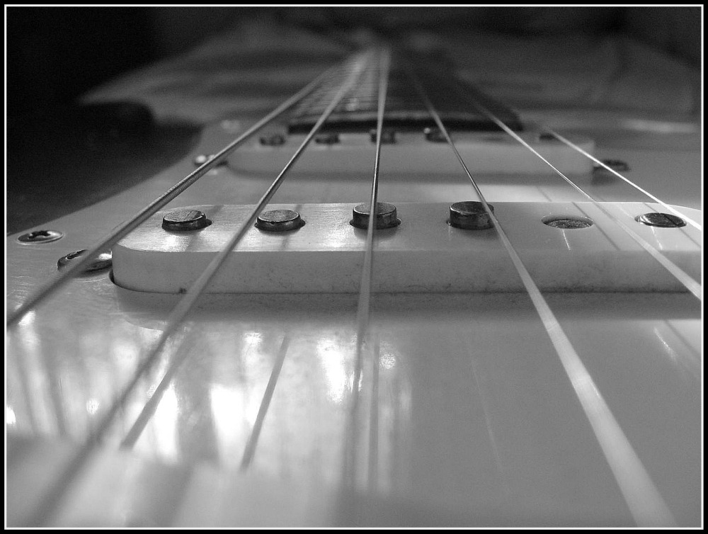
The Strat • By Ann H. LeFevre • Three creative jump start ideas

• The Strat •
By Ann H. LeFevre (Click to view large)


Creativity can be blocked by over-thinking about the “next shot”. This little game helps to bring back some spontaneity into your picture taking.

Take Another Look

We get used to seeing things the way we always see things. In this exercise the object is to take something common, perhaps something you see all the time. Then, to look at it from a different perspective.
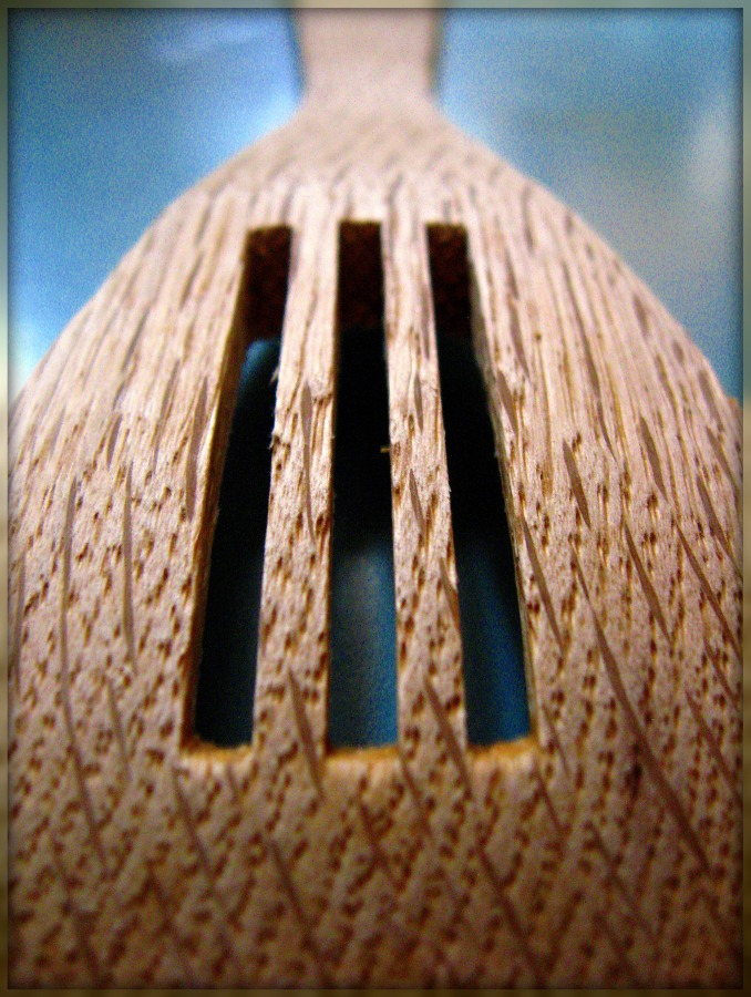
• Wooden Spoon • <br />By Ann H. LeFevre • Three creative jump start ideas

• Wooden Spoon •
By Ann H. LeFevre (Click to view large)


Look at your chosen object from all different angles. Take a shot from each one. Look up. Look down. Look close. Look all around, taking pictures as you go. Looking at a common object from a new vantage point can loosen up the creativity block. A creative jump start works best with a simple views of things.

Play with Processing

Take one of those “Why did I even take this picture?” photos. Make a copy of the original. Put it into your photo processing program and play around with some special effects. Go all out and experiment. Don’t worry about whether or not you’ll actually keep the picture when you’ve finished. Simply spend time playing around on it for as long as you want. Let your processing ideas flow.
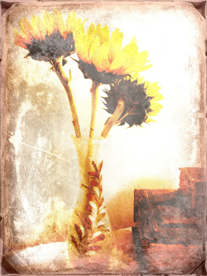
• Sunflowers •<br />By Ann H. LeFevre •  Three creative jump start ideas

• Sunflowers •
By Ann H. LeFevre (Click to view large)


Laugh at what you create. Laughter loosens up your creativity. And who knows? One of those crazy effects may trigger an idea! Processing can also transform an ordinary picture into something that is visually pleasing. Playing with the way a photo looks is a great way to charge up your creativity.

Beyond routine and distraction

Shooting slumps occur because we become anchored to routine or distracted by our busy lives. A creative jump start serves to break those habits and change our perspective. Try one out the next time you’re in a rut and see what happens!

Ann H. LeFevre – contributing author

Ann holds a B.A. in Fine Arts from Bethany College. She is a member of the Pocono Photo Club Pocono Photo Club | External link - opens new tab/page, and participates in the 365 Project Ann H. LeFevre - contributing author on 365Project.org | External link - opens new tab/page an on-line photographic community. She has enjoyed the artistic aspects of photography for many years and enjoys exploring a variety of photographic subjects in her work.

Top ^

Comments, additions, amendments or ideas on this article? Contact Us
or why not leave a comment at the bottom of the page…

Like this article? Don’t miss the next — sign up for tips by email.

Can you write? Of course you can!
Write for Photokonnexion...

We would love to have your articles or tips posted on our site.
Find out more…
Write for Photokonnexion.

Review your own photographs

Low flying aircraft

• Low flying aircraft •
Click image to view large
• Low flying aircraft • By Netkonnexion on Flickr External link - opens new tab/page
Every picture has its merits. However is there enough in the picture to interest and invigorate the attention of your viewers? Sometimes, like this picture, if you don’t have a point worth making then you should not really bother with it.

A picture is a wonderful communication.

But like speech if there’s no point there is no impact. To help you see if you have made a great picture here are some guiding points.

We are going to consider…
• What you are communicating:
• Presentation:
• Camera technique:
• Technical Quality:
• Visual Awareness, Visualisation, Seeing and aesthetics:

Looking critically at your own picture

When you make a picture your previsualisation of what you want to achieve is critical to the outcome. If you don’t know what you are trying to make how can you make it convincing? So try to have a mental image of what your picture it going to look like when you make it. If you can see the image before you make it you should have a good point in mind – a reason for making it. All too often snappers see something and just ‘snap’. That being the case, few of the images will have real meaning or impact.

When looking at your own picture you must see if there is really something there. Are you really saying anything? Are you really communicating with the viewer of your picture? Or, is what you have just made only a simple picture? To have real impact is to create in the viewers mind an image. An image that means something to them. So look at your picture and honestly ask yourself what is the viewer going to get from it? What will it mean to them? If you find that you have really said something in the picture then the first criteria for success has been passed.

To this end you should consider how successfully each of these things has contributed to the success of the image…

  • Personal input: have you understood and connected with the subject
  • Appropriate communication the message, mood, ideas, and information you want to pass to your viewer
  • Complementary use of the photographic media (mounting, projection, printing, texture of print etc.)
  • Appropriate imagination and creativity / suitable timing for the shot
What about the other things?

• Presentation: It is important to have a good presentation for your picture. Have you edited out distractions and sensor/lens spots, removed the errant sweet rapper littering the foreground etc. In other words, have you done the little tidying up tasks that make the image stand up as clean representation of your original vision for it? If it is a print, is it well mounted in a non-distracting way. Is the printing immaculate or are there streaks and spots; over-run and smear.

• Camera technique: Is the sharpness the way you want it – deliberate softness is fine as long as that is making an artistic point in a way you intended. Is the depth of field right for the composition? Have you emphasised the point or simply missed the point. Is the digital noise too high, or the contrast too low. What you are looking for here is to see if your prowess with the camera has come through. Did your technique work or were there any errors or mistakes that detract from the delivery of your point? Some of the other things to consider are…

  • Viewpoint to the subject – exciting, interesting, different, right?
  • Choice of lighting – does it complement or complete the subject or is it at odds with your point?
  • Accurate focusing – accurate choice of focus for the subject.
  • Appropriate quality and choice of exposure.
  • Suitable use of depth of field (aperture).
  • Appropriate shutter speed for the subject (and shot timing).
  • Highlights and shadows (ensuring detail is retained)
  • Appropriate quality and choice of exposure – does the balance of light and dark complement or detract from the subject?
  • Is the quality of the light effective or bland; does is make a statement or is it of little consequence?

• Technical Quality:
In this category you should consider exposure, colour and tonal control…

  • Absence of processing faults (dust, spots, hairs, processing artefacts, image damage by sharpening etc.)
  • Appropriate adjustments of colour temperature; hue, saturation, colour balance etc.
  • Appropriate tonal use and control of the range of tones.
  • Good image finishing: removal of distractions, removal of abrupt or discordant features.
  • Appropriate use of levels, curves, colour management, filters, overlays etc (post processing)

In this category you are looking to make sure that the image is digitally developed properly. Is the exposure even or has it been obviously enhanced and changed. Is the light effective to make the point or has the exposure not been fine tuned. It is easy to take a picture, but all these thing go into making an image. Think about what you are trying to achieve and does this picture achieve it with its colour and technical delivery/

• Visual Awareness, Visualisation, Seeing and aesthetics:
Do you think that your shot, the one you have in front of you sees anything different? Are you reporting what you saw or expressing a point, message, communication, feeling… does this picture have IMPACT?

  • Is the composition, design and cropping of the image an effective aesthetic construction?
  • Appropriate simplification (minimising complexity and clutter)
  • Distractions / intrusions should not divert the viewers eye
  • Good use of light, mood, texture and colour
  • Good use of masking/manipulation where appropriate
What you are doing…

Each time you want others to look at your picture you want to impress them, to lift them, to… well, get out your message or point for the picture. The type of questions I have asked above are aimed at getting you looking at your images with a critical eye. If you are honest, you will find that none of your pictures will be satisfactory in all of the above. But if you find you are gradually improving your standard of delivery you will see that the above get closer to ideal with every new picture. Critically reviewing each picture before you publish print or show it to other people helps make sure you are producing something worth showing.

You won’t be right every time. But you will see as you develop, your comments will begin matching those of other people. You will than have a benchmark that tells you if your work is measuring up to peoples view of it. Or, more importantly to see if your picture is measuring up to your original vision of how you wanted the shot.

Comments, additions, amendments or ideas on this article? Contact Us
or why not leave a comment at the bottom of the page…

Like this article? Don’t miss the next — sign up for tips by email.

By Damon Guy (author and Photokonnexion editor)

Damon Guy - Netkonnexion

Damon Guy (Netkonnexion)

Damon is a writer-photog and editor of this site. He has run some major websites, a computing department and a digital image library. He started out as a trained teacher and now runs training for digital photographers.
See also: Editors ‘Bio’.

Simple ways to add contrast to your black and white images

Changing colour images to B&W often has surprising results.

You may not get what you expected. Often this is because the contrast in colour shots is quite low. B&W conversion requires contrast to work well. This is how you can increase the contrast…

Wolf - the range of black and white tones can really add to the dramatic impact

Wolf – the range of black and white tones can really ad to the dramatic impact.
Click image to view large.
Wolf – By Netkonnexion on Flickr External link - opens new tab/page

The objective

We are trying to increase the range of greyscale tones in the picture. Grey is a fickle colour – it fades from tone to tone almost unnoticed. In a high contrast shot we want to stretch the grey and express tones from deep blacks to whitest whites. This is something we avoid in colour because deep black or blown-out white is a distraction. In black and white they can be too, but if well controlled the balance helps emphasise the pictures’ strong elements. So we must add the contrast. That can be done by applying one or more techniques in post-processing:

  1. Add deeper tones to the darker areas, whites to the lighter areas
  2. Create darker/lighter tones over the whole image – moody effect
  3. Use an overlay technique to apply contrast

I am not going to go into depth with these. Just some simple ideas.

Add deeper tones to the darker areas, whites to the lighter areas
This is essentially a manual technique. Using photoshop or a similar editor, you need to activate the ‘burn’ tool. Originally burning was a way of making film processing darken the print. In digital editing it spreads a soot-like effect where applied. Normally you can just paint it on. Set it so the ‘exposure’ level is low and set for ‘shadow’ in the settings. Then paint away. You will darken the dark shadows without darkening the lighter areas. Higher exposure will darken more. If you set for ‘highlights’ you will be able to paint out whites – great for toning down strong white burn!

You can do the same for whites with the ‘Dodge’ tool. Select ‘highlights’ and a low ‘exposure’ then paint over bright areas and they will brighten slightly. Higher exposures brighten more. Set the tool for shadow and you can lighten darker areas.

In both tools ‘mid-tone’ will brighten or darken the mid-range tones depending on which tool you are using.

Create darker tones over the whole image – moody effect

You can use a ‘contrast’ control in most image editors to affect the lightness and darkness proportions across the image. However, too much of this control tends to give sickly greys an outing. Faces especially look ill if you apply too much of the contrast control.

In most image editors there is usually a ‘gamma’ control somewhere. This uniformly affects the blacks right across the image. Often the toning down of blacks is enough to shift the image to the moody or dramatic side. Gamma gives you great control over this. So look up in your help files how to adjust your Gamma.

In Photoshop the control is in the exposure adjustments panel. If you have not got gamma control in your editor you can use it in Irfanview (free download). Irfanview has a great gamma control. You can find both gamma and contrast with other colour controls in the menus. Go to Image; Colour Corrections… The dialoge box there is worth playing around with.

Gamma is not so good for adding brightness, but in small measure it is OK. So you can either whiten or darken the image using the gamma setting. It actually is great for toning down all sorts of white errors.

Use an overlay technique to apply contrast

In the image editing applications that use layers and overlay there are literally hundreds of ways to adjust contrasts. I have seen one ‘grunge’ technique use 16 layers and 35 steps to create a contrast-widening effect. While grunge is a popular look in image processing it is an artistic process that you really need to practice a lot before it is effective. And, like many processes can be overdone. So, to help you out I have researched the technique below. It is quick and easy. It is possible in several of the full blown applications for image editing. Best of all it takes a few seconds to apply and you can see the results straight away. So watch this short video and I bet you will be itching to have a go…

Uploaded by Larry Lourcey on Dec 16, 2010 http://www.PhotoEducationOnline.com

An important note…

Remember that all of these techniques work better in RAW. Attempting to use them in .jpg is a lost cause and may just look a mess. Although, to be fair, that does depend on the image. Take my advice and shoot in RAW. For 99.8% of the time the results will be better after processing. Remember not to do post processing on your only image. Keep an original and only work on copies.

Five warning signs that your photo should not be posted online

Some photographs are not impressive.

You feel proud of them. You want to get them posted straight away. Unfortunately, not every photo is suitable to put online. Concentrate on getting your best shots up there. Here are five ways to think about the posting decision.

Fast tracking is a disaster!

Beware the quick snap. I have rarely seen anyone make a great shot from an instant snap. Sure, journalists and professional photographers seem to be able to do it. They have a vast experience of shooting in difficult situations. They are more accurate, frame better and shoot faster than the average hobby photographer. For other photographers careful shooting is essential. After the shot, to just download and post will be to compound any errors you make. If you want your photos to have impact then think about every part of the shot through to final posting. Every detail will affect the quality of your final result. Rush it and you may as well flush it!

Is there anything there?

Before you post a picture do one thing. Ask yourself, “is there anything there”? This simple question will tell you – if you’re truthful – if the shot is worth posting. You must look with care to see if there is something in the photograph that will make your viewers sit up and pay attention to your shot. Is it pretty? Is it emotive? Will it draw them in? Will they stare into the picture transfixed? In your heart, as a photographer, you will know the answer to that question. If your shot does not have ‘something’ there… reconsider!

Is it technically good enough?

Look at your shot. Is it really sharp enough? Some things may not need to be sharp, but are they expressing the right thing? Or, are they expressing anything? If the technique fails, the point of the picture is often lost. The interest in a shot is often a fine balance – if something distracts the balance is tipped the wrong way. Softness, bright spots, clutter… whatever is causing the fault will cause the shot to fail. Discard the technically poor shots.

Is it artistically effective?

This is difficult. We may completely disagree on the artistic success of a shot. You be the judge. Think carefully about your style. Do it your way. Express it your way. Just make sure that it meets or exceeds the standard you have attained. Each picture you publish should make your artistic point slightly better than the last. Edit your shots so they say exactly what you want them to say. If your shot does not say it – then don’t post it. If your image ‘sort-of’ says it, then don’t publish. You have a duty to your photography to express yourself. Make that expression as clear and effective as you know how. A confused or weak message will be lost and that is a photo you should not publish.

Do you love it?

If the answer to that is “YES, IT’S THE BEST THING SINCE THE WHEEL WAS INVENTED” then don’t publish it. You are probably drunk or suffering from an extreme case of authors pride. We have all been there. Walk away from it. Leave it 24 hours. Get a grip. It may well be the best picture you have ever made. If that is true then you will be able to savour it like a fine wine. You will be able let it breath in the processing so it is improved for the final posting. A picture as good as that deserves to become a vintage. And, you will be able to better able to judge it (and process it) when you have become less heady about it. Then again, you may find it was all a dreadful mistake and it should never see the light of day again! When you are suffering from authors pride you cannot make that judgement. Take the time for your editing head to catch up before you publish. Try to establish a new personal best every time you post. To achieve that work with a reasoned, objective judgement in mind.

A thought on improvement

Our improvement journey as photographers needs to be validated. It is difficult, if not impossible, to improve without people giving us feedback. This short essay is intended to help people accomodate principles in thier workflow that help them to take a personal and critical look at each post. Take time, consider your work, do your best. If your post is not ‘perfect’ it is because we need to aspire to improve. If you have tried your best then put it out there. The feedback you get will help you exceed your best next time. Improving as artists and photographers is an incremental journey. We cannot jump to perfection. Every artist in history has risked revealing their latest work knowing it is not perfect. Self-doubt helps us move forward. We can only seek to improve and to provide some pictorial pleasure for others along the way.

I hope that helps you take a step back and look at your images before shooting and especially before posting. Your photography will be all the better for it if you watch these points.

Converting your image to black and white

The mill on the Rye. Taken in a local park this mill presented a wonderful opportunity to capture the early morning sunlight. However, I think it might look good in black and white. Nice contrasty subject matter makes a good conversion.

The mill on the Rye. Taken in a local park this mill presented a wonderful opportunity to capture the early morning sunlight. However, I think it might look good in black and white. Nice contrasty subject matter makes a good conversion.

Converting properly to black and white gives you greater control

I argued previously that you should not photograph your pictures in black and white. While you might get a credible picture it is not necessarily going to yield the best result. In my experience black and white, as processed by the camera, tends to be flat and lifeless. So how should you do it?

First look to your shot

Not every shot will work best in black and white (B&W). Some shots look flat and lifeless regardless of how you treat them. To get a good B&W shot try to look for pictures where the tones vary widely. Big contrasts in the colour and the texture of a subject will show big differences in the B&W ranges. Some colours convert better than others too.

The second point to look for is to shoot in RAW. If you are shooting with *.jpg files you will restrict the ability to post-process your shot effectively afterwards. The whole point of shooting in colour and converting to B&W is that you are able to fully manipulate the process to draw out the best that B&W can offer. RAW provides the depth of tones with which you can do that.

The conversion to Black and White

Converting to B&W is not difficult. However, you need to know the most effective process. In most editing applications there are two methods. These are…

Desaturation:
Photoshop: [ Click – Image menu | Adjustments | Desaturate ] Or [ Hold down Shift + Control + U ]
All colours resolve to a grey colour if mixed correctly with another colour. The tendency to create a grey from a specific colour is to desaturate it. However, all colours will resolve into the same grey if it were not for variations in brightness/lightness. The standard desaturation option in image editors is a program for reducing the colours to greys leaving the variations in brightness to create the grey tones. The ‘Desaturate’ option is limited. It does the same as a camera when shooting in black and white. Using this option you have no control over the conversion.

Adjustment:
Photoshop: [ Click – Image Layer | New Adjustment Layer | Black & White ]
This option allows you full control over the colour brightness before the conversion to grey. As the brightness determines the grey tones this gives you the opportunity to vary the intensity of the grey in the final conversion. In Adobe PhotoShop you are presented with a dialogue box that provides a slider for each available colour. As you slide them back and forth you will see the grey tones change. These changes are what allows you to adjust the strength and depth of the blacks and whites in your picture. The adjustment brings out subtle variations to emphasis the depth and three dimensionality of the picture. In addition, colours, tones and brightness/lightness varies for every picture. Using the sliders you will be able to adjust these variables to suite your scene. This is something your camera or your ‘Desaturate’ option cannot do. As a result you will be able to create a subtle variation that brings out the best in your picture.

Although I have used Adobe PhotoShop as the example here most applications have two options for the creation of B&W pictures. You can access your help files to see which you want. The most effective is the adjustment option – so look for a term that describes that sort of control.

To see what the difference is between the methods I include two B&W conversions of the picture above. The first uses the ‘Desaturate’ version…

The Mill on the Rye - Desaturated version. Not bad, but a little flat

The Mill on the Rye – Desaturated version. Not bad, but a little flat


The second picture uses the ‘Adjustment’ method. The colours have been adjusted to create a greater contrast in the black and white range of the picture. This gives a better grey tonality and creates a greater sense of depth in the picture…
The Mill on the Rye - created using the 'Adjustment' process for converting to black and white.

The Mill on the Rye – created using the ‘Adjustment’ process for converting to black and white. There is a greater range of tones.

Getting Started With Cloning

Vulture Landing - not a bad photo; some final adjustments are required

Vulture Landing – not a bad photo; some final adjustments are required. A little cloning work needed to tidy up loose ends. Click to view large.

Cloning allows you to clear up small problems – here’s how

Every picture starts its life with the composition. Once you have composed you take the shot. In those two simple actions is a world of experience and knowledge. It does not finish there – there is a third stage – post-processing (or just processing). Simplicity in your image is one of the keys to good photography. Often to achieve simplicity you need to remove unwanted elements of the picture. This is where cloning comes into play. In what follows I am going to look at simple cloning techniques using my photograph above.

Removing stuff

In this post we will concentrate on an essential technique… that of cloning in small strokes or spots. The essential element of any cloning job is the copying of the texture/pattern/colour (whatever) at the source point onto the destination point. The destination point is where you are hoping to remove something. Here is the first picture. It is an enlargement of the legs on the main image at the top of this article. The aim of this cloning work is to remove the leg harness from the bird.

The problem... an enlarged view shows the offending leg harness.

The problem… an enlarged view shows the offending leg harness.

Two simple points of technique underlie about 75% of the work of cloning. First the spot technique.

The success of cloning usually depends on collecting the source texture or pattern from near to the destination point. This is because there is a better chance that the colours, textures and patterns are going to match if they come from close to each other.


Lets get started

First, set up the source point. How the source point is selected depends on the application you are using. You will need to check the instructions. The idea is that there will be a cursor icon for sensing the source and a painting icon for where the cloning will be done. In the next picture you can see how I have cloned a little from the harness from the surrounding area. The round icon is the painting tool, the cross-hair is the source tool. As you move the painting tool the cross-hair moves with it.

To replicate textures, use near-by similar surfaces

You will see that I have done some cloning in two places. The cursor is currently cloning over the area of the harness, collecting the source from the surrounding green bokeh.

Placing your clone tool sensor

You can place the sensor cursor at any angle or distance to the painter cursor. You will see if you look carefully, that I have also done some cloning on the leg. Part of the harness has been removed there. You will notice that the leg has a scaly texture. I had to work close to the harness with the cross-hairs north of the area I was cloning. This allows me to pick up the texture and deposit it on the harness area. If you run over the same area as you have just cloned you get a repeating pattern. So, use short strokes. Change the sensor cross-hairs after each stroke or spot you clone.

The source point can be anywhere. In this image I have shown the positions I took the clone from for the leg and the harness part off the leg.

The source point can be anywhere. The image shows the positions for the clone from the leg texture and the harness part sticking out from the leg.

Three common problems

When just starting it is easy to just clone away until the job is done. However, when you stand back there are frequently three things wrong – lines are not straight any more; repeating patterns show up; big clone spots show up. To counter all three of these errors it is best to work in very close to the area you are working on. Make tiny changes each stroke. They are less likely to be noticed. They blend in together better and have less impact on the picture as a whole.

As you can see from the black icons in the image the painting circle is very close to the leg edge. To get lines back you have to work with the edge of the circle, as I have done here. Just skim it along the line to straighten it from one side. Then, working from the other side (in this case on the leg) work that side too. Work from side to side. Gently skim it into a straight line. Keep working until you are satisfied your work will not be noticed when you zoom out. Here is the finished leg.

Now the tools are out of the way, you can see how the lines, shades, textures and colours are all blended and maintained.

Now the tools are out of the way, you can see how the lines, shades, textures and colours are all blended and maintained.

Working zoomed-in is critical

One of the easy mistakes to make is to do your cloning large, at the image normal size. If you look carefully at the leg you will see that, even zoomed out, you can see some texture and areas of darker and lighter shading. However, you cannot see the detail of the cloning spots/strokes. If you work at normal image size you will find it very difficult to replicate those shades, tones and textures. They are delicate and subtle. But life is delicate and subtle. If you want it to look realistic you have to put those subtle differences in. Working in a highly zoomed state allows you to do that.

If you click here  External link - opens new tab/page, you can see the finished full sized image on a new page. Look carefully. The slight colour variations and texture changes look natural and fit in well. The variations are poorly integrated, clumsy and unrealistic if you work in at 100% image size.

What we have covered
  • Make Small changes. They are less likely to be noticed. Also, work zoomed in and with small tool sizes. They blend in better and have less impact on the picture as a whole.
  • A pattern/texture source close to the clone destination is more likely to match than distant sources.
  • A continuous clone stroke will be noticed. Work with small spots and short strokes changing your clone source frequently.
  • Avoid running over an area you have cloned already with your sensor. It creates highly visible repeating patterns.
  • When working with lines/edges skim them gently from both sides until straight.

If this all sounds like quite a lot of time consuming work… well, it is. As you can see it is worth it. A good image improved in a natural way. And, like all your photography skills, it takes time and practice. It is fun and absorbing however, so enjoy your processing!

Useful links after the jump…

Irfanview – A free image viewer and basic image editor.

GIMP  External link - opens new tab/page – a full featured, open source, free image editor – download and install.

Photoshop (by Adobe) – Adobe Photoshop CS6 (PC) External link - opens new tab/page – Industry standard post-processing professional software

Adobe Lightroom – Adobe Lightroom 4.0 (Mac/PC) External link - opens new tab/page – Professional photographers workflow and post-processing software

Adobe Elements – Adobe Photoshop Elements 10 (PC/Mac) External link - opens new tab/page
– Powerful editing system for amateur/semi-professional photographers.

Google listing for ‘online image editor External link - opens new tab/page

Damon Guy - Netkonnexion

Damon Guy (Netkonnexion)

Damon is a writer-photog and editor of this site. He has run some major websites, a computing department and a digital image library. He started out as a trained teacher and now runs training for digital photographers.
See also: Editors ‘Bio’.

Processing Your Images… New Resources

New resources dedicated to processing images now online

We have been preparing for doing more posts about processing images in the future. To make it easier to find these resources on post-production techniques we have prepared a resource page on processing. You can find it here…
Post Processing Images.

Also online today is an interesting new entry in our Photographic Glossary on Cloning…
Definition: Cloning; To Clone; Cloned; Clone Tool;

Tomorrow the post will be on cloning techniques. Be sure to check back for that!

By Damon Guy (author and Photokonnexion editor)

Damon Guy - Netkonnexion

Damon Guy (Netkonnexion)

Damon is a writer-photog and editor of this site. He has run some major websites, a computing department and a digital image library. He started out as a trained teacher and now runs training for digital photographers.
See also: Editors ‘Bio’.

Contribute A Definition?

Send us a definition of a photographic word or phrase...

Send us a definition for our list of photographic words and phrases. Simply write a clear definition and send it in. Include an original picture if you wish. Give us your name and a link to your website and we will credit your work.