Tag Archives: Black and white

Rare black and white pictures – great examples

Rare historical pictures in black and white

• Rare historical pictures in black and white •
Great pictures go beyond the capturing of great events…
These are excellent examples of monochrome photography too.
[Image from the slide presentation]

Quality black and white photography is an art.

Early photography taught us there is more to an image than conveyed by colour. Black and white Photography can be emotionally powerful and visually satisfying. Sometimes colour reduces that impact.

Why is there so much impact in black and white?

The use of colour has seduced the eyes of the users of modern media and screens. The realism is amazing and the quality excellent. What people forget is that colour can reduce your awareness to the meaning in a picture. It is all too easy to lose the impact of a story when the picture is so vivid.

The underlying impact of an image is more powerful with simple presentation. Black and white or monochrome images simplify the message beautifully. They create a stark reality in an image. That reduces distractions and focusses the eye on the story.

This is a great lesson for modern photographers. Reduce the image down to a simple, powerful message. Make sure it also has great visual impact. Add a great story and you have captured the attention of the viewer.

What makes black and white visually powerful?

Here are some things to consider when thinking about making a black and white image…

  • Try to use a wide contrast range from darkest blacks to whitest whites.
  • Make sure that the darkest and brightest areas of the picture are not too large or they will distract from the greyscale in between.
  • Try to ensure there is a good spread of different greys between the darkest and brightest.
  • Using only deepest black or whitest white will tend to be too harsh for the eye except where there is a good pattern for the eye to follow.
  • Harsh shadows from hard light will distract the eye. Look to use soft light and graduated shadows.
  • Try to include as much detail as possible to bring out the subject of the image.
  • Work hard to bring out textures. This will throw up the subject without distracting the eye. It will help develop depth too.
  • Be especially sensitive to layers in the image (foreground, mid-ground and distance). Low levels of texture and poor layering will make the image look flat and lifeless.
Some great examples of successful black and white images

As you go through the great images in the slide show below consider the points above. You will find food for thought for your own black and white images.

Want to see regular historical black and white images?

As a lover of black and white pictures I signed up to Retronaut  External link - opens new tab/page. This great site is not exclusively about black and white images, but most of the historical material there is of that type. I get a daily email with some great images. It’s pretty instructive because black and white images are a personal interest. Why not give it a try? Enjoy.

Comments, additions, amendments or ideas on this article? Contact Us
or why not leave a comment at the bottom of the page…

Like this article? Don’t miss the next — sign up for tips by email.

Netkonnexion

Damon Guy (Netkonnexion)

Damon is managing editor of Photokonnexion.com with professional experience in photography, writing, image libraries, and computing. He is also an experienced, webmaster and a trained teacher. Damon runs regular training for digital photographers who are just starting out.
See also: Editors ‘Bio’
By Damon Guy :: Profile on Google+

Ansel Adams – Master Photographer

Ansel Adams Video

• Ansel Adams BBC Master Photographers (1983 •
Ansel Adams speaks about his photography and his development.
Picture taken from the video.

Exquisite insights to a legend.

The videos I show are usually for you to quickly watch and learn. This one’s different. It’s longer (34 mins.). And, there is so much in it that you will want to watch it over and over again. The wonderful insights run deep and some show us how much photography has changed.

Ansel Adams’ ideas, photographic insights and depth of feeling is magnetic. He was probably one of the first philosophers of photography. He was one of the undoubted masters too. I hope you enjoy this video as much as I did.

Ansel Adams – “BBC Master Photographers” (1983)

Uploaded by: Rob Hooley External link - opens new tab/page

Can you write? Of course you can!
Write for Photokonnexion...

We would love to have your articles or tips posted on our site.
Find out more…
Write for Photokonnexion.

By Damon Guy (author and Photokonnexion editor)

Damon Guy - Netkonnexion

Damon Guy (Netkonnexion)

Damon is a writer-photog and editor of this site. He has run some major websites, a computing department and a digital image library. He started out as a trained teacher and now runs training for digital photographers.
See also: Editors ‘Bio’.

Cliché in photography – are you guilty and what to do about it

• Hat Selective •

• Hat Selective •
Click image to view large
Hat Selective By Netkonnexion on Flickr External link - opens new tab/page
It is one of the things we have a go at… selective colour. But, is it really effective?

Clichés are fun but can blow your credibility.

Everyone wants to try some well tried ideas in photography. They help you learn the basics with great examples. Beware, some things have been done so often they are clichéd. It is not wrong to do them. It might be right to keep them to yourself in some situations. Here is some advice about cliché in photography.

Advice

Caring, sharing websites around the web help you get honest, fun and supportive comments made. They are great places where learners can safely post clichés and enjoy doing it. In fact it is a good thing to do. You learn by doing the photos that other people have done, and by example. You get the obvious shots out of your system then move on to more creative photography.

Developing photographers cultivate observational skill helping them get past the cliché. I think the lifetime challenge for a photographer is to see what everyone else failed to see and were amazed they missed. Work to get past the cliché and publish the inspirational.

Photographs create the beautiful and – over generations of picture-taking – use it up. Certain glories of nature… have been all but abandoned to the indefatigable attentions of amateur camera buffs. The image-surfeited are likely to find sunsets corny; they now look, alas, too much like photographs.
Susan Sontag, “On Photography”, London, 1979

In a competition once I heard a judge say… “Ah, N – A – B – S – S!”. He didn’t say what he meant until he encountered the third sunset that evening. Several audience hands shot up to ask. He recounted the story of a judges seminar. They had seen so many sunsets the acronym stuck for “Not Another Bl..dy Sun Set! Taking a sunsets for the sake of it is not an achievement. It is a disappointment – unless something inspirational is included. Sunsets should set the scene, not be the scene.

If you publish a cliché on some websites, or in a personal gallery, you had better watch out for your credibility ratings. What else should we cut out from our online portfolio?

What are these clichés?

Bathroom mirror selfies: Doing “selfies” is fun. They’re examples of things we need to purge from our system. Lets face it most bathroom selfies are boring – of interest mostly to the person making them. Consider doing a mirror selfie in a truly palatial rest room (try the Palace of Versailles, Paris  External link - opens new tab/page).
Selective colour: I happen to enjoy some of these. But really, most of them are out of context. It is fine with a clear artistic point. Quite often there is not.
Black and white (B&W): Making a picture B&W does not make it artsy. A naff picture remains naff when converted to B&W. There are some well documented, excellent reasons to use B&W. It can ruin a shot, or doesn’t add anything. Use the technique. I love a contrasty B&W capture. However, make sure it works before publishing. The long history of B&W photos in street photography make a modern B&W look clichéd if done only for effect. It is NOT a “street photography” shot just because it lacks colour. There should be something else there that justifies that approach.
Flower: Your prize bloom is of extreme interest to you and your family. Most other people have seen stunning photos of blooms in magnificent gardens or with exquisite photography. These are the ones that capture the eye. If you have a truly inspired view of your blooms and a top technique, then publish.
“Perspective shots” in tourist spots: We have all seen them – pinch the Eiffel Tower between two fingers, Kiss the Sphinx, catch the sun between your hands; hold up the Leaning Tower of Pisa  External link - opens new tab/page. These are fun. We should all have one in the home album. Online they are definitely a cliché.
Fake lens flare: Flare is great when used to good artistic effect. Faux flare is just a disaster and easily spotted. Do it right with a proper shot or not at all.
Vintage iPhone apps: They’re not great because everyone else does them. Several years ago they were fun and different. Now, I think “Phone apps” look tired and frankly embarrassing. Over done or what!
Naff borders: Powerful borders filled with character, exotic flushes or effects make strong statements. If your picture needs that then it’s probably lacking in some way. Don’t publish it.
Over-saturated HDR: HDR has been vastly overdone. We are beginning to see HDR photographs that are not super-saturated, heavily rimmed and tonally wrecked. That’s good. HDR is a post-processing technique that is beginning to mature. If you use HDR, try it as it should be used, to enhance contrast depth. If you really notice HDR – it has been over cooked!
Your car on holiday: After 1000 pictures of the Grand Canyon the vista is not improved by the presence of your car in the last shot. Great shot for the hard drive. Not one to publish.
Fake gang signs, peace signs, bunny ears and naughty middle fingers: These have been over done. If you find them funny keep them to yourself. Remember, employers often use social network sites to check on prospective employees. Do you want a potential boss checking out your gangster signs and middle fingers shots!
Duck face: The average snapper gets quite a few of these. The silly poser with the pouting smackeroonie kiss lips! Just not good photography.
Making heart-shaped hands at sunset, weddings, engagements: These are usually just embarrassing. If you feel an occasion is romantic there are a multitude of soft focus, colour casts and posing angles that do the job so much better. There are a few other wedding clichés too…

  • Brides garter around the grooms head.
  • Posing to cut your partners throat with the cake knife.
  • Selective colour on confetti, wedding cakes, brides shoes etc.
  • “Bloke shots” – doing silly things in lines, with beer and mock genitals etc.

A few years ago there were thousands of shots of rings standing upright in open books. The ring casts a shadow heart-shape. They are good in the right place – the wedding ring ceremony. Certainly learn about the light/shadow relationship and have a go at a classic. Otherwise it’s an idea with a limited time and place. For examples: Google Image Search = Heart Ring Book  External link - opens new tab/page.

It is not just the amateur

Professional photographers are guilty of creating cliché in their work too. Take two minutes to enjoy this video poking fun at “Stock” photographers.

The Clichéd Stock Photo Song


GerritAndKit

Inspirational is good.

Are there any more of these cliché shots? Yes, hundreds… some websites are filled with nothing but these types of shots. So how do you avoid the mistake?

The cliché is something we can all spot – we’ve seen it so often it’s tiresome. Quietly have a go at the techniques – learn – move on. Don’t infest your online gallery with it. Cliché tends to come and go. In 20 or 30 years the retro effect will re-birth today’s cliches! That’s the time to release ones safely stored on the hard drive.

Your time as a photographer is best spent looking for inspirational images and developing a unique communication with your viewers. You will learn more by ignoring the cliché and working on your unique vision of the world.

Comments, additions, amendments or ideas on this article? Contact Us
or why not leave a comment at the bottom of the page…

Like this article? Don’t miss the next — sign up for tips by email.

Can you write? Of course you can!
Write for Photokonnexion...

We would love to have your articles or tips posted on our site.
Find out more…
Write for Photokonnexion.

By Damon Guy (author and Photokonnexion editor)

Damon Guy - Netkonnexion

Damon Guy (Netkonnexion)

Damon is a writer-photog and editor of this site. He has run some major websites, a computing department and a digital image library. He started out as a trained teacher and now runs training for digital photographers.
See also: Editors ‘Bio’.

Do you know what street photography is? A look behind the scenes

• Lady in black •

Click image to view large
• Lady in black • By Netkonnexion on Flickr External link - opens new tab/page
The street photographer looks to expose life as it is on our streets and much more…

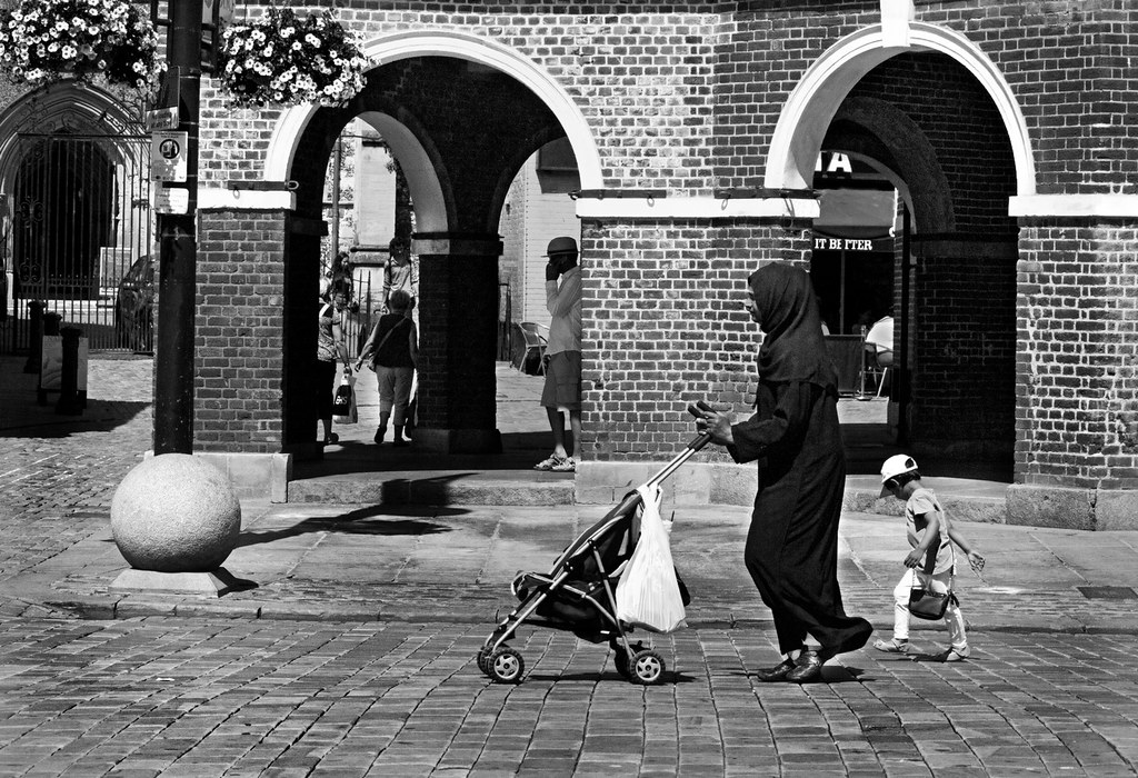
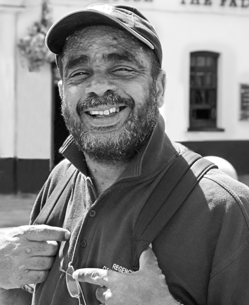
What do we really mean by street photography?

The concept of street photography covers a lot of ground and means many different things to the people who do it. Simple descriptions of street photography might include things like:

  • Candid photographs taken in public places
  • Portraits and depictions of ordinary people out and about
  • Pictures telling the stories of people living their lives
  • The normal behaviour of individuals seen in public
  • Extraordinary scenes in ordinary places
  • The street environment with or without people
  • Things which catch the eye photographed in public places
  • Extraordinary sights amid people going about their daily lives
  • A micro-social documentary through a still photograph
  • The drama of an event in the every day lives of people on the street

Street photography is a broad spectrum subject. Mostly, street photography is about the sights and significant micro-events that attract the eye of the photographer in urban places or other popular places. The idea of “street” means where people can be seen. Or, where they “may” be seen. It is not absolutely necessary to have people in the scene. Although people usually provide the focus of interest.

In fact, beyond these simple descriptions of the craft there are other things. The need to have sympathetic framing, simple backgrounds, good composition and excellent timing go without saying – these are a part of photography in general. Beyond those there are other themes underlying the term “street photography”…

The environment

The ‘street” environment is as important as the people themselves in that it provides a context. The environment and the people together makes the scene interesting. Background provides the cultural context for the shot and so it is important to include it. Nevertheless, many street photographers will work to minimise the impact of the surrounding scene so they can focus the viewers eye on the behaviour of the people of interest. The choice to show the wider scene or to focus right in is both an aesthetic one and a contextual one. You have to consider what would make the picture as visually pleasing as possible and at the same time make sure you are able to show the subject in the best possible environmental context. Difficult choice – but an essential part of working the street scene.

Because the environment is important street photographers often prefer to work with lenses that give a wider angle than other DSLR users favour. A wider view captures the scene as well as the subject person. A common lens for street photogs would be a 35mm or 50mm fixed prime. These lenses tend to give you a more immediate correspondence with the scene you are in. They are close to the focal range and angle of view that the eye sees. They reduce distortion and give the impression of the scene through the photographers eyes. Street photography is a unique and real experience for the photographer. The best of them try to convey that experience in a very real way to the viewer too.

Black and white or colour

Most of the well known names in street photography worked with black and white film. Perhaps for this reason today’s street photographers tend to work in black and white too. It emulates an era of the past with a stark reality and a retro-cultural look about it.

Some street photographers dispute the (cynical) view that black and white is the medium of choice because it promotes a ‘retro’ atmosphere and see that as an insult, a cheapening view of their work. Instead they’d argue B&W street pictures have more impact.

It has often been argued that when you take colour out of a photograph it almost purifies the picture. Certainly much of the distraction is taken out. Colour does draw the eye. A Canadian photojournalist was once quoted saying…

“When you photograph people in colour, you photograph their clothes. But when you photograph people in Black and white, you photograph their souls!”
Ted Grant

There is much to be said for removing colour to see the inner person. However, it is not obligatory to work in black and white for street photographers. Your choice is part of the way you present the scene you are photographing. There are merits in colour and in B&W media. Making the right choice for your picture is a part of the success of your final image.
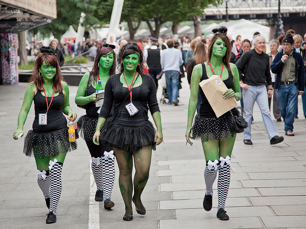
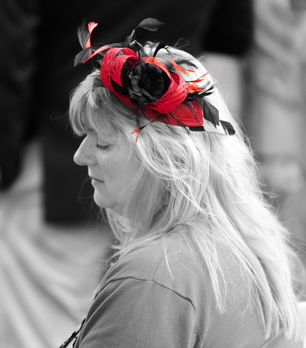
• Green girls •

• Green girls •
Click image to view large
• Green girls • By Netkonnexion on Flickr External link - opens new tab/page
Sometimes pictures simply don’t work in black and white. You have to make the choice. There are no rules that say you must do street photography in monochrome.

Cultural context

Street photography is a worldwide phenomenon. However, there are undoubtedly cultural contexts that tend to make certain places more interesting. That is especially the case when the viewer is seeing something they consider exotic or out of the ordinary. Street photographers take pride in finding the ‘unusual’ in otherwise ‘everyday’ places. So where possible street photographers will search out the poorer environments, the degenerating places and the places that their viewers would not go themselves. On the other hand they may find interest in the very essence of modern culture and how that actually contrasts with local way of life there. In this way they can help their viewers see another culture, observe different behaviours, see another way of life or shock their viewers about how others live.

Seeing other cultures and other places in the world is part of the wider scope of the art. You may choose to travel to far away places. However, street photography is found everywhere. In your local town, urban area or event space you can find interesting and captivating scenes everyday. Watching your fellow citizens is great sport. It’s funny, serious, interesting, frightening and enlightening. Showing your culture in all its facets is interesting. It requires a strong sense of place, character and understanding of your subjects and where they are.

It is often the deep contrasts that make a street photograph successful. The ordinary and unremarkable are the things that are not celebrated because of our familiarity with them. After all they are in our daily view. Strange or culturally contrasting situations draw the eye. It is a part of the street photographers observational skill to isolate and therefore to highlight these inconsistencies in our view of the world. It is not about travel, getting around the world, but seeing into our own locality and monitoring the differences between each of us and the others who share our streets.

Taking this alternative look at our own cultural space is one of the really difficult things about street photography. Henri Cartier-Bresson, sometimes referred to as the father of street photography, once said…

To interest people on far away places… to shock them, to delight them… it’s not too difficult. It’s in your own country – you know too much when it’s on your own block. It’s such a routine… it’s quite difficult… in places I am in all the time, I know too much and not enough. To be lucid about it is most difficult… But your mind must be open. Open-aware. Aware.
Henri Cartier-Bresson

In his strong French accent, he was trying to express the difficulty of overcoming the ‘ordinary’ view and seeing the extraordinary things about our culture that are in plain sight.

Street photographers are the ultimate people watchers and observers. They look for the extraordinary in the ordinary. They are able to articulate culture through the medium of the very people they sit next to on the bus. They are in the scene and a part of the picture they are creating with others around them. At the same time they are documenting it and living it, but bringing out the things that other people miss.

Origins

Much of the body of street photography was generated in the 20th century. During the 19th century the film speeds were low and exposures too long for effective fast capture of people going about their everyday lives.

There is currently a huge resurgence of interest in street photography. It has come about partly as a response to a renewed interest in photography. It is also partly due to recent significant collections of work from street photography artists being published around the world. A whole genre has developed from the interest of key individuals from photographic history. Some of the great street photographers we recognise today worked in the years from around 1900 through to the 1980s. Some of the well known names are…

  • Henri Cartier-Bresson
  • Diane Arbus
  • Vivian Maier
  • Alfred Eisenstaedt

There are many more (See: Category: Street photographers  External link - opens new tab/page). These bodies of work are of key interest today to many people. Academics, street photographers themselves and ordinary people all have an active interest in the past and particularly of places they know. Their photographs offer a unique insight to both the time and place – but also of the photographer themselves.

Today’s street photographers are providing an insight for future generations into the way we live now. It is the ordinary and extraordinary things that happen in ordinary lives that street photographers want to search out. Diane Arbus, working in the middle of last century, is famously quoted as saying…

I really believe there are things nobody would see if I didn’t photograph them.
Diane Arbus

Her interest and focus was on people who were different. She called them freaks. Often they were on the fringes of society as well as hidden from the eyes of the ordinary person. Today we are slightly more tolerant of the type of people she photographed. Nevertheless, we still label people who live differently by describing them in a “politically correct” manner. In effect that is a euphemism that is more damning than a direct label. Street photographers can open up the difficult lives that some people live – help them to become a part of a wider scene, a more tolerant world.

• All Smiles •

• All Smiles •
Click image to view large
• All Smiles • By Netkonnexion on Flickr  External link - opens new tab/page
Truly candid street photography is about bringing out the inner essence of the people you photograph.

Celebrating the rich diversity of people and the things they do is important. It makes human beings so different to the animals. We can and do respond so differently to each other and the situations we find ourselves in. It’s a cultural cliché that almost defines us.

Successfully seeking the essence of the person being photographed is an expression of the photographers vision and an exposure of a culture. It is another tiny revelation about ourselves as humans and as members of society at large.

Respect and communication, doing and being

One of the hallmarks of street photography is to be excited and invigorated. The situation may even make you nervous. This is right and proper. Representing people in a photograph makes you a conduit for who they are. You must respect them. Holding a camera is a responsibility and a communication. You are saying something to the people who see you working the scene. So don’t ‘do’ street photography as if there is a bad smell under your nose. Be a street person who happens to be engaging with people while holding a camera. Then you will be a part of the scene. With respect, and contact with the people you photograph, you become a part of the life you are depicting. Not only an observer, but a participant. Then you will see more clearly, the spirit of the people you want to document.

Comments, additions, amendments or ideas on this article? Contact Us
or why not leave a comment at the bottom of the page…

find out more...Photokonnexion tips by email
If you enjoyed this article please sign up for our
Tips by email service.
                                                 Find out more

By Damon Guy (author and Photokonnexion editor)

Damon Guy - Netkonnexion

Damon Guy (Netkonnexion)

Damon is a writer-photog and editor of this site. He has run some major websites, a computing department and a digital image library. He started out as a trained teacher and now runs training for digital photographers.
See also: Editors ‘Bio’.

Give your holiday landscapes a little extra punch

How to make a digital camera

How to make a digital camera

Do something different with your summer shots.

Holiday times always give us a chance to capture a few landscapes. Often they are a more difficult to get right than is appreciated. In fact a little thought can make all the difference. Think about your composition and your colours. The key to a good landscape is to find impact and contrast. In the video below Gavin Hoey shows you two things. First he shows how to think about your composition and colours. Next in the context of colours he shows how to turn your landscape into black and white in Photoshop (actually you can use any full featured image editor to do the same thing).

B&W Landscape Tips


AdoramaTV

Making black and white images

In the video Gavin Hoey made a great point about shooting in RAW. Landscape pictures often look great to the eye when in the field but they lose their appeal when the image is created on-screen. So in order to make your landscape pop some post processing is essential.

This video shows how to bring out contrasts to make the scene look great in black and white. However, he makes an important point about shooting in RAW. You don’t lose the original colour, it is retained in a RAW file. Then you convert to black and white afterwards. This is not possible in *.jpg. That format does not have the colours stored like the RAW format. If your black and white *.jpg is less than successful you lose the colour option too.

Gavin Hoey points out that you should test that your camera will process a RAW file in monochrome mode on its screen, but still leave a full colour RAW file. It is possible your camera converts the RAW file to a *.jpg file in the colour scene mode. So cover your options and try it before going in the field.

Gavin showed the conversion method to black and white using the colour sliders. Most image editors have two basic ways to create monochrome shots. Your shot can be simply colour converted to shades of grey, or you can use the colour slider method where you have some control over the intensity of colour which greys are created from. This latter method gives you much greater control over the contrasts in the picture. When working in monochrome that is the most effective way to ensure the picture has visual impact. So always choose the colour slider method to get better control of the conversion.

There are some additional links below to show how to improve your black and white shots in other ways.

Comments, additions, amendments or ideas on this article? Contact Us

find out more...Photokonnexion tips by email
If you enjoyed this article please sign up for our
Tips by email service.
                                                 Find out more

By Damon Guy (author and Photokonnexion editor)

Damon Guy - Netkonnexion

Damon Guy (Netkonnexion)

Damon is a writer-photog and editor of this site. He has run some major websites, a computing department and a digital image library. He started out as a trained teacher and now runs training for digital photographers.
See also: Editors ‘Bio’.

Eight ways to bring out texture in your photographs

• Medieval Prison •  Bring out the texture in your shots

• Medieval Prison •
A dismal dungeon! Bring out the texture in your shots.
Click image to view large
• Medieval Prison • By Netkonnexion on Flickr External link - opens new tab/page

Texture is essential for a 3D effect.

If you want a realistic feel you need to work at it. Convincing texture lies in the fine detail – your picture must look like it feels. Here are eight things you can do to increase the texture from capture to printing…

What is texture?

Texture is the fine detail in your photograph. I am sure you would know what it feels like to run your finger over the surface of a brick. If a photograph of a brick convinces you that touching the photograph would feel like a brick, your depiction of texture has been successful. The term texture is a fine art concept which applies to photography [texture definition].

More after this…

Get Photokonnexion tips by email!
We send you tips daily – find out more…

Start email subscription now!
#11030#

Eight ways to enhance texture
  1. Pick your subject to ensure it will show texture. Close ups are easiest as you can work large. If you are with a large subject like a person and want to show fine texture on the background you should ensure the background surface you pick is well defined. Look for the largest contrast in shades of colour and in light/dark. Look for shadow areas and bright areas. Make sure that the physical texture (roughness) is roughest where you will be taking the shot. These are the features of texture the camera will pick up.
  2. Hard light on your texture will give it a sharp, unyielding feel, a sandpaper type effect. Soft light will give it a rounded less harsh look, more like weathered stone surfaces. Arrange your light to emphasis the character of the texture you are photographing.
  3. When taking your photograph arrange the light coming at your texture from the side. A shallow angle of light creates light/shadow areas which define the texture. When these little contrasts can be seen they make the texture stand out. If light comes from where you are shooting from these shadows are not created and the texture will be flat (eg. pop-up flash or sun from behind you).
  4. Consider very slightly over-exposing your shot. This will give you room to exaggerate the contrast in the post processing.
  5. In the developing module of your processing (RAW only) use the contrast tool to maximise the contrast potential in your texture. If working in *.jpg enhance the contrast in the normal picture editing view.
  6. Consider making your picture a grey-scale shot in post processing. If possible do not do a direct colour to black & white conversion. Use colour control methods to enhance the contrasts in each colour. You will need a more advanced image editing application for this (PhotoShop, or Elements for example).
  7. Use the ‘burn’ in post processing to deepen the dark areas of the shot. Set it to emphasis shadow. Manually pick out the shadow/darker areas and give them a very slight darkening. Try working at about 10% (or less) ‘burn’ exposure. Similarly, use the ‘dodge’ tool to brighten the highlights. Set the tool to pick out highlights at about 8%-18% exposure.
  8. When printing use paper that has a texture appropriate to the texture you want to bring out. You will need to print a test print. Then hold the test texture up against several paper surfaces to compare the textures. Paper with softer, uneven texture will take the edge off textures in the print. Harder textures with more regular surface will tend to sharpen the depicted texture. However, the eye must be your final guide. There is great skill involved in picking the right paper texture for specific pictures when printing. So you might need to make several tests with different paper textures to get the most emphasis for your texture.

Enhancing the contrast between light and dark or between colours will emphasis texture, but the most effective impact will be what you achieve in the actual shot. Try to ensure you use the light to gain the best advantage from your texture as you do the shooting. It will look more realistic and you will have to spend less time at the computer.

By Damon Guy (author and Photokonnexion editor)

Damon Guy - Netkonnexion

Damon Guy (Netkonnexion)

Damon is a writer-photog and editor of this site. He has run some major websites, a computing department and a digital image library. He started out as a trained teacher and now runs training for digital photographers.
See also: Editors ‘Bio’.

Can you write? Of course you can!
Write for Photokonnexion...

We would love to have your articles or tips posted on our site.
Find out more…
Write for Photokonnexion.

Black and white is fun – try monochrome

Reflection of a girl in a shop window

Reflection of a girl in a shop window. There is more to monochrome than black and white photography. Single colours are a great way to express yourself.

Give your shots a new dimension.

There is something exciting about black and white. The use of one tonal range gives a simplicity that is a new dimension. You can do the same working with one colour other than grey.

In “Don’t photograph in black and white” I said it is better to take a shot in colour with black and white processing in mind. Well, it need not be just black and white. Some photos work really well in other monochrome colour tones. There are several ways you can do it and I am going to set out some ideas for you to try.

Getting the shot

There are many ways you can get a monochrome shot in camera…

  • Find a monochrome subject. My shot above is an example. This girls face reflected off a shop window. The predominant cobalt blues in the shop display created a perfect monochrome reflection in blue. I fired off an opportune shot! So look for situations where you can pick up a monochrome appearance. Reflections are a great opportunity.
  • Filters. There are an amazing range of photographic filters on the market. There is a whole range of colours. Using these you can colour your image as you take it – strong filters will impart a monochrome overall. You will need to experiment however, filters change the nature of the light entering your camera. You might get some surprising results!
  • Gels. Photographic gels are coloured material that colour light. You can, if you stretch it tight, put thinner gels over the front of your lens. This will colour the light as it enters the camera. Try to make sure there are no wrinkles or you will get dark lines across your shot. Although, you might artfully arrange wrinkles to give your shot a unique texture as well as colour. If you use gels you might need some strong lights, hard light is best. Gels tend to be quite colour saturated. So they need the subject to be brightly lit so you see details. Its all part of the fun!
  • Coloured light. Using gels you can also light the scene with a strong colour. Deep red, blue or green gels make some really erie colours and impart some interesting shadows. If you use your gels in conjuction with strong house-lights the colour-cast will be enough to completely colour the shot as a monochrome. Moody and atmospheric shots are especially good with strong gels. They make for some great scenes. If you have an off-camera flash you will be able to try a wider range of shots with brighter results too. Just lightly tape the gel onto the lens of the flash so it shines through the gel when the flash goes off.
  • Shoot through glass. Shop windows, especially armoured glass often imparts a greenish tinge to everything you see through it. It also gives a sort of dreamy, almost watery feel to the shot. Try taping a small piece of glass like that to the front of your lens hood.
  • Colour ordinary glass. There are many types of colourant that will go on a small piece of glass. Various paints, makeup, inks, food colour… I am sure you can think of a few others too. The single colour will be imparted to the shot. Some of the things you put on will give an inconsistent coverage. More creative fun can be had by producing patterns on the glass with your colourant. Then you will be able to influence not only your monochrome shot, but also the texture of the exposure.
  • Processing. There are a whole range of ways you can get some shots to be post-processed in a monochrome. You could just have a go with your favorite image editor. Experimenting is a great way to learn. I will also be doing a future article on monochrome processing here.

I hope those ideas give you great creative thoughts. Activities like this are fun and great for extending your skills. Just make sure you keep exotic liquids, paint and chemicals off your lens. They may damage the coating on the glass.