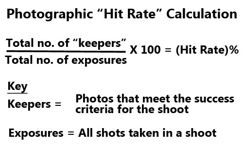
• Transparent Covers •
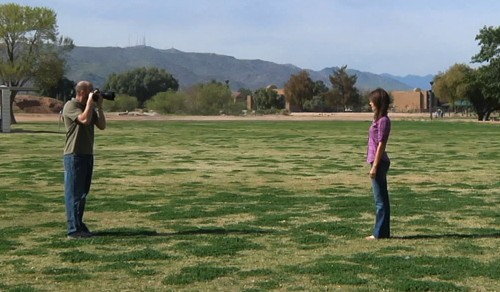
The picture shows a transparent image slightly lifted off the page demonstrating how a transparent image can be stacked on top of the image below. It is normally invisible when set up properly – it’s shown lifted here only for effect. If you right click/copy the on an actual transparency you only copy a transparent shape not the image you want below.
Can images be protected online?
There are a number of ways to steal an image off of a website. And, yes, there are a number of ways to protect an image on a website. How effective is that protection? When it comes down to it we lose sleep over our images being stolen. So if that protection is not 100% we have a problem.
What protection is available?
Probably the most common protection for images on a website is a programmed solution. A small piece of code detects a right mouse click over an image. The code disables the right click preventing you saving or copying the image or the image address.
The picture above shows another method of protecting images. It is possible to place images on top of each other on a page. If the top image is transparent the image below it can still be seen. When you right click the image you are actually only able to get the top transparent image not the image below. This is an interesting method because it also masks the internet address of the image below. If you try to copy the location of the image you get the location of the transparent image.
Press and grab!
Both the methods above, and similar ones, are sufficient to prevent the casual, non-technical user from stealing images. However, they are absolutely ineffective against one simple theft method – the screen grab. If you click on the window where an image is displayed, hold down [Alt] & press [PrtScrn] the image selects a copy of the window that is currently selected. You can then paste that image into an image editor. If you use [Ctrl] & [PrtScrn] you grab the whole screen as an image. Some web designers have used code to disable these button combinations but it is not reliable. It is also completely ineffective against selection tools. There are many little applications that you can download which will give you the ability to select any section of your screen and copy it. The copy is then pasted into an image editor for saving.
The ultimate solution…
When it comes down to it there is no full-proof method of preventing image theft. If you can see it online, you can steal it. The ultimate solution to preventing image theft online is not to put your images onto a website.
Of course this is not an answer really. If we cannot publish then we cannot get sales, acclaim, support… whatever. These days, if you are not online then your images are not seen. Are there other practical methods of protecting images?
Water marking
One of the more common methods of protecting images is to put a watermark on it. This effectively renders the image unusable on another website or for printing. However, it also makes it difficult to fully appreciate the art in a picture if it has a trade mark or copyright symbol plastered across it.
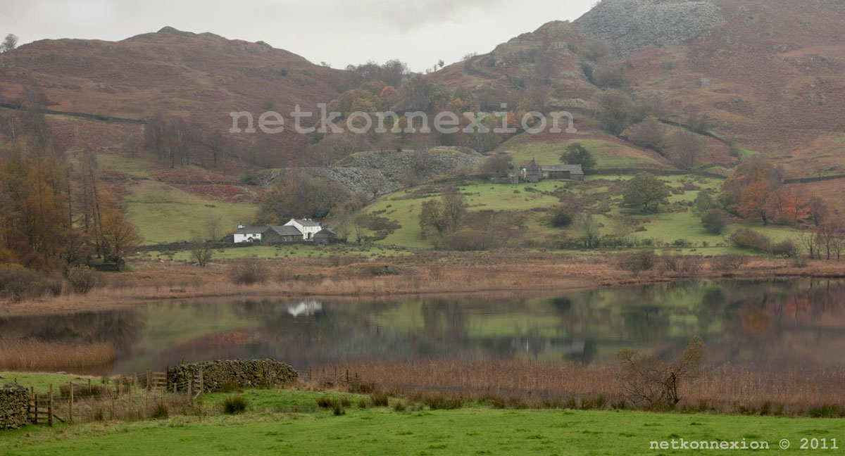
• Little Langdale •
Watermarks can be rather obtrusive like the large one here (centre). Less obtrusive placement and size is easily cloned out or cropped out (the small watermark bottom right).
Generally speaking the smaller or less obtrusive a watermark is on an image the less effective it is against theft. On the other hand the more obtrusive it is the more impact it has on the viewer looking at the image. Writing in particular draws the eye very strongly. So you are in danger of the viewer having to peer around/behind your watermark because the eye is drawn to the watermark before the subject of your image. This is not satisfactory and rather destroys the point of putting the image online.
Copyright and copyright registration
Copyright refers to the established right of the author of a picture to maintain control over the image. However, the law of copyright differs worldwide. So how it applies in your country is something you will have to research. In basic terms a country like the UK has an assumed right of copyright ownership. So the original image file would stand as proof of ownership. In this case it is best to ensure that you also embed your copyright data in the image data (see: Exif data). The Exif data will then reveal the owner. However the data is not secure so the method is not full-proof.
In a country like the USA copyright owners can protect themselves against theft by registering their image with the Library of Congress  .
.
Copyright is good protection in that the force of the law lies on the side of the copyright owner. However, in many countries a dispute over copyright involves a lengthy and expensive legal process. This may be beyond the means of the small artist/photograph. This renders it an ineffective method of protection. However, recent legislation in the UK has made it easier for authors to make small claims for disputes covering them for up to £5000 pounds fine. This could change the balance in favour of the photographer/artist seeking remedy for stolen images.
Show the useless image!
It sounds daft, but if you present your images as a low resolution small size image this is a simple and effective protection against most theft. Image thieves want a quality image to use on their own site or to print or to sell to others. If you limit your image longest side to 500 pixels as a *.jpg image compressed to around 60% you will provide partial protection for your image. This size and compression is an acceptable size on a web page for the purpose of viewing. However, the thief cannot blow the image up larger without damaging it. The low resolution at 500 pixels will make print sizes too small. In effect this makes the image perfectly viewable for your site users, at the same time it renders it pretty useless for the image thief. This is a practical and simple method of protecting against theft. It is not full proof – since thieves can still use it small size. However, it does at least limit the possibilities for commercial exploitation by others.
There is no 100% protection – its about risk
When it comes down to it you have to take a risk. There is no method of absolutely protecting your images online. However, there are enough different types of protection to be able to protect most images enough to feel confident that your images ‘probably’ will not be stolen. In the end you have to decide if you are going to gain more by displaying online than you would lose by having an image stolen. It is a very personal decision.
By Damon Guy (author and Photokonnexion editor)

Damon Guy (Netkonnexion)
Damon is a writer-photog and editor of this site. He has run some major websites, a computing department and a digital image library. He started out as a trained teacher and now runs training for digital photographers.
See also:
Editors ‘Bio’.
Can you write? Of course you can!We would love to have your articles or tips posted on our site.
Find out more…
Write for Photokonnexion.


.")