Category Archives: Post Processing

Any of the activities associated with the processing of the captured photographic or graphic file.

Five warning signs that your photo should not be posted online

Some photographs are not impressive.

You feel proud of them. You want to get them posted straight away. Unfortunately, not every photo is suitable to put online. Concentrate on getting your best shots up there. Here are five ways to think about the posting decision.

Fast tracking is a disaster!

Beware the quick snap. I have rarely seen anyone make a great shot from an instant snap. Sure, journalists and professional photographers seem to be able to do it. They have a vast experience of shooting in difficult situations. They are more accurate, frame better and shoot faster than the average hobby photographer. For other photographers careful shooting is essential. After the shot, to just download and post will be to compound any errors you make. If you want your photos to have impact then think about every part of the shot through to final posting. Every detail will affect the quality of your final result. Rush it and you may as well flush it!

Is there anything there?

Before you post a picture do one thing. Ask yourself, “is there anything there”? This simple question will tell you – if you’re truthful – if the shot is worth posting. You must look with care to see if there is something in the photograph that will make your viewers sit up and pay attention to your shot. Is it pretty? Is it emotive? Will it draw them in? Will they stare into the picture transfixed? In your heart, as a photographer, you will know the answer to that question. If your shot does not have ‘something’ there… reconsider!

Is it technically good enough?

Look at your shot. Is it really sharp enough? Some things may not need to be sharp, but are they expressing the right thing? Or, are they expressing anything? If the technique fails, the point of the picture is often lost. The interest in a shot is often a fine balance – if something distracts the balance is tipped the wrong way. Softness, bright spots, clutter… whatever is causing the fault will cause the shot to fail. Discard the technically poor shots.

Is it artistically effective?

This is difficult. We may completely disagree on the artistic success of a shot. You be the judge. Think carefully about your style. Do it your way. Express it your way. Just make sure that it meets or exceeds the standard you have attained. Each picture you publish should make your artistic point slightly better than the last. Edit your shots so they say exactly what you want them to say. If your shot does not say it – then don’t post it. If your image ‘sort-of’ says it, then don’t publish. You have a duty to your photography to express yourself. Make that expression as clear and effective as you know how. A confused or weak message will be lost and that is a photo you should not publish.

Do you love it?

If the answer to that is “YES, IT’S THE BEST THING SINCE THE WHEEL WAS INVENTED” then don’t publish it. You are probably drunk or suffering from an extreme case of authors pride. We have all been there. Walk away from it. Leave it 24 hours. Get a grip. It may well be the best picture you have ever made. If that is true then you will be able to savour it like a fine wine. You will be able let it breath in the processing so it is improved for the final posting. A picture as good as that deserves to become a vintage. And, you will be able to better able to judge it (and process it) when you have become less heady about it. Then again, you may find it was all a dreadful mistake and it should never see the light of day again! When you are suffering from authors pride you cannot make that judgement. Take the time for your editing head to catch up before you publish. Try to establish a new personal best every time you post. To achieve that work with a reasoned, objective judgement in mind.

A thought on improvement

Our improvement journey as photographers needs to be validated. It is difficult, if not impossible, to improve without people giving us feedback. This short essay is intended to help people accomodate principles in thier workflow that help them to take a personal and critical look at each post. Take time, consider your work, do your best. If your post is not ‘perfect’ it is because we need to aspire to improve. If you have tried your best then put it out there. The feedback you get will help you exceed your best next time. Improving as artists and photographers is an incremental journey. We cannot jump to perfection. Every artist in history has risked revealing their latest work knowing it is not perfect. Self-doubt helps us move forward. We can only seek to improve and to provide some pictorial pleasure for others along the way.

I hope that helps you take a step back and look at your images before shooting and especially before posting. Your photography will be all the better for it if you watch these points.

A simple introduction to colour for photographers

Photographers use colour all the time but do they understand it?

Colour can be quite complex. However, there are some simple principles that help you to work with colour. Like other compositional elements colour can change your picture in many ways. If you use it you can enhance your picture. If you are not aware of its significance you can spoil the impact of the picture.

These two videos provide introductory principles as an insight into understanding how colours work together and their effects within the image.

Colour in photography – The colour wheel explained
http://www.imagemaven.com

Complementary Colours in Photography
http://www.lourceyphoto.com

How to tell a story with your picture

Photo storytelling :: Spoken With Humour My Lady

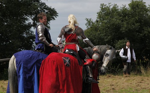
“Spoken with humour my Lady”
Photo storytelling with your picture will capture the imagination of your viewer and draw them into the image.

What is photo storytelling?

Help your viewer to be involved in your picture. Get them thinking. Then they will look hard at it. So, tell a story with it. To get viewers thinking draw out the threads of a story with a time line. Aim to help them see how the story came about. Show clues for what might happen next. Photo storytelling is about making your image clear on what is happening.

The best photo story-tellers are photo-journalists. They capture an event or activity. They try to show the progress of a story. Things you see in the shot tell you what’s happened, what is happening now, and what is possible. In short, it is a time-line.

Photo storytelling :: Keep it simple

Don’t obscure the story. The more interesting you can make the shot, the more viewers will want to look at it. Your story should portray the fullness of events.

Try to make the shot as simple as possible. If there is too much going on it distracts the viewer. Too much clutter does the same. If you do distract the viewer it will confuse or obscure the story.

Have a plan

Ensure clarity in your story. Have a complete plan of what you want to convey. You should:

  • Know what you want to say.
  • Have a clear idea of the main subject.
  • Know the story line (as simple as possible).
  • Know how to express the storyline.
  • Know the composition you will use.
  • Be aware of light, mood, time.
  • Know what to exclude (de-clutter).
  • Know how you are going to work the scene.
  • Have technical settings worked out.
Behind the subject

It is easy to confuse the viewer with the background. Ensure it is consistent with the story. The little romantic exchange in my picture above fits with its background. If this were an urban scene the knights would be out of their expected context. That throws the story off.

How people and things relate to each other

As the story unfolds show the relations between people. That is juicy eye-candy for viewers. The relationship between people and things, in the scene helps too. Working with one photograph, your photo storytelling is going to have to show these links.

There are three relationships in the photo storytelling above. The horse is engaging with the viewer. It stares back at us. The knights are engaging in light-hearted flirting. The peasant is clearly amused by the whole scene. The story tells the viewer where the people are, but also about the feeling between them. Looks, and the direction of gaze, are important. Facial expressions speak volumes. The position of things and people show how they relate to each other.

You must be careful to pick up these traces of relationships. Without them you don’t have the sense of interaction. Then you don’t see photo storytelling in progress.

Time

Time in photo storytelling usually comes from action, expression or movement. In this picture the horse shows boredom. The knights show an on-going and flirtatious conversation. The peasant clearly enjoys the moment. These things show the story is not static. And, it has a future because the knights are clearly enjoying the exchange.

In another type of photo storytelling you might see strong movement. A race is a story. The action shows the progress of time. The race positions tell of the competition. The place where the race is sets the scene.

Clearly there are many ways to express progress through the story. The important thing is that you do actually make sure that it is obvious to the viewer.

The fresh, candid look

Clearly, if the story is staged and forced, the fresh look will be lost. Capture it as if it was unscripted. Captured on the spur of the moment makes it look fresh. Even better if it was a complete candid shot. Nothing beats an honest, true expression. The best scenes are spontaneous. The whole discipline of street photography is based on that concept. However, make sure that the elements of a story still hold true. It will look false if they are not.

If doing candid street shots your post-production work can help. In your editing look to find the shots with the elements above. Then crop or work your post processing to bring it out. Don’t try staging them through a plan. Urban scenes make poor acting scenes for photography.

Patience

Photo storytelling takes patience. So does trying to spot a story in progress. To shoot a scene like the one above takes a few moments. It may only involve a few quick few shots. But the right result may not happen the first time. Take your time and work on the elements needed for your Photo storytelling. As you get better at the things mentioned here you will bring out the story easier.

Photo storytelling :: In Post-production

A story is almost always completed in post-production. Often the composition has to be done quickly in order to capture the right moment. As a result you may need to think about the framing and the crop later. Also think about cloning out clutter and distractions. When Photo storytelling, that is especially true for candid shots.

Photo storytelling is helped by a title

If my image above was called “knights on horses”, there’d be less interest. The title sets the scene. It shows the viewer the link between the knights. A good human relationship or a juicy gossip-phrase gets attention. Photo storytelling is all about those human things. Bring them out in a title.

The actual story

Most important is the actual Photo storytelling itself. To get that right you have to check you have a story at all. That means finding the shot that expresses the story. That is an editorial task. Be ruthless when you try to tell a story with a picture. Show only the shots which actually tell one. Otherwise you will have a fudged concept. There is nothing worse.

Enjoy your Photo storytelling. It’s fun and a challenge. Your skill as a photographer and as an editor of your own work will improve.

Comments, additions, amendments or ideas on this article? Contact Us
or why not leave a comment at the bottom of the page…

Like this article? Don’t miss the next — sign up for tips by email.

Damon Guy - Netkonnexion

Damon Guy (Netkonnexion)

Damon is a writer-photographer and editor of this site. He has run some major websites, a computing department and a digital image library. He started out as a trained teacher and now runs training for digital photogs.
See also: Editors ‘Bio’.
By Damon Guy see his profile on Google+.

Landscape loves – do you know why you are photographing this scene?

Do you know why you are shooting the landscape you are looking at?

Do you know why you are shooting the landscape you are looking at? If not then you will probably not make it exciting for your viewer either. Shoot for impact.
(Click the image to see large)

A landscape ‘snap’ just does not seem to cut it…

Many landscape photos are really stimulating for the author, but few other people. The problem? It’s too easy to ‘snap’ a shot that will bring back the moment. You really need to think about what will stimulate someone else when they see the picture.

One of my favourite landscape photographers once said,

Landscape photography is the supreme test of the photographer, and often the supreme disappointment.

Ansel Adams
…and he was right. Most people do not have a reason to take a landscape shot that will satisfy someone else.

Insights to landscapes

Personal perspective is all important, but it can misrepresent the situation. I studied the environment when at university, including geology. I loved landscapes and knew how to read them. I could take them apart and tell you their geo-history, rock types, erosion… well, you get it, I was a geek! I loved taking pictures of landscapes. I found them beautiful and interesting. It was many years before I realised they were interesting to me because of my geeky knowledge. I realised I was taking geeky geology pictures of landscapes. I thought they were beautiful. Everyone else just did not get it. That’s the point. You should be finding elements in the landscape that capture the scene for what is attractive and what it means to everyone, not just you.

Themes

There are a number of themes that successful landscape photography hinges upon.

As with any photo, light is the key. Great light, great attraction. Early morning, sunset, dramatic weather – they all have their place. Flat mid-day, blue sky light, not so good. But even then, combined with other composition elements you can make it work.

The angle of light is important because of the creation of shadows. They define the landscape by creating bright and dark spots which really brings out the contrast in the landscape. The camera is not as versatile as our eye and a good contrast brings out the depth in a landscape picture that we can see naturally but needs to be strong for the camera.

Drama is another theme that helps a landscape picture. Think of the primal drivers of our inner being. Sunsets, uplifting because of the promise of a new day tomorrow. Storms, threatening our existence, fascinate and drive us to shelter. Dawn, captures our hopes and fears of the unknown in the new day. We all respond to these drivers. So, pick them out.

Aesthetics, what we find stimulating and uplifting. Yes, beauty is a factor. You need to find elements in the picture that are truly attractive to everyone, not just your feeling of the moment. Don’t take a shot because of a lovely moment shared with your love. Look for the attraction for everyone in this scene and capitalise on that. Show what is attractive by using composition to focus the viewer on the subject. Take a moment to consider where to take the shot to show it best. Look all around you, consider high and low, left and right. The perspective of the shot is important.

The subject is the thing you want to show most. So make sure you find ways to bring it out. Is it the danger, the beauty, the vista, the awe? Look at the landscape and sense what it is doing for you – then hunt it down with your camera. If you know why it is stimulating you, and it is a primordial driver, then you have isolated the essence of it.
More after this…

Composition

Just taking a snap is a kind of composition – even if a negative one. Remember that you are trying to create an impact others will find attractive. So, look for compositional elements that bring out your theme and then frame the shot for them.

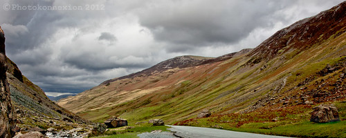
In the shot above I was looking for ways to draw the viewer into the picture. The essence of this shot lies in the drama and the layers of the landscape. These layers make you want to go into the shot to see how the landscape changes as you go in. They give the shot depth and invite you to see what is around the next bend in the valley.

Knowing these were the reasons for my attraction to the scene informed my composition. I wanted foreground emphasis. This lead to the capture of foreground objects giving a sense of being there. In the shot on the other side of the road I could see round the corner. The scene there lost the mystery of implied discovery. The drama in the sky drew me into the distance because of the mystery in the unseen there too. Closer to me the drama in the sky created an implied threat. That was too good to lose. So I had to take several exposures so I could capture the sky without blowing it out and the hills without underexposing them. The contrast between the two was too much for the camera to capture both at once as my eye saw it. This meant I had to think about my post-processing too, including my crop. The shot was taken so I could bring out a panorama to enhance the feel of awesomeness in the landscape. A ‘letterbox’ crop gives right-left depth to complement the depth from the contrast as well as foreground, mid-ground and distance layers in the picture.

I know there are other things that made me stand right there and create this shot. The point is that I knew why I was doing it that way. I knew what it meant to me. I knew what the drivers were that would impart meaning to others. Then I composed and shot for the post processing.

One more thing. It might not surprise you to know that this photo represents a lot of time working the scene at this location. There were about 35 pictures of the general location. More takes on the exact spot of the shot. In all, there was about 50 minutes work, with tripod, to get this one shot. A ‘snap’ it was not!

The effect of over sharpening

The effect of over sharpening ruins the shot

The effect of over sharpening ruins the shot. Worse, when you upload a shot to a website it will be compressed too. This makes the sharpening worse.

Sharpening can do more harm than good.

When you sharpen a *.jpg picture the application attempts to find lines and edges and make them more distinct. The process can cause damage to the file spoiling the picture. The trick is not to sharpen your picture too much. Here are a few things to consider…

First an explanation. If you want to take out any softness or poor focus then you must sharpen. In fact most images benefit from one sharpen action in post-processing. Lets say, in your image editor application, you apply the sharpen tool. When you sharpen a picture you are trying to define the edges of objects in the picture. Softness due to poor focus, out of focus, or movement blur, can have better defined edges. The softness seems to be removed as the edges give the appearance of good focus when they form sharp lines.

The downside to sharpening is that you cannot rescue an image from being very soft or very out of focus. If you attempt to sharpen a soft picture you will need to repeat the sharpening process many times creating over sharpening. This will eventually damage the picture. You get clear lines, halos and spots which indicate the over sharpening.

Look for white edges – that’s over sharpening starting

A sure sign of over sharpening is the appearance of white lines along the edges of an object. Look at the grass in the picture above. The whitened edges have become distinct and have ruined the sharpness of the grass. In fact the grass has become ‘un-grass-like’ because of over sharpening. I did that to make the point.

When sharpening an image you should look carefully at the lines, like the edges of grass. When you look in detail you will see tiny artefacts from the sharpening process begin to appear. This effect will get worse the more you sharpen the picture. In most editing programs you should not sharpen more than twice. Even though you cannot see it, damage is already there and usually it will begin to be visible after two ‘sharpen’ actions.

Repeat ‘sharpens’ happen without your permission

When you sharpen a picture you are hoping to make it a little more distinct to the eye. So lets say you have a reasonably sharp picture you want to publish online. You give it two sharpens. It looks good. So you upload the picture to the website. Suddenly it looks as if its been through over sharpening. What is going on?

First, when you save a file in *.jpg format the save process sharpens the image. You are in fact applying another sharpen action just by the act of saving. Having already sharpened twice, you are applying a third on the save.

Secondly, when you upload a picture, many websites apply compression to the file before displaying it. The website takes a look at your picture. It decides some of the data which creates the image is unnecessary. So it dumps it. This helps the website use less storage space. However, this process is similar to sharpening. Tthe result is that an uploaded image could well look like it has two ‘sharpens’ applied by the upload action. The final result is four sharpens overall. Two from you and two from uploading. The impact on the file can be substantial.

Lessons to be learned

First, it is important not to over sharpen. In some images a good eye can spot even the second sharpen action.
Second, the save process for *.jpg involves a sharpen action too.
Third, when you upload a file to a website, that site may apply sharpening too, as part of the compression process. Both the compression action and the sharpen action have the overall effect of increasing sharpening once again.

In effect image files get ruined simply by repeated saves and uploads. So if you add sharpening of your own it is no wonder that some pictures look damaged when online.

Unfortunately there are very few things you can do about over sharpening damage. The best action for you to take is concentrate your efforts on getting a better image in-camera while doing the shoot. Certainly, it is best to keep the sharpening to a minimum. That way you can make sure that you don’t see as much damage as I have shown in the image above.

Comments, additions, amendments or ideas on this article? Contact Us
or why not leave a comment at the bottom of the page…

Like this article? Don’t miss the next — sign up for tips by email.

Netkonnexion

Damon Guy (Netkonnexion)

Damon is managing editor of Photokonnexion.com with professional experience in photography, writing, image libraries, and computing. He is also an experienced, webmaster and a trained teacher. Damon runs regular training for digital photographers who are just starting out.
See also: Editors ‘Bio’
By Damon Guy :: Profile on Google+

If you shoot with JPG, beware Auto-White Balance

"Test shot" - the ambient light in the room has created a yellow/red colour cast.

“Test shot” – the ambient light in the room has created a yellow/red colour cast. Removing this colour would be pretty impossible in *.jpg format.

It is ironic that people often shoot with the image format *.JPG because it seems ‘easier’. They can simply point and shoot with the camera on auto-settings. Well, precious photos are at risk. The *.jpg format dumps data when it is created in the camera.

Shooting in *.JPG mode is a problem. The data that is dumped leaves the file ‘baked’. Photographers use that term to describe a file where your options for change are limited. It’s a bit like a cake. Once the ingredients are baked, you cannot change the flavor of the cake. You might be able to make cosmetic changes. But you cannot change the fundamentals of the cake. So it is with *.jpg. If your colours or your white balance are off, you cannot change it.

Domestic florescent light bulbs (for example low energy bulbs) are some of the worst culprits for colour cast. They often create a bright yellow colour. The ‘Test Shot’ shown above is an example. Our eyes can normally compensate for the colour cast. The camera cannot. This ambient light shot has picked up a bright yellow cast – actually the background was brilliant white. It was white core board. The *.jpg format means that colour cast is there to stay.

Other colours may appear. Most common are yellows or steely blues. It depends on the bulbs that are present. So if you see these colours appear in your test shots, which is quite common, you need to compensate. If you read your camera manual you can look up White Balance. You will be able to find out how to compensate for these colour casts. In most cases digital cameras have white balance menu-settings for ‘tungsten’ and ‘fluorescent’. So it easy to select the appropriate setting. The next test shot will shot the colour as ‘true’ without the cast.

On the other hand, you can make it easy on yourself. Shoot in RAW instead. This is the type of file where the data in the file is retained. Then you can use an image editor – like PhotoShop or Elements – to change the colours when you are doing your post-processing. RAW files do no have the ‘baked in’ colour problem.

That brings me back to my original point. It is ironic that people think it’s easier to shoot in *.jpg until disaster strikes and everything goes yellow! Actually, since you cannot change anything, *.jpg is pretty hard to deal with at that point.

The motto of this story is… either get your white balance right when using *.jpg, or do the sensible thing and learn to shoot in RAW. The latter is easier and more flexible. And, you can save the day in ways that you cannot with *.jpg.

By Damon Guy (author and Photokonnexion editor)

Damon Guy - Netkonnexion

Damon Guy (Netkonnexion)

Damon is a writer-photog and editor of this site. He has run some major websites, a computing department and a digital image library. He started out as a trained teacher and now runs training for digital photographers.
See also: Editors ‘Bio’.

Converting your image to black and white

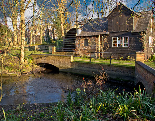
The mill on the Rye. Taken in a local park this mill presented a wonderful opportunity to capture the early morning sunlight. However, I think it might look good in black and white. Nice contrasty subject matter makes a good conversion.

The mill on the Rye. Taken in a local park this mill presented a wonderful opportunity to capture the early morning sunlight. However, I think it might look good in black and white. Nice contrasty subject matter makes a good conversion.

Converting properly to black and white gives you greater control

I argued previously that you should not photograph your pictures in black and white. While you might get a credible picture it is not necessarily going to yield the best result. In my experience black and white, as processed by the camera, tends to be flat and lifeless. So how should you do it?

First look to your shot

Not every shot will work best in black and white (B&W). Some shots look flat and lifeless regardless of how you treat them. To get a good B&W shot try to look for pictures where the tones vary widely. Big contrasts in the colour and the texture of a subject will show big differences in the B&W ranges. Some colours convert better than others too.

The second point to look for is to shoot in RAW. If you are shooting with *.jpg files you will restrict the ability to post-process your shot effectively afterwards. The whole point of shooting in colour and converting to B&W is that you are able to fully manipulate the process to draw out the best that B&W can offer. RAW provides the depth of tones with which you can do that.

The conversion to Black and White

Converting to B&W is not difficult. However, you need to know the most effective process. In most editing applications there are two methods. These are…

Desaturation:
Photoshop: [ Click – Image menu | Adjustments | Desaturate ] Or [ Hold down Shift + Control + U ]
All colours resolve to a grey colour if mixed correctly with another colour. The tendency to create a grey from a specific colour is to desaturate it. However, all colours will resolve into the same grey if it were not for variations in brightness/lightness. The standard desaturation option in image editors is a program for reducing the colours to greys leaving the variations in brightness to create the grey tones. The ‘Desaturate’ option is limited. It does the same as a camera when shooting in black and white. Using this option you have no control over the conversion.

Adjustment:
Photoshop: [ Click – Image Layer | New Adjustment Layer | Black & White ]
This option allows you full control over the colour brightness before the conversion to grey. As the brightness determines the grey tones this gives you the opportunity to vary the intensity of the grey in the final conversion. In Adobe PhotoShop you are presented with a dialogue box that provides a slider for each available colour. As you slide them back and forth you will see the grey tones change. These changes are what allows you to adjust the strength and depth of the blacks and whites in your picture. The adjustment brings out subtle variations to emphasis the depth and three dimensionality of the picture. In addition, colours, tones and brightness/lightness varies for every picture. Using the sliders you will be able to adjust these variables to suite your scene. This is something your camera or your ‘Desaturate’ option cannot do. As a result you will be able to create a subtle variation that brings out the best in your picture.

Although I have used Adobe PhotoShop as the example here most applications have two options for the creation of B&W pictures. You can access your help files to see which you want. The most effective is the adjustment option – so look for a term that describes that sort of control.

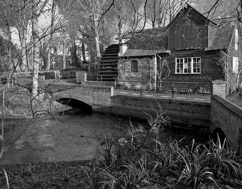
To see what the difference is between the methods I include two B&W conversions of the picture above. The first uses the ‘Desaturate’ version…

The Mill on the Rye - Desaturated version. Not bad, but a little flat

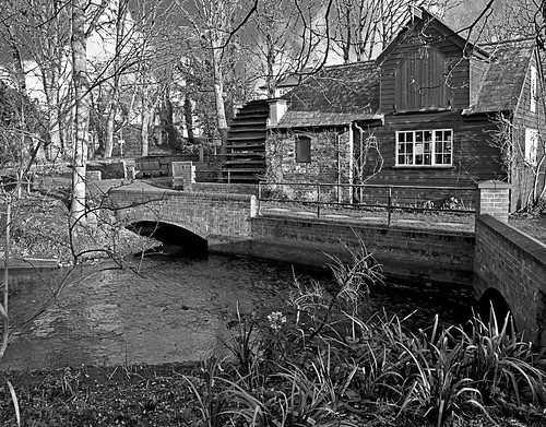
The Mill on the Rye – Desaturated version. Not bad, but a little flat


The second picture uses the ‘Adjustment’ method. The colours have been adjusted to create a greater contrast in the black and white range of the picture. This gives a better grey tonality and creates a greater sense of depth in the picture…
The Mill on the Rye - created using the 'Adjustment' process for converting to black and white.

The Mill on the Rye – created using the ‘Adjustment’ process for converting to black and white. There is a greater range of tones.