Category Archives: Light and Lighting

Anything to do with light, lighting, soft light, hard light, light work, light use, light quality, etc.

How to do DIY diffusion – great light from simple tips

 • DIY Ways to diffuse light •

• DIY Ways to diffuse light •
Image taken from the video.

Inexpensive photography equipment!

Following on from the Save money and improve your scene lighting yesterday, we have another video showing how you can provide yourself with an inexpensive light diffuser. It will be quite as good as any professional diffuser and in fact you make it have variable diffusion effects.

Professional and amateur alike use quickly and easily made DIY solutions for their photography. They know they can make things to the specification they require without the equipment costing the earth. In most photographers studios you will find materials and adaptations to be able to do all sorts of ‘quick makes’ with materials, frames and stands. It just makes sense to save money and do it how you need it, rather than spend a mint on something you only use once.

DIY Ways to Diffuse Light


Playgallery  External link - opens new tab/page

Comments, additions, amendments or ideas on this article? Contact Us
or why not leave a comment at the bottom of the page…

By Damon Guy (author and Photokonnexion editor)

Damon Guy - Netkonnexion

Damon Guy (Netkonnexion)

Damon is a writer-photog and editor of this site. He has run some major websites, a computing department and a digital image library. He started out as a trained teacher and now runs training for digital photographers.
See also: Editors ‘Bio’.

Can you write? Of course you can!
Write for Photokonnexion...

We would love to have your articles or tips posted on our site.
Find out more…
Write for Photokonnexion.

Save money and improve your scene lighting!

DIY Reflectors, Bouncer, and Absorbers

• DIY Reflectors, Bouncer, and Absorbers •

Professional equipment costs so much!

But easily made DIY lighting equipment can do the same as professional light diffusers and absorbers. There is so much you can do to create your own effects. It is pretty easy too. With some simple tools and materials you can have the same outcomes as from a professional studio. The video shows you not only how to make the simple reflectors, bouncers and absorbers, but also shows how they can be used. If you want to get really good with them you will need to practice your photography with them – that is the fun part!

Light reflectors, bouncers and absorbers

The use of flash or studio lights is a great way to light your subjects. However, flash is very harsh and studio lights are often expensive. You can make the reflectors, bouncers and absorbers very cheaply and they can also help adjust the light colour. Bright white board and silver reflectors help to modify the light colour from domestic lights. You may still need to adjust the light balance on your camera, but the reflections will give much more controllable light against the skin tones and clothes of your subject.

Why do we use reflectors and bouncers? These are part of a general class of photography equipment called light modifiers. Anything which changes the light from a light source is a light modifier.

With most lighting situations we have only one main light called the key light. Other lights should not be as strong as the key light. They should also have strength in proportion to the key light. We get that proportion by using reflectors and bouncers to distribute the light around our subject. This ‘fill’ light helps the light on the subject be less harsh. Bounced or reflected light creates soft shadows that wrap around curves and lessen the intensity of darkness in the shadows.

On the other hand absorbers actually cut down the reflections and help the darkness get more intense. This too has its uses. We can make shadows darken and help cut down the effect of light bounced off other things near the subject. The use of absorbers helps define shadows and create darker areas of the scene.

And now to the video…

DIY Ways to Reflect, Bounce, and Absorb Light


Playgallery

Comments, additions, amendments or ideas on this article? Contact Us
or why not leave a comment at the bottom of the page…

A simple way to bring out your subject in environmental portraits

• Early morning worker • Bring out your subject in environmental portraits.

• Early morning worker •
Click image to view large
• Early morning worker • By Netkonnexion on Flickr External link - opens new tab/page :: Environmental portraits
A great way to show off your subject is to find a way to make them brighter than the background. This projects them right out into the viewers eye. Environmental portraits are particularly good subjects for this technique.

Subjects should come first.

Every photograph should have a subject, but sometimes they get lost in the overall picture. If that happens you lose the viewers eye. Make the subject stand right out. In environmental portraits, one of the best ways to do that is to bring out your subject. Find a way of making them brighter than the background.

Environmental portraits

Most people shots, whether street photography, simple portraits, or even an event shot benefit from emphasis. There are lots of forms of emphasis. Here are a few examples…

  • High contrast
  • Big colour variations
  • Placement in the frame
  • Perspective…

Probably one of the most effective forms of emphasis in environmental portraits is subject highlighting. Environmental portraits are where a person is captured in the context of their environment. You can see them as they are in that environment. This helps you see into the person and their character.

If you can use highlighting your emphasis has two impacts. First, it provides an immediate draw for the eye. This is because the eye is drawn to the brightest spots in a picture. Secondly, the scene takes on more depth because of the impact. The very fact that the background is more subdued helps the eye to perceive the depth. The highlight creates a wider contrast between the darkest and lightest parts of the picture. In environmental portraits this has a profound effect on the eye.

How?

During the middle of the day the ambient light is very bright. You have to take care when highlighting to prevent blown out areas or over-exposure. There is one way to do it. Pick out your subject as the focus. Then turn down your exposure to slightly underexpose your background. Then use a manually set flash to illuminate the foreground subject. You will see the background as darker from the slight under-exposure. The subject will be properly exposed by the flash. Be careful not to have your flash too powerful. It will over expose the foreground and leave the background too dark. You might need to practice your technique.

In the photograph above I was lucky enough to capture the subject in bright clothes. The incidental light that did most of the work for me. A little brightening in my post-processing helped bring out the details. The emphasis of the light made the foreground object (the man) stand out. Often, what makes environmental portraits powerful is the understated background lighting.

In environmental portraits, bringing out the subject with highlighting is about taking advantage of natural lighting. Nearly every situation has local lighting variations. So if you take the time to look around your location and find light/shadow situations you are sure to find some place where the natural highlighting will give you an advantage. Most of the time it is down to becoming aware of the light and shade relationships.

Two lessons

What we should be doing when the light is right is highlighting the subject. It gives the picture impact and depth. When doing environmental portraits you will always have local light variations. Take advantage of them where you can. If you need to, use a little flash to emphasis the subject and make them stand out.

Comments, additions, amendments or ideas on this article? Contact Us
or why not leave a comment at the bottom of the page…

find out more...Photokonnexion tips by email
If you enjoyed this article please sign up for our
Tips by email service.
                                                 Find out more

Damon Guy - Netkonnexion

Damon Guy (Netkonnexion)

Damon is a writer-photographer and editor of this site. He has run some major websites, a computing department and a digital image library. He started out as a trained teacher and now runs training for digital photogs.
See also: Editors ‘Bio’.
By Damon Guy see his profile on Google+.

Avoid funny colour casts in your holiday pictures

White balance - grey card

White balance – grey card

Unnatural indoor colours?

Holiday time – out comes the camera and most daytime shots are great. However, indoor shots often get a funny colour cast. Odd yellowish, greenish or blue tones have appeared. The reason? Auto-white balance problems. The condition is curable.

Auto-white balance problems

Outdoors the auto white-balance function works reasonably well. But not in all cases. Auto-white balance aims to iron out colour casts in your photography. The problem is that the camera frequently gets it wrong. There are two main places that can happen…

  • Out of doors when there is a lot of one particular colour around (eg. lots of sky blue; orange/red sunsets or snow)
  • Indoors when there are artificial lights illuminating the scene (ordinary domestic lights, fluorescents and bulbs).

When a lot of one colour appears in your shot. The camera assumes that too much of one colour is a problem. So, it shifts something called the colour temperature toward a neutral grey colour. This takes out the colour cast.

Intentions ruined

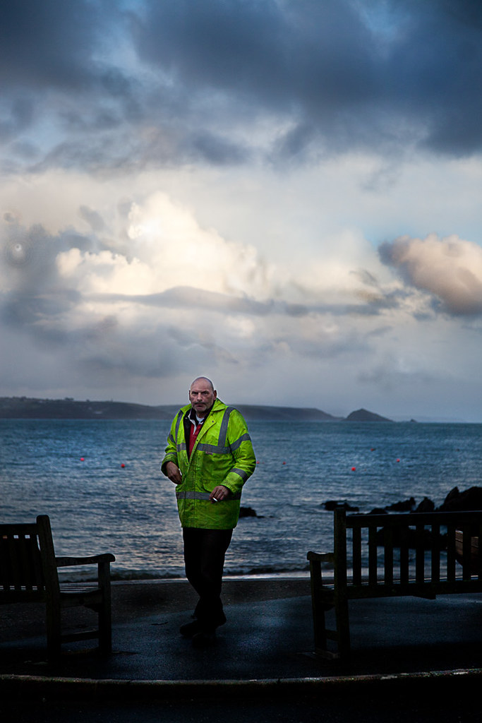
If you intended to capture that colour cast (from a sunset for example), the auto-white balance mechanism will ruin your shot. Typically blue skies and white snow tend toward grey. And, the real classic, lovely orange and red sunsets look pink, cartoon-like and flat instead of saturated. Orange and reds are particularly badly affected. So if your sunsets look cartoon pink/grey instead of saturated fire-orange you need to adjust your auto-white balance.

Auto white-balance fail!

• Auto white-balance fail! •

Cartoony pink-grey skies. The auto-white-balance function has colour shifted the orange/red tones toward greys.
Click image to view large
• Auto-white-balance fail! • By Netkonnexion on Flickr External link - opens new tab/page

Artificial light also creates a colour cast. Often the auto-white balance cannot properly adjust for this. The result is odd yellowish, blue or greenish tones in the picture where you did not see them yourself at the time. These also require an adjustment to your white-balance.

Why is there a problem?

Mainly the problem arises because we have made an adjustment in our heads without noticing. Most of the time we compensate for these colour casts and don’t see them. In fact, once we realise there is such a thing as a colour cast we can train ourselves to see it. We certainly see the heavy red colour casts of evening and early morning light. If we look carefully we can also see the yellows and blues from domestic lights – although less strongly.

Remedies

There are two possible ways to tackle the situation…

  • Compensate for colour casts by using a camera pre-set.
  • Correctly set the white-balance so it records the natural colours.

DSLRs have reasonably good pre-sets to tackle well known colour cast issues. On most cameras you will find white balance settings something like these below. The notes explain details…

  • Auto – The cameras best-guess colour match for what it senses. OK most of the time. Poor when there is a predominance of a strong colour.
  • Tungsten – (bulb icon) indoor, tungsten incandescent lighting using bulbs. Cools the colours – often bluish. This setting helps remove blues to warmer tones.
  • Fluorescent – for use under fluorescent lights – will tend to warm up the colours.
  • Daylight/Sunny – (sun icon) indicates the ‘normal’ white balance (may not be present if this is the default setting).
  • Cloudy – (cloud icon) Adds a warmer, yellowish colouration.
  • Shade – This light is cooler (bluer) than sunlight. Shade mode warms the colours a small amount.
  • Flash – (lightening icon) Stark and cool, flash desaturates towards blue. Flash setting compensates with a slightly warmer yellowish tone.
  • Custom – You do a little procedure to get an accurate setting to suit the situation.
Accurate colours

Colour accuracy is important. You really do want a bright blue sky or white snow or saturated red sunsets. The problem is that the pre-sets are averaged out for the “types” of situations encountered. The pre-sets will change the colours from dull flat colours to more representative ones. For example more saturated sunsets will be captured if you use the cloudy setting. However, to get it right you need to adjust the custom white balance.

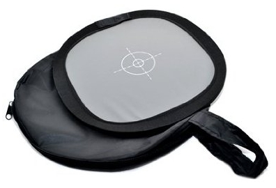
Setting the custom white balance is simple. The camera does most of it. You need a “neutral grey card”. This is simply a card or piece of material set at an average grey colour, normally at 12% grey, which matches the cameras accurate shade for neutral. You can buy these quite cheaply at most camera stores. (See: Range of photographic grey cards).

• The Lastolite Ezybalance •

  • collapsible; durable
  • wipe clean; very light
  • 12% grey; 30cm wide

An easy to use grey-card system. White on one side, grey on the other. The card doesn’t crease, the sprung border stretches the material tight. The card collapses into the supplied case, slipping easily into your camera bag. A great accessory to ensure colour accuracy in your pictures. You should not be without one.Spacer image

To set custom white-balance

It’s easy to set the white balance. However, there are lots of variations for how different cameras do it. Therefore it’s essential to use the right procedure from your manual. To get ready…

  • Place the card about 30cm/12 inches in front of your camera.
  • Zoom in or out to make the grey card fill the frame.
  • Now follow the camera manual “custom white balance” instructions.

To ensure complete accuracy you must do this procedure in the ambient light in which you will be shooting. This is the light the camera will sense and compare to the grey on the card.

More after this…

find out more...Photokonnexion tips by email
Enjoying this article? Please sign up for our
Tips by email service.
                                                Find out more

Shooting with RAW vs. *.jpg

I am sure lots of you are saying, “But I shoot with RAW and this is unnecessary”. OK, that is partly true. You can, with RAW format files change the white balance in the post-processing. Here are two reasons you should NOT do that…

  1. It is time saving to get as much right in the camera as possible. I like to spend my time shooting not computing!
  2. I have rarely met anyone who can remember colours so accurately that they get the post-processing colour and temperature balance right. I like to get them right in-camera as accurately as possible. Then I can safely change them later if necessary.

RAW format is excellent – you have complete control over colour temperature and hues. However, if the picture is wrong from the start, RAW is only as good as your own memory or colour awareness. Artists of many years may be able to remember colours accurately. Very few others can. Beginners especially have very poor colour memory/accuracy. So, use RAW, get it right in-camera – then do your artistic processing from a solid colour-base you know is accurate.

Compensation and accuracy

While both compensation for colour casts, and accurate representation of colour casts both rely on white balance there are differences in how they are treated. Strong colours or a strong colour bias through the picture needs some special treatment. Think about the two different methods above and practice them.

Comments, additions, amendments or ideas on this article? Contact Us
or why not leave a comment at the bottom of the page…

By Damon Guy (author and Photokonnexion editor)

Damon Guy - Netkonnexion

Damon Guy (Netkonnexion)

Damon is a writer-photog and editor of this site. He has run some major websites, a computing department and a digital image library. He started out as a trained teacher and now runs training for digital photographers.
See also: Editors ‘Bio’.

A fast and simple introduction to portrait photography

How to make a digital camera

A rapid but full introduction to portraiture


When I introduce a new idea or a concept in these pages I often provide a video to help put the point across. Well, here is a video that stands up on its own. It is a light and simple introduction to portraiture. It bombs along at a great rate and has plenty to say about good principles in portrait photography. So, without further ado here it is. It’s 4mins 15secs long.

How to take great portrait photos


VideoJug  External link - opens new tab/page
Portraiture – Resources on Photokonnexion.com

Comments, additions, amendments or ideas on this article?
Contact Us
or why not leave a comment at the bottom of the page…

Seeking the light – the essence of photography through the eyes of a war photographer

Don McCullin - Seeking The Light

Don McCullin – Seeking The Light • Video

Great equipment does not create great images.

Photographic insight is not in the equipment but the vision of the photographer. This is never more true than can be seen in this video. Don McCullin was a war photographer for more than 30 years. He saw some of the most appalling atrocities and covered some of the worlds most horrific wars – conflicts that would sear the sole. Yet in all that time he has retained a human and gentle perspective that provides a delicate insight but which also covers a dark vision too.

Transition

In this video Don McCullin is confronted, in his 70’s, with using a brand new digital camera for the first time. After more than 50 years of film and darkroom work as a professional photographer he abruptly makes the transition to digital. This film charts the progress of his first week. It is a transition which anyone who has started to learn digital photography has gone through. For Don it is a shock and revelation as well as a considerable learning curve. Many of you will empathise with his self-questioning and re-evaluation of his own skills and knowledge.

Canon CPS | Don McCullin Feature “Seeking the light”


Frank Algermissen

Iconic

Despite his gentle and unassuming approach in the video Don McCullin has demonstrated an amazingly insightful photographic vision. His war photography, and his street photography is eye-catching and beautiful. His control of dark tones and wide variations in light is his signature – one that made his war photography iconic.

In a previous article I covered a BBC programme Vivian Maier: Who Took Nanny’s Pictures?  External link - opens new tab/page in the Series “imagine – Summer 2013”. There is now also a wonderful programme on Don McCullin. You can see the recently broadcast BBC programme on the BBC iPlayer if you have access. The programme has some upsetting images and some extraordinary photography covering the ugly truth of war photography in the face of grave personal, life threatening danger. It is an amazing film. “McCullin”  External link - opens new tab/page will be available for another few weeks (published 11/07/2013).

Insights into an extraordinary life

For an insight into a very dark path through war photography, as well as some of his amazing photographs, watch this interview on a Canadian television programme. Don McCullin tells of his extraordinary life, some of the horrific things he has seen and explains who he is today. Well worth watching.
The Agenda with Steve Paikin  External link - opens new tab/page

Comments, additions, amendments or ideas on this article? Contact Us

By Damon Guy (author and Photokonnexion editor)

Damon Guy - Netkonnexion

Damon Guy (Netkonnexion)

Damon is a writer-photog and editor of this site. He has run some major websites, a computing department and a digital image library. He started out as a trained teacher and now runs training for digital photographers.
See also: Editors ‘Bio’.

Give your holiday landscapes a little extra punch

How to make a digital camera

How to make a digital camera

Do something different with your summer shots.

Holiday times always give us a chance to capture a few landscapes. Often they are a more difficult to get right than is appreciated. In fact a little thought can make all the difference. Think about your composition and your colours. The key to a good landscape is to find impact and contrast. In the video below Gavin Hoey shows you two things. First he shows how to think about your composition and colours. Next in the context of colours he shows how to turn your landscape into black and white in Photoshop (actually you can use any full featured image editor to do the same thing).

B&W Landscape Tips


AdoramaTV

Making black and white images

In the video Gavin Hoey made a great point about shooting in RAW. Landscape pictures often look great to the eye when in the field but they lose their appeal when the image is created on-screen. So in order to make your landscape pop some post processing is essential.

This video shows how to bring out contrasts to make the scene look great in black and white. However, he makes an important point about shooting in RAW. You don’t lose the original colour, it is retained in a RAW file. Then you convert to black and white afterwards. This is not possible in *.jpg. That format does not have the colours stored like the RAW format. If your black and white *.jpg is less than successful you lose the colour option too.

Gavin Hoey points out that you should test that your camera will process a RAW file in monochrome mode on its screen, but still leave a full colour RAW file. It is possible your camera converts the RAW file to a *.jpg file in the colour scene mode. So cover your options and try it before going in the field.

Gavin showed the conversion method to black and white using the colour sliders. Most image editors have two basic ways to create monochrome shots. Your shot can be simply colour converted to shades of grey, or you can use the colour slider method where you have some control over the intensity of colour which greys are created from. This latter method gives you much greater control over the contrasts in the picture. When working in monochrome that is the most effective way to ensure the picture has visual impact. So always choose the colour slider method to get better control of the conversion.

There are some additional links below to show how to improve your black and white shots in other ways.

Comments, additions, amendments or ideas on this article? Contact Us

find out more...Photokonnexion tips by email
If you enjoyed this article please sign up for our
Tips by email service.
                                                 Find out more

By Damon Guy (author and Photokonnexion editor)

Damon Guy - Netkonnexion

Damon Guy (Netkonnexion)

Damon is a writer-photog and editor of this site. He has run some major websites, a computing department and a digital image library. He started out as a trained teacher and now runs training for digital photographers.
See also: Editors ‘Bio’.