Tag Archives: Colour

Five easy tips for better photos in difficult weather and light

Its easy to make weather excuses, but….

We can actually find a way to shoot in almost any weather situation. Here are some tips to get the shot even though the weather conditions are not ideal for a photograph.
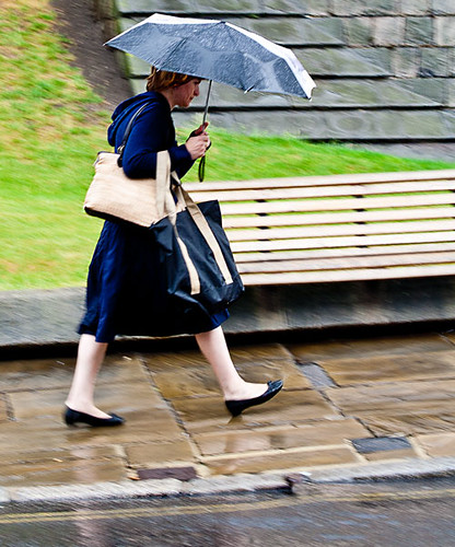
1. Rain…

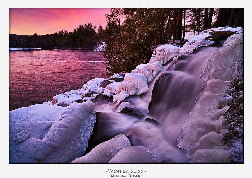
Cameras hate water. If there is a sure fire way to ruin your equipment, get it wet. So we want to dodge the rain shots. Actually rain is fun. You don’t need to be shooting right in the rain. Most of the time there is cover you can use to work from for your shot. Shop fronts, cars, through open windows, under canopies… you can think of thousands of rain hides if you try. And, rain provides lots of great things to shoot too. Rain is a great cleanser. The pavements and side roads are dust-free, shiny, or with splashing drops and running water. Yet life goes on. Street photography becomes dynamic, frenetic and full of new behaviors. People are doing things they normally do not do. They run, they put up umbrellas, they crowd under cover… lots of great behaviors that often do not get photographed. Look to catch people in the puddles, jumping, dashing for cover. Look for colours and reflections. Look for droplets, wet surfaces, running water. Most of all try to catch the reactions of people as they try not to get wet. Rain is great fun. Don’t hide your equipment away. Get out and take some great shots. After the rain look for skyward glances, great reflections, splashes and people emerging from cover.

2. High noon…

A high and harsh sunlit situation is not good for any kind of photography. Normally we think of it as pretty awful for any kind of portrait shot. The direct light creates washed out, over-exposed areas of the shot. The faces look flat and colours lose the subtle tonality. You can still get a great shots though. Seek out some cool, even shade. Under the canopy of shops or malls is ideal, or maybe within the shade of a substantial tree. Look for anything that provides enough shade for you and your subject to get out of the direct sunlight. However, stay near to the main sunlight area. The direct sunlit area will act as your main light source. The shade will act as a diffuser. Now, make sure you do not shoot into the direct sunlight or deeper darkness of deep shade. Try to keep your shot on your subject and make sure any background you use is also in the same light-shade level of intensity. That way your contrasts and colours will all be within the same dynamic range of light – which your camera deal with. However, the main light source will be diffused – creating a lovely soft, bright light source. Remember, if you shoot out of the shade into the sun you will find the contrast range too high. You will get bright highlights and over-exposure which will draw the eye away from your subject. So keep the shots tight to the light level you are working within and your shots will be fine and bright. Don’t shoot in mixed or dappled light.

3. Insufficient shade?

Avoiding very hard light or direct sunlight makes sense but what if you cannot find enough shade for you and your subject to be in the same light. If you are trying to photograph a person the impact of this direct light is particularly hard on their face and unflattering. Unfortunately putting your subject into the shade can make the situation worse. The darkness in the shade contrasts strongly with the bright light outside where you are standing. So you get bright spots in your shot and harsh darker areas in the deeper shade – very distracting. To overcome this high contrast situation take your shot on the shadow line. Line up the person you want to shoot on the shadow edge so the bright light is softened. In this intermediate place your subject gets the golden glow from the brighter light but it is softened by the slight shadow.

To help your camera to cope try to shoot from the same half-in half-out of shadow position too. The contrasts will not overpower your sensor there. If you get it right you will split the light to make it just right. Carefully placed you will capture the lovely sky and background but not lose detail in the shadow-darkness under the shade. Be careful not to get dappled light from sun through the leaves, and make sure the shadow line does not cross your subject. Bright contrasts and sharp shadow lines on the subject are very unflattering. Instead shoot along the half shade into the brighter light utilising the foreground weaker light as your main source for the subject.

4. The sun flattens the landscape

Often, particularly on holiday or when out on a shoot, we cannot wait for the golden hour. We are in a place where there is a deadline to move on and you want to get the shot. Unfortunately the high, direct sunlight flattens everything, eliminating shadows and ironing out colour tones. The light is boring and harsh and the shadows minimal.

How do you get the landscape? Include more sky than usual. Often in these situation the most interesting lighting is for the sky. The clouds and far away places look good. So expose for the sky and reduce the amount of landscape you include. This means using the sky as the main bright source of light. Point your focus point to a cloud. If the auto-focus ‘hunts‘ and will not focus turn it off and focus manually. Make the sky your subject and concentrate on the distance and sky. This may mean some of your foreground will be slightly underexposed. However, it is easier to brighten the foreground or a near subject later in post-processing if you have exposed for the sky.

#11030#

5. Dreary, grey diffused sky light

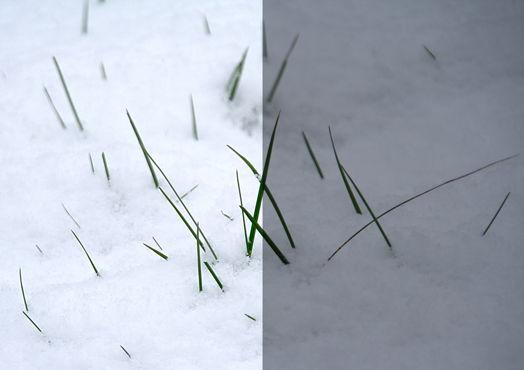
Another bad light situation for the photographer is the dreary grey day. Uniform light from across the sky leaves little or no shadow detail anywhere. Everything looks flat and dead. The problem here is there is nothing in the landscape that provides relief for the greyness. The sky is difficult too – you cannot do foreground shots as the uniform lack of colour or shadow means everything is pale and uninteresting. The distance has lost its sky appeal too. Even exposing for the sky creates almost uniform grey.

Well, this is the time to get out the flash. Off-camera flash is best, although pop-up flash will also do the trick. Get close to the ground or a surface with great texture. Then, shoot along the surface with the flash. If the flash is off-camera set it off to one side so it exaggerates ground shadows. If you are working with pop-up flash then make sure you work with the shadow at its maximum. This may mean shooting with your camera upside down so the light is really close to the surface and the optical axis is across the surface lit by the flash. If you use a relatively wide aperture, these low-level flash shots will bring out shadow detail in the foreground and leave the distance in bokeh and out of focus.

Some places to find great surfaces for this type of shot are low grasses, sandy or gravelly surfaces, tarmac, along road lines, autumnal leafy forest floors, bare rock… well, you get the idea. Seek out any surface that provides texture for you to capture. Lots of small to medium undulations and detail is best. Large objects will block the foreground so reserve them for the middle distance.

Remember the five rules…

The key to difficult weather and light situations is…

  • Find the right vantage point to shelter/shoot from
  • Maximise the opportunities for spotting unusual behavior
  • Make the most of the weather opportunities (sky, puddles, splashes etc)
  • Keep the light where you are shooting within approximately the same dynamic range
  • Look for, or create, light situations that exploit texture detail

By Damon Guy (author and Photokonnexion editor)

Damon Guy - Netkonnexion

Damon Guy (Netkonnexion)

Damon is a writer-photog and editor of this site. He has run some major websites, a computing department and a digital image library. He started out as a trained teacher and now runs training for digital photographers.
See also: Editors ‘Bio’.

Winter photography inspiration – colour, texture and tone…

• Winter Bliss • By Kyle McDougall

• Winter Bliss • By Kyle McDougall

Winter photogrpahy – free your vision.

Too often the dull, dim and dank days of Winter leave us cold. Venturing out? Winter photography? Noooo! Yet Winter offers a world of inspiring colours, textures, sights and light not there at other times of the year.

Not grey, great!

Like any other time of the year sunset and sundown are times of the day when the most amazing colours are revealed. The magic of the golden hour pinks and golds is just as exciting in the winter as it is in the summer – and you don’t have to be out so early or so late with shorter days. What is not so obvious to the inexperienced, Winter photography is the power of the winter colours. There is amazing colour, strong colour. However, especially in snowy environments, the golds, pinks and blues are mellowed into a softness that you don’t see at other times of the year. The wonderful pink tones in the image above show the point beautifully.

I have mentioned before in these pages that often the best pictures are captured just after the sun has gone down or just before it comes up. This “blue” period of the day provides infinite tonal blues that caress the eye. I just love these times of day. The great thing is that most photographers have packed up and gone home as the “blue” time starts… you have the stage. Make the best of this time as you will be among the few who use it well.

In Winter, texture wins the day

The lower light levels, and lower angle of light in the sky, often puts off photographers in Winter. But this is the best time to capture some wonderful textures. Muted winter colours and low light combine to create excellent contrasts and micro-shadows. Along with the soft light these environmental factors are a gift to the seeing photographer. Ice, snow and even water take on an almost ethereal glow punctuated by texture. If you can capture that with a good composition your pictures will create wonderful and lasting images in your viewers mind. Look for opportunities to get the sun low in the sky and those lovely early morning or evening tones and shadows from the side.

Opportunities

In your winter photography look for opportunities to express the colours and contrasts that appear. They are different to those you find in the Summer. The subtleties of tone, texture and colour are there for all to see, but only the insightful photographer will make good use of them.

My thanks to Kyle McDougall for his permission to use his photographs.

find out more...Photokonnexion tips by email
If you enjoyed this article please sign up for our
daily email service.
                                                 Find out more
#11030#

By Damon Guy (author and Photokonnexion editor)

Damon Guy - Netkonnexion

Damon Guy (Netkonnexion)

Damon is a writer-photog and editor of this site. He has run some major websites, a computing department and a digital image library. He started out as a trained teacher and now runs training for digital photographers.
See also: Editors ‘Bio’.

Simple ideas about sepia effects

• Sepia biplane •

• Sepia biplane •
Click image to view large
• Sepia biplane • By Netkonnexion on Flickr External link - opens new tab/page

Sepia is an old photographic effect.

It’s a photographic chemical process dating back to the 1800’s. Sepia creates a brown tone in the photograph. Today we sometimes colour our photographs in sepia tones too. What is the background to this old technique?

Print toning in sepia

In the days of chemical processing black and white pictures were processed using metallic silver in chemical emulsions. In the sepia process the silver was replaced by an alternative, silver sulphide. Silver sulphide is a more stable toner than the metallic silver counterpart. Sepia toned photographs have a longer life than alternative compounds making them ideal for archiving and preservation. However, there are in fact a whole range of chemical toners and some of them have brown tones. In some cases the non-sepia toners are not safe to handle. Be careful if you are handling lots of old films and wear protective gloves.

Sepia, the colour, gets its name from the rich brown coloured ink derived from the cuttlefish Sepia. The ink had been used in art and writing for centuries before photography. The richness of the browns in the chemical development process was a close match to the sepia ink. In fact sepia has a considerable tonal range. While it can be used to create rich brown and white photographic prints it can be printed in such a way as to parallel greyscale in its effect.

Modern sepia chemical processing involves three stages. During those stages processes and chemical variations can be applied that allow the compounds to have different toning capabilities or mixed with alternative toners. As a result the modern chemical sepia process can create multi-toning effects, mid-tones and shadow forms. These allow multiple tonal forms in the final print.

Modern digital sepia

Photographic toning is a way of changing a black and white picture to a different, warmer tone – a brown hue. Black and white are starkly contrasting. Sepia is a softer colour and easier on the eye. The sepia tone, while brown produces a ‘brown-scale’ picture, rather than a greyscale picture that would incorporate the black and white tones. As such, both are monochrome.

Of course today we use sepia in many ways. It can be used as it was in the past to create a softer, warmer colour in a print which is easier on the eyes than stark black and white. However, modern sepia no longer carries the archival or protective functions of the previous chemical process. Here are some other ways it is used today…

To:

  • Induce warmer tones
  • Softer colour impact
  • Give a picture a traditional or aged appearance
  • Give the appearance of a more natural tonal range

As a result of some quite flexible toning processes in using sepia the modern equivalent of sepia is a very loose term. In many ways digital sepia use is really just toning. Its the same as would be applied if we used a blue, green or red tone. Of course each image editing package has its own sepia toning colour. As a result you should experiment to make sure that your editor colour is appropriate to the way you use it.

find out more...Photokonnexion tips by email
Enjoying this article? Please sign up for our
daily email service.
                                                Find out more…
#11030#


In fact sepia is, like black and white, a fairly flat colour. Variations in the intensity of the toning can create quite variable light and dark shades. In the final print the flatness of the colour can be enhanced by using textured papers. On a screen image or digital projection textures can be incorporated into the image as I have included above. This relieves the monotony of the sepia when there is a large area of one tone in the image.

If your use of sepia is intended to give the appearance of age then other measures can help too. One idea is to give the impression of a distressed print. The photograph below is a scan from an old print. I have kept the dirt and creases on the image in order to give that “distressed” effect that makes the image look like it has been around for a long time.

The photographs of the past are often distressed by damage and age.

The photographs of the past are often distressed by damage and age. Modern images can be given the same appearance with a little work in an image editor.


The distressed appearance can be reproduced carefully in post processing to give the impression of age and deterioration. You will have to practice such skills to make them realistic, but worth it if the final outcome is effective.

Finally, one of the things that people often forget is consistency. If you are going to do a photograph in sepia in order to make it look old, then remember to make the clothes, objects and environment within the picture match the age of the intended shot. There is nothing more confusing to a viewer than mixed messages. An appearance of old processing, but modern clothes, just looks odd. So try to make your image and processing match.

By Damon Guy (author and Photokonnexion editor)

Damon Guy - Netkonnexion

Damon Guy (Netkonnexion)

Damon is a writer-photog and editor of this site. He has run some major websites, a computing department and a digital image library. He started out as a trained teacher and now runs training for digital photographers.
See also: Editors ‘Bio’.

Correct snow scenes using exposure compensation

Bright snow scenes create a problem with the auto-settings for exposure

Bright snow scenes create a problem with the auto-settings for exposure
Click image to view large
Green shoots through the snow By Netkonnexion on Flickr External link - opens new tab/page

Snow reveals a problem with auto-modes.

The brightness of a snow scene throws off exposure. Cameras in auto-modes work to a “normal” type of scene. When unusually bright scenes are encountered the camera cannot compensate. It leaves the scene grey. This is because the camera is calibrated to work with a mix of colours, light and darks that represent the sort of scene we encounter every day. It senses the luminance levels in the scene and sets exposure to the middle of the range between light and dark.

If the camera senses an unusually bright scene, like the snow scene above, it is unable to compensate properly. The brightness is outside its normal range of compensation. The camera responds by underexposing the shot, and the snow turns grey. The photograph above shows the scene as shot in the right hand panel. It is grey. The left hand panel shows the correct exposure after the underexposure is compensated by an exposure compensation of 1.66 stops (one and two thirds stops). (See: Definition: f-stops)

Photographers are more accurate than camera auto settings

In these bright (or dark situations) we can dial in exposure compensation to manually set the scene to be brighter. Using the exposure compensation we can increase the exposure to brighten the scene (+ settings) or even darken the scene (- settings) as appropriate. Then, we take another picture. By looking at the screen on the camera (“Chimping”) we can get the exposure correct by adjusting the exposure compensation to correctly whiten the scene.

This exposure compensation principle applies to the camera modes which are automatic or semi-automatic. In full auto, the camera calculates the exposure by balancing the ISO, shutter speed and aperture settings. However, in the semi-automatic modes the photographer changes one of the settings while the camera changes the other. In these modes, as in full-auto, the camera can still make the mistake of under-exposing (or over-exposing). Only the photographer can judge the exposure correctly.

When using aperture priority mode, you the photographer, makes the decision on the aperture size (f-stop setting). The camera calculates the appropriate shutter speed. If your camera cannot correctly interpret the scene, as with snow for example, then you will need to dial the exposure compensation to correct for the under-exposure. If you are using shutter priority, same again, the camera calculates the aperture (f-stop) setting. If the camera makes a wrong exposure decision, you can manually set the exposure compensation to over-ride the f-stop setting the camera would set.

Full manual mode, where the photographer sets all the settings directly, cannot use exposure compensation. In this mode the photographer makes all the decisions. The camera does not interfere with the exposure settings. In this case the photographer is free to make decisions to fix the exposure setting for all three factors of exposure – ISO, aperture and shutter speed. There can be no element of compensation for a failed camera decision. The photographer stands by their own settings and has full discretion to control the exposure as they wish. Deliberate over or under-exposure as well as accurate exposure are all possible. It is for this reason that I urge you to work in full manual where you can. You have far more control over the outcome of the shot. You also as a consequence have more artistic control over your image.

If you are working in RAW, the native data mode of image files in camera, it is possible to correct for camera exposure errors in post-processing. As I have argued elsewhere it is better to try and get all the settings correct in camera than to spend time processing afterwards for a number of reasons. So, no matter what file type you are using, try to set the shot up correctly from the start.

There you have it. Exposure compensation is a camera setting which is wholly dedicated to compensating for the mess-ups that the camera makes with its exposure calculations in auto or semi-auto modes. But when using auto-modes, and/or using *.jpg files, it is essential to be able to compensate for the cameras’ failings by using exposure compensation – otherwise your snow will be grey!

find out more...Photokonnexion tips by email
If you enjoyed this article please sign up for our
daily email service.
                                                 Find out more…
#11030#


By Damon Guy (author and Photokonnexion editor)

Damon Guy - Netkonnexion

Damon Guy (Netkonnexion)

Damon is a writer-photog and editor of this site. He has run some major websites, a computing department and a digital image library. He started out as a trained teacher and now runs training for digital photographers.
See also: Editors ‘Bio’.

Simple ‘Principles’ of photographic composition

Photographic composition happens on two levels.

First you should work to understand the scene at the basic level – the ‘elements’ that catch the eye and draw the viewer in. Then you should think about how to construct the overall composition. A photograph is all about the impact you create in your viewers mind. Composition is about constructing that impact.

The principles of art, design and photography

In Easy introduction to ‘visual elements’ in photographs we examined the elements of a photograph. The visual elements in a scene are the components that enable us to distinguish objects from one-another. They are the patterns we see from which we make sense of the world.

Organising the visual elements into a coherent photograph requires a higher level of composition. This is the layer of design. It is the layer that artists, including photographers, use to create an overall composition. One that lies above the native elements of the scene.

These principles pull together the elements in the scene. There are eleven of the “Principles”. However, some are so intimately mixed that people sometimes combine them. They are all in there however, they are presented. Here they are:

  • Balance: The state of creating visual equilibrium between elements in the picture.
  • Contrast: Conditions within the picture that emphasize differences, conflicts, opposition, between the elements.
  • Emphasis: The establishment of a focal point, or centre of dominance in a picture.
  • Variety: The visual interest that draws a number of different elements together.
  • Unity: The concept behind the picture, the comprehensiveness of the scene, the oneness of the message.
  • Harmony: Overall visual continuity achieving the unity in the theme; the wholeness of the elements; simplicity; uncluttered; conditions that emphasize similarity, peace and flow.
  • Proportion: Controls the size relationships of the different elements or components in the scene.
  • Rhythm: The use of visual elements to induce regular movement, a visual repetition or tempo.
  • Movement: Can be either a combination of elements to depict action/movement; or a dynamic design to draw the eye through the picture.
  • Pattern: The repeating of one type of element to create a picture (or form a major part of one).
  • Repetition: A combination of elements used many times to create a harmonious whole.

More after this…

Examples – a slide show!

It is difficult to take these principles out of context and understand them straight away. Here is a short slide show by Chandler Studio Art. The examples pull the concepts together. However, you should remember the ideas from the post on Easy introduction to ‘visual elements’. Because the ‘Principles’ pull them together. The author revises the elements in the beginning and asks you to remember them again at the end, before summarising the Principles.

Click the bottom arrows to move back or forward on the slides. Use the four arrow symbol (Right end) to expand the slide to full screen size.


Damon Guy - Netkonnexion

Damon Guy (Netkonnexion)

Damon is a writer-photog and editor of this site. He has run some major websites, a computing department and a digital image library. He started out as a trained teacher and now runs training for digital photographers.
See also: Editors ‘Bio’.
See also: Profile on Google+.

Easy introduction to ‘visual elements’ in photographs

Look into your photograph, go deeper than it’s content.

Examine the composition of your image. Go beyond it’s immediate pictorial display. Look into the basic structure and you will be able to break your picture down into its component parts. Consequently, understanding individual “Visual Elements” in an image can help you to capture the eye of the viewer too. It’s these simple elements that make the eye work to absorb the content of an image.

Visual elements shown in a slide show.

Image taken from the slide show below shows how the visual elements work.

What are the ‘Visual Elements’?

We make sense of the world by building a picture of it in our heads. Objects in our environment are visible to us because our eye/brain system is able to see and analyse the edges, contrasts, light/shadow/dark, colours and perspectives we see. Subsequently, our ability to analyse these patterns gives us an understanding of the world around us. So, if we can isolate these simple visual elements it will help our composition.

To make an image, photographers should look for strong visual elements through the lens. A great deal of the creative work in photography is to remove content that doesn’t contribute to the point of an image – these are distractions. So, to make the image effective we should also seek a point of view that isolates elements that we want to show.

Having isolated distractions the next job is to ‘see’ the subject in the ‘best possible light’. This English idiom is not just waffle (especially for photogs). It is really about using the edges, contrasts, light/shadow/dark, colours and perspectives mentioned above. Finding ways to use these effectively is what will draw the eye into our images. As a result, we should be finding simple, eye-catching features that make the scene realistic and easy to understand.

The Elements of Art

Research in art shows, that we can pin-point specific ‘visual elements’ in a photograph as powerful, but fundamental parts of our images. Artists have isolated these visual elements. They are called, “The Elements of Art”. There are seven of them…

  • Line (The path of a point, or implied path of a point, through space or over a surface.)
  • Shape (A two dimensional enclosure created by a single line – may be geometric or freeform.)
  • Form (A three dimensional object which has a ‘mass’ or ‘weight’; a shape with depth; physical width/height/depth.)
  • Space (Positive space: the subject or dominant object in the picture plane; Negative space: the background area. Space can occupy the outside, inside or surrounds in a depicted object.)
  • Value (The relative brightness/lightness/darkness/colour intensity. Photographers usually refer to Value as ‘Tone’.)
  • Colour (Light of particular wavelengths in the visible light spectrum.)
  • Texture (The presence of an apparent surface that would have a touch/feel character of its own.)
Examples – a slide show!

Perhaps, some of my definitions above are difficult to understand. If you can put them into context it will help. Here is a short slide show by Kelly Parker. The examples really show the visual element of colour well. Click the bottom arrows to move back or forward on the slides. Furthermore, you can find examples of the other ‘Elements or Art’ available in many other articles. Search “Elements of Art“.

The Elements of Art – A glossary Entry

To follow up, the Photokonnexion Glossary has an extended article on the Elements of Art. You can see that here… Definition: Elements of Art


Download a Presentation Transcript of the slide show.

Damon Guy - Netkonnexion

Damon Guy (Netkonnexion)

Damon is a writer-photog and editor of this site. He has run some major websites, a computing department and a digital image library. He started out as a trained teacher and now runs training for digital photographers.
See also: Editors ‘Bio’.
See also: Profile on Google+.

Ten obvious reasons to change your approach and how to do it

Your photograph is not perfect.

You see good quality photographs every day. Why does your photo not match up to the photographic quality in a publication? What can you do? The answer is simple. You need to look at your overall technique.

Things add up…

Assuming a great idea and composition – what can go wrong? In photography every step of the process counts. The more you get right the better the result.

Professional photographers often repeat a shot tens of times to get it right, sometimes more. They aspire to excellence. Care, dedication, persistence and attention to detail add up to technical quality.

What can go wrong?
  1. Bad lighting: There’s no substitute for suitable, interesting light that’s sympathetic to the subject. If the light is wrong, your shot will not work either.
    Solution: Learn everything about the quality of light, hard light, soft light, the colour of light and the properties of light.
  2. The whole picture is soft: You moved the camera while shooting.
    Solution: Pros use tripods – good ones. They use them fast and efficiently because they practice.
  3. The whole picture is soft: You had to hand-hold the shot.
    Solution: Professionals know how to set up a manual exposure that suits the light. Learn to shoot in manual modes. Know what shutter speed/ISO combinations you can use without movement.
  4. The exposure is too dark/light: Common when learning manual camera control.
    Solution: Use RAW, then you can compensate. With RAW you can deliberately manage your exposure too. There is no ‘perfect exposure’ – there is only the result you want. To get the result you want you have to adjust your exposure. (Hint: you can’t adjust your exposure effectively in *.jpg unless you use exposure compensation).
  5. Colours off: If you are shooting in *.jpg you deserve all you get. The white balance is probably wrong. The manufacturers settings are limited. You can’t fix it in processing. Remember, *.jpg is a RAW file developed in-camera to manufacturers settings, not yours. The settings are applied to your shot blind. No wonder they are not what you want.
    Solution: Get it right. It’s easier to shoot in RAW and develop the shot yourself. It gives you fine control and you can develop your shot work the way you want. Something *.jpg cannot do.
  6. Poor focus: Focus is critical to the right technical and artistic result.
    Solution: Learn about: Depth of Field; aperture, Bokeh, Circle of confusion and how they relate to your lenses. Pros know these things intuitively. You can too with practice.
  7. Poor or soft focus from movement: Focus mode is on the wrong setting.
    Solution: Learn to use the correct focus mode (eg. single shot or continuous etc). Also, learn to focus manually. There are situations where auto-focus is poor (eg. in poor-contrast light). Switch off auto-focus to get better results.
  8. The shot is not sharp: A suspect, poor quality or broken lens.
    Solution: Buy decent lenses. All lenses have sweet and sour spots – even professional ones. Cheap lenses have a poorer optical quality and have more sour than sweet spots.
    Solution: Quality costs money. However, look after a good lens it will last longer than your camera. If you choose right, it’ll fit your next camera. It pays to buy the best quality lens you can afford.
  9. Great lens and tripod! My shot’s still not sharp: Sharpness requires attention to the above and these specific details too…
    Solutions:
    one: Turn off vibration reduction functions. On a tripod motors cause vibration, not stop it.
    two: Turn off auto-focus (another motor), or at least the continuous-focus setting (use the ‘one-shot’ setting).
    three: Use ‘mirror lock-up’ (DSLRs). Mirrors clunk up causing tripod vibration.
    four: Keep out of wind, away from vibration and keep your tripod low (don’t fully extend legs).
    five: Use a remote shutter trigger. Button pushing causes vibration.
  10. I did all this and it’s still not right!
    Solutions:
    one: Practice – putting this together takes time and effort.
    two: Return to locations many times to get the right light and conditions.
    three: Post processing! RAW users, this is where you polish the shot up. Since the earliest photography developing the shot has been a key process. RAW processing is another skill to learn. It’s essential, so learn it. Only *.jpg’ers should worry because they have disabled files. If you used *.jpg there is no hope of properly completing the job.

There is a lot to do! Follow the links and keep at it – you WILL succeed.

By Damon Guy (author and Photokonnexion editor)

Damon Guy - Netkonnexion

Damon Guy (Netkonnexion)

Damon is a writer-photog and editor of this site. He has run some major websites, a computing department and a digital image library. He started out as a trained teacher and now runs training for digital photographers.
See also: Editors ‘Bio’.