Tag Archives: Post processing

Composition for impossible photography

Video

Video

Working in two dimensions is easy.

The trick is to make our photograph look like 3D. Well, Erik Johansson has taken this one step further. He likes to trick the eye with his photography. His subtle constructions in the pictures make you look, think and look again. Most of his pictures are actually impossible. But the images are constructed so as to realise the reality in impossibility.

If that sounds convoluted, so are his pictures. In the video Johansson not only talks around the way he conceived the pictures, be also describes the compositional theory behind them. It’s very simple, but it is also illuminating for our general ideas about perspective and reality.

Enough from me. This short video (6mins.22secs) will fill you with ideas and give you some new perspectives… enjoy!

Erik Johansson: Impossible photography


Filmed Nov 2011 • Posted Feb 2012 • TEDSalon London Fall 2011
TED – Ideas worth spreading  External link - opens new tab/page

Comments, additions, amendments or ideas on this article? Contact Us
or why not leave a comment at the bottom of the page…

By Damon Guy (author and Photokonnexion editor)

Damon Guy - Netkonnexion

Damon Guy (Netkonnexion)

Damon is a writer-photog and editor of this site. He has run some major websites, a computing department and a digital image library. He started out as a trained teacher and now runs training for digital photographers.
See also: Editors ‘Bio’.

find out more...Photokonnexion tips by email
If you enjoyed this article please sign up for our
Tips by email service.
                                                 Find out more

Five easy tips for better photos in difficult weather and light

Its easy to make weather excuses, but….

We can actually find a way to shoot in almost any weather situation. Here are some tips to get the shot even though the weather conditions are not ideal for a photograph.

1. Rain…

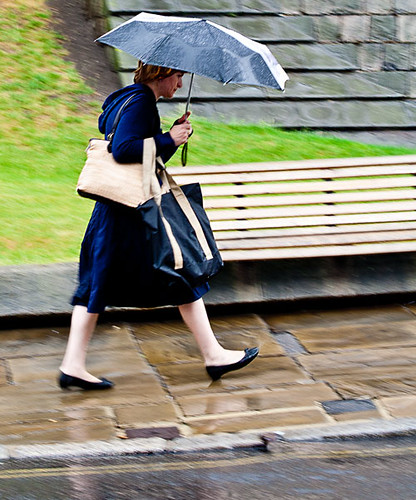
Cameras hate water. If there is a sure fire way to ruin your equipment, get it wet. So we want to dodge the rain shots. Actually rain is fun. You don’t need to be shooting right in the rain. Most of the time there is cover you can use to work from for your shot. Shop fronts, cars, through open windows, under canopies… you can think of thousands of rain hides if you try. And, rain provides lots of great things to shoot too. Rain is a great cleanser. The pavements and side roads are dust-free, shiny, or with splashing drops and running water. Yet life goes on. Street photography becomes dynamic, frenetic and full of new behaviors. People are doing things they normally do not do. They run, they put up umbrellas, they crowd under cover… lots of great behaviors that often do not get photographed. Look to catch people in the puddles, jumping, dashing for cover. Look for colours and reflections. Look for droplets, wet surfaces, running water. Most of all try to catch the reactions of people as they try not to get wet. Rain is great fun. Don’t hide your equipment away. Get out and take some great shots. After the rain look for skyward glances, great reflections, splashes and people emerging from cover.

2. High noon…

A high and harsh sunlit situation is not good for any kind of photography. Normally we think of it as pretty awful for any kind of portrait shot. The direct light creates washed out, over-exposed areas of the shot. The faces look flat and colours lose the subtle tonality. You can still get a great shots though. Seek out some cool, even shade. Under the canopy of shops or malls is ideal, or maybe within the shade of a substantial tree. Look for anything that provides enough shade for you and your subject to get out of the direct sunlight. However, stay near to the main sunlight area. The direct sunlit area will act as your main light source. The shade will act as a diffuser. Now, make sure you do not shoot into the direct sunlight or deeper darkness of deep shade. Try to keep your shot on your subject and make sure any background you use is also in the same light-shade level of intensity. That way your contrasts and colours will all be within the same dynamic range of light – which your camera deal with. However, the main light source will be diffused – creating a lovely soft, bright light source. Remember, if you shoot out of the shade into the sun you will find the contrast range too high. You will get bright highlights and over-exposure which will draw the eye away from your subject. So keep the shots tight to the light level you are working within and your shots will be fine and bright. Don’t shoot in mixed or dappled light.

3. Insufficient shade?

Avoiding very hard light or direct sunlight makes sense but what if you cannot find enough shade for you and your subject to be in the same light. If you are trying to photograph a person the impact of this direct light is particularly hard on their face and unflattering. Unfortunately putting your subject into the shade can make the situation worse. The darkness in the shade contrasts strongly with the bright light outside where you are standing. So you get bright spots in your shot and harsh darker areas in the deeper shade – very distracting. To overcome this high contrast situation take your shot on the shadow line. Line up the person you want to shoot on the shadow edge so the bright light is softened. In this intermediate place your subject gets the golden glow from the brighter light but it is softened by the slight shadow.

To help your camera to cope try to shoot from the same half-in half-out of shadow position too. The contrasts will not overpower your sensor there. If you get it right you will split the light to make it just right. Carefully placed you will capture the lovely sky and background but not lose detail in the shadow-darkness under the shade. Be careful not to get dappled light from sun through the leaves, and make sure the shadow line does not cross your subject. Bright contrasts and sharp shadow lines on the subject are very unflattering. Instead shoot along the half shade into the brighter light utilising the foreground weaker light as your main source for the subject.

4. The sun flattens the landscape

Often, particularly on holiday or when out on a shoot, we cannot wait for the golden hour. We are in a place where there is a deadline to move on and you want to get the shot. Unfortunately the high, direct sunlight flattens everything, eliminating shadows and ironing out colour tones. The light is boring and harsh and the shadows minimal.

How do you get the landscape? Include more sky than usual. Often in these situation the most interesting lighting is for the sky. The clouds and far away places look good. So expose for the sky and reduce the amount of landscape you include. This means using the sky as the main bright source of light. Point your focus point to a cloud. If the auto-focus ‘hunts‘ and will not focus turn it off and focus manually. Make the sky your subject and concentrate on the distance and sky. This may mean some of your foreground will be slightly underexposed. However, it is easier to brighten the foreground or a near subject later in post-processing if you have exposed for the sky.

#11030#

5. Dreary, grey diffused sky light

Another bad light situation for the photographer is the dreary grey day. Uniform light from across the sky leaves little or no shadow detail anywhere. Everything looks flat and dead. The problem here is there is nothing in the landscape that provides relief for the greyness. The sky is difficult too – you cannot do foreground shots as the uniform lack of colour or shadow means everything is pale and uninteresting. The distance has lost its sky appeal too. Even exposing for the sky creates almost uniform grey.

Well, this is the time to get out the flash. Off-camera flash is best, although pop-up flash will also do the trick. Get close to the ground or a surface with great texture. Then, shoot along the surface with the flash. If the flash is off-camera set it off to one side so it exaggerates ground shadows. If you are working with pop-up flash then make sure you work with the shadow at its maximum. This may mean shooting with your camera upside down so the light is really close to the surface and the optical axis is across the surface lit by the flash. If you use a relatively wide aperture, these low-level flash shots will bring out shadow detail in the foreground and leave the distance in bokeh and out of focus.

Some places to find great surfaces for this type of shot are low grasses, sandy or gravelly surfaces, tarmac, along road lines, autumnal leafy forest floors, bare rock… well, you get the idea. Seek out any surface that provides texture for you to capture. Lots of small to medium undulations and detail is best. Large objects will block the foreground so reserve them for the middle distance.

Remember the five rules…

The key to difficult weather and light situations is…

  • Find the right vantage point to shelter/shoot from
  • Maximise the opportunities for spotting unusual behavior
  • Make the most of the weather opportunities (sky, puddles, splashes etc)
  • Keep the light where you are shooting within approximately the same dynamic range
  • Look for, or create, light situations that exploit texture detail

By Damon Guy (author and Photokonnexion editor)

Damon Guy - Netkonnexion

Damon Guy (Netkonnexion)

Damon is a writer-photog and editor of this site. He has run some major websites, a computing department and a digital image library. He started out as a trained teacher and now runs training for digital photographers.
See also: Editors ‘Bio’.

Simple ideas about sepia effects

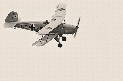
• Sepia biplane •

• Sepia biplane •
Click image to view large
• Sepia biplane • By Netkonnexion on Flickr External link - opens new tab/page

Sepia is an old photographic effect.

It’s a photographic chemical process dating back to the 1800’s. Sepia creates a brown tone in the photograph. Today we sometimes colour our photographs in sepia tones too. What is the background to this old technique?

Print toning in sepia

In the days of chemical processing black and white pictures were processed using metallic silver in chemical emulsions. In the sepia process the silver was replaced by an alternative, silver sulphide. Silver sulphide is a more stable toner than the metallic silver counterpart. Sepia toned photographs have a longer life than alternative compounds making them ideal for archiving and preservation. However, there are in fact a whole range of chemical toners and some of them have brown tones. In some cases the non-sepia toners are not safe to handle. Be careful if you are handling lots of old films and wear protective gloves.

Sepia, the colour, gets its name from the rich brown coloured ink derived from the cuttlefish Sepia. The ink had been used in art and writing for centuries before photography. The richness of the browns in the chemical development process was a close match to the sepia ink. In fact sepia has a considerable tonal range. While it can be used to create rich brown and white photographic prints it can be printed in such a way as to parallel greyscale in its effect.

Modern sepia chemical processing involves three stages. During those stages processes and chemical variations can be applied that allow the compounds to have different toning capabilities or mixed with alternative toners. As a result the modern chemical sepia process can create multi-toning effects, mid-tones and shadow forms. These allow multiple tonal forms in the final print.

Modern digital sepia

Photographic toning is a way of changing a black and white picture to a different, warmer tone – a brown hue. Black and white are starkly contrasting. Sepia is a softer colour and easier on the eye. The sepia tone, while brown produces a ‘brown-scale’ picture, rather than a greyscale picture that would incorporate the black and white tones. As such, both are monochrome.

Of course today we use sepia in many ways. It can be used as it was in the past to create a softer, warmer colour in a print which is easier on the eyes than stark black and white. However, modern sepia no longer carries the archival or protective functions of the previous chemical process. Here are some other ways it is used today…

To:

  • Induce warmer tones
  • Softer colour impact
  • Give a picture a traditional or aged appearance
  • Give the appearance of a more natural tonal range

As a result of some quite flexible toning processes in using sepia the modern equivalent of sepia is a very loose term. In many ways digital sepia use is really just toning. Its the same as would be applied if we used a blue, green or red tone. Of course each image editing package has its own sepia toning colour. As a result you should experiment to make sure that your editor colour is appropriate to the way you use it.

find out more...Photokonnexion tips by email
Enjoying this article? Please sign up for our
daily email service.
                                                Find out more…
#11030#


In fact sepia is, like black and white, a fairly flat colour. Variations in the intensity of the toning can create quite variable light and dark shades. In the final print the flatness of the colour can be enhanced by using textured papers. On a screen image or digital projection textures can be incorporated into the image as I have included above. This relieves the monotony of the sepia when there is a large area of one tone in the image.

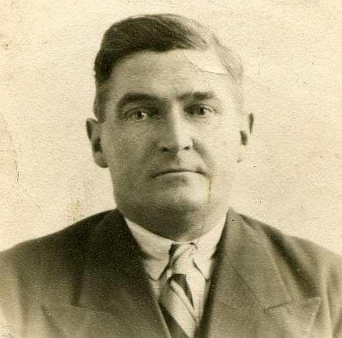
If your use of sepia is intended to give the appearance of age then other measures can help too. One idea is to give the impression of a distressed print. The photograph below is a scan from an old print. I have kept the dirt and creases on the image in order to give that “distressed” effect that makes the image look like it has been around for a long time.

The photographs of the past are often distressed by damage and age.

The photographs of the past are often distressed by damage and age. Modern images can be given the same appearance with a little work in an image editor.


The distressed appearance can be reproduced carefully in post processing to give the impression of age and deterioration. You will have to practice such skills to make them realistic, but worth it if the final outcome is effective.

Finally, one of the things that people often forget is consistency. If you are going to do a photograph in sepia in order to make it look old, then remember to make the clothes, objects and environment within the picture match the age of the intended shot. There is nothing more confusing to a viewer than mixed messages. An appearance of old processing, but modern clothes, just looks odd. So try to make your image and processing match.

By Damon Guy (author and Photokonnexion editor)

Damon Guy - Netkonnexion

Damon Guy (Netkonnexion)

Damon is a writer-photog and editor of this site. He has run some major websites, a computing department and a digital image library. He started out as a trained teacher and now runs training for digital photographers.
See also: Editors ‘Bio’.

Eight ways to bring out texture in your photographs

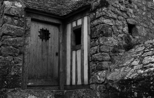
• Medieval Prison •  Bring out the texture in your shots

• Medieval Prison •
A dismal dungeon! Bring out the texture in your shots.
Click image to view large
• Medieval Prison • By Netkonnexion on Flickr External link - opens new tab/page

Texture is essential for a 3D effect.

If you want a realistic feel you need to work at it. Convincing texture lies in the fine detail – your picture must look like it feels. Here are eight things you can do to increase the texture from capture to printing…

What is texture?

Texture is the fine detail in your photograph. I am sure you would know what it feels like to run your finger over the surface of a brick. If a photograph of a brick convinces you that touching the photograph would feel like a brick, your depiction of texture has been successful. The term texture is a fine art concept which applies to photography [texture definition].

More after this…

Get Photokonnexion tips by email!
We send you tips daily – find out more…

Start email subscription now!
#11030#

Eight ways to enhance texture
  1. Pick your subject to ensure it will show texture. Close ups are easiest as you can work large. If you are with a large subject like a person and want to show fine texture on the background you should ensure the background surface you pick is well defined. Look for the largest contrast in shades of colour and in light/dark. Look for shadow areas and bright areas. Make sure that the physical texture (roughness) is roughest where you will be taking the shot. These are the features of texture the camera will pick up.
  2. Hard light on your texture will give it a sharp, unyielding feel, a sandpaper type effect. Soft light will give it a rounded less harsh look, more like weathered stone surfaces. Arrange your light to emphasis the character of the texture you are photographing.
  3. When taking your photograph arrange the light coming at your texture from the side. A shallow angle of light creates light/shadow areas which define the texture. When these little contrasts can be seen they make the texture stand out. If light comes from where you are shooting from these shadows are not created and the texture will be flat (eg. pop-up flash or sun from behind you).
  4. Consider very slightly over-exposing your shot. This will give you room to exaggerate the contrast in the post processing.
  5. In the developing module of your processing (RAW only) use the contrast tool to maximise the contrast potential in your texture. If working in *.jpg enhance the contrast in the normal picture editing view.
  6. Consider making your picture a grey-scale shot in post processing. If possible do not do a direct colour to black & white conversion. Use colour control methods to enhance the contrasts in each colour. You will need a more advanced image editing application for this (PhotoShop, or Elements for example).
  7. Use the ‘burn’ in post processing to deepen the dark areas of the shot. Set it to emphasis shadow. Manually pick out the shadow/darker areas and give them a very slight darkening. Try working at about 10% (or less) ‘burn’ exposure. Similarly, use the ‘dodge’ tool to brighten the highlights. Set the tool to pick out highlights at about 8%-18% exposure.
  8. When printing use paper that has a texture appropriate to the texture you want to bring out. You will need to print a test print. Then hold the test texture up against several paper surfaces to compare the textures. Paper with softer, uneven texture will take the edge off textures in the print. Harder textures with more regular surface will tend to sharpen the depicted texture. However, the eye must be your final guide. There is great skill involved in picking the right paper texture for specific pictures when printing. So you might need to make several tests with different paper textures to get the most emphasis for your texture.

Enhancing the contrast between light and dark or between colours will emphasis texture, but the most effective impact will be what you achieve in the actual shot. Try to ensure you use the light to gain the best advantage from your texture as you do the shooting. It will look more realistic and you will have to spend less time at the computer.

By Damon Guy (author and Photokonnexion editor)

Damon Guy - Netkonnexion

Damon Guy (Netkonnexion)

Damon is a writer-photog and editor of this site. He has run some major websites, a computing department and a digital image library. He started out as a trained teacher and now runs training for digital photographers.
See also: Editors ‘Bio’.

Can you write? Of course you can!
Write for Photokonnexion...

We would love to have your articles or tips posted on our site.
Find out more…
Write for Photokonnexion.

Get your settings right with all file types

File-formats and settings

The power of the file format you use…

Most photographers don’t think about settings and file formats when starting. First off, most people just want to take pictures. Down the road you need to think about what you are doing more carefully. You will need to get into RAW processing to overcome the shortcomings (but also, see my comment after this article)

File formats

When you think about settings and file formats it appears very technical. It’s not easy to work out what you need to know. Here are the basics. There are two in-camera file types for photographers…

  • RAW = a file type for capturing all the data from your camera, but which needs developing (post processing) after the file is downloaded. There are many manufacturer-specific versions of the RAW format.
  • *.jpg = a specific file type created in-camera from a RAW file. It is processed by the camera. The *.jpg format was originally designed only for transmitting and displaying files. It is extremely limited for post processing and easily degraded.

Both file types are useful for certain things. The RAW format is ultimately the most useful for photographers because it is so flexible. It allows you to develop the image you want from the picture you have taken. The *.jpg file on the other hand is processed for you, in a limited auto-processing system over which you have little control. It is confusing for beginners because *.jpg files create reasonably good images. But it is difficult to make them do what you intend. Beginners eventually find they cannot create the excellent images that RAW users produce. Nevertheless, starters use *.jpg because they don’t understand RAW and processing – they are stuck without help.

The processing is already done for *.jpg files by the time they are downloaded. Most beginners think they have something special when they get a great image straight out of the camera. Actually they are getting something processed according to someone else’s ideas. So it is not entirely their creation.

How do you break out of this situation?

The easiest way is to do a course or join a club or both. Then you can gain the experience and techniques you need to learn while having fun with others who share your interests. There are lots of courses and clubs around. More specifically you will have three goals. You need to learn how to…

  • Control your camera to get the picture you want.
  • Do post processing to produce great images.
  • See great scenes and compose them to create great images.
Along the way…

At some point every aspiring photographer is told, “why not try moving to RAW, that format gives you greater control over your processing”. This is true and a worthwhile pursuit.

What most beginners also hear along the way is something like this… “It is easier to shoot in RAW because you don’t need to worry about your settings so much”. “You can sort it out in post processing”.

This whole “sort it out later” attitude is a recipe for disaster. Here is my reasoning…
Most beginners:

  • Have an underdeveloped sense of colour.
  • Are not sensitive to light intensity or brightness variations.
  • Have an underdeveloped sense of the quality of light.

And crucially…

  • Cannot properly remember the colours shades, tones and brightness levels at a scene until they can start the post processing hours or days later.

The result is that during processing colours, brightnesses, tones and shades get over/under processed owing to no reference point. The resultant image is often a long way from reality. Incidentally, as your eye/mind system develops the “photographers eye” you begin to remember these details much more.

I urge you to cultivate the habit of fine control of your camera. Every shot, or at least every set of similar shots, should be set up individually. Be obsessive about it. Then, when you get your work into the computer, your post processing has a realistic starting point. It is easier, and more realistic, to process a picture that starts out very close to your intended image.

There is another reason to be obsessive and accurate about controlling settings from the start. Bad habits are really, really difficult to break. If you get into the habit of sloppy settings from the start you will almost certainly be a lazy photographer. I can assure you that will condemn you to many hours in front of the computer doing menial development tasks. It is much easier to get it right in-camera from the start. Then you can slightly tweak it later. Breaking a sloppy habit to get fine control of your camera later is a long, hard road.

Professional photographers are obsessive about getting the settings right. They know that the difference between an amateur and a professional is getting EXACTLY the image they want. And, they know they will not get that exact image by being sloppy. Precise, accurate and pre-set control is the name of the game if you want to create sharp, and realistic images.

So, forget about ‘rescuing images later’. Do your photography correctly from the start and do it using RAW files.

Addendum:
It is important to consider the tools you work with. If your camera does not offer the opportunity to save RAW files you have to work with what you have got. Nothing wrong with that. It is worth reading my comment after this article.

By Damon Guy (author and Photokonnexion editor)

Damon Guy - Netkonnexion

Damon Guy (Netkonnexion)

Damon is a writer-photog and editor of this site. He has run some major websites, a computing department and a digital image library. He started out as a trained teacher and now runs training for digital photographers.
See also: Editors ‘Bio’.

A fun and easy Halloween trick in post-processing

• Little Fire Devils •

• Little Fire Devils •
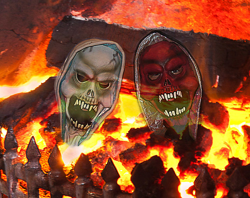
Creating a translucent layer on strong background to make a ghostly image.
Click image to view large.
• Little Fire Devils • By Netkonnexion on Flickr External link - opens new tab/page

Some fun with Halloween pictures.

If you have captured some Halloween partying, or your kids loved their costumes, you can easily create some Halloween fun in post-processing. With a few ideas you can use this technique to create all sorts of ghostly images.

What you need

To do this post processing work you will need two photographs. One will be the character(s) you have photographed, which you will make into ghosts. In the picture above you see the face masks my kids were wearing. If you have more than one photo with multiple characters you can do that too. You will need to add the characters separately. I will show you how below.

The second photograph will need to be the layer you are going to use as a background. I chose to use an old picture of a domestic fireplace fully ablaze. If you want to create a fire background from scratch have a look at: How to take quick and easy photographs of fire.

There is a summary of all the steps at the end of this post. You will be able to see what you have done there. Or, you could refer to it as a way of getting an overview.

Although I will be using Photoshop in this tutorial, you can use other editing applications. I know you can do this in Elements, Paintshop, GIMP and others. Check your editor and see if it has layers and blending options. If it does, you can follow this tutorial.

How you do it

1. Open the background image in Photoshop, or your favourite image editor [Image one].
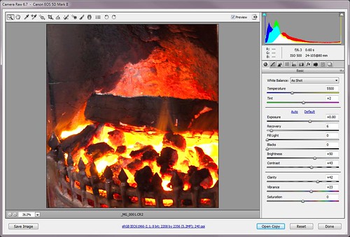
Opening the RAW image in Photoshop

Opening the RAW image in Photoshop – if your image is a *.jpg it will open directly in the editing window. • Image one

2. You will notice that there is a layer in the layers pallet. Open the layers pallet now if it is not already open (press F7 in Photoshop [Ps]). It is good practice to open a new layer. Make sure the layer is selected, then right click it and select ‘Duplicate Layer’. Now you have a working layer to do the edits in. You also have a copy of the original layer to fall back on. You will not do any work in the original layer. If you make a mistake you can delete all the other layers and start again with the original untouched layer.

3. Using your working layer, now is the time to do any editing on the background should it be needed. I simply cropped the image ready to start working. The idea of any editing is to provide a good backdrop for your characters when they are pasted into the picture [Image two].
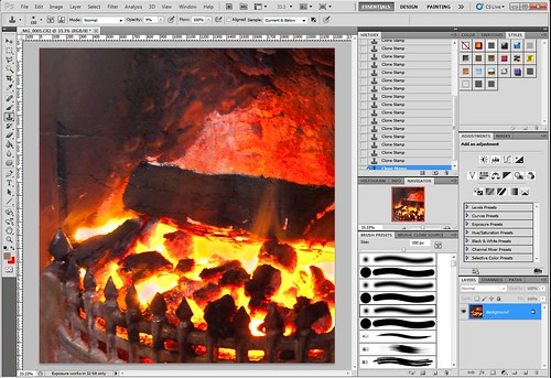
The fully open image in the editing window of Photoshop

The fully open image in the editing window of Photoshop. You can see the layers pallet open with one layer (bottom right hand corner). Create another layer to work on so your original will be there as a fall-back • Image two.

4. Next we will work on the characters themselves. Open the image(s) of your characters so you will now have two images open in Ps. You may have more than two if you are using lots of characters.

5. Now you need to cut out the characters. In photoshop this is done using the polygonal lasso tool. You can see where I have used the tool to draw round the character. I have not bothered to be very accurate because the background will fade out of sight in the end picture. If your background is more critical take more care. [Image three]
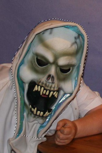
One of the characters is highlighted with 'marching ants' using the lasso tool.

One of the characters is highlighted with ‘marching ants’ using the lasso tool. Next ‘cut’ the character out and paste it into the background image. • Image three .

6. Now you can cut the face out (edit; cut or control+X). Moving into your background image paste the cut segment into your background image (Edit/Paste).
Once the cut segment is pasted in you can move it onto position.

Once the cut segment is pasted in you can move it onto position. • Image four.

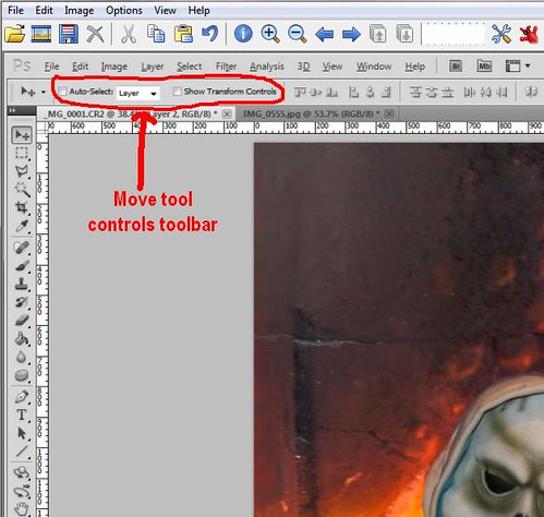
7.You will notice a new layer has appeared in the Layer pallet. Make sure the new layer is selected. Now select the Move tool (press v or click the tool in the tools pallet). By clicking on the pasted character you can slide it around the image to where you want it.

8. You currently have the Move tool open. You will see there is a tool bar showing you the parameters of the open tool [Image four]. Tick in the “Show Transform Tools” box. This gives you the ability to resize the image to make it suitable for the background image [Image five]. You can see the transform lines with corner and mid-line nodes. By holding down the shift button AND pulling/pushing one node you can resize the pasted-in character to your satisfaction. Holding down the shift key keeps the characters side-to-side ratio linked. If you don’t hold the shift key the character will go out of shape. While you are resizing, the tool bar shows accurate measurements of your movements. When you have the size right press the keyboard enter button. The ‘Transform’ controls return to the tool bar. Turn them off now by un-clicking them.
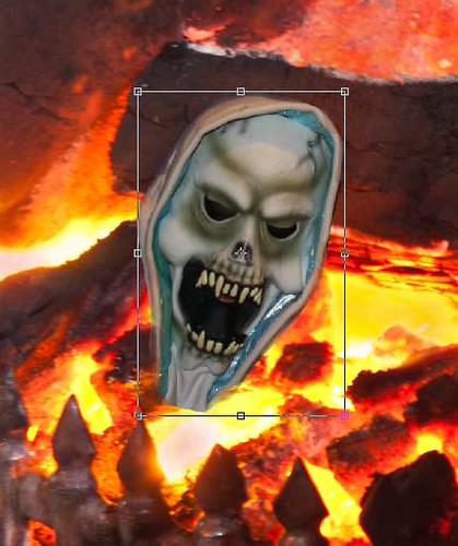
The 'Transform Controls' allow you to resize the image to suit the background.

The ‘Transform Controls’ allow you to resize the image to suit the background. • • Image five .

9. In my image, the rough edges of the character needed to be made slightly translucent to blend them into the background. I selected the Erase Tool (press e or select it from the tool pallet). Then in the toolbar I changed its setting to “20% Opacity”. This means it erases things by 80%, leaving only a remnant of the edges. Then I gently painted around the edges to make them blend into the background as they go translucent.

10. Now I repeated the above process. I cut and pasted with my second character. Then I set it place as well as dimming the edges [Image six].
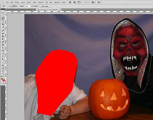
Now you can repeat the process and cut out other characters you want to include.

Now you can repeat the process and cut out other characters you want to include. The picture shows the first character has gone and the second character has been selected using the lasso tool ready to cut out. • Image six

11. Once the character(s) are pasted and treated so the edges are dimmed [Image seven] we can now do the really fun part!
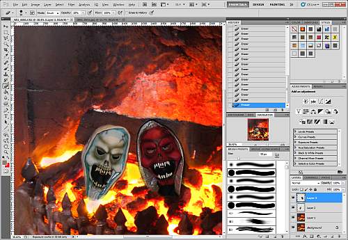
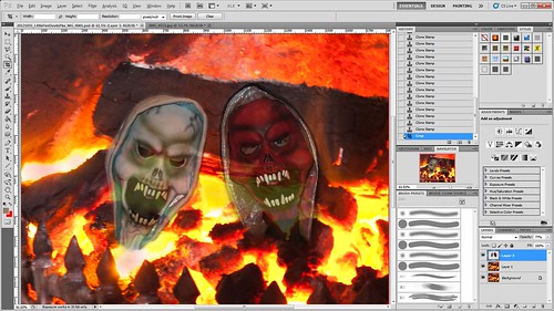
The characters pasted into the background image, resized and treated on the edges.

The characters pasted into the background image, resized and treated on the edges. I have pasted in two characters. You will notice I now have four layers in the layer pallet (bottom right hand corner). The lowest is the original, untouched layer. The next up is my working background layer. The two above are the characters I have pasted into the edit.
• Image seven.

12. I have used two characters pasted in which created two layers. I now want to merge them so I can treat them as one for the next part. In the layers pallet, I select both layers (select one, hold down shift, select the other). Now right-click in the selected blue of the layers. On the menu select Merge Layers [Image eight].
If you look in the Layers pallet [Image eight] you will now see one layer with both my characters merged. If you have only one pasted-in layer you will not need to do this merging part. Click the image to view it in large size.
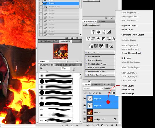
The two character layers are selected and then right-clicked for a menu. Merge Layers.

The two character layers are selected and then right-clicked for a menu. Merge Layers. Once the character layers are merged we have only three layers.
Click image to view large.
Merged layers (Netkonnexion on Flickr)External link - opens new tab/page • Image eight.

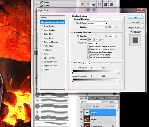
13. Double-click the layer with your characters and a dialogue will open called “Layer Style”. In the “General Blending” box (middle top) [Image Nine] you will see an ‘opacity’ slider. Move that slider back and forward and the layer will go translucent, showing the background layer from behind. Now you have a ghostly effect! I have selected 77% but you might want more or less [Image ten].
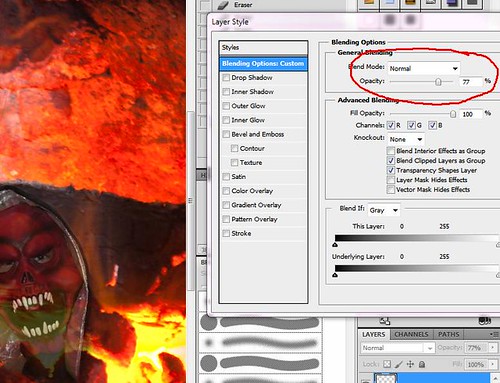
Double click the character layer. A 'Layers Style' box will appear.

Double click the character layer. A ‘Layers Style’ box will appear. Adjust the layer so it has a ghostly translucence.
Click image to view large.
The Layer Style Box (Netkonnexion on Flickr) External link - opens new tab/page • Image nine.

The selection of the right 'opacity' sets the ghostliness of the characters.

The selection of the right ‘opacity’ sets the ghostliness of the characters. I have selected 77% – you might select more or less for your image. • Image ten.
Click image to view large.
Blending opacity = 77% (Netkonnexion on Flickr)External link - opens new tab/page • Image ten

14. Next, I did any a few edits to tidy up the picture ready to save. In my case I just did a little more tidying up of the edges of the characters to remove remaining straight lines I could see. Then did a final crop to size it as I wanted it and saved it [Image eleven].

The final picture ready to save.

The final picture ready to save.
Click image to view large.
The final picture ready to save. (Netkonnexion on Flickr)External link - opens new tab/page

A quick summary
  • In brief you have opened a file as the background.
  • Then you have opened a second file (or more) with a character you want.
  • You have cut out the character.
  • Next you pasted it into the background.
  • You moved and resized the character.
  • You slightly erased edges of the pasted characters to blend into the background.
  • If you need more than one character the cut/paste above is repeated.
  • If you now have more than one character you next merged the layers of characters.
  • The single layer (merged) is now styled to be translucent, slightly showing the layer below for ghostly effect.
  • Finally, you tidied up and saved the file.

These simple steps make it easer to see what has been achieved. As you see it’s not that difficult.

I hope you learnt a lot of ideas for your own blending of layers to make ghostly images.

The effect of over sharpening

The effect of over sharpening ruins the shot

The effect of over sharpening ruins the shot. Worse, when you upload a shot to a website it will be compressed too. This makes the sharpening worse.

Sharpening can do more harm than good.

When you sharpen a *.jpg picture the application attempts to find lines and edges and make them more distinct. The process can cause damage to the file spoiling the picture. The trick is not to sharpen your picture too much. Here are a few things to consider…

First an explanation. If you want to take out any softness or poor focus then you must sharpen. In fact most images benefit from one sharpen action in post-processing. Lets say, in your image editor application, you apply the sharpen tool. When you sharpen a picture you are trying to define the edges of objects in the picture. Softness due to poor focus, out of focus, or movement blur, can have better defined edges. The softness seems to be removed as the edges give the appearance of good focus when they form sharp lines.

The downside to sharpening is that you cannot rescue an image from being very soft or very out of focus. If you attempt to sharpen a soft picture you will need to repeat the sharpening process many times creating over sharpening. This will eventually damage the picture. You get clear lines, halos and spots which indicate the over sharpening.

Look for white edges – that’s over sharpening starting

A sure sign of over sharpening is the appearance of white lines along the edges of an object. Look at the grass in the picture above. The whitened edges have become distinct and have ruined the sharpness of the grass. In fact the grass has become ‘un-grass-like’ because of over sharpening. I did that to make the point.

When sharpening an image you should look carefully at the lines, like the edges of grass. When you look in detail you will see tiny artefacts from the sharpening process begin to appear. This effect will get worse the more you sharpen the picture. In most editing programs you should not sharpen more than twice. Even though you cannot see it, damage is already there and usually it will begin to be visible after two ‘sharpen’ actions.

Repeat ‘sharpens’ happen without your permission

When you sharpen a picture you are hoping to make it a little more distinct to the eye. So lets say you have a reasonably sharp picture you want to publish online. You give it two sharpens. It looks good. So you upload the picture to the website. Suddenly it looks as if its been through over sharpening. What is going on?

First, when you save a file in *.jpg format the save process sharpens the image. You are in fact applying another sharpen action just by the act of saving. Having already sharpened twice, you are applying a third on the save.

Secondly, when you upload a picture, many websites apply compression to the file before displaying it. The website takes a look at your picture. It decides some of the data which creates the image is unnecessary. So it dumps it. This helps the website use less storage space. However, this process is similar to sharpening. Tthe result is that an uploaded image could well look like it has two ‘sharpens’ applied by the upload action. The final result is four sharpens overall. Two from you and two from uploading. The impact on the file can be substantial.

Lessons to be learned

First, it is important not to over sharpen. In some images a good eye can spot even the second sharpen action.
Second, the save process for *.jpg involves a sharpen action too.
Third, when you upload a file to a website, that site may apply sharpening too, as part of the compression process. Both the compression action and the sharpen action have the overall effect of increasing sharpening once again.

In effect image files get ruined simply by repeated saves and uploads. So if you add sharpening of your own it is no wonder that some pictures look damaged when online.

Unfortunately there are very few things you can do about over sharpening damage. The best action for you to take is concentrate your efforts on getting a better image in-camera while doing the shoot. Certainly, it is best to keep the sharpening to a minimum. That way you can make sure that you don’t see as much damage as I have shown in the image above.

Comments, additions, amendments or ideas on this article? Contact Us
or why not leave a comment at the bottom of the page…

Like this article? Don’t miss the next — sign up for tips by email.

Netkonnexion

Damon Guy (Netkonnexion)

Damon is managing editor of Photokonnexion.com with professional experience in photography, writing, image libraries, and computing. He is also an experienced, webmaster and a trained teacher. Damon runs regular training for digital photographers who are just starting out.
See also: Editors ‘Bio’
By Damon Guy :: Profile on Google+