Tag Archives: Post-Processing

Get your settings right with all file types

File-formats and settings

The power of the file format you use…

Most photographers don’t think about settings and file formats when starting. First off, most people just want to take pictures. Down the road you need to think about what you are doing more carefully. You will need to get into RAW processing to overcome the shortcomings (but also, see my comment after this article)

File formats

When you think about settings and file formats it appears very technical. It’s not easy to work out what you need to know. Here are the basics. There are two in-camera file types for photographers…

  • RAW = a file type for capturing all the data from your camera, but which needs developing (post processing) after the file is downloaded. There are many manufacturer-specific versions of the RAW format.
  • *.jpg = a specific file type created in-camera from a RAW file. It is processed by the camera. The *.jpg format was originally designed only for transmitting and displaying files. It is extremely limited for post processing and easily degraded.

Both file types are useful for certain things. The RAW format is ultimately the most useful for photographers because it is so flexible. It allows you to develop the image you want from the picture you have taken. The *.jpg file on the other hand is processed for you, in a limited auto-processing system over which you have little control. It is confusing for beginners because *.jpg files create reasonably good images. But it is difficult to make them do what you intend. Beginners eventually find they cannot create the excellent images that RAW users produce. Nevertheless, starters use *.jpg because they don’t understand RAW and processing – they are stuck without help.

The processing is already done for *.jpg files by the time they are downloaded. Most beginners think they have something special when they get a great image straight out of the camera. Actually they are getting something processed according to someone else’s ideas. So it is not entirely their creation.

How do you break out of this situation?

The easiest way is to do a course or join a club or both. Then you can gain the experience and techniques you need to learn while having fun with others who share your interests. There are lots of courses and clubs around. More specifically you will have three goals. You need to learn how to…

  • Control your camera to get the picture you want.
  • Do post processing to produce great images.
  • See great scenes and compose them to create great images.
Along the way…

At some point every aspiring photographer is told, “why not try moving to RAW, that format gives you greater control over your processing”. This is true and a worthwhile pursuit.

What most beginners also hear along the way is something like this… “It is easier to shoot in RAW because you don’t need to worry about your settings so much”. “You can sort it out in post processing”.

This whole “sort it out later” attitude is a recipe for disaster. Here is my reasoning…
Most beginners:

  • Have an underdeveloped sense of colour.
  • Are not sensitive to light intensity or brightness variations.
  • Have an underdeveloped sense of the quality of light.

And crucially…

  • Cannot properly remember the colours shades, tones and brightness levels at a scene until they can start the post processing hours or days later.

The result is that during processing colours, brightnesses, tones and shades get over/under processed owing to no reference point. The resultant image is often a long way from reality. Incidentally, as your eye/mind system develops the “photographers eye” you begin to remember these details much more.

I urge you to cultivate the habit of fine control of your camera. Every shot, or at least every set of similar shots, should be set up individually. Be obsessive about it. Then, when you get your work into the computer, your post processing has a realistic starting point. It is easier, and more realistic, to process a picture that starts out very close to your intended image.

There is another reason to be obsessive and accurate about controlling settings from the start. Bad habits are really, really difficult to break. If you get into the habit of sloppy settings from the start you will almost certainly be a lazy photographer. I can assure you that will condemn you to many hours in front of the computer doing menial development tasks. It is much easier to get it right in-camera from the start. Then you can slightly tweak it later. Breaking a sloppy habit to get fine control of your camera later is a long, hard road.

Professional photographers are obsessive about getting the settings right. They know that the difference between an amateur and a professional is getting EXACTLY the image they want. And, they know they will not get that exact image by being sloppy. Precise, accurate and pre-set control is the name of the game if you want to create sharp, and realistic images.

So, forget about ‘rescuing images later’. Do your photography correctly from the start and do it using RAW files.

Addendum:
It is important to consider the tools you work with. If your camera does not offer the opportunity to save RAW files you have to work with what you have got. Nothing wrong with that. It is worth reading my comment after this article.

By Damon Guy (author and Photokonnexion editor)

Damon Guy - Netkonnexion

Damon Guy (Netkonnexion)

Damon is a writer-photog and editor of this site. He has run some major websites, a computing department and a digital image library. He started out as a trained teacher and now runs training for digital photographers.
See also: Editors ‘Bio’.

A fun and easy Halloween trick in post-processing

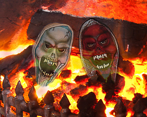
• Little Fire Devils •

• Little Fire Devils •
Creating a translucent layer on strong background to make a ghostly image.
Click image to view large.
• Little Fire Devils • By Netkonnexion on Flickr External link - opens new tab/page

Some fun with Halloween pictures.

If you have captured some Halloween partying, or your kids loved their costumes, you can easily create some Halloween fun in post-processing. With a few ideas you can use this technique to create all sorts of ghostly images.

What you need

To do this post processing work you will need two photographs. One will be the character(s) you have photographed, which you will make into ghosts. In the picture above you see the face masks my kids were wearing. If you have more than one photo with multiple characters you can do that too. You will need to add the characters separately. I will show you how below.

The second photograph will need to be the layer you are going to use as a background. I chose to use an old picture of a domestic fireplace fully ablaze. If you want to create a fire background from scratch have a look at: How to take quick and easy photographs of fire.

There is a summary of all the steps at the end of this post. You will be able to see what you have done there. Or, you could refer to it as a way of getting an overview.

Although I will be using Photoshop in this tutorial, you can use other editing applications. I know you can do this in Elements, Paintshop, GIMP and others. Check your editor and see if it has layers and blending options. If it does, you can follow this tutorial.

How you do it

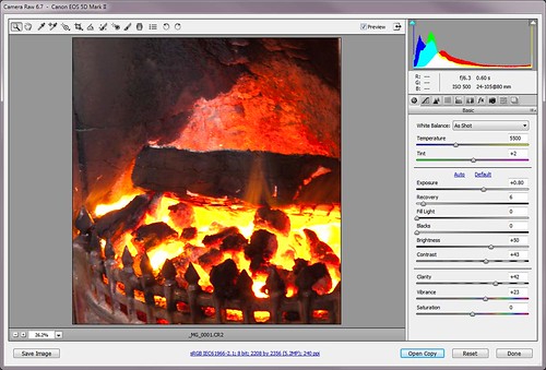
1. Open the background image in Photoshop, or your favourite image editor [Image one].

Opening the RAW image in Photoshop

Opening the RAW image in Photoshop – if your image is a *.jpg it will open directly in the editing window. • Image one

2. You will notice that there is a layer in the layers pallet. Open the layers pallet now if it is not already open (press F7 in Photoshop [Ps]). It is good practice to open a new layer. Make sure the layer is selected, then right click it and select ‘Duplicate Layer’. Now you have a working layer to do the edits in. You also have a copy of the original layer to fall back on. You will not do any work in the original layer. If you make a mistake you can delete all the other layers and start again with the original untouched layer.

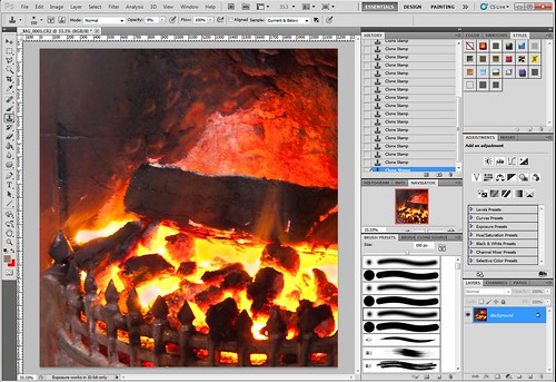
3. Using your working layer, now is the time to do any editing on the background should it be needed. I simply cropped the image ready to start working. The idea of any editing is to provide a good backdrop for your characters when they are pasted into the picture [Image two].

The fully open image in the editing window of Photoshop

The fully open image in the editing window of Photoshop. You can see the layers pallet open with one layer (bottom right hand corner). Create another layer to work on so your original will be there as a fall-back • Image two.

4. Next we will work on the characters themselves. Open the image(s) of your characters so you will now have two images open in Ps. You may have more than two if you are using lots of characters.

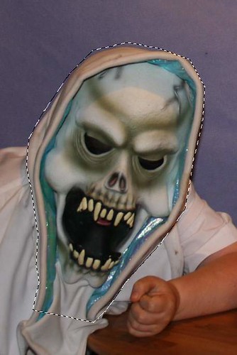
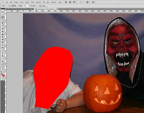
5. Now you need to cut out the characters. In photoshop this is done using the polygonal lasso tool. You can see where I have used the tool to draw round the character. I have not bothered to be very accurate because the background will fade out of sight in the end picture. If your background is more critical take more care. [Image three]

One of the characters is highlighted with 'marching ants' using the lasso tool.

One of the characters is highlighted with ‘marching ants’ using the lasso tool. Next ‘cut’ the character out and paste it into the background image. • Image three .

6. Now you can cut the face out (edit; cut or control+X). Moving into your background image paste the cut segment into your background image (Edit/Paste).

Once the cut segment is pasted in you can move it onto position.

Once the cut segment is pasted in you can move it onto position. • Image four.

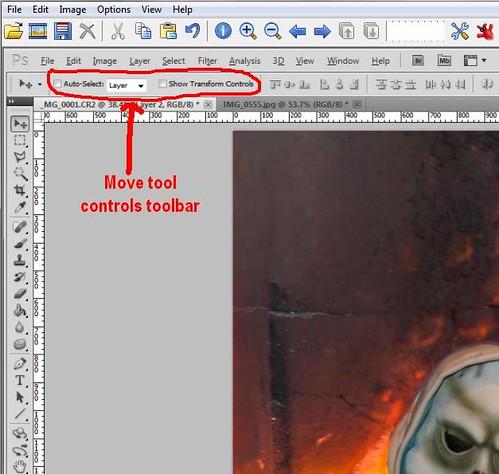
7.You will notice a new layer has appeared in the Layer pallet. Make sure the new layer is selected. Now select the Move tool (press v or click the tool in the tools pallet). By clicking on the pasted character you can slide it around the image to where you want it.

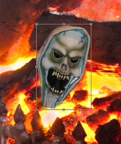
8. You currently have the Move tool open. You will see there is a tool bar showing you the parameters of the open tool [Image four]. Tick in the “Show Transform Tools” box. This gives you the ability to resize the image to make it suitable for the background image [Image five]. You can see the transform lines with corner and mid-line nodes. By holding down the shift button AND pulling/pushing one node you can resize the pasted-in character to your satisfaction. Holding down the shift key keeps the characters side-to-side ratio linked. If you don’t hold the shift key the character will go out of shape. While you are resizing, the tool bar shows accurate measurements of your movements. When you have the size right press the keyboard enter button. The ‘Transform’ controls return to the tool bar. Turn them off now by un-clicking them.

The 'Transform Controls' allow you to resize the image to suit the background.

The ‘Transform Controls’ allow you to resize the image to suit the background. • • Image five .

9. In my image, the rough edges of the character needed to be made slightly translucent to blend them into the background. I selected the Erase Tool (press e or select it from the tool pallet). Then in the toolbar I changed its setting to “20% Opacity”. This means it erases things by 80%, leaving only a remnant of the edges. Then I gently painted around the edges to make them blend into the background as they go translucent.

10. Now I repeated the above process. I cut and pasted with my second character. Then I set it place as well as dimming the edges [Image six].

Now you can repeat the process and cut out other characters you want to include.

Now you can repeat the process and cut out other characters you want to include. The picture shows the first character has gone and the second character has been selected using the lasso tool ready to cut out. • Image six

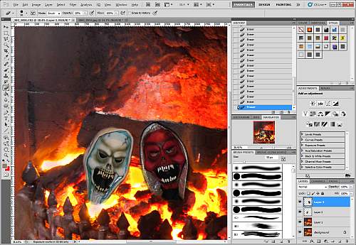
11. Once the character(s) are pasted and treated so the edges are dimmed [Image seven] we can now do the really fun part!

The characters pasted into the background image, resized and treated on the edges.

The characters pasted into the background image, resized and treated on the edges. I have pasted in two characters. You will notice I now have four layers in the layer pallet (bottom right hand corner). The lowest is the original, untouched layer. The next up is my working background layer. The two above are the characters I have pasted into the edit.
• Image seven.

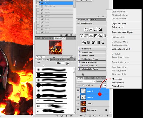
12. I have used two characters pasted in which created two layers. I now want to merge them so I can treat them as one for the next part. In the layers pallet, I select both layers (select one, hold down shift, select the other). Now right-click in the selected blue of the layers. On the menu select Merge Layers [Image eight].
If you look in the Layers pallet [Image eight] you will now see one layer with both my characters merged. If you have only one pasted-in layer you will not need to do this merging part. Click the image to view it in large size.

The two character layers are selected and then right-clicked for a menu. Merge Layers.

The two character layers are selected and then right-clicked for a menu. Merge Layers. Once the character layers are merged we have only three layers.
Click image to view large.
Merged layers (Netkonnexion on Flickr)External link - opens new tab/page • Image eight.

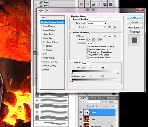
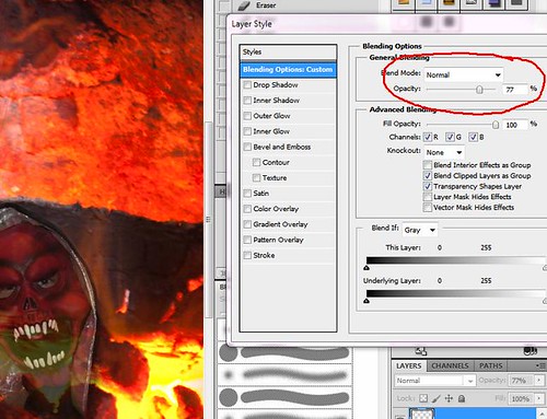
13. Double-click the layer with your characters and a dialogue will open called “Layer Style”. In the “General Blending” box (middle top) [Image Nine] you will see an ‘opacity’ slider. Move that slider back and forward and the layer will go translucent, showing the background layer from behind. Now you have a ghostly effect! I have selected 77% but you might want more or less [Image ten].

Double click the character layer. A 'Layers Style' box will appear.

Double click the character layer. A ‘Layers Style’ box will appear. Adjust the layer so it has a ghostly translucence.
Click image to view large.
The Layer Style Box (Netkonnexion on Flickr) External link - opens new tab/page • Image nine.

The selection of the right 'opacity' sets the ghostliness of the characters.

The selection of the right ‘opacity’ sets the ghostliness of the characters. I have selected 77% – you might select more or less for your image. • Image ten.
Click image to view large.
Blending opacity = 77% (Netkonnexion on Flickr)External link - opens new tab/page • Image ten

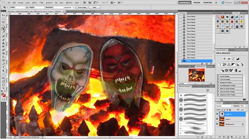
14. Next, I did any a few edits to tidy up the picture ready to save. In my case I just did a little more tidying up of the edges of the characters to remove remaining straight lines I could see. Then did a final crop to size it as I wanted it and saved it [Image eleven].

The final picture ready to save.

The final picture ready to save.
Click image to view large.
The final picture ready to save. (Netkonnexion on Flickr)External link - opens new tab/page

A quick summary
  • In brief you have opened a file as the background.
  • Then you have opened a second file (or more) with a character you want.
  • You have cut out the character.
  • Next you pasted it into the background.
  • You moved and resized the character.
  • You slightly erased edges of the pasted characters to blend into the background.
  • If you need more than one character the cut/paste above is repeated.
  • If you now have more than one character you next merged the layers of characters.
  • The single layer (merged) is now styled to be translucent, slightly showing the layer below for ghostly effect.
  • Finally, you tidied up and saved the file.

These simple steps make it easer to see what has been achieved. As you see it’s not that difficult.

I hope you learnt a lot of ideas for your own blending of layers to make ghostly images.

Do you make this one awful mistake in your photos?

The horizon has only got to be off a little bit to make things look odd.

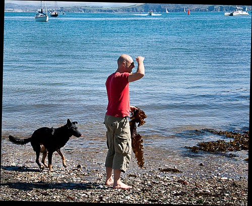
The horizon has only got to be off a little bit to look odd. It’s not just the horizon – other lines may cause problems too. In this image a quick shot meant the beach line across the bay was off the horizontal. After straightening, the black cut-outs show how much the picture was skewed. View large External link - opens new tab/page

The horizon is a main focus of viewing.

It’s a strong feature to orientate yourself in the image. When the main line in the shot is wrongly positioned it irritates your audience. This mistake is easily fixed in-camera or in processing later.

A major line like the horizon needs careful presentation. Strong lines catch the eye. You tend to match them to the edges of the image frame. They look peculiar when slightly out of line. That is not to say you should not take dynamic or action shots at interesting angles. It is the slightly skewed angle that is irritating. Interesting angles is about something special, not slight photographic inaccuracy. Make your special angle shots a statement.

Get the horizon straight in-camera

Being aware of strong lines is half the battle. When composing your shot, watch out for them. Line them up. There are two ways to do this…

  1. Use your focus points in the viewfinder. Make the strong line lie across two or more of the focus points. If you have a grid, line up with the lines on it. Many compact cameras and recent DSLRs also have an electronic level on the screen. Check in your manual how to activate it. This will enable straightening too.
  2. Using a tripod? Many have a spirit level built into the tripod head. It’s invaluable for setting up and saves making the mistake from the start. If you don’t have one built-in, you can buy cheap hot-shoe mounted spirit levels.
Later, back at the computer

Sometimes a quick shot prevents perfectly lining things up. Straighten the picture in post-processing. Image editor applications have straightening tools. Normally they are really easy to use.

In Adobe Photoshop the straightening tool is used on importing the image. It looks like an angle bracket on the tool bar in the developer module (RAW format only). Drag it along the straight line you want straight. You can also swivel the picture when using the crop tool. Just go to a corner and move the cursor away from the corner at 45°. A quarter-curve cursor arrow appears. Hold down the right button and swivel.

In Irfanview the straightening tool is in: Edit Menu | Show Paint Dialogue. When the paint toolbar comes up hover over each tool. The tooltip will pop-up and tell you which is the straighten tool. Drag the cross-hairs along the line you wish to straighten. The image will swivel to fix the problem (see the image above with black infill showing the reorientation). Then you crop the image to get rid of the odd edges.

By Damon Guy (author and Photokonnexion editor)

Damon Guy - Netkonnexion

Damon Guy (Netkonnexion)

Damon is a writer-photog and editor of this site. He has run some major websites, a computing department and a digital image library. He started out as a trained teacher and now runs training for digital photographers.
See also: Editors ‘Bio’.