• Groom •
Candid photography – getting the shot is a pressure. Weddings are times when you need to work particularly fast and accurately. •
Responding is a skill.
When starting on the path to disciplined photography we’re told to slow down. Take careful, measured and pre-visualised shots. We are told to stop trying to frantically pepper the scene with shots. Take time. Take stock. Think everything through. The aim is to get the shot under control.
A good photographer often needs to respond rapidly. The careful, measured approach still applies. They still have to get the picture. However, the pace of a situation demands swift shots. The practised photog can respond with speed and accuracy. Practice at candid photography is a great way to realise those skills for yourself.
Candid photography and practice
The aim is to make a clean, sharp, well composed image. The nature of a candid shot makes that difficult. While trying to make a success of your candid photography some conditions may apply. Some of those may contradict each other…
- The subject may not know you are going to take a picture.
- The subject could know you are going to take a picture.
- The subject may be unpredictable.
- You will need to be very quick.
- You will need to be able to get a sharp image despite speedy working.
- You may have to take several shots (eg. not dozens).
- Your subject should be in an interesting position.
- The subject needs to to be in an interesting context in the scene.
- You should anticipate the shot (rather than getting lucky).
- You will have your camera ready and settings correct for the shot.
- You will have only a microsecond to compose the shot.
You just do not know what you are going to encounter until you have to deal with it.
Dealing with all that may seem a tall order. Especially if you are told not to machine-gun the scene with shots. Haste and frantic bursts rarely lead to good luck. Actually, it is not about doing all that at super speed. Like everything you do in photography, candid photography requires preparation, practice and control.
Equipment – knowing what you can do
NO! Do not go out and buy yourself a micro-weight, super-camera. Up-to-date bells and whistles are not the point. Instead, look for simplicity. Sometimes the best camera is an old and familiar one. What we want for this exercise is knowledge.
The best possible way to get fast with a camera is to know what it can do. The lens too. If you are familiar and well versed in using your equipment you will automatically respond to the scene. Here is an example.

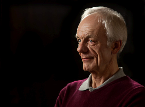
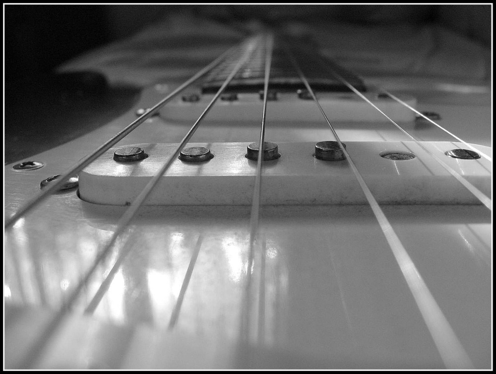
• Impish grin •
Keep the subject in focus but the background is frosted out.
In candid photography control of depth of field is essential
(Click to view large)
This shot was captured as this lovely man turned from a conversation. He was talking to someone on his right. I was ready for his turn toward me. His impish grin as he saw me really made the shot.
I wanted a depth of field that had his head and face sharp. I also wanted the background indistinct. Notice the sharpness is lost just on the far shoulder. My lens was set up to have a depth of field of about 400mm (about 15in to 16in). But there was no measurement involved. This was an estimate. It involved knowing the depth of field at my distance from the man, and using the right aperture. This capture is the result of knowing the lens and camera combo really well. It was a practised shot using very familiar equipment. The successful candid photography came out of the practice and familiarity.
Equally, it is easy to get the shot wrong. Depth of field, especially at close range, is fickle. It is easy to get the tip of the nose out of focus, the eyes and face in focus, and the hair out of focus. It is important to look at the variables involved. The aperture size and distance-from-subject control the depth of field. So, try the exercise below using manual settings.
Take a bright coloured builders tape measure. Place a small object beside a mid-point on the measure. Take a photo of the object down the measures’ length. Use a wide aperture. Check out the depth of field by looking at the measurements that are sharp. Now by varying your distance from the object see how much you change the depth of field. Do this for a wide range of apertures. With experience you will get a feel for controlling the depth of field. With twenty or thirty variations you should get a feel for the depth of field.
Settings
Aperture is one setting. ISO and shutter speed are important too. Getting a feel for your equipment means getting familiar with how these settings work.
Candid photography often involves working in darker lighting. Parties and indoor sessions, weddings in churches and in evening light all require wide apertures. You might use flash. But in a lot of situations that may not be practical or desirable. So using a high ISO setting (more sensitive sensor) will allow you to work effectively in lower light. So, lower the light where you are working with the tape measure. Raise the ISO and repeat the exercises. Get a feel for how you can vary the exposure by changing the ISO.
Needless to say you can vary the shutter speed in similar ways. Try the exercise again. This time keep the aperture and ISO fixed and change the shutter speed up and down through a range of shots. [More on varying shutter speed].
Learning to use your settings manually takes more than one session. That is important. You can gain a lot by training yourself to be sensitive to the settings. Working toward good quality candid photography can really help you gain that sensitivity. Poor photographs of faces and people are immediately obvious! You get great feedback from the experience of poor shots.
Composition – seizing the moment
Candid photography is about seizing the moment. You need to use good settings. You also need some understanding of composition. This means working to get your subject in the right environment. They will have an appropriate pose and possibly the right context or behaviour too. Without all these coming together the moment is lost. Setting it all up takes some thought.
Normally people do candid photography with some idea of what they want to achieve. Random wanderings are normally unproductive. Luck follows more often from preparation and forethought than stumbling upon a notable event.
So, have a good think about your scene composition….
- Set yourself up in a viable position ahead of the shot.
- Think about how the light is placed in the scene overall.
- Place yourself for the right background on the far side of the shot.
- Fix the camera settings for the composition ahead of the shot.
In other words be prepared. Then, when the right moment comes along, you will have the minimum to do. A little composition, framing the shot, is essential. A tweak of the focus possibly… But essentially – you should be ready.
Now you stand the best possible chance of getting the shot.
Candid photography is successful when it all comes together
All this preparation and practice is about getting you to the moment when you take the shot. Making a success of your candid photography is about three things…
- Knowing your settings.
- Practice with and knowing your equipment.
- Forethought about the scene.
Having everything ready is the key. Then when all the elements of the scene come together all you do is frame it and capture. If you succeed in that, you will also make a swift shot. Because, in fact, you have little to do. Speed and accuracy is about being ready with everything and having the minimum to do when the right events pull the shot together.
Comments, additions, amendments or ideas on this article? Contact Us
or why not leave a comment at the bottom of the page…
Like this article? Don’t miss the next — sign up for tips by email.

Damon Guy (Netkonnexion)
Damon is a writer-photographer and editor of this site. He has run some major websites, a computing department and a digital image library. He started out as a trained teacher and now runs training for digital photogs.
See also:
Editors ‘Bio’.
By Damon Guy see his profile on Google+.

 Photokonnexion tips by email