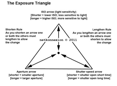
• The Exposure Triangle •
Click the image to download an A4 *.pdf version to print.
Going manual with your DSLR.
For many people exploring manual settings is a challenge. There is a lot to learn. Without guidance it is difficult to work it out for yourself. Here is my approach to the subject.
Why the exposure triangle
The “Exposure Triangle” is a memory aid to help us balance light for a good exposure.
One thing you should remember. The exposure triangle is NOT a calculator. The aim is to help you get used to using the settings. The ‘Triangle’ loses its importance once you understand the settings. Instead you will see your visualisation of the shot as more important.
Beyond auto-settings
“Auto settings” in modern cameras are average types of shot. They are pre-set in the camera programming. Sports mode freezes the action; landscape mode gives deep focus in the shot; portrait mode promotes close focus and so on. The pre-sets make credible pictures but take creative decisions away from you. Controlling exposure gives you artistic control over our photos.
It’s all about control
Photographs capture light reflected from objects in the scene. Too much light – the object is over-bright, or worse, blown out (completely white). Too little light and the light does not excite the sensor enough. Thnthe object is dark, sombre, or worse – black. At the extremes we have blown out or black. In between are a whole range of capture intensities.
The trick is to balance the incoming light so the sensor can make the picture as we wish it to come out. the idea is to control the light in-camera to create optimal light conditions for the sensor.
Three essential elements
There are three critical elements that control the incoming light…
- ISO: controls the sensitivity of the sensor and how we capture the light brightness. A sensitive sensor allows a shot in lower light conditions (example: ISO100). High sensitivity to light is referred to as High ISO (example: very high ISO = 3000). The penalty is the picture becomes noisy (Definition: Digital Noise) as the ISO gets higher. Noise affects the quality of the picture. The lower you keep the ISO, the better quality the final image will be.
- Aperture: controls the amount of light allowed through the lens. It also controls the depth of field. As the aperture increase the amount of light entering the lens also increases. However, as the aperture gets bigger the lens loses the ability to focus at infinity. As the focus shortens part of the picture is not so clearly defined. Taking a photo at F4 means you might be able to focus on a face beautifully and with sufficient light. But you may not be able to discern any detail behind the head. The depth of field has been shortened by the wide aperture.
- Shutter value or Time value: How long the sensor is exposed to light affects the amount of light you collect. Leave the shutter open too long and the shot is too bright, blowing out parts of the picture. Close the shutter too quickly – the result is underexposed. Long exposures tend to exaggerate movement introducing blur. Fast shutter speeds tend to freeze an object in place.
What is exposure?
There is no right or wrong for achieving the outcome we desire. But there is only ONE point at which the exposure (all three elements combined) is right for your picture. That is the one to make your photo come out the way you want. You must find the correct exposure balance for your visualisation of the picture using all three elements.
Exposure is the right balance of ISO, Aperture and Shutter speed which provides for your intended depth of field, movement blur, brightness and representation of the scene. It is a unique response to the sensor settings you think will make your shot come out right.
The Exposure Triangle is a concept to help you adjust the balance to get the exposure right. The key to using the exposure triangle is that the three elements of exposure: ISO, aperture and shutter speed, must always balance.
It teaches us to understand how the three exposure elements play off one-another. Shorten one arrow the others will need to accommodate by adjusting their length. You can increase one or both of the other elements to accommodate the change.
If you increase one element you will need to decrease one or both of the other elements to accommodate the change.
Full Manual Control
Our exposure settings aim to balance the three elements in the camera. This needs to be done on the ‘Manual’ setting or ‘M’ setting to get the desired result. To gain full creative control we must do two things…
- First we must have a clear idea of what we are going to achieve for each shot. Do we want the water blurred in our stream or not? Do we want the final picture to look bright and breezy or dark and sombre? Do we want movement blur or sharp, frozen action… and so on. So look at the scene and determine what you want.
- Secondly, on the basis of what we want we must adjust the camera settings to achieve the desired result.
How do we adjust the settings to get the optimal exposure? Simple. The camera light-meter indicates when exposure is optimal.
The DSLR light sensor is the key
Inside every DSLR is a digital sensor. It detects light intensity. If the light is correctly optimised it will be indicated on the exposure meter.
With the camera set to “M” look through the eye-viewer. At the bottom of the screen you will see a scale. There should be a needle above the scale. This is the indicator of the current exposure. The centre of the scale is the correct exposure level for most shots.
If the needle is off to the right the sensor is getting too much light. If it is off to the left there is insufficient light. The trick is to balance ISO, aperture and shutter speed so the needle is centred.
Your camera manual will show you how to change each of the three settings. There are normally three controls somewhere on the DSLR body to change each of them. Again, your camera manual should have a diagram of the readings in your viewer screen when you look through it. Check out that diagram. You will see the location of the settings on the screen that will change when you alter the controls.
A trick to get you started…
Put the camera on full automatic (the ‘green square’ setting). Take a shot like the one you want. Now look at the settings for that picture on your camera screen. Your camera manual will show you which setting you can look at on the screen. This gives you a guide to what your manual settings should be for this shot.
Now switch to ‘M’ or manual to vary the results. If you want movement blur then slow down the shutter speed (longer exposure, more light let in) and/or decrease the aperture (reduce incoming light) to keep the needle in place. One click of longer shutter speed needs one ‘f-stop’ less of aperture to keep the exposure optimal. But now you get the movement blur!
The aim here is to balance a change in one element by changing one or both of the other elements. In the process you try to keep the needle over the centre of the scale in your viewer. The centred needle tells you you have an optimal exposure that your sensor can use.
Experience…
If you practice regularly with your camera on ‘M’ you will get control of your shots. Try to relate the settings to the type of results you get. Relate shutter speed to the resulting blur/sharpness. Similarly, relate depth of field to aperture size. Relate ISO to balancing light sensitivity to achieve the correct sensitivity for your intended exposure. Gaining experience with these attributes will help you remember settings to use in particular situations.
Comments, additions, amendments or ideas on this article? Contact Us
or why not leave a comment at the bottom of the page…
Like this article? Don’t miss the next — sign up for tips by email.
Photokonnexion Photographic Glossary – Definitions and articles.
Definition: Exposure
Definition: Aperture
Definition: f number
Definition: ISO
Definition: Shutter Speed
depth of field
DSLR
Download a *.pdf of the Exposure Triangle

Damon Guy (Netkonnexion)
See also: Editors ‘Bio’
By Damon Guy :: Profile on Google+

