“Low light action shots” is contributed by Melanie Hyde (Bio) of PaintShopPro.com ![]() .
.
Low light action shots need care to get them right.
Given the challenges that come with action photography, removing most of the light only makes it all the more difficult.
There is good news. The same principles of action photography and proper exposure apply. It’s just a little more challenging to get those low light action shots.
Light sources for your low light action shots
When it comes to taking low light action photos, you’ll need to combine the available light sources. This will help to make the most of the situation. First, take a look around and identify whether the lighting is constant or variable.
Constant Light
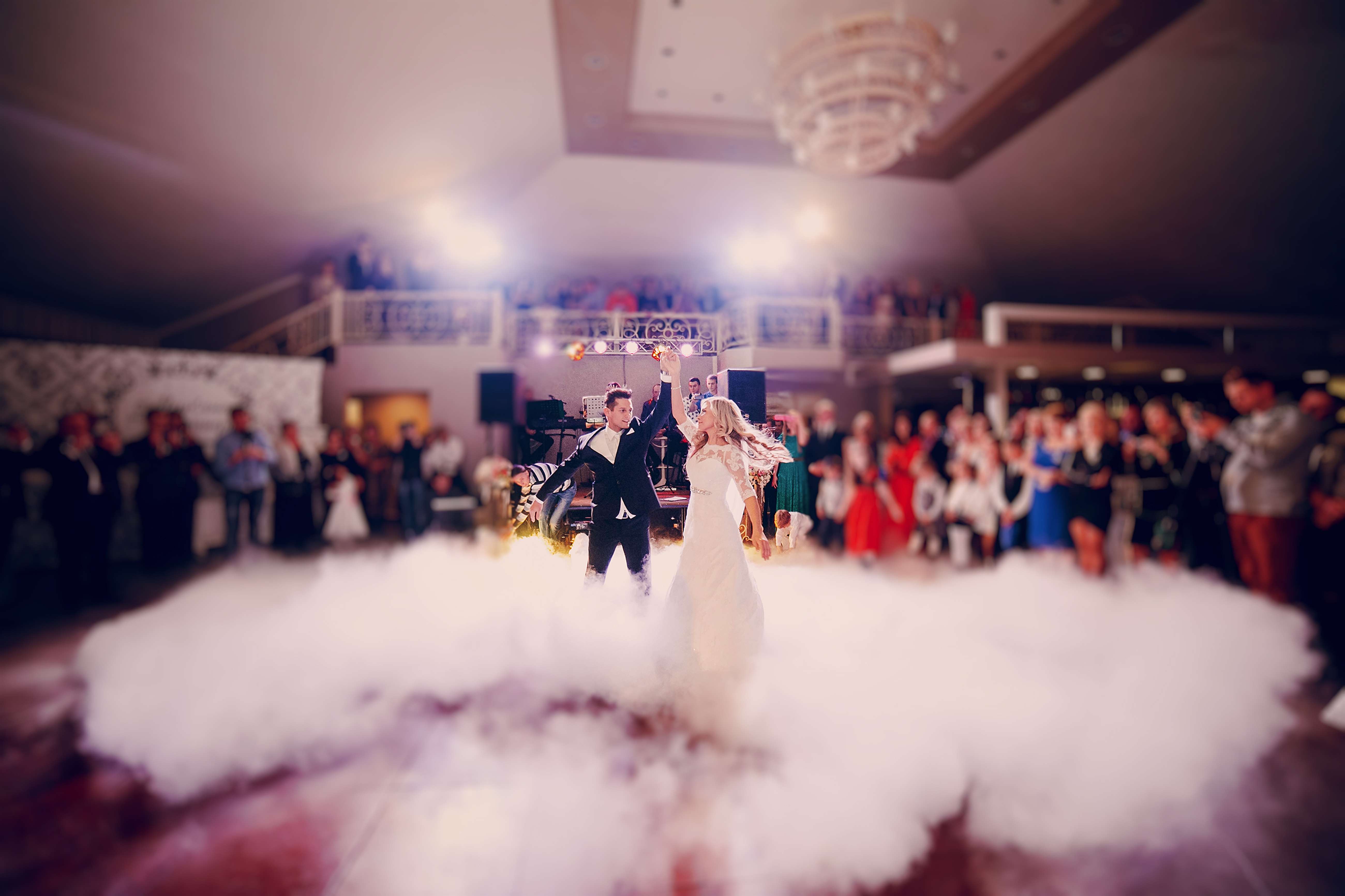
Constant light occurs within your setting when you can isolate out a source for a shot. Framing the shot is important so that the light is consistent for that shot. The next shot may have a different source – you need to isolate the light for that too. For example, if you were shooting a wedding reception, you might capture an image of the bride and groom on the dance floor. Then, you turn around and capture an image of the bride’s parents dancing across the room. Depending on the setting, the lighting may be different between the two subjects but consistent within each shot.
When lighting is consistent, operating your camera becomes much easier. The camera can adjust to meet the needs of the low light action shots. Here are a few points to keep in mind when shooting with constant low light:
- Shoot in shutter priority mode so the camera can adjust.
- Use Auto White Balance so the camera can adjust.
- Manually control your ISO.
Variable light
Variable light occurs when light sources are constantly changing and are inconsistent across your field of view. Imagine you’re photographing the lead singer at a rock concert. You may have to deal with strobes, spotlights and pyrotechnics. The constant changes in light sources will cause your camera to struggle to automatically expose the image correctly.

Low light action shots with variable light sources can confuse your camera – go manual.
- Manually set your aperture and shutter speed.
- Manually set your White Balance.
- Manually set your ISO.
Balance aperture, shutter speed, and ISO
You have three ways to control the way your camera exposes an image. Aperture, shutter speed, and ISO. To successfully capture great low light action shots, you must be able to manipulate these elements. Select settings that allow you to capture the highest quality image for the ambient light conditions.
The exposure triangle helps you to keep your shot’s exposure within the capability of the camera and lens. So when going manual your settings should allow these three essentials to balance. Look in your viewfinder to get the needle settled in the centre for a proper exposure. For more detail check out The Exposure Triangle – An aid to thinking about exposure.
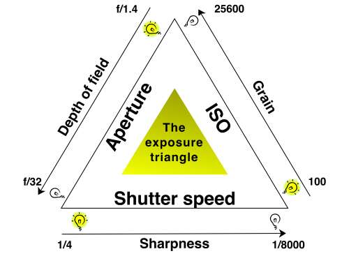
The exposure triangle is an idea that helps you balance aperture, shutter speed and ISO for a good exposure.
Start with shutter speed
Low light action shots are by definition going to be in difficult light for your camera. Getting your shutter speed right can be tricky. However, it has a huge impact when shooting movement in low light. The following diagram will help you select the right setting.
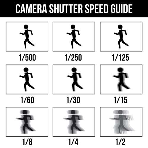
Camera shutter speed guide :: Low light action shots need the right camera speed. If the shutter speed is too low you get blurring.
Select the widest aperture for your low light action shots
In action photography, capturing crisp and clean images is usually the priority. When shooting with low light settings, it’s crucial to get as much light to your sensor in the small amount of time that your shutter is open as possible.
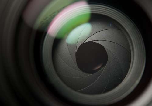
The aperture sets the initial amount of light coming into the lens. For low light action shots use a wide aperture to increase the incoming light.
Using high ISO
Are your images are consistently coming out blurry with your aperture is as wide as can be? Consider stepping up your ISO settings.

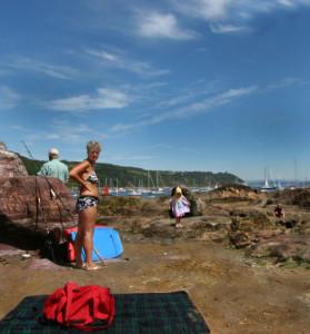
On the dance floor the light is almost always difficult. Your low light action shots can really win the day if you get your ISO right.
Check your work as you go
Throughout the shoot, use your histogram. (See: Can you use the histogram on your camera?) It will help to make sure you’re exposing your images correctly. The histogram shows the distribution of the type of light in your shot. It aims to help you capture a consistent amount of light across the full spectrum of your image.
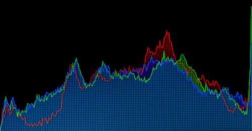
The histogram on your camera helps you ensure effective use of light in your exposure.
You’ll also want to make sure that your white balance looks good and adjust accordingly. In most cases, your camera is going to be able to set white balance automatically, but you may need to tweak it; especially if your lighting is wildly inconsistent.
Increase your odds
Low light action shots are all about being in the right place at the right time with the right equipment.
Use the fastest lens you can find. The wider the aperture, the more light your lens allows to strike your camera sensor. Anything higher than F2.8 will cause you to struggle with exposure.
Set the camera to continuous drive. This equips your camera to capture a burst of images every time you press the shutter release and gives you a better chance of capturing that perfect picture.
Use a fast memory card. Your camera can only capture images as fast as it can write them to the memory card. If you snap too many images in rapid succession, you’ll have to wait for the card to catch up with your camera and you might miss “the shot.”
Be prepared to shoot…a lot. You’re going to have a lot of images that are no good. So remember to keep tinkering with your settings. The key is shooting lots of images at different settings until you get the perfect mix.
Don’t forget to have fun
Low light action photography can be both challenging and fulfilling. As you refine your skills and your eye for lighting, action, and composition, remember to regularly experiment and try new settings.
Comments, additions, amendments or ideas on this article? Contact Us
or why not leave a comment at the bottom of the page…
Like this article? Don’t miss the next — sign up for tips by email.
Photokonnexion Photographic Glossary – Definitions and articles.
PaintShopPro.com
Getting started with action shots.
Definition: Exposure.
Definition: Aperture.
Definition: Shutter speed.
Definition: ISO.
Definition: Ambient light.
Definition: Exposure triangle.
The Exposure Triangle – An aid to thinking about exposure.
Definition: Digital noise.
Lightroom
Definition RAW (file formats etc.).
Can you use the histogram on your camera?
Definition: Fast lens.