Tag Archives: Emphasis

Photography Tips to Improve Your Online Selling…

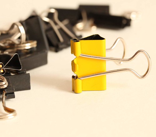
Online selling? Make your product shots interesting

Selling online? Make your product shots clean, interesting and good looking.
Click to view large.

Online selling? Better sales – great looking products

Selling online is about getting your product noticed. Nobody will pay top dollar for your product when others look better? A great photo is essential to your sale. Here are some questions to ask yourself. Does your product photo…

  • Look great?
  • Look clean?
  • Show everything important?
  • Show the product is in great condition?
  • Represent the true colour?
  • Show only the product?

Make your buyer think, “Yes, I want THAT one”! If lots of people want it then you can get a high price. If your photograph is dull, cluttered, dirty and with poor colour… forget it. Someone else will make the sale. Here are a few tips to help you get your online selling product looking good.

Photographic background for online selling

Make sure that your background is looking good when online selling. White is a colour that looks crisp, clean and bright. It can lift the mood of your shot immediately. It is also a neutral colour so it goes well with most others. It will not clash with your product and will look great.

You can buy large white card sheets cheaply from a local art or stationery suppliers. Look after it and you can use it hundreds of times for your online selling backgrounds. You might also try this technique for white backgrounds… Simple photography in the bath – high key shots.

Use a card bent in the middle so you can see it below and behind the product. Or, use two boards jointed with white tape to hide the join. This gives the feeling of infinite white space around your product. Clean crisp white to infinity in your image is a great way to display a product for online selling. Online catalogues use this technique a lot.

For very brightly coloured or white products, use another neutral colour. Off-white, cream or black cards are great as backgrounds. They will not distract buyers from your product. Black is good for focusing the attention on the subject. Cream is a slight contrast from yellows or very bright colours. Make sure your colours and background are sympathetic to the subject. If they clash your online selling will bomb.

Distractions…

Make sure there is only your product in view. Other items are a distraction for the buyer. They will wonder why it is there and what it has to do with the sale. Online selling relies on your product being the centre of attention. Simplify the scene as much as possible. Present the product as a centerpiece.

Make your online selling products interesting

Try to present the product in an interesting way. If there are multiple items in the product you can arrange them artistically. If you have only one item take it from an interesting angle. Try to think how most people look at the object and take the shot from a different viewpoint. If you normally look down on an object, look at it from below. If you normally see it from the side take it from above and so on. If someone sees the shot from a different view they will often spend more time looking at it. That is when you will be most likely to make a sale.

Warning: Check your photo for unexpected reflections or body parts. Many Internet joke sites have unfortunate pictures of people who did not notice dodgy additions to the shot!

 
• eBay Photography the Smart Way •
Creating Great Product Pictures that Will Attract Higher Bids and Sell Your Items Faster.
It stands to reason that you should present a product well. Nobody will buy awful looking products. Great sales rely on a great looking product. It’s quite easy to improve your skills.

This book will help you to get to grips with making your product look outstanding.   • eBay Photography the Smart Way •


Show the product in full

Consider if you need more than one view of your product. Some sites allow you to have several photos. Try to capture it from all sides without too many shots or you can cause indecision. With one picture, shoot from the best side so it presents well.Online selling pays off if you spend a little time presenting it in full and from the best angle.

Bring out all the good points. Product marketing aims for the ‘unique selling points’ of a product – the reasons why people want to buy it. So ensure you have these in the photo if possible. If not, write about it in your posting.

If there are accessories, additional products or extra items included, think carefully how to photograph them. Consider just listing them with the product on your advert. Extra photographs of something which is not the main product may weaken your message.

Lighting the shot for online selling

If using images straight from your camera beware of light casts. Indoors tungsten bulbs and fluorescent lights can strongly colour the scene. Choose the ‘Tungsten’ or ‘fluorescent’ setting in your ‘White balance’ menu. This will off-set the colour cast. You will get a more realistic colour.

If you get the lighting right your product will be much more likely to sell

The right lighting will help you sell your project.

Top: Underexposed, dim light with a tungsten colour cast - unappealing.

Middle: Nasty highlights, too bright, reflections, washed out colour - distracted buyer.

Bottom: Diffused light, proper camera settings - An attractive product.
.

The important part of your photograph is the light. Make lighting simple and bright. One diffused light, slightly off from one side is best. Try not to make it a hard light. That will cause harsh shadows and highlights and make it look ugly. Diffuse the light as much as you can so it is a soft light. Hang a piece of white cotton in front of the light, or use some other type of diffusion. This will allow the brightness but keep the shadows soft and flattering to your product. Also try to light your product to avoid unnecessary black spots. If the detail is lost, so is your online selling customer.

Harsh lights and flash both create over-brightness which is ugly and distracting. It puts customers off. Most people use flash – it’s easy and already set up in their camera. Unfortunately, it is often far too bright and harsh, sharpening the shadows and washing out the colours. Many cameras allow you to turn down the flash. Look through the menus for the flash control. If you are close to the product for the photo then the lowest setting is probably fine.

You may also need to diffuse the flash. You can put tissue paper over the flash panel and tape it on. Alternatively you can deflect the flash or point it at a wall/ceiling so the light is bounced around the room. This gives a nice even and diffused light.

If you used bounced light for your online selling photographs, be careful about coloured walls. They can cause colour casts. This leaves your product looking odd coloured and unattractive.

Look out for nasty highlights, bright sparkles and bright reflections. They are totally distracting and will put off potential buyers. Find a way to light your product to get rid of them. Good online selling requires your customer to like the product and not be distracted by the photography!

Taking the shot

Here is a quick checklist…

  • Make sure the whole object is properly in focus.
  • For maximum sharpness use a tripod – very important.
  • Make sure the product is spotless – really work on cleanliness.
  • Set white balance and lighting correctly to get the best colours.
  • Arrange your scene in a pleasing way.
  • Get close to fill the frame to provide the most detail you can.
  • Try not to lop bits off your subject – get it all in the frame.
  • Shoot and re-shoot… get it right.
Finally…
Practice for online selling

Don’t assume you will get it right straight away. Take a shot and look at it very carefully. Re-shoot several times if necessary. Download the shot and look at it on the computer. Be prepared to go back to get it right.

If you are serious about selling things online this is your chance to do it well. The key is good lighting and careful attention to detail. With practice you will get it right quicker, increase your business and have fun with your photography.

Comments, additions, amendments or ideas on this article?
Contact Us or leave a comment at the bottom of the page…

Like this article? Don’t miss the next — sign up for tips by email.

Damon Guy - Netkonnexion

Damon Guy (Netkonnexion)

Damon is a writer-photographer and editor of this site. He has run some major websites, a computing department and a digital image library. He started out as a trained teacher and now runs training for digital photogs.
See also: Editors ‘Bio’.
By Damon Guy see his profile on Google+.

Filters – Some Reasons To Love Them

Filter making is a craft

Over the years it is possible to collect a lot of filters. They are sometimes a necessary item in the kit bag an sometimes something to be bought out for a particular shot. However, every time I buy one I wonder why they are so expensive. After all they are only a bit of coloured plastic in a frame – aren’t they? Not so! This video shows you how they are made and what goes into making them.

Despite all the modern technology in up to date photography, filters are still hand crafted. Each one may take several days to make, including the ‘cooking’ phase. It is a surprisingly hands-on process involving a number of quite technical steps. When you consider how much goes into making these things it is not surprising there is a heavy price attached. Yet a good quality filter is worth its weight in gold when getting the right shot. Since seeing this video I will not feel so bad about handing over my money next time… and I learned a lot about filters. More on filters after the video. Enjoy!

But… Are they really necessary?

Here are some reasons to love filters…

  • They create great light in-camera saving post processing
  • Some can do things that cannot be done in processing
  • They protect your expensive lens
  • They can create effects that are unique to the scene

The fact that filters can do things in-camera that cannot be done in processing is excellent. For example, a polarising filter gives a blue hue to the sky that is difficult to produce in post-processing. It is also closer to the sky colour we actually see rather than the washed out colour most photos create. Some filters are also great for reducing glare and reflections, making shots through liquid and glass easier. There are a wide range of other effects that they can create too. More on that in another article.

Filters can be expensive but I know they are not a rip-off – they are the result of a time consuming craft process. There are some very good reasons to know more about them. If you would like to know more about filters here are four great books on the subject…

By Damon Guy (author and Photokonnexion editor)

Damon Guy - Netkonnexion

Damon Guy (Netkonnexion)

Damon is a writer-photog and editor of this site. He has run some major websites, a computing department and a digital image library. He started out as a trained teacher and now runs training for digital photographers.
See also: Editors ‘Bio’.

Perspective (Compositional ideas)

Perspective helps us to see depth, three dimensions, on a two dimensional page.

Perspective helps us to see depth, three dimensions, on a two dimensional page.

From babyhood we learn to see perspectives. Although today this seems natural to us it has not always been this way. Artists first began to consistently portray three dimensions during the Renaissance period. Before that time symbolism and the relative importance of elements defined art. People might be sized according to rank for example or defined by the clothing colour. In ancient art perspective was almost missing. Many of the worlds cultures had flat pictures depicting people and objects only in two dimensions (2D).

Today pictures are considered representations of the real world. We see this ‘reality’ so strongly that we are astonished if it turns out as an illusion. So what gives something 3D in a picture? It’s a simple trick. We employ elements in a picture that strengthen our view of depth or dimension. We use converging lines or relative sizes to give visual clues to our viewers. They see these clues and they ‘see’ distance and depth.

Successful photographers hunt for elements in a scene to help the viewer see depth. It’s part of composing the shot. Look for those visual clues. Deliberately pick out the lines of perspective, the relative sizes of objects or the position of smaller (distant) objects compared to bigger (near) ones.

In your compositions try to…

  • …pick out lines that convey perspective.
  • …emphasise the relative sizes of things near and far.
  • …use key objects to help viewers judge size/distance of other objects.
  • …use foreground objects as clues for size/distance to background objects.

In your photographs try to find as many things as possible to help the viewer see into your picture. If you give your viewer lots of these clues you will have an interesting and ‘alive’ picture.

The definition in our photographic glossary also provides a lot of information on perspective

Record Shots – a definition

Record shot - old airliner cockpit

Record shot - old airliner cockpit

The way a photograph is taken differs according to the purpose of the shot. In this post I define what is meant by a record shot…

Definition: Record Shot(s); Record series;

Definition: Record Shot  | Glossary entry

Record Shot

 A record shot is where the emphasis is on creating a record of the photographed object. you are not trying to portray the object in an artistic representation.

A record shot for your own use

Take a shot of a bird in your garden. In its simplest form it just captures the bird as it is seen. However, professional photographers and competition judges what to see some interpretation of what that bird is like in nature. So the more interesting shots will show it eating, or fighting, or showing some natural behavior that is not just “being a bird on a stick”. Likewise, other wildlife are always more interesting when they are, so to speak, in action. These ‘in action’ shots are NOT what we would call a record shot. The record shot is the straight forward representation of the detail of the object, animal or whatever you are recording. It brings out the essential essence of the look and feel of the subject. It does not include behavioral or interpretive art.

Reasons for taking a record shot

A record shot may simply be a shot you take to remember you have been somewhere. It may show you have done something. Your shots as records could be, for example, a complete insurance inventory for your house. Then again, it could be the birds you are following in your garden. As you can see, there are a whole range of things you might want to take such shots for at home.

The record shot is important to the professional

Record shots are increasingly used in a professional context. It’s normal for such shots to be retained for future reference (archived). They often form a history of the condition of an object.

Record shots are frequently used to record items for valuation, especially for insurance or recovery purposes. They may also form part of the ‘provenance’ of an artwork – proof of its origin, history, condition and ownership. They are often used to record work-flow, project progress or to validate contract completion. The latter may include a record of progress for legal reasons.

Increasingly, the staff headshot is used for the records of the organisation. They may be used in the front office operations. Head shots inform the public who the staff are and their names. But the headshot is also used in the back office for personnel reasons and staff record-keeping. These shots have now become part of the rich lexicon of legal and professional management of the company.

Record sequences and time considerations

Multiple shots are often taken for record purposes. This creates a complete record from all aspects of the item for a given time. Normally, the shots follow logical and straight-forward points of view. Thus, a record of a car might be taken one from all sides and above; one of the engine, boot (trunk) and interior shots.

A Record shot, or record series, are often taken periodically. This creates a complete set of time-period shots. This historical record sequence is used to determine changes, deterioration and updates – including repairs.

Record shot expertise

Record shots require their own expertise. Record shot photography provides a complementary background for other materials. Documents, reports and scientific work all require documentary images forming a record for the work. Artifacts and historical pieces are photographed for cataloguing, publication, preservation, valuation and repair.

Considerations when taking a record shot

Taking a record shot is not always straight forward. The photographer needs to provide a complete record of the item. All angles and aspects of the item need to be considered in a complete series. Also, one must be careful to ensure the photography does not damage it (e.g. camera flash can damage manuscripts and paintings). Consider that some items need careful handling, mounting or arranging. This is especially the case where historical artifacts need to be recorded for preservation purposes.

In insurance, engineering, science and medical records very specific or precise angles and perspectives are required. Record photographers often follow pre-set procedures to ensure representative comparable images. There is also a detailed set of metadata records required to go with this type of work. It will ensure the proper cataloguing and filing of the images.

Record shots are frequently the recording method in forensic and investigative science. Such shots are often used in court proceedings. High photographic standards are essential. forensic proof is a very precise science. The work must also include professional record keeping of the forensic photographic process itself.

The background in a record shot

It is simply impossible to separate out the detail in some pieces when there is a complex or difficult background. When taking a record shot you should be careful to pay attention to the background. Make it simple, appropriate, devoid of unnecessary detail. If possible provide a blank background, proper lighting and ensure effective use of contrast to separate the piece from the background. These are essential to make sure the proper details are preserved in your subject item.

[refdefR]#2836#

Contribute A Definition?

Send us a definition of a photographic word or phrase...

Send us a definition for our list of photographic words and phrases. Simply write a clear definition and send it in. Include an original picture if you wish. Give us your name and a link to your website and we will credit your work.

Horizontal and Vertical Lines

Birch stand - strong vertical lines are a compositional element

Birch stand - strong vertical lines are a compositional element

Vertical Lines

In a picture with vertical lines the eye is drawn up and down the picture. Many of our experiences with vertical lines involve strength, height, grandeur, growth and expansiveness. This is not surprising since trees, buildings, our fellow humans and many of mans most impressive achievements use vertical lines and make us look up. Using verticals in our pictures is one way of conveying these feelings to the viewer. They are strong compositional elements and provide a powerful incentive for the eye to follow them. Often the use of an upright, vertical frame to the shot also strengthens the feelings these elements give us.

Horizontal Lines

Lines that go across the page promote a wide range of feelings. Because the horizon is a strong horizontal line it is also regarded as a strong compositional element. By association other strong horizontals include prone or lying people and animals, roads in landscapes, the beach/sea line and many more. The feelings promoted by strong seascapes are almost universal, similarly with skys – they both invoke something primeval, stirring and uplifting our feelings. As with vertical lines the orientation of the picture can strengthen the horizontals. A ‘landscape’ view flatters horizontals. A ‘letterbox’ crop of a picture can also improve long horizontals as the eye is drawn across the picture and through the scene by the exaggerated length.

Sometimes horizontals can be negative. When a horizon is not straight, or any strong horizontal is off-line with the edges of the picture, it can be very negative. Make sure that you keep the horizontals lined up and true-to-nature. A strong horizontal foreground element can block entry into the picture. The eye travels down the length of the edges of features and pop out of the picture at the end – that’s when you lose the viewer. Barbed wire, when directly horizontal across the scene is a strong negative, reinforcing our cultural view of it. So be careful what you pick to create your horizontals.

Composing with Horizontal and Vertical Lines

When you see horizontal or vertical lines in your frame during composition of the picture you should look out for the way that they impact on the viewer. It is the viewer of your picture that will, consciously or subconsciously be affected by what is in the picture. So you need to be aware of any potential impact the lines will have. So here are a few points to look out for when considering the use of verticals or horizontals as compositional elements.

Lines should do something…

  • lead the viewer into the picture
  • draw the eye along them
  • point to something
  • emphasis or minimise the impact of something
  • create a pattern
  • develop a way to go
  • indicate something to reach toward
  • develop a sense or feeling of some sort
  • make you feel you want to follow them
  • create a frame in the picture

Lines should not…

  • create a barrier to getting into the picture
  • preventing the viewer seeing other things
  • upset the balance of the picture
  • unintentionally draw the eye out of the picture
  • create unintended chaos
  • complicate the picture beyond understanding
  • draw the eye away from the subject

Of course there are two sides to every story. Using lines effectively could mean deliberately using negative things about them. You might be trying to shock or make the picture complex. The point is that we use horizontal and vertical lines a lot in our lives. There are always ways to do it differently. That is part of the creativity that makes us photographers. The most important thing about the use of lines as compositional elements is that you are in control. When composing, pick out the ones you need and try to minimise the impact of the others. It is about trying to ensure you know what effect the lines will have in the final picture. Work to make them effective and lines provide great ways to move the eye around, create patterns and to emphasis things. Ignore them and you will lose your viewer. They will not be able to get into your picture if the lines prevent them from doing so.

By Damon Guy (author and Photokonnexion editor)

Damon Guy - Netkonnexion

Damon Guy (Netkonnexion)

Damon is a writer-photog and editor of this site. He has run some major websites, a computing department and a digital image library. He started out as a trained teacher and now runs training for digital photographers.
See also: Editors ‘Bio’.

Definition [L] [V] [H] [Lines] [Horizontal] [Vertical]

Compositional Lines – Principles

Horizontals and Verticals - your eye naturally picks out the lines

Horizontals and Verticals - your eye naturally picks out the lines. In any picture you can use natural lines to bring out features in your picture.
Flag - by Damon Guy (click to view large).

Composition has many different elements. One of them is ‘lines’. Perhaps ‘lines’ are not something that people automatically ‘see’, often they work subconsciously. However, they are crucial to how the eye moves through a picture. We naturally look for patterns in nearly everything we see. Lines are strong patterns and simple ones too. So it is natural for the lines in a scene to draw the eye and to lead the viewer. So how can we use these lines?

When we compose a picture the best thing we can hope for is that the viewer is drawn into it. We want them to be absorbed by the picture and to be impressed by it. Lines provide a way to help the eye around the picture, to be pulled into the experience that it provides. A good composition using them will generally do one or more of the following with lines…

  • …make a pattern that is eye-catching
  • …draw the eye around the picture
  • …lead the eye to something in the picture
  • …create the focus/subject of the picture
  • …create a dynamic feeling of force or motion
  • …create a feeling of harmony and balance

On the other hand an unsuccessful composition with lines would tend to do the opposite of these. It may…

  • …create a chaotic view – the eye does not know what to follow
  • …distract the eye to an unimportant place in the picture
  • …block the viewer from getting deeper into the picture
  • …oppress the view, dampen the mood, upset the balance
  • …point or draw the eye out of the picture
What is a Compositional Line?

Basically, anything in your picture which is long and thin can be a line. Or it could be something that is a strong edge. There could be features in the picture that provide multiple lines. A river has two banks and the water itself, three lines. A road has several lanes and roadsides and lines drawn on the road for drivers to follow.

So lines could be anything well defined that have a length many times greater than the width. Your line could be a long thin set of clouds. It could be a fence. You could have a vertical line as a person standing up – they could be lying down (horizontal line). Many things together could be a line – traffic, railways, a queue, piles of something… I could go on and on. If it can be long and thin, implied as long or thin or an edge of something well defined, you have a line for the eye to follow. There is a lot of compositional flexibility with lines.

Of course lines could be more than just horizontal or vertical. Lines can be curved, diagonal, angled, shaped, chaotic, ‘u’ shaped – in fact anything you can envisage that you want them to be. And all the features that lines exhibit can be used in compositional ways in the picture. Basically, you are looking for ways your picture can be enhanced. With practice you will be able to spot them in the frame when you are composing the picture. Then the trick is to look for ways the eye can flow along the lines to draw you into the picture. Alternatively you can show the viewer things you want them to see. Again, you can make the lines into a pattern. Or, you can even ignore them as a compositional element.

What you must not do is let lines be in your picture without having some idea of how they influence the viewer. Use lines, or ignore them, but try to work out what the impact of the lines are. If they don’t enhance the picture then find away to get rid of them or minimise the effect. If they do enhance the picture then compose to make the best of them.

Have fun with your lines!

Principles of compositional lines

A complex of lines can join up. Making the lines work together can help compose a picture where the eye flows around the scene. Click to see full size.
- By Damon Guy

By Damon Guy (author and Photokonnexion editor)

Damon Guy - Netkonnexion

Damon Guy (Netkonnexion)

Damon is a writer-photog and editor of this site. He has run some major websites, a computing department and a digital image library. He started out as a trained teacher and now runs training for digital photographers.
See also: Editors ‘Bio’.

Definitions [L] [Lines]

Don’t Stick the Horizon Line in the Middle!

DownHill View

Downhill View.
 
Putting the horizon off-centre helps maintain a more dynamic feel to the picture.
Click image for full size.

If you feel the temptation to put the horizon smack bang in the middle of the shot – Don’t! We all wrestle with the need to make our photos neat and symmetrical. And, because of that, we end up with a horribly ‘ordinary’ feel to the shot.

Take a careful look at your landscape when doing your composition. Size up the position in the frame of all the compositional elements. Then decide which is more important – the foreground through to the horizon or the horizon to the top of the frame. Once you have made that decision bias your shot to give you more of the best part of the picture.

More emphasis on one side or another of the horizon has benefits…

  • Viewers are not distracted by the least interesting of the ‘land’ or ‘sky’.
  • There’s more room – make the interesting segment big in the frame.
  • Develop all features of the biggest segment in full detail.
  • Give room for the most interesting part – show all its variations.

Really make a *big thing* of the part of the shot you have emphasised. If you can not do that, then you have chosen the wrong part of the picture to focus on. Alternatively, you really don’t have a worthwhile shot. A photograph with impact is one that has the main subject right out in front and big! The subject just has to grab the attention! So do it justice and make it important.

So where do you put the horizon? Well a good guide is on the upper or lower third. Remember the rule of thirds? Well, use it.

Why does this off-balance placement work? Well, it makes the viewer step into the picture to try and see why the balance is wrong. It emphasises the big part, the eye-catching part, the part you want your viewer to get into.

Have fun with your camera!

By Damon Guy (author and Photokonnexion editor)

Damon Guy - Netkonnexion

Damon Guy (Netkonnexion)

Damon is a writer-photog and editor of this site. He has run some major websites, a computing department and a digital image library. He started out as a trained teacher and now runs training for digital photographers.
See also: Editors ‘Bio’.

Can you write? Of course you can!
Write for Photokonnexion...

We would love to have your articles or tips posted on our site.
Find out more…
Write for Photokonnexion.