Author Archives: InCamera

Everybody Street… a new documentary about street photography

Video

Video

Documentary released for Film Festival.

Released at the “Hot Docs International Film Festival”, Everybody Street is about the street photography art of New York. Focusing on a range of street photogs it opens up the everyday reality of street photography.

The trailer for the documentary has been released and provides an insight to what may be in the documentary. It shows some stunning shots and some powerful insights. However, it also takes a rather voyeuristic and antagonistic view of street photography. While I personally don’t aspire to that approach there are others that do.

I believe that to act as an antagonist on the street is both dangerous and unnecessary. Personally I believe in respect, contact and participation in the street scene. But I do acknowledge that there are some people that take a different view.

I think it is worth seeing this documentary and I hope that one day it will be widely available. For now I leave you with the trailer. See what you think. The video is just over two minutes.

EVERYBODY STREET – New York City

Everybody Street Trailer from ALLDAYEVERYDAY on Vimeo.

Visit the website for the documentary at: http://everybodystreet.com/  External link - opens new tab/page

Comments, additions, amendments or ideas on this article? Contact Us
or why not leave a comment at the bottom of the page…

find out more...Photokonnexion tips by email
If you enjoyed this article please sign up for our
Tips by email service.
                                                 Find out more

By Damon Guy (author and Photokonnexion editor)

Damon Guy - Netkonnexion

Damon Guy (Netkonnexion)

Damon is a writer-photog and editor of this site. He has run some major websites, a computing department and a digital image library. He started out as a trained teacher and now runs training for digital photographers.
See also: Editors ‘Bio’.

Colour is Eye Action! The Colour Wheel

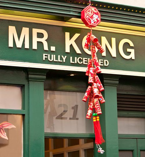
Understanding colour can help us bring out features of our pictures

Understanding colour helps us bring out features of our pictures. The complementary colours red and green emphasis the colour strength of red. Red is a powerful symbol of luck and good fortune in Chinese culture - emphasised here by the colours.

One of the things that I love about life is colour. It’s everywhere. As well as the awesome colours in nature there are wonderful shades of colour created by modern paints, printing and materials. To get the most from your pictures colour is something that photographers should exploit.

I wonder how many colourful scenes you walked past today? We all do it. We see vivid and rich colours so much that we miss them when they are right in front of us. Good photographers know the strength of colour and how to use it. To begin working well with colour it is a question of sensitising yourself.
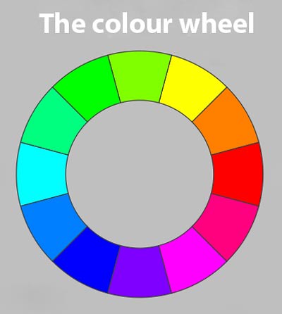
The colour wheel helps us to understand the relationships between colours.

The colour wheel helps us understand relationships between colours. Complementary colours are on opposite sides of the wheel. Harmonious colours that work well together are found adjacent to each other.

The colour wheel is one way to look at colour in your pictures. Finding colour harmonies and opposites is important. Good use of colour helps us to convey our message more effectively.

In the colour wheel above you can identify some basic ideas to help you use colour in your photography. Research has shown that colour is largely a perceptual experience. That is, we all see it in our own unique way. There are no absolutes. However, humans do broadly agree on colour and there are a range of theories explaining it and what we see. Colour wheels, like the one above, are simple systems that help us see some features of colour. If you read up more about colour then you will see different representations of colour – often in different colour wheels.

To get you started thinking about colours I want you to think of two features of the colour wheel above.

First, colours that are opposite each other are known as ‘complementary’ colours. They are like that because they contain no element of thier opposite in thier make up. They throw up opposite views and feelings. The colours play off each other. They help to stand out from each other. They are distinct and strong against each other.

On the other hand, the colours next to each other on the wheel are known as a adjacent or harmonious colours. These are the ones that work best with each other. In graduated steps these colours will blend through different tones into each other. They contain elements of each others colours. They convey harmony, tonal graduations, interweaving and subtle variation.

To help you understand colours you can do a simple ‘awareness’ exercise. Pick a colour – it can be any colour you want. It could even be a colour you do not like. Note its opposite and its adjacent colours. Now you have looked at these go out and take some photographs. Start to sensitise yourself to this colour and its complements and adjacent colours. Take as many shots as you can that show harmonious and complementary ideas.

Once you are sensitised to that colour try another, and then another. Before long you will find eye-candy in a whole range of colours and you will be looking for it everywhere.

Our eyes like a bright colour. So, try to be distracted by as many bright, vivid colours as possible. Explore the way they relate to other things near them. Look at how they make things stand out from the background noise of life going on around them. Feel how they blend into the world around them – or not. In other words, sensitize your eyes to the meaning and feeling of colour – then bring it out in your photography.

Colour is about making things bright and fun. Have a whole week of colour. See if you can really get some eye action!

By Damon Guy (author and Photokonnexion editor)

Damon Guy - Netkonnexion

Damon Guy (Netkonnexion)

Damon is a writer-photog and editor of this site. He has run some major websites, a computing department and a digital image library. He started out as a trained teacher and now runs training for digital photographers.
See also: Editors ‘Bio’.

Can you write? Of course you can!
Write for Photokonnexion...

We would love to have your articles or tips posted on our site.
Find out more…
Write for Photokonnexion.

Google Honors an Early Photographer

Todays Google Doodle honors Eadweard J. Muybridge who is celebrated for his pioneering photography using stop-frames.

Todays Google Doodle honors Eadweard J. Muybridge is celebrated for his pioneering photography using stop-frames.


The Google Doodle today is an animation of a famous study of horses in motion. The photographer, Eadweard J. Muybridge, is best known for this work. Muybridge was engaged by race horse owner and breeder Leland Stanford. Artists had depicted horses running with all four legs off the ground. Stamford, a californian business man and horse breeder, wanted proof of this locomotion. Muybridge deployed 24 cameras to take detailed film sequences capturing the motion of horses legs throughout the galloping cycle. He produced a film strip that showed the whole range of leg positions.

Muybridge did his work for Stamford in 1872. The sequence he produced proved that all four legs did indeed leave the ground at once. Artists had depicted the legs streched out to the front and behind when this happened. Muybridge showed that the legs were all tucked up under the body at the time they were all off the ground. The position is shown in the Google screen capture above in the first column.

Muybridge was born in Kingston on Thames, UK, on 9th April 1830. He later lived in the United States. While recouperating from a serious stage coach accident he became a committed photographer. He initially focused on landscapes establishing his career as a photographer. After his success with the horse film sequences he continued to investigate human and animal movement. His work was associated with academic papers and popular books. He died of a heart attack in 1904.

His work on the film sequences is widely regarded as a precursor to modern videography. Muybridge invented the zoopraxiscope during the course of his work on movement. The moving-sequence invention was one of the earliest attempts to animate film into moving pictures. His early popular insights into movement in film are said to have contributed to the later developments leading to motion pictures and eventually cinema.

Shooting in Low Light Without a Flash

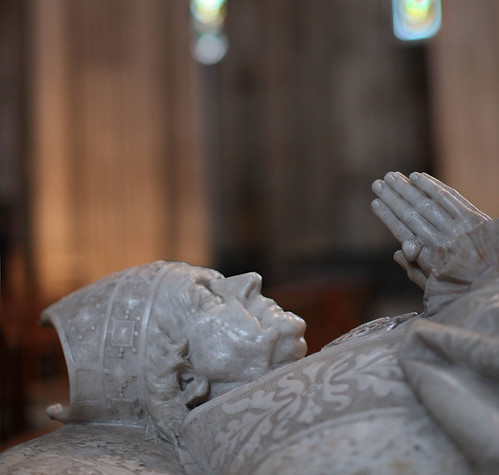
Shooting in churches is often difficult because of low light.

Shooting in churches is often difficult because of low light.

Using flash is sometimes the only way to get a picture – or is it? Actually it is perfectly possible to get a shot in low light without using the DSLR flash. You will need to actually take control of your camera a little.

Lets look at the situation. Often in churches, museums and other public places you are not allowed to use a tripod. It creates a trip hazard apparently. These places are often dimly lit. That’s ironic, it’s just where you need that tripod. So if you have to handhold a shot you need flash right? Well, you may also have noticed that flash is often banned in these sorts of places too. Flash distracts other people and the strong light degrades art treasures and artifacts. So with no tripod or flash how do you get that shot you so badly want? The answer is you need to play with the ISO setting.

A high ISO setting is what you need. High ISO is considered to be a high number. On most DSLR cameras ISO can be found as a setting in a prominent position – look it up in the manual. You will probably find that you can set the settings from about 80 to some very high numbers – possibly thousands – depending on the camera. To use the ISO setting you will also need to be using one of the manual settings too. Aperture priority or shutter speed will both allow you to set your ISO. If you have not done this before try starting by selecting the aperture priority setting.

ISO sets the sensitivity of your camera to light. Low ISO means low sensitivity. In low light it will take a long exposure to collect a lot of light. High ISO means high sensitivity to light. Set high ISO to collect more light when you are in a low light situation. Then the camera will be sensitive to the light and you will not need a long exposure.

So, if you need to hand hold a shot in low light you need to set the ISO high. In a church for example you will find it is pretty dark for most cameras. However, if you set your ISO for, say, 800 you will find that you will be able to get a reasonable speed of shot on aperture priority… if you open your lens right up.

Your lens has an aperture… a hole through which the light enters into your camera. When you set the aperture you are controlling the size of that hole. The aperture size is numbered using something called an f-stop. The rule is high aperture (say f22) -> small hole. Small aperture (say f4) -> large hole. So go for the large aperture to let more light into the camera try f4 or even lower if you can.

Try experimenting with different ISO settings and different f-stops. In aperture priority your camera will set the length of exposure for you. So you can try out different things and still get a good result.

If this article has given you the taste for more understanding and control over your camera keep watching this space. we will be doing more on exposure soon.

Ruin Your Shot Using Optical Stabilisation

As bizarre as it sounds, using image stabilisation (IS) or optical stabilisation can actually ruin your shot! Manufacturers are always claiming that it improves your shots. Well, not always. Sometimes the cause of movement in your camera is the technology itself.

Hand-held shots are definitely improved by the use of IS. It stabilises the shot and helps to iron out any shake created by the hand-hold.

When it comes to using a tripod things are different. The action of the stabilising motor in the lens has an impact. Any photograph taken with IS turned on will cause the motor in the lens to try and smooth out any movement. The same applies to the action of the autofocus… it hunts for a focus using mechanical changes which causes movement. The two play off each other. What actually happens is that both the auto-focus and the IS system create their own movement. This is translated into vibration in the tripod. The IS system then trys to iron out the movement in the tripod – which makes things worse!

The result is that the auto-focus and the IS create movement, not prevent it when on a stiff mount like a tripod. This leads to a deterioration in your picture quality. You may find that the shots you get with these turned on are quite ‘reasonable’. However, I would rather see excellent, not reasonable shots. Sharpness in your photography is a quality goal that needs to be pursued at all costs. As you get better you want more sharpness.

The simple answer is to turn off auto-focus and your IS system when using the tripod. The IS is not needed anyway because the lens should be steady on the tripod; the auto-focus is not ‘hunting’ for the sharpness. This leaves you in control and doing your own manual focus.

It is a small improvement we are looking for when turning off the auto-functions. Yet, if you add this to the other techniques you use to get sharper shots you begin to see vast improvements in the outcome of your pictures. It all adds up in the end!

By Damon Guy (author and Photokonnexion editor)

Damon Guy - Netkonnexion

Damon Guy (Netkonnexion)

Damon is a writer-photog and editor of this site. He has run some major websites, a computing department and a digital image library. He started out as a trained teacher and now runs training for digital photographers.
See also: Editors ‘Bio’.

Can you write? Of course you can!
Write for Photokonnexion...

We would love to have your articles or tips posted on our site.
Find out more…
Write for Photokonnexion.

Compositional Lines – Principles

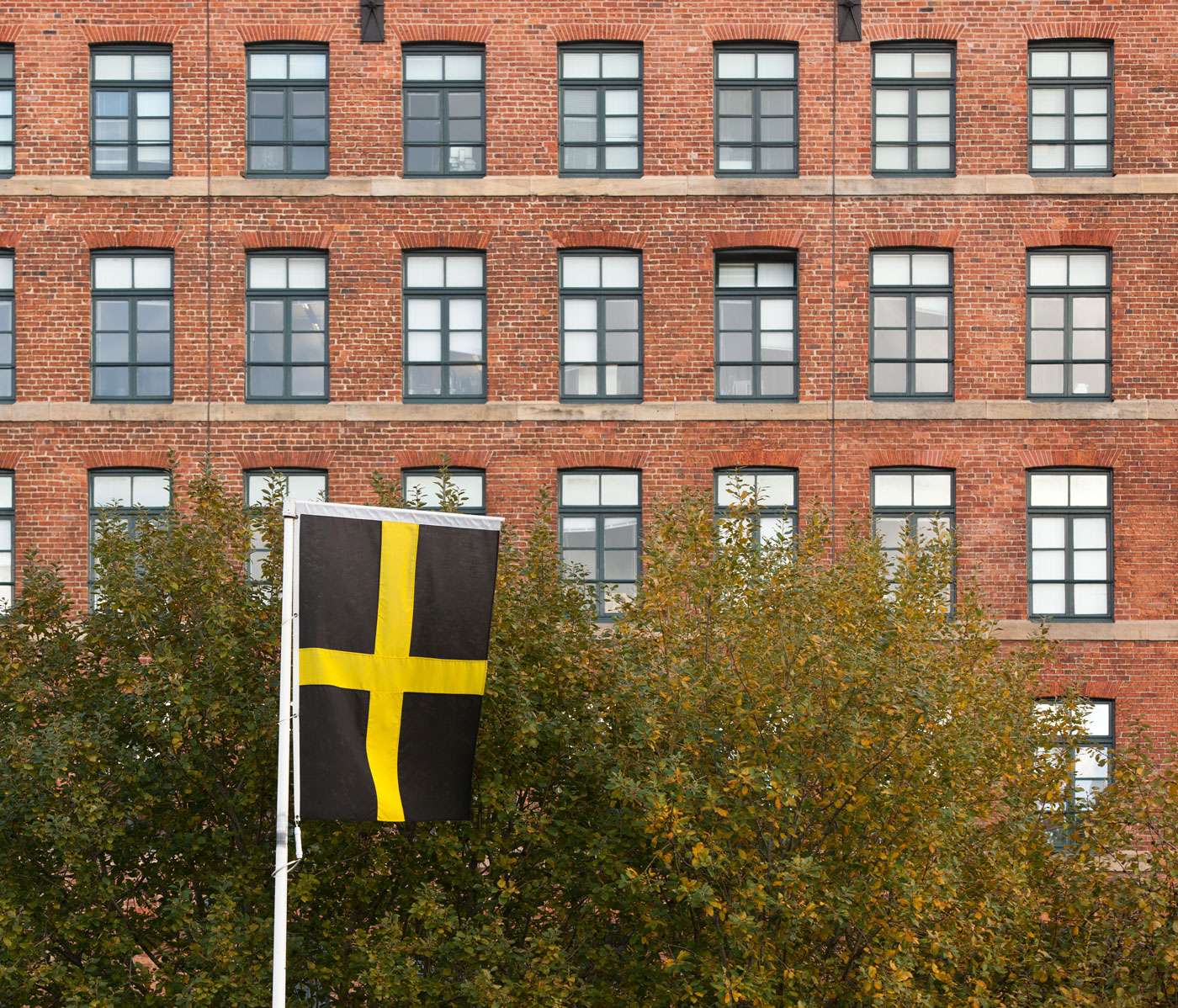
Horizontals and Verticals - your eye naturally picks out the lines

Horizontals and Verticals - your eye naturally picks out the lines. In any picture you can use natural lines to bring out features in your picture.
Flag - by Damon Guy (click to view large).

Composition has many different elements. One of them is ‘lines’. Perhaps ‘lines’ are not something that people automatically ‘see’, often they work subconsciously. However, they are crucial to how the eye moves through a picture. We naturally look for patterns in nearly everything we see. Lines are strong patterns and simple ones too. So it is natural for the lines in a scene to draw the eye and to lead the viewer. So how can we use these lines?

When we compose a picture the best thing we can hope for is that the viewer is drawn into it. We want them to be absorbed by the picture and to be impressed by it. Lines provide a way to help the eye around the picture, to be pulled into the experience that it provides. A good composition using them will generally do one or more of the following with lines…

  • …make a pattern that is eye-catching
  • …draw the eye around the picture
  • …lead the eye to something in the picture
  • …create the focus/subject of the picture
  • …create a dynamic feeling of force or motion
  • …create a feeling of harmony and balance

On the other hand an unsuccessful composition with lines would tend to do the opposite of these. It may…

  • …create a chaotic view – the eye does not know what to follow
  • …distract the eye to an unimportant place in the picture
  • …block the viewer from getting deeper into the picture
  • …oppress the view, dampen the mood, upset the balance
  • …point or draw the eye out of the picture
What is a Compositional Line?

Basically, anything in your picture which is long and thin can be a line. Or it could be something that is a strong edge. There could be features in the picture that provide multiple lines. A river has two banks and the water itself, three lines. A road has several lanes and roadsides and lines drawn on the road for drivers to follow.

So lines could be anything well defined that have a length many times greater than the width. Your line could be a long thin set of clouds. It could be a fence. You could have a vertical line as a person standing up – they could be lying down (horizontal line). Many things together could be a line – traffic, railways, a queue, piles of something… I could go on and on. If it can be long and thin, implied as long or thin or an edge of something well defined, you have a line for the eye to follow. There is a lot of compositional flexibility with lines.

Of course lines could be more than just horizontal or vertical. Lines can be curved, diagonal, angled, shaped, chaotic, ‘u’ shaped – in fact anything you can envisage that you want them to be. And all the features that lines exhibit can be used in compositional ways in the picture. Basically, you are looking for ways your picture can be enhanced. With practice you will be able to spot them in the frame when you are composing the picture. Then the trick is to look for ways the eye can flow along the lines to draw you into the picture. Alternatively you can show the viewer things you want them to see. Again, you can make the lines into a pattern. Or, you can even ignore them as a compositional element.

What you must not do is let lines be in your picture without having some idea of how they influence the viewer. Use lines, or ignore them, but try to work out what the impact of the lines are. If they don’t enhance the picture then find away to get rid of them or minimise the effect. If they do enhance the picture then compose to make the best of them.

Have fun with your lines!

Principles of compositional lines

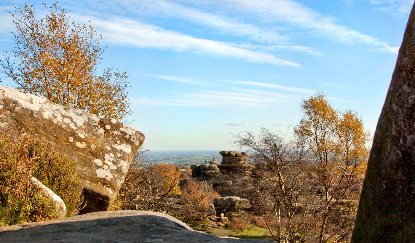
A complex of lines can join up. Making the lines work together can help compose a picture where the eye flows around the scene. Click to see full size.
- By Damon Guy

By Damon Guy (author and Photokonnexion editor)

Damon Guy - Netkonnexion

Damon Guy (Netkonnexion)

Damon is a writer-photog and editor of this site. He has run some major websites, a computing department and a digital image library. He started out as a trained teacher and now runs training for digital photographers.
See also: Editors ‘Bio’.

Definitions [L] [Lines]

Photography, Philosophy and Time

Its the big thing in your jar hold your attention.

The big things in your jar should hold your attention.


I want you to read this story. It is about you and me and anyone trying to make time for
photography…


The Mayonnaise Jar and the Two Glasses of Wine

When things in your life seem almost too much to handle and 24 hours in a day are not enough, remember the mayonnaise jar and the two glasses of wine.

A professor stood before his philosophy class and had some items in front of him. When the class began, wordlessly, he picked up a very large and empty mayonnaise jar and proceeded to fill it with golf balls. He then asked the students again if the jar was full. They agreed it was.

The professor then picked up a box of pebbles and poured them into the jar. He shook the jar lightly. The pebbles rolled into the open areas between the golf balls. He then asked the students again if the jar was full. They agreed it was.

The professor next picked up a box of sand and poured it into the jar. Of course, the sand filled up everything else. He asked once more if the jar was full. The students responded with a unanimous yes. The professor then produced two glasses of wine from under the table and poured the entire contents into the jar, effectively filling the empty space between the sand. The students laughed.

Now, said the professor, as the laughter subsided, I want you to recognize that this jar represents your life. The golf balls are the important things; your family, your children, your health, your friends and your favorite passions; things that if everything else was lost and only they remained, your life would still be full.

The pebbles are the other things that matter like your job, your house and your car. The sand is everything else; the small stuff. If you put the sand into the jar first, he continued, there is no room for the pebbles or the golf balls. The same goes for life. If you spend all your time and energy on the small stuff, you will never have room for the things that are important to you. Pay attention to the things that are critical to your happiness.

· Play with your children.
· Take time to get medical checkups.
· Take your partner out to dinner.
· Play another 18 holes of golf.

There will always be time to clean the house and fix the disposal. Take care of the golf balls first; the things that really matter. Set your priorities. The rest is just sand.

One of the students raised her hand and inquired what the wine represented. The professor smiled. I’m glad you asked. It just goes to show you that no matter how full your life may seem, there’s always room for a couple of glasses of wine with a friend.

– Author Unknown –

What do you need to do now?

If you read “Go take some photographs” for the line above that says “Play another 18 holes of golf” you will understand. The things in life that are important are the ones that you are passionate about. Take photos – make beautiful images – be passionate.

Enjoy your camera…

By Damon Guy (author and Photokonnexion editor)

Damon Guy - Netkonnexion

Damon Guy (Netkonnexion)

Damon is a writer-photog and editor of this site. He has run some major websites, a computing department and a digital image library. He started out as a trained teacher and now runs training for digital photographers.
See also: Editors ‘Bio’.

Can you write? Of course you can!
Write for Photokonnexion...

We would love to have your articles or tips posted on our site.
Find out more…
Write for Photokonnexion.