Tag Archives: Shape

Easy introduction to ‘visual elements’ in photographs

Look into your photograph, go deeper than it’s content.

Examine the composition of your image. Go beyond it’s immediate pictorial display. Look into the basic structure and you will be able to break your picture down into its component parts. Consequently, understanding individual “Visual Elements” in an image can help you to capture the eye of the viewer too. It’s these simple elements that make the eye work to absorb the content of an image.

Visual elements shown in a slide show.

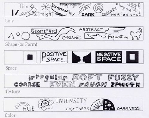
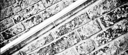
Image taken from the slide show below shows how the visual elements work.

What are the ‘Visual Elements’?

We make sense of the world by building a picture of it in our heads. Objects in our environment are visible to us because our eye/brain system is able to see and analyse the edges, contrasts, light/shadow/dark, colours and perspectives we see. Subsequently, our ability to analyse these patterns gives us an understanding of the world around us. So, if we can isolate these simple visual elements it will help our composition.

To make an image, photographers should look for strong visual elements through the lens. A great deal of the creative work in photography is to remove content that doesn’t contribute to the point of an image – these are distractions. So, to make the image effective we should also seek a point of view that isolates elements that we want to show.

Having isolated distractions the next job is to ‘see’ the subject in the ‘best possible light’. This English idiom is not just waffle (especially for photogs). It is really about using the edges, contrasts, light/shadow/dark, colours and perspectives mentioned above. Finding ways to use these effectively is what will draw the eye into our images. As a result, we should be finding simple, eye-catching features that make the scene realistic and easy to understand.

The Elements of Art

Research in art shows, that we can pin-point specific ‘visual elements’ in a photograph as powerful, but fundamental parts of our images. Artists have isolated these visual elements. They are called, “The Elements of Art”. There are seven of them…

  • Line (The path of a point, or implied path of a point, through space or over a surface.)
  • Shape (A two dimensional enclosure created by a single line – may be geometric or freeform.)
  • Form (A three dimensional object which has a ‘mass’ or ‘weight’; a shape with depth; physical width/height/depth.)
  • Space (Positive space: the subject or dominant object in the picture plane; Negative space: the background area. Space can occupy the outside, inside or surrounds in a depicted object.)
  • Value (The relative brightness/lightness/darkness/colour intensity. Photographers usually refer to Value as ‘Tone’.)
  • Colour (Light of particular wavelengths in the visible light spectrum.)
  • Texture (The presence of an apparent surface that would have a touch/feel character of its own.)
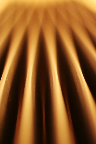
Examples – a slide show!

Perhaps, some of my definitions above are difficult to understand. If you can put them into context it will help. Here is a short slide show by Kelly Parker. The examples really show the visual element of colour well. Click the bottom arrows to move back or forward on the slides. Furthermore, you can find examples of the other ‘Elements or Art’ available in many other articles. Search “Elements of Art“.

The Elements of Art – A glossary Entry

To follow up, the Photokonnexion Glossary has an extended article on the Elements of Art. You can see that here… Definition: Elements of Art


Download a Presentation Transcript of the slide show.

Damon Guy - Netkonnexion

Damon Guy (Netkonnexion)

Damon is a writer-photog and editor of this site. He has run some major websites, a computing department and a digital image library. He started out as a trained teacher and now runs training for digital photographers.
See also: Editors ‘Bio’.
See also: Profile on Google+.

Simple ways to create photographic abstracts

Photographic abstracts

• Photographic abstract •
See the world a different way by looking for non-representational images to make.

The key to photographic abstracts is observation

The material for photographic abstracts is in the world all around us. With a little practice it is easy to see them. Your view will unfold with a through looking at the component parts of things.

Abstracts can be almost anything. Most often they are the properties, attributes or component parts of something else. Where we see the whole of something – the abstract is found in the parts. Where we see a car, the abstract is found in the pattern of rust. Where we see a fence, the abstract is found in the texture of the wood. It may be found in the pattern of the fence too. The photographic abstracts shows the essence of something. It’s not always the whole of it. Or, it might be the whole of something, but a part of something else wider, larger, or more inclusive. In the reality of abstraction we are looking for something that is not necessarily the actual picture shown. Most often that means making an image that does not represent something. These non-representational images bring out form, shape, colour, hue, light, shadow – almost any attributes of the world of imagery. But, this is the point, the image tends not to be about what is represented, but what is the experience of the image itself.

photographic abstracts bring out things that are found in patterns, colours, shape form, lines, angles. These and other things contribute to the essence of a thing. The inner beauty of something is often not in seeing the whole, but appreciating its parts. And, it is also about knowing that the whole is more than the sum of the parts. Photographic abstracts show that extra view.

Training your eye to see photographic abstracts in the world around you takes time. Once you start looking for non-representational imagery you will find them quickly and everywhere. Look out for the experience of what you see in the textures and forms, colours and hues – do not look to show a straight forward subject.

Insight into photographic abstracts

If all that sounds difficult then you need to give your eye some experience. Examine some of the abstracts available online. Here are some links to look at photographic abstracts…

Simple ways to produce abstracts

To get into making successful abstract images you need to make a simple start. The complexity of many images can easily confuse the eye. So to get started, open your eyes to the simple things you see.

Take a bicycle. Complex in its whole, but photograph just the shadow from the back wheel on a sunny evening. A whole new world of angles, light and tone is revealed. The subject may be clear – it may not. The point I am making is, the interest lies in the result of the wheel creating a shadow. The power of the image is not in the bicycle itself, but the impact of its relationship between the sun and the actual structure. Check out these examples for some insight Bicycle wheel shadow images on Google | External link - opens new tab/page.

The key word I just used is “relationship”. Often abstracts explore relationships. A non-representational image is about understanding the relationship of the parts to the whole. That, and expressing the feeling that it imparts to the viewer. The power of an abstract is to connect to the emotions of the viewer and provide something deeply appealing, but which examines the relationships of the parts. Producing an abstract is about finding ways to explore the relationships of the parts in ways that are not a plain, representation of the subject.

So, try looking for ways to show the subject of your interest without showing the subject itself. Try some of these ways of looking…

  • Looking for a part shot of the whole.
  • Show it as a shadow.
  • Light it in a unique way.
  • Explore only parts of the subject.
  • Show the shape or form, but do not show the whole.
  • Look at the graduation of colour, shadow or light.
  • Go really close – just for a part.
  • Show the image in part through something else.
  • Show something that looks like something else.
  • Explore the texture of your subject.
  • Spotlighting just a part of your subject.
  • What is the relationship between tone and colour?
  • Show one thing in relation to another – an unusual pairing

You can probably think of many more approaches to making an image. To get your creative juices flowing take a few days to review other peoples ideas about abstracts. Look through some of the example links I have given here.

As you can see some of the ideas in the list above are starting to get more complex. Explore with simplicity first. Then later explore more complex mixtures of ideas about your subject.

Trying to show the essence of something needs thinking about in new ways. Look at this list of the Elements of Art

  • Form
  • Line
  • Colour
  • Space
  • Texture
  • Light value (lightness/darkness)
  • Shape

Each of these attributes of your subject can reveal new insights. Try exploring only one or two of these at a time. This will reduce the complexity of your approach. Your image will reveal a great deal about your subject but from a new, simple perspective. Describe your subject using the simplest possible elements of what you can see in it. Then you will have picked out a true abstract.

Finding out more about photographic abstracts

Abstracts fascinate photographers. The idea of expressing something without actually showing it in its complete form is really satisfying. Abstracts allow you to express yourself and say something new about your subject that no-one else has ever said. Abstract photography is one of the few ways you can really get a deep insight into your subject yourself, at the same time give a deep insight to your viewer. It gives you a license to express yourself more than almost all other aspects of photography.

If you want to find out more about the subject there are few good books on the market. One of the real insights into this subject is The Edge of Vision: The Rise of Abstraction in Photography. It is a really interesting book, with historical insights and well positioned photographic insights too.

I recommend this book to help you get a feel for the subject of photographic abstracts. As a photographer you will enjoy the pictures as well as the understanding you will gain by reading it. For me it helped an understanding of the context of photographic abstracts in popular art culture. But it also released me from it. In modern terms abstracts are an open subject. Today photographers have largely escaped the cultural context and are free to use the techniques without the strong cultural constraints of the past. So read the book and get into the ideas. Use it to expand your horizons.

Comments, additions, amendments or ideas on this article?
Contact Us or leave a comment at the bottom of the page…

Like this article? Don’t miss the next — sign up for tips by email.

Damon Guy - Netkonnexion

Damon Guy (Netkonnexion)

Damon is a writer-photographer and editor of this site. He has run some major websites, a computing department and a digital image library. He started out as a trained teacher and now runs training for digital photogs.
See also: Editors ‘Bio’.
By Damon Guy see his profile on Google+.

Seven examples of abstract photography

Abstract photography taps into something deep in us.

It reveals elements of a subject rather than the whole subject. Abstracts examine the mystery of a subject though the parts we normally ignore in favour of the whole. It is this that makes an abstract unique.

In Definition: Abstract Photography we examined what makes an abstract. In the article Abstract Photography we examined abstracts in photographic terms and how to take abstract photographs. We looked carefully at the sort of properties or attributes of a subject to consider when taking abstract shots. In this post we are going to see some examples.

How to look at an abstract

The concept of an abstract is about the elemental make-up, the properties and attributes, of a subject. Often when we see something we tend to regard is as a whole. Abstracts explore the components that make the whole. We consider those in their own right rather than as their contribution to the whole. To appreciate an abstract try not to second-guess its part in the whole. Appreciate it for what it is – a thing which has its own properties, attributes and aesthetics.

Seven examples of abstracts


Light-Shadow

Light-Shadow By ~LuceAnima

On Deviant Art


Golden Fins By Richard Homer

Golden Fins By Richard Homer


Abstract Photography

Abstract Photography
By d o l f i
http://www.flickr.com/photos/kelehen/5285763767/


 Abstract  No shape change.

Abstract – No shape change. By Tanakawho


Abstract-blue-sono2531a

Abstract-blue-sono2531a – By Ara_gon
On Flickr… http://www.flickr.com/photos/ara_gon/4035403/


Abstract in black, blue and white

Abstract in black, blue and white by Xollob58
On Flickr… http://www.flickr.com/photos/xollob58/3049040298/


abstract mini

Abstract mini – By Ary Snyder
On Flickr… http://www.flickr.com/photos/arysnyder/4178120542/

Further exploration by links…

Abstracts on Flickr…  External link - opens new tab/page
Abstracts on Deviant Art External link - opens new tab/page
Abstracts on 500px External link - opens new tab/page
Abstracts on 365Project… External link - opens new tab/page

10 ways to bring out the point of interest

"Drag bike" Selective colouring is a great way to bring out your point of interest in the shot

“Drag bike” – Selective colouring is a great way to bring out your point of interest.
Click image to view large

Focus the attention of your viewer using these great techniques.

The most important thing about your image is the part that you want your viewer to see. A great image needs to concentrate their attention and hold it in the shot.

Next time you are ready to take a photograph – pause for a second. Think about composing your picture so you direct the viewer at the most important part of your image. The ‘point of interest’, ‘focus of attention’ or a ‘focal point’ is where the viewer finds satisfaction from looking at the image. It makes sense that you use one or two techniques to point the viewers eye right at the reason you are taking the shot.

10 Techniques directing the eye to the point of interest
  • Crop: The cropped shape of the picture is an important way to help the viewers eye find the ‘point of interest’. Letterbox shaped crops help the viewers eye to run across the width of the picture; square crops help direct the reader to the centre of the shot; landscape views are so common that they help the reader be unaware of the crop; Portrait views alert the reader to the vertical things of interest. A crop is a great way to help the readers eye, especially when used with other techniques below.
  • Position: Where you place your point of interest in the shot can affect how prominent it is or how the eye is drawn to it. A good introduction to positioning is to look up the Rule of Thirds. That is a basic rule of composition that gives the eye a dynamic reason to look at the point of interest.
  • Size: A large subject or point of interest is a great way to make people look at it. Big and bold and your viewer will hardly miss it!
  • Focus: The use of depth of field is really effective. The human eye naturally sees what we directly look at in focus. So we tend to concentrate our viewing in the area of sharpness in a picture.
  • Movement blur: Capturing movement creates blur. In my picture above the bike is travelling very fast. To capture it like that I have panned my camera. The background is out of focus. The sharpness and blur create a contrast that draws the eye to the sharpness. Alternatively, you can photograph something moving that you want to become blurred as the focus of attention. Classic movement blur is often created at the fair in the evening. Fast movement with brightly coloured lights wonderfully blurs the merry-go-round in a longer exposure. The strangeness and strong colours draws the eye to the patterns.
  • Colour: Using colour is a great way to draw the eye. Strong primary colours (red, green, blue etc.) are especially good at catching the eye. One bright colour against other lesser colours also directs the eye. Contrasting colours can be a good way of highlighting a particular point of interest too. Colours are best used to make the point of interest stand out from the background.
  • Selective colour: The absence of colour in part of a picture and the selection of one colour or an object in colour is a great contrast in the picture. That difference – greyscale to colour – will strongly make the point of interest stand out. An example is the picture above.
  • Shape: The use of shape is a way to draw the eye too. Again you can use a contrast. One round object in a group of square objects really captures the attention. A strong geometric shape in a picture where there is no other strong, well defined shapes pulls the eye.
  • Pattern: Where there is pattern there is focus. Our eyes are good at picking out patterns. Sudden, clear formation of pattern in a picture where there is no otherwise clear pattern focusses the attention on the pattern. The opposite is true too. Where there is a breakdown in a pattern the eye is drawn to the difference and questions why the change or break in the pattern.
  • Lines: The eye naturally follows lines in a picture. So, you can use lines both as the actual point of interest, and as a way of pointing at the focus of attention. Implied lines can be useful in the same way. A line that strongly points to something else is another way to capture the attention.

It is important too, you are careful not to make the picture too complicated or cluttered. To much to catch the attention will have the eyes whizzing around the picture and not able to settle on your point of interest. Likewise, it is best to use just one or two of the above techniques. Too many and the eye is confused with what direction they should follow. Composing your picture is about subtle messages and directions to help the eye. The last thing you want to do is to confuse or misdirect your viewer.

By Damon Guy (author and Photokonnexion editor)

Damon Guy - Netkonnexion

Damon Guy (Netkonnexion)

Damon is a writer-photog and editor of this site. He has run some major websites, a computing department and a digital image library. He started out as a trained teacher and now runs training for digital photographers.
See also: Editors ‘Bio’.

Can you write? Of course you can!
Write for Photokonnexion...

We would love to have your articles or tips posted on our site.
Find out more…
Write for Photokonnexion.

The Rule of Odds – Uneven Composition

The rule of 'odds' - a rule grounded in our concepts of pattern and chaos.

The rule of ‘odds’ is grounded in our concepts of pattern and chaos. We find it easy to pick out a pattern. If the pattern is broken or shows anomaly it is more interesting. The eye is drawn into the picture. Odd numbers are just a little off the comforting pattern of evens. They draw the eye too. Click image to view large.

It’s a little ‘odd’ – but ‘even’ is not as interesting!

The rule of odds relies on the human sense of pattern to capture the attention the viewer. Our brains work well with pattern. We see pattern in almost everything in the world. So it is natural to see it as a central part of composition. When there are small groups of objects or people the rule of odds becomes a valuable attraction for the eye.

Why does the rule of odds work so well? There are several reasons. The eye is pleased by symmetry. Evenness represents symmetry. It represents balance… it’s about plainness and organization. On the other hand an odd number steps out of the realm of organization and plainness. When we see an odd number it is natural and compelling for our eye to seek the missing component to even it up again. We look into the picture to try and satisfy the pattern.

Some pictures, like the one, above obviously have nothing in them to fulfill evenness. There is no fourth dice here. However, the number three creates another simple pattern. The Triangle is also attractive to us. Placed in a position that creates a triangle three objects form an implied shape that attracts the eye. It is symmetrical, yet it is odd.

The rule of odds is not just about ‘threes’. The eye is drawn to odd numbers in small groups where we can see the oddness of objects at a glance. Five, seven, even nine are all numbers that pull the eye toward them. Once objects become too numerous to be immediately and obviously odd in number the appeal is lost. The eye does not search to fulfill the pattern. So the rule of odds works because of the simplicity of low numbers – it relies on quick recognition of the situation to draw the eye into the picture and keep it working to find the balance.

The rule of odds plays out its role in composition in many ways. If you are looking to make a bigger impact then find a way to place an odd number of objects into your picture. An odd number provides more interest, more reason for the eye to search the picture. Remember, the ultimate aim is to draw the eye of the viewer into the shot and keep them looking and finding interest.

By Damon Guy (author and Photokonnexion editor)

Damon Guy - Netkonnexion

Damon Guy (Netkonnexion)

Damon is a writer-photog and editor of this site. He has run some major websites, a computing department and a digital image library. He started out as a trained teacher and now runs training for digital photographers.
See also: Editors ‘Bio’.

Abstract photography – what it is and how to do it

Abstract photography - great pictures and lots of fun!

'Red' - In the style of Rothko
Abstract photography can produce great pictures and be lots of fun!
Concentrate on colour, form, shape and focus for best effect.
Click to view large.

What is Abstract Photography?

“Abstraction forces you to reach the highest level of the basics.”

Alan Soffer

Abstract photography concentrates on the very simplest of components in a piece of art. Those are are known as the “Elements of Art”. They are…

  • Line;
  • Two dimensional shape (2d);
  • Three dimensional (3d) form;
  • Colour;
  • Space;
  • Tone, and
  • Texture.
Extra dimensions in abstract photography

Two extra dimensions are often found in abstract photography. One is the use of ‘movement’ – mostly through movement-blur. Perhaps, used more often is the use of focus, especially by controlling the depth of field. In addition, abstracts often incorporate “pattern”, which is a more complex structure from the “Principles of Art”.

Photo abstracts take the viewer away from knowing or recognizing the subject. Instead they invite the viewer to almost ‘feel’ the textures, forms and other elements of the subject. Often abstract photography makes the object unrecognisable as an object in its own right. Instead it directs attention to the look and feel – the essence of the object.

For a more detailed definition of Abstract Photography check this page in our Glossary…
Abstract Photography – a Definition

How to Shoot Abstracts

Abstracts are about our creativity and not about the object. The simple shot above, with its rich emotional orange, is a glass of water coloured with red dye and slightly backlit with a desk lamp. Many abstracts are created using the simplest things – often they are found around the home. Abstract photography is all about simplicity. Getting down to the basics is often the best route to a good abstract.

Using the “Elements of Art”

The list above is perhaps difficult to think about in terms of actually creating an image. However, think carefully about what you see in the frame for your shot. Often you can see these simple elements in your subject. Try to simplify your shot so that you see only one, two, or at most three of those elements. If you manage to get the image to remain simple, you will make the shot more understandable. If you also manage, through that simplicity, to capture the readers eye, you will excite the viewer. Simple components, simple connections, simple insight to a subject – all these give you effective abstract material.

Study the Elements of Art, at length. Try to see the simplicity within your frame. That is the key to developing your insight into abstraction.

Other techniques…

To help you shoot a few abstracts I have put a list of things you can try below. Try one, or a few at a time. Compare them to some of the examples in the links below the list. Reduce or remove clutter. Keep your shot as simple as possible.

  • Look for patterns – especially very close up.
  • Textures – show the ‘feel’ of surfaces and faces of an object.
  • Try unusual or unique angles.
  • Use a macro lens, macro tubes, or get really close.
  • Crop very tight to an interesting/unrecognisable part.
  • Concentrate on multiple colour variations without showing the whole object.
  • Concentrate on tonal variation – minimise colours.
  • Use long, low light exposure to bring out subtle shadow variations.
  • Use soft or hard light variations on close-ups.
  • Emphasis the ‘shape’ (2d) of an object – keep it from being recognised.
  • Exaggerate the ‘form’ (3d) of something – keep it from being recognised.
  • Concentrate on curves and rounded shapes or forms.
  • Concentrate on angular and geometric shapes or forms.

Many of these can be applied to everyday objects or common items. Once you become aware of the shapes, forms, patterns and textures in the things around you a new world opens up. So try to take one of the above and spend a few days looking at everything around you for ways to see that item. Then move on to others. Before long you will be an abstract photographer!

Damon Guy - Netkonnexion

Damon Guy (Netkonnexion)

Damon is a writer-photographer and editor of this site. He has run some major websites, a computing department and a digital image library. He started out as a trained teacher and now runs training for digital photogs.
See also: Editors ‘Bio’.
By Damon Guy see his profile on Google+.