Tag Archives: Rules of Composition

Keep it simple… thats it!

There is no better way to improve your images.

If you can keep it simple the power in the photography comes out. If you can cut out all the clutter the image comes alive with the main subject in it. If your subject is all you have to show, it is the meaning and the message in the photograph.

Here are some quick ideas about simplicity in photography… Enjoy!

The basic idea (1min 24secs)
National Geographic Photography Tip: Keep it Simple

National Geographic Photography Tip: Keep it Simple
Uploaded by National Geographic Channel  External link - opens new tab/page to YouTube


David Bailey (30secs)

David Bailey is a famous UK contemporary photographer who was pretty prominent in the 1960s and continued to create photo-masterpieces right up to the present day. Here is his page on Wikipedia: David Bailey  External link - opens new tab/page

David Bailey on simplicity in 30 seconds

Uploaded by: softlad telly visual  External link - opens new tab/page

 
Hmmm! Did he actually say anything useful? Why not leave a comment about that? The next video is very useful!
 

Dominance and simplicity (2mins 21secs)
Outdoor Photo Tips with Jerry Monkman – Week 4: Composition – Dominance and Simplicity

Uploaded by: Jerry Monkman  External link - opens new tab/page

The fifteen second landscape appraisal

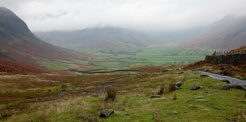
• Looking into Great Langdale •

• Looking into Great Langdale •
Click image to view large
• Looking into Great Langdale • By Netkonnexion on Flickr External link - opens new tab/page

The classic landscape shot deserves one last look.

There’s nothing more frustrating than a poor landscape shot. You have the right light and place, the right angle too. Then the final shot looks wrong. Here is how to avoid the last moment mistakes.

Right up to the last moment…

You are on location and getting ready to take your shot. What do you do first? ‘Work the scene’, that’s what. Two things to remember about every landscape shot…
• The first location you put your camera down will be wrong
• The first time you compose the scene it will be wrong.
OK, these may not always be true, but they usually are true. If the first place you put your camera is where you take the shot you have missed the million other angles and places. You could have done a better job. So read the article on ‘Working the scene’ and then read the rest of this article.

Working the scene may involve a lot of different shots. In Landscape loves I pointed out that you can spend a great deal of time getting the final shot. When doing landscapes I often spend over an hour on working toward a final capture. Sometimes I may take 50 shots before I am ready for the ‘one’. Take your time. Think it through.
More after this…

You are ready…

Now to take the shot, the ‘one’. It’s time for the “Fifteen second appraisal”. You are going to do three things in this final check. Each will take five seconds.

  • The frame: You need to check all is well with your framing. Check you have included all the elements you want in the shot. Check the frame captures your scene as you intended it. Look for odd elements creeping into the scene that you have not spotted on the edges. Check that you have excluded all the undesirable elements on the edges of the picture too.
  • The compositional elements: Every picture is improved if you use compositional elements to help the eye see the scene. Make sure that you have a way get the viewer into the scene, leading lines, strong features, dramatic light and so on. Whatever you have identified will capture the viewers eye, make sure you know they are there. Dissect the scene, know why the composition pulls the eye into the scene and why the scene has depth and why the eye is held in the scene.
  • The continuity check: With this final check you are looking for a state of harmony and the absence of the three D’s…
    1. Discordance: Do all the elements come together? Is it complicated, can it be simplified? Do the colours clash? Is there anything in there that does not ring true with the rest of the scene? Is the scene harmonious or broken? Do the compositional elements pull the eye or split the view. Anything out of place?
    2. Disruption: Is there something in the scene that will change or disrupt the shot? Look for a moving car, a rolling fog bank, the wrong shaped wave, walkers stepping into the frame. You are checking for all things that might disrupt the shot.
    3. Distraction: Are there things in the scene that will spoil the view and draw the viewers eye away from the central message of the shot? Think of blown highlights, over-bright colours out of place, odd-items (bins? rubbish? pick-nick furniture? power lines?).

The fifteen second appraisal does not seem a long time. It is just right after practice. So take this check-list with you and practice it. After a while you should be able to do it in fifteen seconds without a check-list. Make it a habit and your landscapes will improve.

By Damon Guy (author and Photokonnexion editor)

Damon Guy - Netkonnexion

Damon Guy (Netkonnexion)

Damon is a writer-photog and editor of this site. He has run some major websites, a computing department and a digital image library. He started out as a trained teacher and now runs training for digital photographers.
See also: Editors ‘Bio’.

Can you write? Of course you can!
Write for Photokonnexion...

We would love to have your articles or tips posted on our site.
Find out more…
Write for Photokonnexion.

Easy introduction to ‘visual elements’ in photographs

Look into your photograph, go deeper than it’s content.

Examine the composition of your image. Go beyond it’s immediate pictorial display. Look into the basic structure and you will be able to break your picture down into its component parts. Consequently, understanding individual “Visual Elements” in an image can help you to capture the eye of the viewer too. It’s these simple elements that make the eye work to absorb the content of an image.
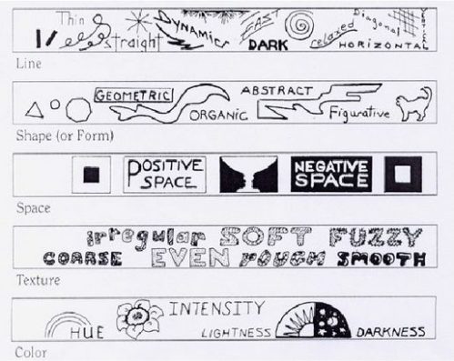
Visual elements shown in a slide show.

Image taken from the slide show below shows how the visual elements work.

What are the ‘Visual Elements’?

We make sense of the world by building a picture of it in our heads. Objects in our environment are visible to us because our eye/brain system is able to see and analyse the edges, contrasts, light/shadow/dark, colours and perspectives we see. Subsequently, our ability to analyse these patterns gives us an understanding of the world around us. So, if we can isolate these simple visual elements it will help our composition.

To make an image, photographers should look for strong visual elements through the lens. A great deal of the creative work in photography is to remove content that doesn’t contribute to the point of an image – these are distractions. So, to make the image effective we should also seek a point of view that isolates elements that we want to show.

Having isolated distractions the next job is to ‘see’ the subject in the ‘best possible light’. This English idiom is not just waffle (especially for photogs). It is really about using the edges, contrasts, light/shadow/dark, colours and perspectives mentioned above. Finding ways to use these effectively is what will draw the eye into our images. As a result, we should be finding simple, eye-catching features that make the scene realistic and easy to understand.

The Elements of Art

Research in art shows, that we can pin-point specific ‘visual elements’ in a photograph as powerful, but fundamental parts of our images. Artists have isolated these visual elements. They are called, “The Elements of Art”. There are seven of them…

  • Line (The path of a point, or implied path of a point, through space or over a surface.)
  • Shape (A two dimensional enclosure created by a single line – may be geometric or freeform.)
  • Form (A three dimensional object which has a ‘mass’ or ‘weight’; a shape with depth; physical width/height/depth.)
  • Space (Positive space: the subject or dominant object in the picture plane; Negative space: the background area. Space can occupy the outside, inside or surrounds in a depicted object.)
  • Value (The relative brightness/lightness/darkness/colour intensity. Photographers usually refer to Value as ‘Tone’.)
  • Colour (Light of particular wavelengths in the visible light spectrum.)
  • Texture (The presence of an apparent surface that would have a touch/feel character of its own.)
Examples – a slide show!

Perhaps, some of my definitions above are difficult to understand. If you can put them into context it will help. Here is a short slide show by Kelly Parker. The examples really show the visual element of colour well. Click the bottom arrows to move back or forward on the slides. Furthermore, you can find examples of the other ‘Elements or Art’ available in many other articles. Search “Elements of Art“.

The Elements of Art – A glossary Entry

To follow up, the Photokonnexion Glossary has an extended article on the Elements of Art. You can see that here… Definition: Elements of Art


Download a Presentation Transcript of the slide show.

Damon Guy - Netkonnexion

Damon Guy (Netkonnexion)

Damon is a writer-photog and editor of this site. He has run some major websites, a computing department and a digital image library. He started out as a trained teacher and now runs training for digital photographers.
See also: Editors ‘Bio’.
See also: Profile on Google+.

A composition trick from classical art in under seven minutes

The ‘Rule of Thirds’ is beaten into second place.

The improvement in a picture set to the rule of thirds is amazing. Suddenly the picture becomes dynamic and the proportions appear pleasingly laid out. The Golden Ratio is the Rule of Thirds on steroids and is the subject of the video today.
More after this…

The Golden Ratio

The Golden Ratio (GR) has been around for a long time. Modern artists and photographers use the GR as a simple principle for their composition. The particularly aesthetic proportions are universally recognised. Some of the worlds greatest artworks are composed using the principle. The Greeks also used GR proportions in their architecture. As we learn from the video there is also a natural history associated with the GR going back millions of years. Our very DNA  External link - opens new tab/page is set in the same proportions. The GR appears throughout nature too. To our eyes, it represents a wonderfully aesthetic proportion that appears in so many things around us that we barely see it. You will be astonished where it appears. And, it is a great help when doing your photographic composition.


“The golden mean” Uploaded by angigreek

Are you aware of hidden emphasis?

By careful composition you can create hidden emphasis

By careful composition you can create hidden emphasis

Micro-details in your picture can provide clues.

It’s a fair bet that you will not find the hidden emphasis in this picture at first glance. Look carefully and you may see it because of the colour and positioning. Not everyone will see it.

Look at the pencil. One of the rubber bands has been arranged in an elongated circle around the pencil. The bright yellow colour is strong enough to make it stand out as a compositional element. It is like a wide halo around the pencil. It is also sufficiently blended in to be almost invisible at first glance. Can you see it?

Three different types of people will react to this visual clue. The artists, who will spot the emphasis immediately. Their eye is trained to see messages in an image. Then, there are people who may or may not spot the emphasis – depending on how skilled their eyes are at visual clues and geometric shapes (in this case). Finally, there are those that will miss it first time, and may not see it until it is pointed out to them. And, there is a whole range of people between them.

You see, everyone has a different type of perspective. When looking at a picture you will be influenced by a whole range of things. Your training, your experience, knowledge, luck, and even previous failure can all lead you to see into a picture in different ways.

What is extraordinary is that those that do not see it first time will probably still pick up the subliminal message. In this picture the message is simple. It is saying, ‘Look at the pencil’. I have deliberately made it simple so I can make the point.

The lesson to be learned from this is that every time you create a composition you will be using subtle and subliminal messages. Lines, curves, position, framing, colour, size, balance… and other elements all provide visual clues to the viewer. If a compositional message cannot be pointed out by the viewer, it does not mean that the message has not worked.

As you learn to see the messages in composition your awareness of meaning grows. You have probably been responding to these compositional clues for a long time. Until you learn ‘composition’ they remain subtle and hidden. When you learn them a new world opens before your eyes. Composition is a lifelong study. Actually it is also your greatest insight into photography.

The Rule of Odds – Uneven Composition

The rule of 'odds' - a rule grounded in our concepts of pattern and chaos.

The rule of ‘odds’ is grounded in our concepts of pattern and chaos. We find it easy to pick out a pattern. If the pattern is broken or shows anomaly it is more interesting. The eye is drawn into the picture. Odd numbers are just a little off the comforting pattern of evens. They draw the eye too. Click image to view large.

It’s a little ‘odd’ – but ‘even’ is not as interesting!

The rule of odds relies on the human sense of pattern to capture the attention the viewer. Our brains work well with pattern. We see pattern in almost everything in the world. So it is natural to see it as a central part of composition. When there are small groups of objects or people the rule of odds becomes a valuable attraction for the eye.

Why does the rule of odds work so well? There are several reasons. The eye is pleased by symmetry. Evenness represents symmetry. It represents balance… it’s about plainness and organization. On the other hand an odd number steps out of the realm of organization and plainness. When we see an odd number it is natural and compelling for our eye to seek the missing component to even it up again. We look into the picture to try and satisfy the pattern.

Some pictures, like the one, above obviously have nothing in them to fulfill evenness. There is no fourth dice here. However, the number three creates another simple pattern. The Triangle is also attractive to us. Placed in a position that creates a triangle three objects form an implied shape that attracts the eye. It is symmetrical, yet it is odd.

The rule of odds is not just about ‘threes’. The eye is drawn to odd numbers in small groups where we can see the oddness of objects at a glance. Five, seven, even nine are all numbers that pull the eye toward them. Once objects become too numerous to be immediately and obviously odd in number the appeal is lost. The eye does not search to fulfill the pattern. So the rule of odds works because of the simplicity of low numbers – it relies on quick recognition of the situation to draw the eye into the picture and keep it working to find the balance.

The rule of odds plays out its role in composition in many ways. If you are looking to make a bigger impact then find a way to place an odd number of objects into your picture. An odd number provides more interest, more reason for the eye to search the picture. Remember, the ultimate aim is to draw the eye of the viewer into the shot and keep them looking and finding interest.

By Damon Guy (author and Photokonnexion editor)

Damon Guy - Netkonnexion

Damon Guy (Netkonnexion)

Damon is a writer-photog and editor of this site. He has run some major websites, a computing department and a digital image library. He started out as a trained teacher and now runs training for digital photographers.
See also: Editors ‘Bio’.

Improve your images by understanding good pictures

Study paintings by the great painters…

Understanding light, composition, perspective, colour, contrast and depth in pictures is something that takes time. Well, time and analysis. I say that because there is whole set of elements in a picture that impact on the viewer… both obviously and sub-consciously. It is looking at these elements that helps your insight. The key to this is analysis.

In order to understand what you are looking at in a picture you want to be able to analyze it. You are looking to pinpoint the key elements that draw your eye into the shot and what causes you to keep looking at the picture.

Being able to analyze any picture is not something you can learn from one article. However, one piece of advice is invaluable. Look at the paintings of the old masters and great painters. Between the 13th century and the modern day great painters crystalized the essence of composition and the use of light. Today these rules help us to understand what makes a great picture in modern times. Many of these masters provide excellent examples against which we can model our own compositions. Studying the compositions and use of light by the great painters provides an inspiring background to our own photography. By picking up the rules of composition we can gradually, by appreciation and analysis, learn to divine the reasons behind what makes a picture great. With these lessons we can look to improving our own photogaphy.

Below is a video by a great photographer, Art Wolfe External link - opens new tab/page. He has done some wonderful work and has some great insights. Here he is talking about his personal journey, and his personal photographic treasures. He shows how his understanding of the works by the old masters and other artists has helped his photography. A worthwhile watch!

Intro by Art Wolfe from Art Wolfe on Vimeo.

By Damon Guy (author and Photokonnexion editor)

Damon Guy - Netkonnexion

Damon Guy (Netkonnexion)

Damon is a writer-photog and editor of this site. He has run some major websites, a computing department and a digital image library. He started out as a trained teacher and now runs training for digital photographers.
See also: Editors ‘Bio’.