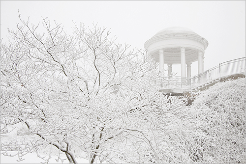
Snow in the deep South – Vestavia Hills
Loosing detail in the whites is a big problem in snow photography. Lack of contrast is the main cause. Look for subjects that have contrasts or ensure you have an exposure that pulls all the detail out of the whites.
Snow in the deep South – Vestavia Hills – IMG_5382 by Bahman Farzad, on Flickr![]()
Snow images requre special compositions.
As you can see from the photo above, snow photography can present special problems. In the case of this photograph the lack of contrast could have spoilt the image. Loosing detail in the whites is a big problem in the snow.
In the photograph (above) the author has made a good exposure and the whites are well defined and detail is not lost even with a white building in the scene. However, be careful with your snow compositions. You can lose a lot of detail and normal compositional features because of the way the snow obscures many of the normal features in the landscape that we use to draw the eye.
# Tip one: Contrasts – Make sure you are able to see the details. Too much white and the detail is lost. Too little white and the snow looks grey. Use exposure compensation or full manual mode to make sure you have the right whiteness without losing the detail. See: Correct snow scenes using exposure compensation. (Photo above).
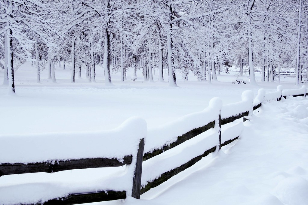
# Tip Two: New compositional and curvey lines – Find a scene where strong lines are well defined. Snow often covers major lines in the scene. Look for new lines. Snow is great for creating curvy lines. As it settles on a fence or wall top, the snow creates great shapes presenting different lines to the ones you normally see. Search out new types of snow defined lines and tracks to help define your composition. “Fencing” By tgroeger_canada ![]() .
.
# Tip three: – When you have a strong line make the most of it. Try to make the scene simple so it stands out without confusing things with other features. Snow is a notoriously soft environment to compose a shot within so try to work with soft compositions. Gentle curves and easy lines are inviting to the eye and promote a sense of peace and well-being.
“Snow”
Click image to view large
“Snow” by Kathy~, on Flickr![]()
# Tip four: – Rule of thirds Of course the general principles of composition apply in snow. The rule of thirds and the rule of odds are both strong contenders to helping to improve your snow shots. Just because everything is lost under the snow don’t lose sight of these old compositional tools.
# Tip five: Tonal variations – With snow being so white it is easy to make the picture too bland. In fact the light you shoot in has a big effect on snow. There is nothing more exciting than a snow scene in a golden sunset. Sunset and Snow ![]() . Snow is especially good at reflecting tonal changes in light. One way to bring those out is to look for changes in light locally. A road disappearing into the trees, or snowy mountainsides with different angles to the light both cause exciting variations in the colour and tone of the snow.
. Snow is especially good at reflecting tonal changes in light. One way to bring those out is to look for changes in light locally. A road disappearing into the trees, or snowy mountainsides with different angles to the light both cause exciting variations in the colour and tone of the snow.

Snowy morning, golden light
Click image to view large
Snowy morning, golden light by Mike Thomas, on Flickr![]()
Finally, try to make your composition as different as possible. Don’t just do landscapes. Snow changes the shapes of everything. So try to find things that are barely recognisable under snow because the snow has created unusual or unexpected shapes. Then you will have the viewer guessing… that will draw them into the picture.
Have fun! Snow photography is not something we can all do daily so make the most of the great opportunities.
 Photokonnexion tips by email
If you enjoyed this article please sign up for our
daily email service.
Find out more…
Start Photokonnexion email subscription now!
Photokonnexion Photographic Glossary – Definitions and articles.
Light and Lighting – Resource pages on Photokonnexion
Definition: Exposure
Definition: Aperture
Definition: f number
Definition: ISO
Definition: Shutter Speed
By Damon Guy (author and Photokonnexion editor)

Damon Guy (Netkonnexion)
See also: Editors ‘Bio’.


