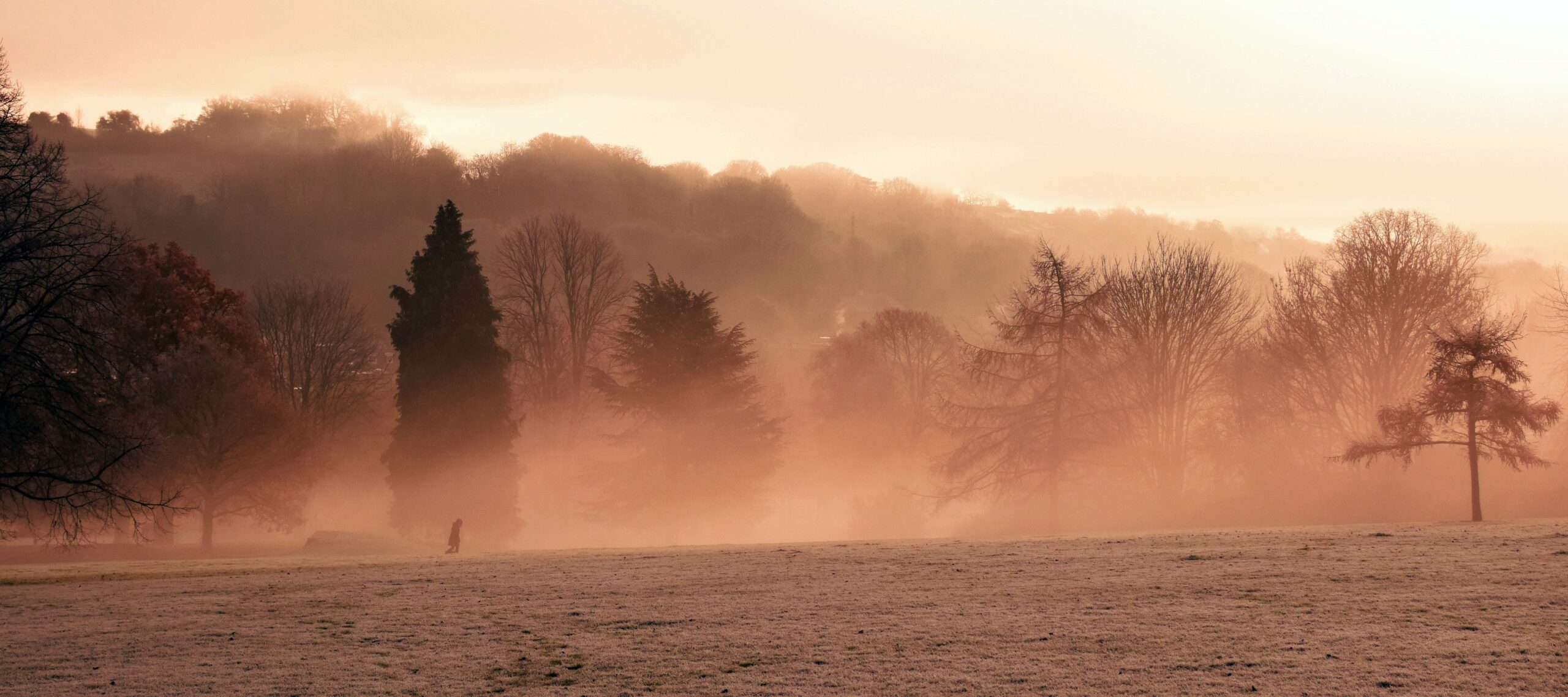
Lone Walker Misty Morning. © Silke Stahl (with permission)
Problems can arise when editing with *.jpg files. Hence, the heavy red colour cast.
{Click image to view large}
Applications usually have a file format associated with them. Editors, like Photoshop, are no different. The native Photoshop file format is *.psd files. However, image editing applications can also use, and work in, a wide range of other file formats. So, what is going on?
Most applications have a native file format. The format is designed specifically to allow the application to use certain data structures and have specific abilities. So, programmers design an optimised file format to ensure storage and data-use in the application is efficient. That means files can be manipulated or re-used quickly and successfully.
Applications are often able to use a variety of formats of the same class. Image programs are a case in point. We know the common file formats for web images quite well. Examples are *.jpg, *.gif, *.png and *.webp. In general, these files are so common that most image editors can work with them. However, being able to use or work with other file formats is not the same as having its own native file type to do exactly what is required. Other formats are usually ‘add-ons’ to the application. The most flexible file type for any application is most likely to be the one it was designed to use.
Specific design
Those four web file formats, mentioned above, hold only the data that is specifically retained for showing the image. There is very little other information in the file. Web image files like these four types carry quite a small amount of data. An Internet picture can be quite a small file size. Whereas, a graphics file from an application like Photoshop needs much more information, structure and data. Such files, in Photoshop (*.psd format), may be a 1000 times larger than Internet *.jpg files.
Fit for purpose – dump the data
Web display file formats, like *.jpg, are small, easily transmitted and quickly displayed. An image editor file is used for storing and manipulating lots of data. However, it is just too large to transmit and display on the Internet. That is true even at today’s high Internet speeds. We routinely use *.jpg images of around 1000Kb (1 Mb) and it only takes seconds to render it in our browser from the Internet. However, when browsers were first invented transmission speeds were much lower. Back then, a 100kb image could take 2 to 3 minutes to render. Consequently, keeping file size down was really important.
Image file formats like *.jpg were optimised for web use and not for image editing. When image editors make these web files they must reduce the file size. So, the image editors literally dump all superfluous data to create them. These file types are generally dubbed ‘lossy’. That is because, when they are created all the data that is irrelevant to the actual display is dumped or lost.
Today, we may use *.jpg files of 1 Mb or more and they render quickly. However, a modern Photoshop file could be 100 Mb or more. If every image was in the Photoshop format (large files), images displayed on the internet would take minutes to render in your browser. A nightmare for web surfers! So, we still need these web-optimised image files.
Each file format has a purpose
Photoshop files have a very sophisticated file format. They handle large amounts of data as well as accurate and varied graphical parameters. They are also optimised for editing changes and to manipulate that data for specific output purposes. But, they tend to be very large files!
Canon, and other camera manufacturers, defined image formats to quickly gather large amounts of image data and organise it into a data file for storage. Then, the camera can quickly store that data. Next, the camera can get back to doing what it does best – the next photo. The RAW file format is specifically designed to quickly capture and store data from the on-camera sensor/computer system. RAW is not designed for editing purposes. Editing files are huge and slow down the file-making process. Not good for a camera!
As a result, we use RAW only for data capture in-camera. Then, the data can be easily loaded into an image editor like Photoshop (a sophisticated editor) or IrfanView ![]() (a simple image viewer/handler/editor) and edit it there. Photoshop creates its own file format to work with the data it has loaded. So, it makes a *.psd file. Do your editing in that format. You can save your work in that format too. You can even print in that format.
(a simple image viewer/handler/editor) and edit it there. Photoshop creates its own file format to work with the data it has loaded. So, it makes a *.psd file. Do your editing in that format. You can save your work in that format too. You can even print in that format.
Working with *.jpg files
A less sophisticated editor, like IrfanView, does not have a native graphical file format. Instead, it will load the RAW file which is output from your camera. However, it will create a *.jpg file for editing. Unfortunately, *.jpg files have to lose a lot of data when they are created. Consequently, the ‘lossy’ format causes that file type to be much less editable.
In common with most other image editors, IrfanView can also save in a range of file formats. However, it works in *.jpg and converts the results to other image file types if you need them. The result is always based on the original *.jpg file. Thus, the editing ability is limited.
Knowing which editor and file format to use
The image at the top of this page is by one of my students, Silke Stahl. The image tells a great little story. It has good compositional structure and the atmosphere she has captured is well balanced. However, while editing the image in IrfanView, she wanted to saturate the reds a little to give more atmosphere to the early sunrise. Great idea!
IrfanView is a brilliant application. It can do a huge range of image related things and it is really fast. However, it is not a very sophisticated image editor. It is intended for very quick, basic and low level edits.
As IrfanView works only with *.jpg, its colour management control is limited. The problem Silke experienced was compounded by the edits being carried out in *.jpg format with its limited capabilities. So, using IrfanView and *.jpg, Silke could not get the control she wanted over the colours and colour balance in the image. Hence, the heavy cast of red throughout. She would have been better working with ‘Curves’ in Photoshop. That facility would allow her to adjust image colour and tone, as well as contrast, with great precision.
Which file format should you use?
This raises an interesting point. We know we cannot use the original RAW file format for image editing. So, should we save the file out of Photoshop as a *.jpg file optimised only for display? You could do so. However, you are limiting the potential to make further changes at a later date. This is because, the *.jpg file from your editor is degraded by all the data it dumps. Worse still, every time you re-edit a *.jpg file it will dump more data and degrade further. The quality of the visible image can be significantly affected.
Editing *.jpg images is very bad practice. The file format gives you very little ability to make changes because of the ‘lossy format’. For best results, edit *.jpg files as little as possible – or better still, not at all. If you need to make changes to your *.jpg file, go back to the high quality graphics file (eg. your Photoshop *.psd file). Make your changes in that file format, save it, and then output/save a new *.jpg version for use on-screen or on the web.
The output file format matters
Image editor applications can export a wide variety of file format types. However, each has different properties and are used in different ways and applications. Here are the important web-based properties of the files we use for screen display and on the web…
- A *.jpg image file is relatively small for quick transmission, but it cannot provide transparent backgrounds. Thus, it is sometimes difficult to use on some web pages.
- As a format, *.png is similar to *.jpg but can have transparent areas so the webpage to be seen through the transparency.
- The *.gif format does provide transparency and can have very small file sizes but a limited colour range. So, it is great for cartoon like images, and little animations.
- Recently developed by Google, *.webp
 format is smaller in size than *.jpg and *.png but has the advantages of both.
Wikipedia lists over 1500 file types ![]() . Just over 100 of those have a file format for some sort of image display, printing or manipulation. So, knowing how you will use your image is important. Then, picking the right file format for that purpose is critical to get the best out of your images.
. Just over 100 of those have a file format for some sort of image display, printing or manipulation. So, knowing how you will use your image is important. Then, picking the right file format for that purpose is critical to get the best out of your images.
Best practice
- Export the RAW file format of image data out of your camera.
- Save it as your unspoiled data storage for that image.
- Try not to edit *.jpg files from your camera as you cannot edit them effectively.
- Open your RAW file in a good editing program (say, Photoshop) and do your edit work.
- After editing, create a file saved in the native format for your chosen editor (e.g. *.psd for Photoshop). Keep it for later edits or updates.
- For future edits, printing or changes, or to output to a different file format, go back to your *.psd file and re-export in the file format you need (e.g. *.jpg or other display format).
Enjoy your editing, do it using the right file format!
Comments, additions, amendments or ideas on this article?
Contact Us or leave a comment at the bottom of the page…
Like this article? Don’t miss the next — sign up for tips by email.
Photokonnexion Photographic Glossary – Definitions and articles.
Definition *.jpg file format. (A Glossary entry).
RAW files. (A Glossary entry).
IrfanView
IrfanView – a great image viewer with lots of other abilities.
The Google *.webp format
Wikipedia lists over 1500 file types
Further reading:
Important File formats – JPG files.
If you shoot with JPG, beware Auto-White Balance.
File format types – editing is different in each one.
Definition: Vector Image (A Glossary entry).
Rastor images vs. Vector images
Definition: Raster Image (bitmap image)
 Photokonnexion tips by email
If you enjoyed this article please sign up for our
email service.
Find out more…

Damon Guy (Netkonnexion)
Damon is a writer-photog and editor of this site. He has run some major websites, a computing department and a digital image library. He started out as a trained teacher and now runs training for digital photographers.
See also: Editors ‘Bio’.
See also: Profile on Google+.