Tag Archives: Presentation

How to write great captions for your photographs

A caption about captions

• About captions •
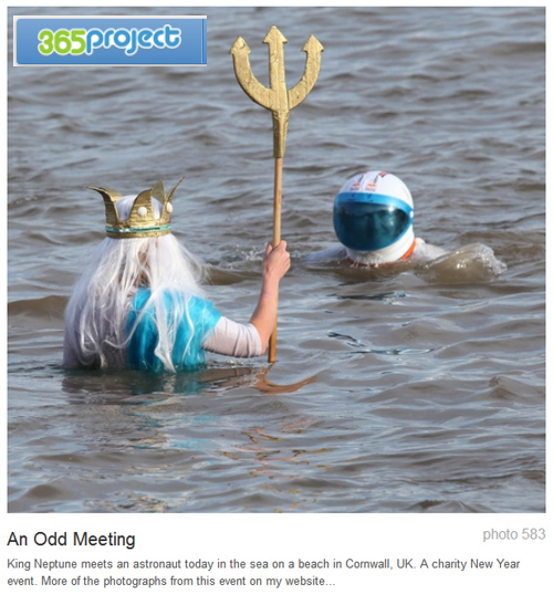
A picture and caption from 365Project, a photographers social networking site.
Click image to view large
About captions – By Netkonnexion on 365ProjectExternal link - opens new tab/page

The power of the image is not just in the picture.

Often the image itself is not the main reason for displaying a picture. Sometimes there is a need for an explanation about your picture or something associated with it. Diagrams, an illustration of a point in the text, secondary ideas, are some of the many good reasons to have a photograph on display. However, to make the point clear you frequently need a caption for the picture.

In What about the title? I discussed how titles impart meaning and context about the picture. They capture an essence of the image in a short phrase.

Captions on the other hand are about good communication. The image, the title and caption together speak to the viewer conveying full meaning. So writing a good caption is essential. If you say anything in your caption that is at odds with the reason for the rest of the communication (picture/title/caption) you will confuse your viewer. So here are some ideas to help your captioning…

  • Think first… Captions like all communications need to be planned. Think about what you want to say, structure it logically, say only what is needed. Once it’s clear why you want it and what it should say, then
    write the caption.
  • Be brief… Say no more than you need. Reserve long explanations for the wider text.
  • Stick to the point… Explain the point of the picture and its relevance. Make other points outside of the caption.
  • Match the text to the purpose… Make sure that the tone of the writing is consistent with the main text, the purpose of the image and the title. If the caption is in a different style to the rest of the communication it will confuse the viewer.
  • Use appropriate caption format… Headshots might just be captioned with a name. Products may be fully captioned. For example “Useful Thingy-Widget showing rear wiring arrangement” explains the product shot. Diagrams should be captioned with a precise abstract of what they show. Detailed explanations go elsewhere.
  • Layout your caption neatly… If the text is arranged in a lopsided way, or if there is a mixture of fonts or other imbalances these will be obvious in a short caption. Try to make the layout attractive to the eye.
  • Resist repetition… If you have a picture of a cake the pointless caption, “Picture of a cake” serves only to frustrate the viewer. “A moist carrot cake is an ideal mid-morning confection”, says a whole lot more and still points out it is a cake.
  • Avoid replication… Do not simply write something in your caption from the main text. Complex explanations in the main text are usefully off-set by a succinct summary in the caption.
  • Avoid cliché… The tired or clichéd phrase in a caption will put off your reader. Try to make captions fresh, invigorating and crisp.
  • Explain or name groups… Six different widgets, three people or four piles of different beans all need to be explained. Name them, number them, explain them – whatever – but make sure the viewer knows which is which and in the correct order.
  • Be consistent… Each of the photographs you use should have a caption. Make sure they are all formatted the same, written in the same style, use consistent references (eg. Dia. 1, Dia. 2 etc) mounted in the page using the same graphical scheme. Deviations will confuse the reader/viewer and throw off their concentration.
  • Include credit, attributes, acknowledgements and links… You would feel cheated if your work was used and not credited. So afford the same courtesy to others if you are using images by other authors.
  • Fact check… Mistakes are glaringly obvious in captions because they are so brief. Check everything, of course, but be especially careful about captions.

Remember, your caption is one part of the communication. The reader sees the picture, title and caption as the full communication. So treat them as a single method of making a point to your reader/viewer. Make all three carry the same message overall. Use this diverse way to communicate with as much impact as possible. Your caption is a vital part of the overall delivery of your point.

By Damon Guy (author and Photokonnexion editor)

Damon Guy - Netkonnexion

Damon Guy (Netkonnexion)

Damon is a writer-photog and editor of this site. He has run some major websites, a computing department and a digital image library. He started out as a trained teacher and now runs training for digital photographers.
See also: Editors ‘Bio’.

The secret to world travel – but staying at home!

• Winchester Cathedral Chroma key image•

• Winchester Cathedral •
Chroma key work is quite easily done in Adobe PhotoShop and a range of other quality photo-editors.

When you want to be somewhere else…

There are places we would rather be than where we are now. I would like to be on an island paradise …not going to happen! But you can do it photographically. The secret is something called Chroma Key photography or green screening.

Chroma Key Substitution

In chroma key, often known as “green screen” photography, the subject is photographed against a uniformly lit green background. Then, in post production the subject is easily selected out from the green background. The selection can then be pasted into any other photographic background.

Any uniform colour can be used as a backdrop for the chroma key shot. The picture above is selected from a blue background and pasted into a picture of Winchester Cathedral in SE England. The two pictures were taken on different days.

To make the selection of the subject from the background it is important to light the background evenly. When the colour is even the selection is easy and can be completed in one operation. Colour variations from uneven light make it more technical to isolate the subject.

Green is the most frequently used colour in chroma key photography. The colour is very easily separated from human skin tones. Where the subject has green tones, blue is often used as the chroma key alternative. Blue is a common colour for clothing. It is therefore less suitable than a strong bright green which is not so popular as a fashion colour. However, green does have other advantages. The human eye is able to see more shades of green than any other colour. This makes it easy to see variations in the green when setting up the lighting. Green sensitivity is also built into software applications to match the abilities of the eye. This helps us to work with the background when doing awkward selections.

Fun and games

The substitution of a subject into any other photographic background provides great opportunities for doing fun things. Film stars can be placed in your garden. You can apparently travel the world without leaving your front room. Just find the right pictures and substitute yourself into the background of your choice.

Of course there are also opportunities for advertising, graphic art, product photography, still life, portraiture, action shots and many other false situations. Of course we should be careful not to be immoral about such things! Feel free to have fun though. You can really make it look like you have traveled the world.

How is it done?

Basically you need a chroma key background, lighting to illuminate it evenly, a camera and a subject. On a small scale this is easy to do. A lot of people doing chroma key work for the first time start with still life or table-top photography to get the technique right. Probably the most common use of the technique is for portraiture. Take a picture of yourself or your friends and then start playing. For this you need a larger screen…

The video is a complete introduction to the use of chroma key photography. You can take the same techniques and scale them to any size. The video introduces the ideas you need to grasp and shows how to set up the lights and the equipment. It also shows one of the software applications. After the video I will briefly look at that software for you.

How to Green Screen (Chroma Key) with Photography!

markapsolon  External link - opens new tab/page

Software

There is a whole range of software that is capable of doing chroma key. In essence chroma key software has two jobs. The first is to select the subject off the green background (or whichever colour you are using). The second is to successfully blend the abstracted subject with the new background.

The software from the video is called PhotoKey from FXHome  External link - opens new tab/page. It has been produced specifically for chroma key compositing. It is not alone in the market. However, there are not many applications specifically aimed at this work. Instead there are plenty of applications that do chroma key blending as part of a general suite of editing tools. There are also plugins for the same process to go into your favourite image editor.

The actual process for producing the final blended image is relatively quick and easy in most of these chroma key applications. The tools are usually quite self explanatory if you have some editing experience. As with any editor, you normally find the blending tools manage colours, contrasts, edging and so on. Ultimately you are creating a blend of the two images, but the best chroma key tools go further. At the end of working through the blending process you can make further changes in a good software suite or plugin. If you are satisfied with it you should be able to export your image to make a .png, .jpg or .tiff image.

The way to do it in Adobe PhotoShop

The general photographer is most likely to have use of a quality image editor like PhotoShop, Elements, GIMP, PaintShopPro and others. All these are able to do the type of work that PhotoKey can do. Admittedly it takes longer. But for beginners it is better to save your money for more general photography kit. For those who are interested, here is a short video explaining the Photoshop method of doing a chroma key composite. It is a simple technique using standard photoshop tools.

Isolating with a Chroma Key Background

This tutorial is aimed at Photoshop intermediate level users.

Overall…

Chroma key work is fun. There is quite a lot to learn, but it adds flexibility to your photographic work and post processing. The use of up to date quality image editors is probably better than splashing out on expensive specialist applications. Nevertheless specialist applications do a great job, saving time in post processing.

Can you write? Of course you can!
Write for Photokonnexion...

We would love to have your articles or tips posted on our site.
Find out more…
Write for Photokonnexion.

find out more...Photokonnexion tips by email
If you enjoyed this article please sign up for our
daily email service.
                                                 Find out more
#11030#

The hidden secrets behind doors…

• Red Door •

• Red Door •
Doors seem to have a powerful psychological impact…
• Red Door • By Netkonnexion on FlickrExternal link - opens new tab/page

Just what is the fascination with doors?

They are the subject of an image that most photographers take at one time or another. They are important in sayings in most languages. Yet visually they act to stop you seeing within, or do they? In fact doors provide a whole range of visual and conceptual photo-opportunities.

A real psychological impact

Recent research  External link - opens new tab/page at Notre Dame University, Indiana, has suggested that going through doorways causes memory lapses.

Entering or exiting through a doorway serves as an ‘event boundary’ in the mind, which separates episodes of activity and files them away.
Professor G. A. Radvansky

While the impact of going through a doorway is clearly a significant memory event there are undoubtedly powerful social forces at work too. Many of the worlds nations have significant ‘doors’ or ‘gates’ in their social consciousness with dominant architectural sites that resemble doors to the nation. Old photographs of occupying powers at the national gate is enough to evoke tearful responses from survivors of the time. The German occupation of Paris, France, is bought to mind through harrowing pictures at the Arc de Triomphe in 1940.

German troops at the Arc de Triomphe

• Paris, Deutsche Truppen am Arc de Triomphe •
German troops at the Arc de Triomphe, Paris, 1940.
Paris, Deutsche Truppen am Arc de Triomphe on WikipediaExternal link - opens new tab/page

Entering the castle

On the more mundane level we all think of our homes as the feudal lords of past times thought of their castles. Our doors are the virtual fortifications that keep the evil hordes at bay. The popular culture of police drama is always breaking the door down in a symbolic statement of violation in order to capture the “bad guy”. Doors are both a symbol of safety and a manifestation of violation when breached.

Not only do doors and gates have an impact on social and dramatic conciousness but they are important to the language too. We talk of “having a foot in the door”, or “opening doors for the future” and so on. We use the idea of doors as both a defence and as an access. Many classic stories rely on symbolic or actual doors as the focus for the story. Even science fiction has its “stargates” and “doors” to other universes. The door connects to all sorts of consciousness stretching ideas.

Art, photography and doors

Doors are also a significant part of the cultural scene too. I did a search for “door” on Flickr, the popular photography social networking site. My simple search returned more than 4.5 million results! In fact doors have had a very long history in art and architecture. The ancient Greeks explored the concept of aesthetics and architecture from their earliest times. The proportions of architectural designs for doors and arches have long been associated with mathematical and aesthetic principles. It is not surprising that doors have penetrated so deeply into the modern psyche, they have a lot to say about our culture. Photographers have picked up on that fact.

Interesting artistic approaches

Pattern: The strong similarity of the conventional shape of the door provides a large number of options for pattern photography. Doors are often dissimilar in so many ways (door furniture, colour, windows etc) that the regularity of the frame becomes the pattern forming element while the rest is the interest.

Montage: Totally different doors offer enough similarities to be able to form great photomontage opportunities. I have seen countless door montages and they always draw my eye.

50 Doors in Crestview by David Erwin, on Flickr

• 50 Doors in Crestview •
The regularity of the door shape make it ideal for pattern and photomontage shots.

50 Doors in Crestview by David Erwin, on Flickr External link - opens new tab/page

Colour: Brightly coloured doors are almost universally photographed. People seem to want to make a statement with their entrances and photographers have gladly advertised the fact. My own picture at the top of the page is an example. Colour draws the eye.

Character and sense of place

Character: Many older buildings have wonderful old doorways. They can be found in some of the most ordinary of locations as well as more grand surroundings. The photographer with an eye to architectural detail can find some wonderful photographic opportunities in old doors.

The hidden secrets behind doors

• The hidden secrets behind doors •

Click image to view large
The hidden secrets behind doors By Netkonnexion on Flickr External link - opens new tab/page

Sense of place: Doors say a lot about a building and often about the type of occupation, they project a strong sense of place, of being and of architectural meaning. There are homely ones, business-like ones, run down doors, expensive, cheap… I cold go on. The door speaks about the place and people.

Beyond the obvious…

The grand statement: I mentioned the national gateway theme of many nations. The grand statement of ‘national’ arches or gates is paralleled by some of the grand doors of classical architecture. Huge structures, grand columns, magnificent entrances all serve to impress and awe the visitor – they tell a story of power and control behind the nation. We see equally as powerful door statements in the doors of some of today’s global businesses who’s power and money rival the historical extent of former empires.

Strong story potential: With all these things that doors can say they can also tell great stories. Street photographers and portrait photographers have a long association with them, as do travel photographers. They know a person in association with a door, especially their own, tells a story that jumps out of the image. Looking for a strong story is a holy grail for photographers.

Secrets: Closed doors pique our interest because we are all a little nosy. Who has not walked past an interesting door and wondered what lay within. Even the plainest could hide secrets we cannot even imagine. The secret, the mysterious and the hidden are all things that pull us into an image. They are interesting for themselves, but they also stimulate imagination. Often a peek in a window in association with an interesting door is a great way to give a taste of hidden fruit beyond our reach… a sure way to keep the viewer interested.

Look out for a door…

There is so much potential in this photographic subject. Sometimes you can walk right past a photo-opportunity if you are unaware. Doorways are there with us every day. They are a source for forgetting and a reason to remember. Think about photographing them. Enjoy!

By Damon Guy (author and Photokonnexion editor)

Damon Guy - Netkonnexion

Damon Guy (Netkonnexion)

Damon is a writer-photog and editor of this site. He has run some major websites, a computing department and a digital image library. He started out as a trained teacher and now runs training for digital photographers.
See also: Editors ‘Bio’.

Can you write? Of course you can!
Write for Photokonnexion...

We would love to have your articles or tips posted on our site.
Find out more…
Write for Photokonnexion.

Simple ideas about using hands to capture the eye

"Time may give you more than your poor bones could ever take" by Janine Young, on Flickr

"Time may give you more than your poor bones could ever take"
by Janine Young, on Flickr
"Time may give you more than your poor bones could ever take"
by Janine Young, on FlickrExternal link - opens new tab/page

To catch the eye, capture emotion…

…something you can do with hands. They are so expressive. We rely on them for communication and they can evoke a lot of emotion. Here are some ideas to get you started photographing them.

What to look for

To find the maximum impact with hands you need to look for common gestures that we all know. The ones that convey something powerful. Giving, receiving, accepting, soothing, feeling, experiencing, sharing, reaching… I am sure you get the idea. So how do we do that? Well, we need to find ways to put the hands in those expressive positions we all know. Then, to complete the picture, place them in the context of something that sparks off our memory of something effective.

The joining of hands means a lot to all of us. A particular case in point is where protection is inferred. The feeling of security is so important to children. We know it when we see it and it invokes deep emotion…

• Hand By Hand • by mikeyarmish, on Flickr

• Hand By Hand • by mikeyarmish, on Flickr
• Hand By Hand • by mikeyarmish, on Flickr External link - opens new tab/page

When photographing special subjects, like hands, the power of the picture is enhanced by great composition. The slight tension created between the adult and child by the out-stretched hands is a strong message. It’s protection, but nearly ready to let go. That’s a special moment in our development, beautifully documented by that slight stretch. And, it is emphasised by the dynamic angle. Upward left-right angles/slopes in Western culture indicate dynamic, powerful, uplifting feelings.

It is so often the case in all forms of art that one can say such a lot with very little. I think of this as a sort of “light touch” in composition. The more you can imply and still convey the message the more you seem to be able to say.

• Limosna • by croqueta0, on Flickr

limosna by croqueta0, on Flickr
• Limosna • by croqueta0, on FlickrExternal link - opens new tab/page

We see only a little of the hand in the last picture. Yet, we all recognise it as an act of devotion. The power of the message is timeless, especially with the number of other burnt-out candles nearby. A great deal is implied in the image conjured up in the mind, but actually the statement is very slight in picture. The moodiness of the light level is all the more evocative of the occasion.

While just picturing the hands can be so expressive, we should not neglect the whole picture. In association with the rest of the body the hands play a vital part in communication. Look at how this self portrait obviously conveys personal feelings. The text gives you the depth of that feeling. I would have got the inner angst-of-teenager just from the hands and the expression (barely seen). The hands are part of the message. A lovely little story and simply told…

• You were sixteen when you fell in love • by Tangolarina, on Flickr

• You were sixteen when you fell in love • by Tangolarina, on Flickr
• You were sixteen when you fell in love • by Tangolarina, on FlickrExternal link - opens new tab/page

A charming little poem comes with the picture too. You can see it on the Flickr page  External link - opens new tab/page for this image.

Hands, like any other part of the body are open to photoshop activity. While slightly creepy, I like this next image. It shows us just how some standard signs can be so expressive. Clever work with the light and some nice cloning work too…

Hand meets Hands by PicVince, on Flickr

Hand meets Hands by PicVince, on Flickr
Hand meets Hands by PicVince, on Flickr External link - opens new tab/page

Finally, one should not underestimate the power of the hands to express the character of the subject. Old hands say so much about a persons life and inner strength…

• Hands of 87 years • by gaspi *yg, on Flickr

• Hands of 87 years • by gaspi *yg, on Flickr
• Hands of 87 years • by gaspi *yg, on FlickrExternal link - opens new tab/page

Hands can say it all…

In this short commentary I hope that I have shown some of the ways you can express a lot in your image. The power of hands is not just in their expression, but context, age, condition… and endless other things. I can think of many things that have been missed from this list – gloves, work, rings, nails… and many more. I hope that this has started you thinking about some images you could do with hands. I would love to see what you come up with. Send us some links… Contact Us

find out more...Photokonnexion tips by email
If you enjoyed this article please sign up for our
daily email service.
                                                 Find out more
#11030#

By Damon Guy (author and Photokonnexion editor)

Damon Guy - Netkonnexion

Damon Guy (Netkonnexion)

Damon is a writer-photog and editor of this site. He has run some major websites, a computing department and a digital image library. He started out as a trained teacher and now runs training for digital photographers.
See also: Editors ‘Bio’.

Simple ideas about sepia effects

• Sepia biplane •

• Sepia biplane •
Click image to view large
• Sepia biplane • By Netkonnexion on Flickr External link - opens new tab/page

Sepia is an old photographic effect.

It’s a photographic chemical process dating back to the 1800’s. Sepia creates a brown tone in the photograph. Today we sometimes colour our photographs in sepia tones too. What is the background to this old technique?

Print toning in sepia

In the days of chemical processing black and white pictures were processed using metallic silver in chemical emulsions. In the sepia process the silver was replaced by an alternative, silver sulphide. Silver sulphide is a more stable toner than the metallic silver counterpart. Sepia toned photographs have a longer life than alternative compounds making them ideal for archiving and preservation. However, there are in fact a whole range of chemical toners and some of them have brown tones. In some cases the non-sepia toners are not safe to handle. Be careful if you are handling lots of old films and wear protective gloves.

Sepia, the colour, gets its name from the rich brown coloured ink derived from the cuttlefish Sepia. The ink had been used in art and writing for centuries before photography. The richness of the browns in the chemical development process was a close match to the sepia ink. In fact sepia has a considerable tonal range. While it can be used to create rich brown and white photographic prints it can be printed in such a way as to parallel greyscale in its effect.

Modern sepia chemical processing involves three stages. During those stages processes and chemical variations can be applied that allow the compounds to have different toning capabilities or mixed with alternative toners. As a result the modern chemical sepia process can create multi-toning effects, mid-tones and shadow forms. These allow multiple tonal forms in the final print.

Modern digital sepia

Photographic toning is a way of changing a black and white picture to a different, warmer tone – a brown hue. Black and white are starkly contrasting. Sepia is a softer colour and easier on the eye. The sepia tone, while brown produces a ‘brown-scale’ picture, rather than a greyscale picture that would incorporate the black and white tones. As such, both are monochrome.

Of course today we use sepia in many ways. It can be used as it was in the past to create a softer, warmer colour in a print which is easier on the eyes than stark black and white. However, modern sepia no longer carries the archival or protective functions of the previous chemical process. Here are some other ways it is used today…

To:

  • Induce warmer tones
  • Softer colour impact
  • Give a picture a traditional or aged appearance
  • Give the appearance of a more natural tonal range

As a result of some quite flexible toning processes in using sepia the modern equivalent of sepia is a very loose term. In many ways digital sepia use is really just toning. Its the same as would be applied if we used a blue, green or red tone. Of course each image editing package has its own sepia toning colour. As a result you should experiment to make sure that your editor colour is appropriate to the way you use it.

find out more...Photokonnexion tips by email
Enjoying this article? Please sign up for our
daily email service.
                                                Find out more…
#11030#


In fact sepia is, like black and white, a fairly flat colour. Variations in the intensity of the toning can create quite variable light and dark shades. In the final print the flatness of the colour can be enhanced by using textured papers. On a screen image or digital projection textures can be incorporated into the image as I have included above. This relieves the monotony of the sepia when there is a large area of one tone in the image.

If your use of sepia is intended to give the appearance of age then other measures can help too. One idea is to give the impression of a distressed print. The photograph below is a scan from an old print. I have kept the dirt and creases on the image in order to give that “distressed” effect that makes the image look like it has been around for a long time.

The photographs of the past are often distressed by damage and age.

The photographs of the past are often distressed by damage and age. Modern images can be given the same appearance with a little work in an image editor.


The distressed appearance can be reproduced carefully in post processing to give the impression of age and deterioration. You will have to practice such skills to make them realistic, but worth it if the final outcome is effective.

Finally, one of the things that people often forget is consistency. If you are going to do a photograph in sepia in order to make it look old, then remember to make the clothes, objects and environment within the picture match the age of the intended shot. There is nothing more confusing to a viewer than mixed messages. An appearance of old processing, but modern clothes, just looks odd. So try to make your image and processing match.

By Damon Guy (author and Photokonnexion editor)

Damon Guy - Netkonnexion

Damon Guy (Netkonnexion)

Damon is a writer-photog and editor of this site. He has run some major websites, a computing department and a digital image library. He started out as a trained teacher and now runs training for digital photographers.
See also: Editors ‘Bio’.

How to tell a story with your picture

Photo storytelling :: Spoken With Humour My Lady

“Spoken with humour my Lady”
Photo storytelling with your picture will capture the imagination of your viewer and draw them into the image.

What is photo storytelling?

Help your viewer to be involved in your picture. Get them thinking. Then they will look hard at it. So, tell a story with it. To get viewers thinking draw out the threads of a story with a time line. Aim to help them see how the story came about. Show clues for what might happen next. Photo storytelling is about making your image clear on what is happening.

The best photo story-tellers are photo-journalists. They capture an event or activity. They try to show the progress of a story. Things you see in the shot tell you what’s happened, what is happening now, and what is possible. In short, it is a time-line.

Photo storytelling :: Keep it simple

Don’t obscure the story. The more interesting you can make the shot, the more viewers will want to look at it. Your story should portray the fullness of events.

Try to make the shot as simple as possible. If there is too much going on it distracts the viewer. Too much clutter does the same. If you do distract the viewer it will confuse or obscure the story.

Have a plan

Ensure clarity in your story. Have a complete plan of what you want to convey. You should:

  • Know what you want to say.
  • Have a clear idea of the main subject.
  • Know the story line (as simple as possible).
  • Know how to express the storyline.
  • Know the composition you will use.
  • Be aware of light, mood, time.
  • Know what to exclude (de-clutter).
  • Know how you are going to work the scene.
  • Have technical settings worked out.
Behind the subject

It is easy to confuse the viewer with the background. Ensure it is consistent with the story. The little romantic exchange in my picture above fits with its background. If this were an urban scene the knights would be out of their expected context. That throws the story off.

How people and things relate to each other

As the story unfolds show the relations between people. That is juicy eye-candy for viewers. The relationship between people and things, in the scene helps too. Working with one photograph, your photo storytelling is going to have to show these links.

There are three relationships in the photo storytelling above. The horse is engaging with the viewer. It stares back at us. The knights are engaging in light-hearted flirting. The peasant is clearly amused by the whole scene. The story tells the viewer where the people are, but also about the feeling between them. Looks, and the direction of gaze, are important. Facial expressions speak volumes. The position of things and people show how they relate to each other.

You must be careful to pick up these traces of relationships. Without them you don’t have the sense of interaction. Then you don’t see photo storytelling in progress.

Time

Time in photo storytelling usually comes from action, expression or movement. In this picture the horse shows boredom. The knights show an on-going and flirtatious conversation. The peasant clearly enjoys the moment. These things show the story is not static. And, it has a future because the knights are clearly enjoying the exchange.

In another type of photo storytelling you might see strong movement. A race is a story. The action shows the progress of time. The race positions tell of the competition. The place where the race is sets the scene.

Clearly there are many ways to express progress through the story. The important thing is that you do actually make sure that it is obvious to the viewer.

The fresh, candid look

Clearly, if the story is staged and forced, the fresh look will be lost. Capture it as if it was unscripted. Captured on the spur of the moment makes it look fresh. Even better if it was a complete candid shot. Nothing beats an honest, true expression. The best scenes are spontaneous. The whole discipline of street photography is based on that concept. However, make sure that the elements of a story still hold true. It will look false if they are not.

If doing candid street shots your post-production work can help. In your editing look to find the shots with the elements above. Then crop or work your post processing to bring it out. Don’t try staging them through a plan. Urban scenes make poor acting scenes for photography.

Patience

Photo storytelling takes patience. So does trying to spot a story in progress. To shoot a scene like the one above takes a few moments. It may only involve a few quick few shots. But the right result may not happen the first time. Take your time and work on the elements needed for your Photo storytelling. As you get better at the things mentioned here you will bring out the story easier.

Photo storytelling :: In Post-production

A story is almost always completed in post-production. Often the composition has to be done quickly in order to capture the right moment. As a result you may need to think about the framing and the crop later. Also think about cloning out clutter and distractions. When Photo storytelling, that is especially true for candid shots.

Photo storytelling is helped by a title

If my image above was called “knights on horses”, there’d be less interest. The title sets the scene. It shows the viewer the link between the knights. A good human relationship or a juicy gossip-phrase gets attention. Photo storytelling is all about those human things. Bring them out in a title.

The actual story

Most important is the actual Photo storytelling itself. To get that right you have to check you have a story at all. That means finding the shot that expresses the story. That is an editorial task. Be ruthless when you try to tell a story with a picture. Show only the shots which actually tell one. Otherwise you will have a fudged concept. There is nothing worse.

Enjoy your Photo storytelling. It’s fun and a challenge. Your skill as a photographer and as an editor of your own work will improve.

Comments, additions, amendments or ideas on this article? Contact Us
or why not leave a comment at the bottom of the page…

Like this article? Don’t miss the next — sign up for tips by email.

Damon Guy - Netkonnexion

Damon Guy (Netkonnexion)

Damon is a writer-photographer and editor of this site. He has run some major websites, a computing department and a digital image library. He started out as a trained teacher and now runs training for digital photogs.
See also: Editors ‘Bio’.
By Damon Guy see his profile on Google+.

Portraits come from you and the sitter

How do you feel when you do a portrait?

Most of us probably feel a little nervous. Portraits are quite personal things and it’s important to get them right. So how do you build your relationship with the person in front of you?

I admit that when I do a portrait a little nervousness creeps in. It tones up the senses. Normally doing a portrait is a quick activity. I have rarely spent more than 30 minutes doing one and most times quite a lot quicker. In that short time you have to assess the person, know their mood. You need to build a little rapport and understand them enough to capture their essence. Its quite a tall order. Yet photographers manage to do a great job on a regular basis.

As a way of keeping my approach fresh I like to hear how other photographers approach their portraits. In this video acclaimed American portrait photographer talks about his approach. He gives us lots of useful insights. One of these is that every portrait is at least a little bit a self portrait – the photographer puts a little of themselves into the shot. Hmmm! Some interesting stuff here. Oh, there is also some superb lighting and photography too. Enjoy!

A few minutes with Gregory Heisler… from Stumptown Visuals on Vimeo.