Tag Archives: Picture Format

Visual toolbox for photographers

Sharpen up your creative photography…

It’s easy when starting photography to over emphasis the importance of gear. In fact it’s ‘photographers eye’ that really makes the difference. Your vision and insight into a scene are critical to producing a wonderful image.

Sage advice from a world master

The Visual Tool Box by David duChemin is all about the skills of composition. He goes into depth around the background ideas which help you look at a scene. The ultimate success in photography is to make your image a pleasure to view. Aesthetics rule – it’s as simple as that. This book is dedicated to teaching you the tools you need to develop the ‘eye’.

David duChemin says,

These are the lessons I wish I’d learned when I was starting out.
The Visual Tool Box by David duChemin

This is my kind of book. He writes superbly, in simple, readable form. His examples are excellent and the pictures are just amazing. But most of all the book is organised for learners to extend their knowledge in easy, well structured steps. This book is all about putting new tools in your photographic tool box and it achieves that with an ease that any beginner will find a joy.

Composition

The book is packed with examples of the sort of compositional ideas that really work – for anyone. Just look at some of the topics covered…

  • Manual
  • Optimize Your Exposures
  • Master the Triangle
  • Slower Shutter Speed
  • Learn to Pan
  • Use Intentional Camera Movement
  • Use Wide Lenses to Create a Sense of Inclusion
  • Learn to Isolate
  • Use Tighter Apertures to Deepen Focus
  • Use Bokeh to Abstract
  • Consider Your Colour Palette
  • Lines: Use Diagonals to Create Energy
  • Lines: Patterns, Lead my Eye, Horizons
  • See the Direction of Light
  • Light: Front Light, Side Light, and Back Light
  • Quality of Light: Further Consideration
  • White Balance for Mood
  • Light: Reflections, Shadow, Silhouettes, Lens Flare
  • People
  • Experiment with Balance and Tension
  • Use Your Negative Space
  • Juxtapositions: Find Conceptual Contrasts
  • Orientation of Frame
  • Choose Your Aspect Ratio
  • Use Scale
  • Simplify
  • Shoot from the Heart
  • Listen to Other Voices (Very Carefully)

And there is plenty more content to complement and extends these ideas. What’s not shown in a list is the excellent and sage advice throughout the book. I will let David duChemin have the last word…

Pace your-self. Anyone can master a camera; that just comes with time. It’s the other stuff — learning to think like a photographer — that takes so much work and allows this craft to become the means by which you create art.
The Visual Tool Box by David duChemin

And it is thinking like a photographer that you will quickly learn from reading this book.

How to buy this great book

This book was originally published as an ebook. However, it is no longer available in that form. The book has moved into the real world. It will be available on Amazon as a Paperback From 31 Mar 2015.
The Visual Toolbox: 60 Lessons for Stronger Photographs (Voices That Matter)You can per-order the book from Amazon.

Comments, additions, amendments or ideas on this article? Contact Us
or why not leave a comment at the bottom of the page…

Like this article? Don’t miss the next — sign up for tips by email.

Damon Guy - Netkonnexion

Damon Guy (Netkonnexion)

Damon is a writer-photographer and editor of this site. He has run some major websites, a computing department and a digital image library. He started out as a trained teacher and now runs training for digital photogs.
See also: Editors ‘Bio’.
By Damon Guy see his profile on Google+.

Simple portrait tips, excellent advice

Simple portrait tips - Excellent Advice

• Portrait by Bambi Cantrell •
Simple portrait tips: seeing the person, seeing the light, seeing simplicity.
(Image from the video)

The best portraits show the person

When photographer and subject gel the magic of portrait photography bursts forth. Bambi Cantrell just bubbles over with enthusiasm about portraiture. And, she gives simple portrait tips and great advice. See the person, see the light – make it simple. In this short video she explains about her portraiture. Really worth watching for the enthusiasm and the advice.

Wedding & Portrait Photography Tips & Advice by Bambi Cantrell

This video is all about simple portrait tips although Bambi also includes wedding photography ideas. But much of wedding work is about portraiture.
Marc Silber – Silber Studios

Simple portrait tips and light

The simplicity in seeing light passes many beginners by when they are starting. These simple portrait tips reveal how light can be used to good effect. But in real terms many of the most important tips about photography are lost if you don’t get great light. So follow up these simple portrait tips with a study of light – especially in your portrait work. Check out these Light and Lighting resources, articles and links

Comments, additions, amendments or ideas on this article? Contact Us

find out more...Photokonnexion tips by email
If you enjoyed this article please sign up for our
Tips by email service.
                                                 Find out more

Damon Guy - Netkonnexion

Damon Guy (Netkonnexion)

Damon is a writer-photographer and editor of this site. He has run some major websites, a computing department and a digital image library. He started out as a trained teacher and now runs training for digital photogs.
See also: Editors ‘Bio’.
By Damon Guy see his profile on Google+.

How to get the sky right in your holiday pictures

Cornish Vista

Cornish vista
Think about how to get the best out of your sky.
Cornish Vista • By Netkonnexion on 365ProjectExternal link - opens new tab/page

Getting the sky right is important.

With the holiday season approaching we want our holiday photographs reflect the happy memories. All too often the sky is over-white, washed out or blown-out. There are a number of techniques you can use to get the sky right, in camera and in post processing.

What are you really looking for in a good sky? Deep blues for the sky, fluffy white clouds and well defined horizons are the ideal situation. To get them like that in the camera you have to pay attention to the time of day, the type of sky, the weather and have a sense of drama. Here are some ideas to help you…

Polarizing Filter

One of the photographers important tools for sky photography is the polarizing filter. It is a glass or composite material that is set into the inner of two metal rings. The first ring screws directly to the front of your lens. The other rotates inside the screw ring. The filter itself cuts out some of the wavelengths of light. You turn the ring with the filter mounted in it so that it can be set for maximum effect. The filter action reduces the glare and haze associated with reflective surfaces like water and glass. Amazingly it also deepens the blue in the sky. So what we see in the photograph is a sky that is darkened with emphasised blues and the air has a crispness and clarity. These effects are not reproducible in post-processing software. It is invaluable to have this effect in camera and will really liven up the drama of the sky.

Critical view-line

If you gaze out across a wide open sky on a bright sunny day you will notice that the blueness of the sky is not uniform. It is a deeper blue in places and a whiter blue elsewhere. In fact the sky gets to be a deeper blue if you are facing away from the sun. It is at its deepest blue at the opposite end of the sky from the sun. So where you can, shoot with the sun at your back.

Of course having the sun at your back is not always possible. A good rule is not to let the sun be in front of you. If it is at your shoulder (90 degrees to your shot) it will still allow you to get a reasonable blueness in the sky. If you have to shoot with the sun in front of you, even if at a wide angle, the blues will start to whiten. The more you are shooting toward the sun the more the sky will wash out.

The mid-day washout

During the middle of a sunny day the sky will be at its most washed out. As the sun is at its highest at this point you should avoid taking photographs if you can. The more the sun falls toward the horizon the more the atmosphere will act as a natural filter and increase the blues at the opposite end of sky. The middle of the day is also bad for photography because the sun being overhead means that objects on the ground have little shadow around them. This gives the landscape a flat and unappealing look. Washed out skies and flat appearance at ground level makes convincing photography difficult!

Use an ND graduated filter

Neutral density filters are great. They are fun to use and give you back some of the blueness in the sky caused by over brightness. They don’t enhance the blueness like the polarized lenses. They are a way of cutting the light down so its intensity is reduced.

Without an ND filter the sky will tend to be over-bright, or the ground will tend to be too dark on a bright day. The graduated ND is an ideal tool for helping to balance the light levels. A full ND filter will reduce the incoming light right across the lens. However, a graduated ND filter allows the full amount of light to enter the lens from the lower half – which keeps the foreground bright. On the upper half of the filter (pointing at the sky) the neutral grey graduates from the very light across the middle to its darkest at the top of the filter. You place the beginning of the neutral grey on the horizon and then the grey graduates darker up the filter so the most washed out or over-exposed parts of the sky at the top of the picture are the parts with the most reduced light levels.

It is worth remembering that you can use both an ND graduated filter and a polarizing filter. However, also remember that each time you put a glass element in the line of light you will be reducing the light that can get into the camera. So remember to adjust your exposure to compensate for the additional glass.

The use of ND filters helps to bring out the clouds too. Brightness in clouds can be pretty harsh, especially if they are very dense. This tends to make them featureless. The use of ND filters for clouds (an ND 2 or 4 – the lowest filter levels) will help to reduce the brightness and enhance the contrasts in the darker parts of the cloud. This brings out its features and helps the cloud to take on a little depth.

Post processing sky enhancements

In post processing you can do a number of things to enhance your sky. However, after years of working on my skies I know that you can get better results in camera… try that first.

On trick to enhancing a washed-out blue sky is to use a saturate tool. Simply wipe the tool across the blue of the sky to deepen and lift the crispness of it. The saturate tool in most image editing applications tends to turn sky blue to turquoise blue. Don’t use full saturation. Set your saturation tool to between 10% and 20% and wipe it several times rather than one heavy wipe. With most tools/brushes it is better to use low exposure/opacity rather than be heavy handed. Not only is it more controllable but you can also build up to a reasonable blueness without over-doing it.

You should watch out that you do not wipe the saturate tool over the clouds. You will find that the clouds look white, but contain a high blue component. If you saturate them they turn blue to the eye – which looks highly unrealistic.

The trick to increasing the contrast in clouds is not the saturate tool. It is to deepen the grey of the darker parts of clouds using the burn tool. The burn tool darkens a colour by increasing its black component. Again, with the burn tool use a reduced exposure. I like to work with about 15% in clouds. Set the tool to mid-tones so the grey parts of the cloud don’t turn black. The idea is to increase the contrast not to give the clouds harsh deep lines – that would hardly match with the surrounding blue sky.

Blue sky thinking

If you really want to get the best skies then work later or earlier in the day to get lower wash-out levels in the sky. Make sure that where you can shoot away from the sun = especially toward the horizon with the sun at your back. Where brightness levels are high and you have to shoot you can reduce the wash-out with polarization and ND grad. filters. You can also post process the skies after your shoot, but this is not as easy as it sounds.

True blue-sky thinking is done before you take the shot. Deploy all the suggestions above and your skies will be blue. Have a happy holiday.

By Damon Guy (author and Photokonnexion editor)

Damon Guy - Netkonnexion

Damon Guy (Netkonnexion)

Damon is a writer-photog and editor of this site. He has run some major websites, a computing department and a digital image library. He started out as a trained teacher and now runs training for digital photographers.
See also: Editors ‘Bio’.

14 easy ways to put the romance back into your your relationship using photography

Sometimes photographers forget…

We want to be following our passion so much we forget about the other special passion in our lives. It’s no surprise our spouse’ gets fed up with photography. They probably feel pushed aside by our hobby.

If you want your spouse or partner to accept your photography you have to find ways to include them and make them feel special too. Help them enjoy the fruits of your photography. Here are some ideas to turn your photography into togetherness…

A gift of choice

• Let your spouse choose a subject, framing and place for a photo. They will be flattered that you want to do that for them. Actually it will be fun. They get your attention on what they like. You show off your skills. You both get something you will treasure.

A lasting bond

• Build a lasting bond – share an interest. Find out about your partners main interest – cooking, a pet, reading, fast cars – a sport maybe. Whatever they love is something you can photograph. Get interested in their passion – it has photographic potential to draw you together.

A gift…

• Look up ways to make photographic gifts. There are lots of craft sites around the web. Make a gift for your spouse. Finish it is beautifully so it will be treasured. Surprise them.

The little things mean so much

• Buy your partner a small but meaningful gift they will love – flowers, special chocolates, a tie – something you would not normally buy. Hide a photo that says, “I love you” in with the surprise gift.

• Express your love in a photo. Frame it. Present it to them when they least expect it and tell them how much you love them. The photograph will be a reminder of a special moment.

Heart in hand

Heart in hand • By Damon Guy


• Take a photo that says “I love you” in some way. Leave it for your partner to find when you are not there. Write a special message on the back – help them feel the photograph is special.

• Take great photographs of your children. Caption them… “I am so proud of you for being such a great mum/dad” Frame the photos and present them to your spouse as a surprise.

• Make a romantic photograph. Put a caption on it that agrees with the mood of the shot. Leave it where they’ll find it later (car seat, under a pillow, in their shoes… in a letter. Make it special and unexpected.

A big gesture

Nothing says “I love you” more than a true commitment…

• Tell your spouse you will do something they choose this weekend. Spend the time with them, take your camera. Your spouse will enjoy it, you get to photograph something different. By dedicating time to them you are saying I love you… and you’ll have photos as proof!

• Book a table at your spouse’ favourite restaurant. Tell them to dress up in their best party outfit, or buy a new one. Tell them you want to do this because they are the special person you want to photograph. Tell them you love them. After the portrait, have a great evening together. Give your partner the photo as a reminder.

• Take your partner away for the weekend. Visit places you can enjoy together and record it photographically. Make an album of the things you did together. Put a loving message on the front page.

• Tell your partner that they can choose the holiday destination this year. Let them have the holiday they want. You will be there to do the photography. Make a great photo-album to commemorate the holiday where they did what they wanted.

Bring back the romance…

Sometimes romantic moments are so far apart we need a reminder…

• Make a picture that your spouse will find sexy, romantic, exciting… whatever best emphasises the right mood. Frame and wrap it. Present it in a sexy, romantic, exciting way as the mood of the photo suggests. Follow up with the promise contained in the photograph.

• Take some candid, every day, photographs of your spouse. Look for those moments when they are doing the things you love to see… smiling, chatting, when those cute dimples appear. When you have about 10 shots of those things that you find attractive about them, make up a little album. Write a romantic message on page one that tells your spouse this is why you love them…

Love is…

These things help us stay close to our partners. A little love and some frequent gestures keep things vibrant. Your partner will appreciate your photography if those little pictures say “I love you”.

find out more...Photokonnexion tips by email
If you enjoyed this article please sign up for our
daily email service.
                                                 Find out more
#11030#

By Damon Guy (author and Photokonnexion editor)

Damon Guy - Netkonnexion

Damon Guy (Netkonnexion)

Damon is a writer-photog and editor of this site. He has run some major websites, a computing department and a digital image library. He started out as a trained teacher and now runs training for digital photographers.
See also: Editors ‘Bio’.

Can you write? Of course you can!
Write for Photokonnexion...

We would love to have your articles or tips posted on our site.
Find out more…
Write for Photokonnexion.

Getting to know file types intimately…

Here at Photokonnexion we try to provide genuinely useful tips, tricks and tutorials, as well as background information and technical supplements. We are gradually building up a small glossary of articles on photography. It is not our intention to do in-depth technical descriptions and detailed technical analysis. We want you to enjoy what you learn and share it with others. So our definitions are aimed to learning rounded facts and interesting background. We hope this helps your understanding of our shared passion without drowning you in techno-info.

In the last two days I published two articles on file types. Knowing your files helps you know your photography! These introduce you to the two classes of files that digital photography uses in general…
Important File formats – JPG
Important File Formats – RAW

Today I have published a more in-depth introduction to RAW files intended as a background reference…
Definition: RAW; RAW format files; TIFF; DNG; NEF; CR2; CRW. There is more to the RAW file than meets the eye!

File types like JPEG (*.jpg) and RAW are distinguished by the techniques used at their creation…

  • RAW files are raw data collected directly from the digital image sensor. The unprocessed file provides a very flexible data-set allowing a wide scope for interpretation of your image.
  • Ready-to-use files like *.jpg are pre-processed. You get an idealized picture produced how the camera manufacturer thinks it should be processed. Any data that does not contribute to that is discarded with little scope for change.

Raw files can be very large. The file integrity relies on all the data from your exposure being available. So to make the file smaller any file compression must not discard data. We have published a reference on ‘Lossless file compression’ so you have a little background on how RAW files might be made more compact. Read…
Definition: Lossless compression; Lossless format

On the other hand *.jpg files are compressed by dumping image data from the file. This ‘Lossy compression’ discards vast amounts of data in order to make the files smaller. Read…
Definition: Lossy compression; lossy format; lossy

Enjoy! Please leave comments and other information below. We would love to hear what you think about these new resources.

By Damon Guy (author and Photokonnexion editor)

Damon Guy - Netkonnexion

Damon Guy (Netkonnexion)

Damon is a writer-photog and editor of this site. He has run some major websites, a computing department and a digital image library. He started out as a trained teacher and now runs training for digital photographers.
See also: Editors ‘Bio’.

Important File Formats – RAW

Highly flexible; ultimate control – unwieldy and unprocessed

Understanding the basics of file formats is important. Your photography may depend on it. In this article I am discussing RAW files. These files give you ultimate control over your image processing and help you to ensure your images come out just the way you want.

Digital cameras of all types collect their data from the digital image sensor. The RAW data collected by the camera can be treated in a number of ways. Normally that data is used to create one of two classes of files…
Processed image file:
This type of file is generally written in a ready-to-view format direct from camera. The file is normally processed in the camera with the photographer having little control over the way it is done. These files are normally compressed (lossy or lossless) to make them faster to move, send, store and display. The most common type is the JPEG (.jpg) file format available from most digital cameras and directly usable in a wide range of applications. However, the potential for you to rectify exposure problems is minimal and you can do very little processing with them.

RAW image files:
The other class of file type is written directly from the raw data collected at the image sensor of the camera too. It contains file data which has not been processed and all the data from the digital image sensor is retained. These files are normally uncompressed, none of the data is discarded as it is with lossy formats like .jpg. Normally these files are generically referred to as RAW files.

RAW files provide you with ultimate control over your post production work. It is here that these files really score. As all the data is retained in the file you can use a range of applications to change the file in infinite ways. You can also access a wide range of changes, not just a few minor ones as with preprocessed files.

When RAW files are output from the camera they tend to be rather dark. JPEG files on the other hand tend to be typically pre-brightened by the camera by about 50 points. However, the RAW file is able to darken the file or brighten it in a dynamic range which is much wider than preprocessed files. So darker than normal areas can be recovered to normal levels. Almost white areas of over exposure can also be toned down so the detail in the white areas can be bought out. Colour saturation, hues, contrast and exposure are all controllable by the photographer, as well as other controls over tonality. In other words the photographer has full control over the portrayal of the light in the photograph. This allows the mood, contrasts and emphasis to be bought out in a controlled and artistic manner.

RAW files act as the raw material from which other processed files are produced. The RAW file acts like a negative of the days of film. Negatives were not actually useable as images. Instead they acted as a mask for the printing process to chemically develop a positive image to paper. The development process was used to create a print. In digital photography the RAW file is used to create a finished image in another file format. The photographer can produce high resolution images for printing; low resolution images for previewing; .jpg files for screen or Internet display… and any number of other purposes including archiving. Through the full range of options the original file is available to reproduce other formats. RAW files therefore provide a resource rather than an image, but the output you can produce from that resource is very flexible indeed. Photographers are offered the full range of options for editing in post processing.

RAW files: Advantages
  • Higher image quality. A one step data collection and file creation process preserves data.
  • The in-camera’s processing including colour control, sharpening and noise reduction is not applied.
  • No data is lost like in lossy compression formats like JPEG.
  • Changes made to a RAW file do not change the original data content. The original data is always retained so changes are considered non-destructive to the file.
  • Finer exposure control in post processing. Raw conversion software allows a wider range of changes to specific controls like colour, brightness, contrast etc.
  • RAW files have actually have more information available than files which have a lossy format.
  • The colour control is much more precise than other file types because all colour data is retained and available to applications so photographers can apply settings as required.
  • Lost detail in very dark areas or very bright areas can be adjusted to bring back the detail because of the large range of changes available.
RAW files: Disadvantages
  • The retention of all the collected data makes RAW files much larger than compressed file formats like JPEG.
  • Storage space required to store the larger files affects how many files can fit on a memory card.
  • Larger file sizes mean that file creation takes longer. Typically, in high speed photography RAW files cannot be produced as fast as .jpg files which dump unwanted data.
  • There are a very wide range of RAW formats. There is also no agreed standard for formatting them. This means that individual manufacturers have tended to maintain their own standard. There are some standards available but not universally accepted. So archiving may require some thought and commitment.
  • Serious archiving for future generations is possible since all data is retained. As jpeg files do not retain all data the format future research or use may be severely limited.
  • RAW files may require specialized or proprietary format software because of the lack of a universal software standard.
  • Post processing work is time intensive. However, the results are determined by the photographer.

RAW files provide great advantages for post processing. If you really want to make your images pop off the page then you need to learn how to work with RAW. There is no doubt about it, despite the disadvantages, your photography will be able to move to the next level.

By Damon Guy (author and Photokonnexion editor)

Damon Guy - Netkonnexion

Damon Guy (Netkonnexion)

Damon is a writer-photog and editor of this site. He has run some major websites, a computing department and a digital image library. He started out as a trained teacher and now runs training for digital photographers.
See also: Editors ‘Bio’.

Landscape verses Portrait – page orientation

Sometimes page orientation is dictated by subject... but there are other reasons to pick a particular format

Sometimes page orientation is dictated by subject... but there are other reasons to pick a particular format

There are a many reasons to choose portrait view

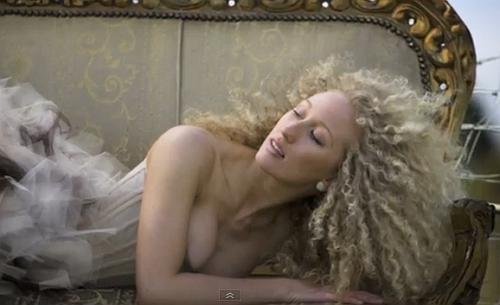
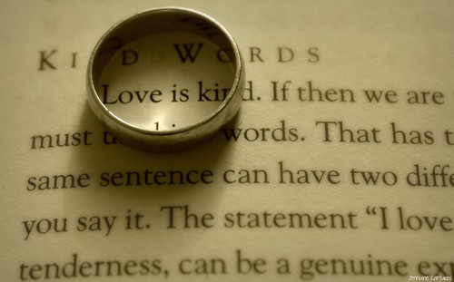
Landscape orientation is where a page or picture has the longest side on the horizontal. The picture above is in the portrait view – the longest side is upright. The use of the term ‘page orientation’ refers to either horizontal (landscape) or upright (portrait).

Of course there is more to it than that. In most cases we also consider the aspect ratio. In most SLR formats the aspect ratio is 4 to 3 (or 4:3 as it is written). This means four units along the long axis. And upwards, 3 units tall. This is a typical landscape view. Wider screens on televisions in recent years has introduced a new format of 16:9 although this is not seen as a common format for still photographs.

The current norm is for SLR video formats to be the same 4:3 of the still images. Normally the aspect ratio is considered only for landscape view – a ratio is not given for portrait view.

When taking a picture the photographer needs to consider orientation as part of the composition decision. It is probably true to say that the starter SLR-photog generally uses landscape orientation. It is a natural position since the shutter release is in a naturally comfortable position.

So what makes you turn your camera sideways and change the page orientation to take a portrait shot? There could be a number of good reasons. So here are a few ideas to keep you thinking…

Subject orientation

If your subject is long and upright then it is pretty natural to take it in an upright framing. Despite how natural it is, many people take the picture in landscape, then crop the shot afterwards. This is wasting a compositional opportunity and image space. If you take the shot in portrait from the start it lets you get close to the shot and fill the frame.

Page orientation drives the framing decision. The same framing opportunities arise in portrait as do in landscape. You just have to practice the framing.
Exercise: Go out for a day. Take only portrait view shots. Consider every one as carefully, or more carefully, than your normal landscape shots.
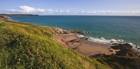
Panorama shots
So panorama shots are in landscape view? Yes. But the best panorama shots are frequently made of portrait shots digitally stitched together along the long axis. This assembly gives them the height and width needed to make up a substantial picture in panorama format. Understanding the portrait format gives you an appreciation of the type of framing needed to master panorama landscape work. So, even in panorama work the page orientation is crucial.
Images in text: page orientation is an essential consideration

If you are planning to contribute to a publication you learn how to take portrait shots. Editors are often more interested in the portrait view. It will fit into one column. That will give the editorial more space to tell the story. Editors like this format. If you wish to be published cultivate your skills in portrait view.

Portraiture:

Portraiture can easily be done in landscape format but has an odd feel. It is important to make page orientation comfortable for the eye. The portrait format is ready made for capturing the upright nature of the natural portrait. We would normally give a wide orientation to something that is moving. The landscape view provides space to move into. In portraits there is often no movement or implied movement. The taller, thinner format helps the person pictured to engage with the viewer. An upright page orientation helps the picture sides to hold in the viewer’s eye to the portrait subject.
Exercise: Try a traditional portrait format and see if you think the portrait orientation is more effective. You will need to shoot a number of different shots to get the feel for it. Try different lighting conditions too.

Page orientation is also about presentation

The need for upright formats is not just about what is in the picture. It might also be about the way the picture is to be used. A picture may be chosen for its shape. Often a picture purchase is made to fit in a place which needs that format. A long thin alcove in a wall suits a long thin picture format. Taking the picture with that page orientation better suites the situation than cropping afterwards. How a picture will be used is a reason to frame a picture that way. Page orientation is a composition and presentation decision.

Words:

If you are taking a picture with words in it think about your page orientation.

It is easy to forget that very wide pages make reading difficult. Landscape view will hinder reading if the text spans the page. If you must use that page orientation with text find ways to keep the text from going across the page.

Using landscape format may be a good idea if the meaning of the text is unimportant. Where the impact of text is stronger than its meaning then you can span the image for effect. For example, the name of a café may not be as significant as the run down and decaying feel of the old building and its name sign. The impact may be more in the other elements of the scene. The importance of reading the text is minimised. Reducing the impact of text in an image is often a good idea as the eye is drawn to it. This can reduce the impact of the rest of the picture. Try to strike a balance. It may be better to use landscape with text if you want to include other things in the image.

If for some reason you are setting up a picture to take text then consider the portrait view. It will make the shot easier and your viewer will appreciate it. The reading will be more comfortable and quicker. This will take the emphasis off the text and allow the reader to quickly move on to the rest of the image.

Exercise: Paste a page of text into a word processor page. Set the page to landscape view. Print it out. Easy to read?

Page orientation as an eye stop

Artists and photographers often use the page orientation as a way to control the eye. The landscape page orientation helps the eye to flow from one side to the other. You can use other elements in the page to help keep the eye move around. The right sort of content in a picture can stop the eye moving out of the page. For example, a tree trunk on the edge of a landscape page tends to act as a natural stop to the eye, directing it upward into the canopy. The eye can then flow back the other way.

The use of a portrait format naturally causes the eye to move upward or downward. Where it is important to stress the up/down impact of an image use portrait view. Portraits, are a classic example. Other examples might be trees, or tall architectural images. The power in the image is controlling the eye between the image sides.

Page orientation is also a resolution issue

Where page orientation is a bad match for the composition, all is not lost. It is easy to crop the image to bring out the content in a new page orientation. However, consider the resolution for a minute. If you have to crop out a segment of the picture you may be affected by resolution. Artefacts, lack of sharpness, poor resolution and blur are all enhanced by a crop. Changing the page orientation makes these more likely to affect the final image. Consider the correct orientation from the start. Then you will not be faced with these quality issues.

Overall

The context of landscape or portrait orientation is the important thing. There is no reason to assume that either format is best. Pay attention to the needs of the composition or context in which the image is used. Clearly both upright or horizontal have their place. It is down to you to decide page orientation. My main point is, don’t ignore poor old portrait view. It can lead to some stunning compositions. It would be a shame to miss out on the benefits.

Comments, additions, amendments or ideas on this article? Contact Us
or why not leave a comment at the bottom of the page…

Like this article? Don’t miss the next — sign up for tips by email.

Damon Guy - Netkonnexion

Damon Guy (Netkonnexion)

Damon is a writer-photographer and editor of this site. He has run some major websites, a computing department and a digital image library. He started out as a trained teacher and now runs training for digital photogs.
See also: Editors ‘Bio’.
By Damon Guy see his profile on Google+.