Tag Archives: Pattern

Visual toolbox for photographers

Sharpen up your creative photography…

It’s easy when starting photography to over emphasis the importance of gear. In fact it’s ‘photographers eye’ that really makes the difference. Your vision and insight into a scene are critical to producing a wonderful image.

Sage advice from a world master

The Visual Tool Box by David duChemin is all about the skills of composition. He goes into depth around the background ideas which help you look at a scene. The ultimate success in photography is to make your image a pleasure to view. Aesthetics rule – it’s as simple as that. This book is dedicated to teaching you the tools you need to develop the ‘eye’.

David duChemin says,

These are the lessons I wish I’d learned when I was starting out.
The Visual Tool Box by David duChemin

This is my kind of book. He writes superbly, in simple, readable form. His examples are excellent and the pictures are just amazing. But most of all the book is organised for learners to extend their knowledge in easy, well structured steps. This book is all about putting new tools in your photographic tool box and it achieves that with an ease that any beginner will find a joy.

Composition

The book is packed with examples of the sort of compositional ideas that really work – for anyone. Just look at some of the topics covered…

  • Manual
  • Optimize Your Exposures
  • Master the Triangle
  • Slower Shutter Speed
  • Learn to Pan
  • Use Intentional Camera Movement
  • Use Wide Lenses to Create a Sense of Inclusion
  • Learn to Isolate
  • Use Tighter Apertures to Deepen Focus
  • Use Bokeh to Abstract
  • Consider Your Colour Palette
  • Lines: Use Diagonals to Create Energy
  • Lines: Patterns, Lead my Eye, Horizons
  • See the Direction of Light
  • Light: Front Light, Side Light, and Back Light
  • Quality of Light: Further Consideration
  • White Balance for Mood
  • Light: Reflections, Shadow, Silhouettes, Lens Flare
  • People
  • Experiment with Balance and Tension
  • Use Your Negative Space
  • Juxtapositions: Find Conceptual Contrasts
  • Orientation of Frame
  • Choose Your Aspect Ratio
  • Use Scale
  • Simplify
  • Shoot from the Heart
  • Listen to Other Voices (Very Carefully)

And there is plenty more content to complement and extends these ideas. What’s not shown in a list is the excellent and sage advice throughout the book. I will let David duChemin have the last word…

Pace your-self. Anyone can master a camera; that just comes with time. It’s the other stuff — learning to think like a photographer — that takes so much work and allows this craft to become the means by which you create art.
The Visual Tool Box by David duChemin

And it is thinking like a photographer that you will quickly learn from reading this book.

How to buy this great book

This book was originally published as an ebook. However, it is no longer available in that form. The book has moved into the real world. It will be available on Amazon as a Paperback From 31 Mar 2015.
The Visual Toolbox: 60 Lessons for Stronger Photographs (Voices That Matter)You can per-order the book from Amazon.

Comments, additions, amendments or ideas on this article? Contact Us
or why not leave a comment at the bottom of the page…

Like this article? Don’t miss the next — sign up for tips by email.

Damon Guy - Netkonnexion

Damon Guy (Netkonnexion)

Damon is a writer-photographer and editor of this site. He has run some major websites, a computing department and a digital image library. He started out as a trained teacher and now runs training for digital photogs.
See also: Editors ‘Bio’.
By Damon Guy see his profile on Google+.

The secrets of good backgrounds

• Backdrops •

• Backdrops •
Wallpaper can be used extensively as a backdrop. There is plenty of variation and the material is relatively cheap.

Get more out of less.

One of the central ideas behind photography is to reduce the “clutter” especially in the background. We want to simplify our shots to help focus the viewers attention on the subject we have chosen. Often, by way of controlling the scene we use backdrops. For the modern photographer a backdrop provides a simple uncluttered background that can be used to off-set the colours of the subject, or to complement them or remain neutral.

Backdrop secrets

Modern backdrops have a wide range of finishes. However, strong patterns and fussy details draw the eye off the subject. So most backdrop patterns are designed to reduce the impact on the eye. Rather than regular strong lines or shapes these back drops will tend to have random and subdued variations in the theme. Other backdrop types are solid colours. The best backdrops are minimalist.

Black backdrops are often used for darkening and absorbing the light. White backgrounds are frequently used for high-key photography. Reds, purples and blues are often used for different types of shots, but can also form effective variations for monochrome work (single tone shots or a single colour and white).

Bright green backdrops are called chroma-key (chromakey). They are often used to provide a set colour ready for post processing technique called compositing. This is where new colours or entire images are to swapped into the image. The subject is retained but the green colour is replaced with an entirely new image. This technique is the digital replacement of the old ‘back-projection’ or painted backgrounds techniques used to make it look like there was something solid in the background in the days of film. Actually there was a blank screen behind the subject. This technique is also known as “green screen”.

Backdrops can be used anywhere but are used extensively in two particular branches of photography. Portraiture and fashion photography use backdrops to simplify the scene as much as possible. This allows the person or model to be the strongest element in the scene. The eye is therefore drawn to the person which is where the photographer wants people to look. A fashion or portrait shot where the eye is not on the person is a disaster!

Still life

The other area where backdrops are used extensively is in various types of still life. Again the intention is to create a simple scene so the subject is the centre of interest. However, in still life the relatively close up nature of the work can allow the use of stronger elements in the backdrop.

Heart in hand

Heart in hand • By Damon Guy
In smaller scenes or still life backdrops can be stronger. The diagonal wallpaper pattern here helps the flow of the eye.


In the picture above the hands are the centre of attention. The backdrop is used in this case to provide a dynamic feel (from the strong diagonal) and to direct the eye along the line of the phrase in the heart. Eyes naturally tend to follow lines like that.

Wallpaper

While solid colours and simple patterns are well catered for in the market, specific patterns on backdrops are limited. However, in the picture at the top of this page you can see that I have arranged a variety of different wallpaper samples. Wallpaper is easy to find – it is in every DIY store and great patterns, plain or textured can be found at relatively cheap prices. If you are working at small, still life, sizes one piece of wall paper might be sufficient. However, I have sometimes worked with wallpaper on a full sized portrait backdrop. In this case I use strong tape to stick the wallpaper sheets side by side to make the backdrop wide enough. Then, I staple the wall paper to two light wooden battens, top and bottom. This helps hold the papers together with less damage. It also helps pull the paper out so it hangs flat. Wallpaper has a tendency to curl. Then the top batten is clamped to the backdrop cross bar. Hey presto! You have a cheap but patterned backdrop.

Other patterns, shapes and marks can be used to do other things in a picture. In fact if it is used properly the use of backdrops can be complementary, can be contrasting, can form effective reflections, light dampening, and many more things. Understanding backdrops is a great way to ensure that you can control what is going on behind the main subject.

Decor

Backdrops have rich history in the theatre. Today, in modern still photography they are relatively simple and uncluttered. However, if you have a specific scene in mind you can use wall paper to provide fun and varied backdrops to complement or change your scene. While proper cloth or paper backdrops can be quite expensive; wallpaper is a relatively cheap way to use fun patterns and interesting backdrops.

By Damon Guy (author and Photokonnexion editor)

Damon Guy - Netkonnexion

Damon Guy (Netkonnexion)

Damon is a writer-photog and editor of this site. He has run some major websites, a computing department and a digital image library. He started out as a trained teacher and now runs training for digital photographers.
See also: Editors ‘Bio’.

find out more...Photokonnexion tips by email
If you enjoyed this article please sign up for our
daily email service.
                                                 Find out more
#11030#

The hidden secrets behind doors…

• Red Door •

• Red Door •
Doors seem to have a powerful psychological impact…
• Red Door • By Netkonnexion on FlickrExternal link - opens new tab/page

Just what is the fascination with doors?

They are the subject of an image that most photographers take at one time or another. They are important in sayings in most languages. Yet visually they act to stop you seeing within, or do they? In fact doors provide a whole range of visual and conceptual photo-opportunities.

A real psychological impact

Recent research  External link - opens new tab/page at Notre Dame University, Indiana, has suggested that going through doorways causes memory lapses.

Entering or exiting through a doorway serves as an ‘event boundary’ in the mind, which separates episodes of activity and files them away.
Professor G. A. Radvansky

While the impact of going through a doorway is clearly a significant memory event there are undoubtedly powerful social forces at work too. Many of the worlds nations have significant ‘doors’ or ‘gates’ in their social consciousness with dominant architectural sites that resemble doors to the nation. Old photographs of occupying powers at the national gate is enough to evoke tearful responses from survivors of the time. The German occupation of Paris, France, is bought to mind through harrowing pictures at the Arc de Triomphe in 1940.

German troops at the Arc de Triomphe

• Paris, Deutsche Truppen am Arc de Triomphe •
German troops at the Arc de Triomphe, Paris, 1940.
Paris, Deutsche Truppen am Arc de Triomphe on WikipediaExternal link - opens new tab/page

Entering the castle

On the more mundane level we all think of our homes as the feudal lords of past times thought of their castles. Our doors are the virtual fortifications that keep the evil hordes at bay. The popular culture of police drama is always breaking the door down in a symbolic statement of violation in order to capture the “bad guy”. Doors are both a symbol of safety and a manifestation of violation when breached.

Not only do doors and gates have an impact on social and dramatic conciousness but they are important to the language too. We talk of “having a foot in the door”, or “opening doors for the future” and so on. We use the idea of doors as both a defence and as an access. Many classic stories rely on symbolic or actual doors as the focus for the story. Even science fiction has its “stargates” and “doors” to other universes. The door connects to all sorts of consciousness stretching ideas.

Art, photography and doors

Doors are also a significant part of the cultural scene too. I did a search for “door” on Flickr, the popular photography social networking site. My simple search returned more than 4.5 million results! In fact doors have had a very long history in art and architecture. The ancient Greeks explored the concept of aesthetics and architecture from their earliest times. The proportions of architectural designs for doors and arches have long been associated with mathematical and aesthetic principles. It is not surprising that doors have penetrated so deeply into the modern psyche, they have a lot to say about our culture. Photographers have picked up on that fact.

Interesting artistic approaches

Pattern: The strong similarity of the conventional shape of the door provides a large number of options for pattern photography. Doors are often dissimilar in so many ways (door furniture, colour, windows etc) that the regularity of the frame becomes the pattern forming element while the rest is the interest.

Montage: Totally different doors offer enough similarities to be able to form great photomontage opportunities. I have seen countless door montages and they always draw my eye.

50 Doors in Crestview by David Erwin, on Flickr

• 50 Doors in Crestview •
The regularity of the door shape make it ideal for pattern and photomontage shots.

50 Doors in Crestview by David Erwin, on Flickr External link - opens new tab/page

Colour: Brightly coloured doors are almost universally photographed. People seem to want to make a statement with their entrances and photographers have gladly advertised the fact. My own picture at the top of the page is an example. Colour draws the eye.

Character and sense of place

Character: Many older buildings have wonderful old doorways. They can be found in some of the most ordinary of locations as well as more grand surroundings. The photographer with an eye to architectural detail can find some wonderful photographic opportunities in old doors.

The hidden secrets behind doors

• The hidden secrets behind doors •

Click image to view large
The hidden secrets behind doors By Netkonnexion on Flickr External link - opens new tab/page

Sense of place: Doors say a lot about a building and often about the type of occupation, they project a strong sense of place, of being and of architectural meaning. There are homely ones, business-like ones, run down doors, expensive, cheap… I cold go on. The door speaks about the place and people.

Beyond the obvious…

The grand statement: I mentioned the national gateway theme of many nations. The grand statement of ‘national’ arches or gates is paralleled by some of the grand doors of classical architecture. Huge structures, grand columns, magnificent entrances all serve to impress and awe the visitor – they tell a story of power and control behind the nation. We see equally as powerful door statements in the doors of some of today’s global businesses who’s power and money rival the historical extent of former empires.

Strong story potential: With all these things that doors can say they can also tell great stories. Street photographers and portrait photographers have a long association with them, as do travel photographers. They know a person in association with a door, especially their own, tells a story that jumps out of the image. Looking for a strong story is a holy grail for photographers.

Secrets: Closed doors pique our interest because we are all a little nosy. Who has not walked past an interesting door and wondered what lay within. Even the plainest could hide secrets we cannot even imagine. The secret, the mysterious and the hidden are all things that pull us into an image. They are interesting for themselves, but they also stimulate imagination. Often a peek in a window in association with an interesting door is a great way to give a taste of hidden fruit beyond our reach… a sure way to keep the viewer interested.

Look out for a door…

There is so much potential in this photographic subject. Sometimes you can walk right past a photo-opportunity if you are unaware. Doorways are there with us every day. They are a source for forgetting and a reason to remember. Think about photographing them. Enjoy!

By Damon Guy (author and Photokonnexion editor)

Damon Guy - Netkonnexion

Damon Guy (Netkonnexion)

Damon is a writer-photog and editor of this site. He has run some major websites, a computing department and a digital image library. He started out as a trained teacher and now runs training for digital photographers.
See also: Editors ‘Bio’.

Can you write? Of course you can!
Write for Photokonnexion...

We would love to have your articles or tips posted on our site.
Find out more…
Write for Photokonnexion.

Twelve Simple tips for atmospheric candlelight shots

Candles put out a wonderful light…

Everyone feels the atmospheric impact of candlelight. The colour and the low light seems to draw you in. Capturing that light is easy with a few simple hints. Lets look at what is needed…

Tripod…

There is nearly always low light associated with candle photography. That means working with longer exposures. A tripod is excellent for that. Indoors, beware of a wooden floor, any move you make can be transferred to the tripod. Floor vibrations can ruin a shot or make it soft. For sharpness remember to use the camera timer for the shot or a remote shutter release.

Lighting…

The best way to view candles is by their own light. Because they don’t use a tripod many people are tempted to use flash. Unfortunately flash will over-power the candlelight. It will take out the colour from the light and tend to create hard, sharp shadows. It will ruin the atmosphere of the candlelight. Make sure you switch off your flash. If you need more light the you can use as many candles as you need to raise light levels. They don’t need to be in the shot, but they will keep the light the same throughout the shot.

Composition…

First decide if your candle or candles are the subject or are props. This decision will affect your focus and how you lay out your scene. Candles can create a strong bright spot in the scene. If it is too bright the flame will form a burnt out white spot. Once you have arranged your scene, ensure that the candle will only draw the eye a small amount unless it is the subject. You should consider the placement of the candle in a way that might minimise the impact of the bright flame spot.

Positioning…

If all your candles are close together the light will tend to act as one light source. This will tend to act as a hard light creating more defined shadows. If you want the light to be softer and the shadows with less well defined edges set your candles further apart. If the light is to be cast on a face then soft light will be more flattering.

Movement…

One of the peculiarities of working with candles is that the flames are subject to the slightest air movement. Unfortunately candle flicker is attractive to the eye in real-time; but looks like a loss of sharpness in a still image. It is quite useful in close focus shots with a candle to use an air break of some kind nearby to stop air movement. In a table-top study use a large sheet of card to one side out of shot. That will help prevent air movements. If not, keep an eye on the flames when shooting. Try to capture the flame upright or, if using more than one flame, make sure they are all going the same way. They look more natural that way.

Since candle light is low intensity, make sure you also prevent other sources of movement in the shot. They will inevitably be blurred as the shot will be using a long exposure. This will look like a distraction against still flames.

Can you write? Of course you can!
Write for Photokonnexion...

We would love to have your articles or tips posted on our site.
Find out more…
Write for Photokonnexion.

Light intensity…

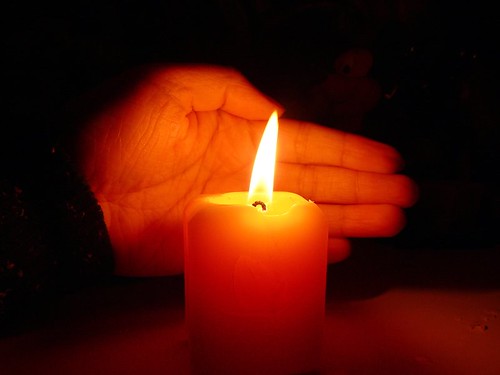
The light from a candle can be made much more intense if you use something to catch the light from the candle. A face, hand or other objects bring alive the picture and complements the candle. The presence of the object acts to reflect the candlelight. Light flesh tones are particularly good in this respect since the flesh colour is tonally close to the candlelight hues and they act as a reflector to bring out the light.

From

From “Candle Series” by Spicedfish
From “Candle Series” by Spicedfish on Flickr External link - opens new tab/page

Using reflectors in a candle scene is a great way to raise the light intensity. You can find other types of surface than the one in this picture in most scenes. Walls, ceilings and even off-shot reflectors are all good. Be careful to use neutral colours. Colour reflectors will affect the colour of the scene. If you are using a big card out-of-shot make it white. This will reflect the same colour light back into the scene, filling in the light.
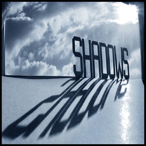
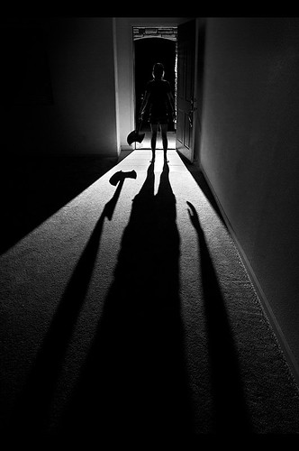
Shadows…

The other side of light intensity is the shadows. The darker tones and strong contrasts of candle shots create most of the atmosphere. Spend time studying the shadows created in your scene. Strong contrasts are great subjects. If you create shadows that fall badly across your scene it will impact on the overall effect. The best use of shadows is often to the edges of the shot. If the light fades out to edges this holds the scene into the shot – naturally focusing the eye. Work with shadows to ensure the mood is harmonious.

Additional lights…

If you want to use fill light in the scene try to match the quality of light from your candles. Use soft light sources and natural light with hues matching the candles. Natural light will fill the scene well but tend to neutralise the colour of the candle light. The warm glow of candles is a great mix with evening, low-intensity light.

Some people use light with gels to give a warm glow. Warming gels can also be used with a flash. However, beware the power of flash. The candles will lose their soothing effect if all the shadows are taken away around the base of the candle and harsh shadows are introduced from one side. Typically use a diffused flash on the lowest setting – it also helps to be a distance away from the candles as well.

Multiple candles…

When working with one candle as subject the main focus of the shot is clear. However, there is a lot of scope for creativity. Consider two main issues. How to layout your candles and how to use the overall light with the layout. Using candles for making patterns is great fun and can produce excellent shots.

Patterns with candles

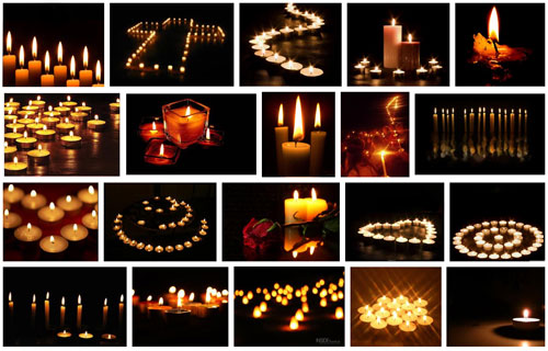
Making patterns with candles
Click to view Google Images “Candle Light” search

Try to keep the scene simple. Overlapping candles or indistinct objects in the pattern are confusing. Work with the sharp contrasts and keep your pattern well defined.

Exposure…

How long should you make your exposure? This depends, like any scene, on your light levels. To get more light in the exposure a long shutter speed is suitable for most candle shots. A range of 1/15 second down to 2 seconds is a good starting range with an ISO of 100. Camera settings vary significantly with reflectors, multiple candles or fill lights. Experiment to get it right. Aim to make the shot moody or atmospheric while providing detail for the eye to look at around the candle flame(s).

The main exposure concern with dark or shadowy shots is digital noise. If ISO is too high you will get more noise. It is better to use a low ISO, say 100 and have longer shutter opening. This reduces noise and means more detail is visible.

Lenses…

A fast lens allows a wider aperture. Faster lenses will allow a quicker exposure than a smaller aperture. Nevertheless, when experimenting check the depth of field. With big candle patterns, or larger subjects, a very wide aperture will give a very shallow depth of field. Too shallow and you will lose a lot of detail. On the other hand, lots of candles in the background with a shallow depth of field will produce pleasing bokeh. For choosing your lens, more than other aspects of your set-up, you need to have a clear vision of what you want your final shot to look like. Then do some “Chimping” to check results.

Prime lenses, especially the 50mm, will give an approximation to the human eyes. To capture the mood of a scene a 50mm will help. A wide angle lens close-up can provide great exaggerations of candle tallness or broadness – depending on lens orientation. There is great scope for artistic interpretation. Also remember that zoom lenses tend to foreshorten, reducing the apparent depth of the shot. With a zoom lens place your candles to give an impression of depth.

White balance…

The warm glow of candles is attractive. If you change the white balance you will change the characteristics of the warm glow. Candlelight shots are about moodiness and atmosphere. It is worth playing with the white balance to influence the shot and increase moodiness, but be careful you don’t remove it. You only need to adjust white balance when shooting in *.jpg as it will be fixed once the shot is taken. If you are shooting in RAW you have more flexibility with settings in post processing to control colours and the final exposure. If you cannot shoot in RAW then, again, make sure you do some “chimping” to get the colours right.

Being safe…

Although fun, candles are naked flames. It is all too easy in low light to leave something close to the candle. Fires start quickly and spread fast too. Feel free to experiment but make sure you don’t accidentally knock over candles, touch wall paper with one or do something else to set off a fire. Never leave candles alight and unattended. Always blow them out and wait for the smoke stop raising before leaving.

find out more...Photokonnexion tips by email
If you enjoyed this article please sign up for our
daily email service.
                                                 Find out more
#11030#

By Damon Guy (author and Photokonnexion editor)

Damon Guy - Netkonnexion

Damon Guy (Netkonnexion)

Damon is a writer-photog and editor of this site. He has run some major websites, a computing department and a digital image library. He started out as a trained teacher and now runs training for digital photographers.
See also: Editors ‘Bio’.

Going with the basics – a simple way to see subjects

Stones And Shell by Netkonnexion, on Flickr

• Stones And Shell • (based on rule of thirds)
Click image to view large
Stones And Shell by Netkonnexion, on FlickrExternal link - opens new tab/page

Simple composition leads to great images.

We have all photo-walked with idol intent and fired off a few shots. I find this unproductive. How about a photo-walk with a composition principle in mind? That helps concentrate the mind wonderfully.

Walk with intent…

No, not criminal intent – photographic intent! If you want to go out for a photo-walk then sit down for two minutes first. Think of a random, generic subject. Try something like “squares”, or “wheels”. Even something more challenging like “Feet” or “Glass” would be good. Your idea can be tailored to where you are going to be walking. In the park you might go for “holes”, or “Rocks” or even “puddles”. In other words, give yourself something to focus on, to look out for and to challenge your view of an ordinary scene. The aim is to capture as many different types of your chosen subject as you can and picture them in as many interesting ways as possible.

I have played this game with myself many times. It’s fun and you get home with a memory card filled with lots of pictures with a common theme. This is great, especially for making a diptych, triptych or other sort of photomontage (not a collage – that’s not a photographic term).

A new idea

Today, I came across the video below. It is a great video explaining three simple principles of composition. Back to basics is always a good idea – even for the experienced photographer. It helps re-ground us in a little simplicity from time to time. The new idea I spotted was to undertake a photo-walk with a compositional principle as your photographic theme. In the video Mark Wallace explains about “pattern”, “unusual point of view” and “rule of thirds“. Then in the second part of the video he goes on a photo-walk in the park where he is looking for these three composition elements.

Digital Photography 1 on 1: Episode 32

This idea of a shoot with a compositional theme produces pictures where the content does not necessarily have a common theme. Instead this game is great for helping you to practice putting composition into your pictures. It is a way to renew your enthusiasm for simple composition at the same time as having fun and improving your photography. You can do it for any of the compositional elements. However, keep it simple, this is an exercise in learning about or getting back to basics.

Have fun!

find out more...Photokonnexion tips by email
If you enjoyed this article please sign up for our
daily email service.
                                                 Find out more
#11030#

By Damon Guy (author and Photokonnexion editor)

Damon Guy - Netkonnexion

Damon Guy (Netkonnexion)

Damon is a writer-photog and editor of this site. He has run some major websites, a computing department and a digital image library. He started out as a trained teacher and now runs training for digital photographers.
See also: Editors ‘Bio’.

The nature of shadows – ideas and inspiration

Shadows are most important in photography.

Without shadows the everyday shapes we see would be ill-defined. It’s shadows that help to give shape to the objects we view. They can also be the very essence of the picture. In this post I am going to look at different aspects of shadows as the subject of the picture. They can be extraordinary elements, message carriers, central attractions or complementary features. They are major influences in our art, sight and our everyday lives. I hope you will be inspired by shadows and appreciative of them as a strong compositional element in your photography.

What is a shadow?

Shadows help us to see. They are not an absence of light (darkness). It is the reduced light in a shadow that creates the contrasts that the eye picks out. In fact the camera does too. Where shadows are well defined, and contrast to the other light around them, we see a lot better than when there are few shadows and very bright light. Brightness makes it difficult to see things because the contrasts are absent and we can’t make out edges or three dimensions either. The variations in light intensities across an object tell us about its shape. If everything was in uniform brightness shapes would disappear.

Aesthetics and shadows

Shadow, and its counterpart light, are the medium of our vision. Decoding the light/shadow relationship is as stimulating as the pleasure of touching a sensuous surface; the electric excitement of a tantalising taste; being immersed in a powerful smell, or mellowing in the caress of a musical experience. Little wonder that as one of our five senses our understanding of light and shadow is also a deep part of our understanding of beauty and ugliness.

Seeing shadow

Of course our eyes sometimes misinterpret shadows and we make mistakes about them as with anything else. So it’s fun to consider the implications of false statements in shadow. In this first picture the shadow as the carrier of a message, but also the shadow as illusion. Shadow views of this sort bring out dark emotions and “shadowy” thoughts, but are also great fun artistically…

366 • 65 • Shadow monster by Pragmagraphr, on Flickr

366 • 65 • Shadow monster by Pragmagraphr, on Flickr
366 • 65 • Shadow monster by Pragmagraphr, on Flickr External link - opens new tab/page

In his notes on this picture the author says… “I have a lot of school work hanging over me like a shadow.” The visual pun is interesting and conveys a great message.

We love it when something appears as one thing and turns out as another. One of the endearing attributes of shadow is the other side of the visual story. In this next picture the lovely shape and bright eyes of this animal convey it’s essential “catness”. But the shadow is something different. The author says… “Her shadow makes me think about a French bulldog – with a tail” … shadows easily take on different meanings.

Flibberty and Her Shadow by peter_hasselbom, on Flickr

Flibberty and Her Shadow by peter_hasselbom, on Flickr
Flibberty and Her Shadow by peter_hasselbom, on FlickrExternal link - opens new tab/page

Of course shadows can be so much more than just a passive message. In this next picture the message is clear and the visual pun means so much to an English-speaking person. A clever use of shadow as the subject.

Shadow of 'a doubt' by Jon Downs, on Flickr

Shadow of ‘a doubt’ by Jon Downs, on Flickr
Shadow of ‘a doubt’ by Jon Downs, on FlickrExternal link - opens new tab/page

While the subject of a picture may not be the shadow there is still an important complimentary part to play by the shadow. The cobalt blue of the shadow in the next picture creates a wonderful tonality. The shape of the object is defined by the shadow, but it is the blueness that makes the statement. The author acknowledges that fact by his title…

If you can write a visual story with your photograph you pull the viewer directly into the shot. In this next picture the shadow and its disembodied juxtaposition on the ladder brilliantly conveys a set of meanings that we, the viewer, impose. The interest is the simplicity of the picture and yet the complexity of the possible meanings… fireman, escapee, workman, who is he? The interpretations are endless…

Shadow Climbing the Ladder at Sunset by S@ilor, on Flickr

Shadow Climbing the Ladder at Sunset by S@ilor, on Flickr
Shadow Climbing the Ladder at Sunset by S@ilor, on FlickrExternal link - opens new tab/page

Shadow and silhouette are closely related. The dark-side of a silhouette is the result of blocked light, as is the shadow. Normally the statement made by a silhouette is in its shape. I like this next picture because the silhouette is betrayed by the darkness behind it. The hard light and low light-source has lengthened and strongly defined the shadow creating a strong subject. It has become all the more threatening because the silhouette is only partially seen. What is there – is there a threat? Are we being menaced by our imagination misinterpreting the shadow… This is a clever interplay of light and of mood. Nicely done…

Shadow. by David Giron, on Flickr

Shadow. by David Giron, on Flickr
Click image to view large
Shadow. by David Giron, on Flickr External link - opens new tab/page

Shadows can convey much more than just mood. They create a picture themselves, but in a minimalist way. The two dimensional aspect of shadow is only partially compensated for by shape. We know that we can so easily misinterpret a shadow. So it is a relief when the meaning is implied without threat or misinterpretation.

Shadows and intimacy are frequently associated. Above, the closeness of the characters shows intimacy. In the next picture the intimacy of the boudoir is so strong that the viewer is relieved by the pattern of shadows to redirect the mood.

Shadows by Pablo Miranzo

Shadows by Pablo Miranzo.


The author says this is one of a series of pictures intended to contrast light and dark and is in black and white to simplify the composition. Oddly enough the composition is simplified by that, but complicated by the opposing mood settings. An interesting picture of mixed tensions.

The interplay between textures is important. While the shadow is a major part of many subjects, sometimes it is not the only subject. Look out for pattern shots that are uniform across the shot until you allow yourself to be drawn in. Often pattern shots have some compositional element to break the pattern, something that draws the eye. Wood grain and the subtle variations in the rhythm of its lines create micro textures and variation providing relief from the pattern, for example. It is that which draws you in.

Texture is an exciting aspect of any picture. It is created by the subtle tonal variations of light and shadow at the micro-level in the picture. If you see a texture and it convinces you that you would feel the texture if you touched it then the picture has convincingly been created as an image in your mind. In this next picture the image I see is all texture. The wonderful curve of the stair rail and its counterpart, the twisted shadow, combine to create great depth in this picture. The combination gives you the feeling that you can reach in and touch… A great image.

The stairs in the next image are pretty minimalist in themselves. However, the elaborate pattern of light and shadow created by them is exquisite. It is a wonderful example of how shadows transform a picture. In this case the shadows have turned the purely mechanical geometry of the stairs into a complex of pattern and curves. It is a wonderful play-off between the simplicity of one and complexity of the other…

Pulling it all together

The shadow as a subject is clearly a compositional feature. It adds to the texture of the shot too. The clever use of shadow can also add a message and/or impart mood as well. Sometimes though, it all just comes together. If you can combine mood, subject, story, composition and texture you have really made the grade. Your picture comes alive in the mind of the viewer. You have truly created an image. To do all this using just shadow is a clever and precious creation. I think this next image is one such example…

Using shadow as a subject is challenging but worthwhile photographic pursuit. Shadow gives you all the essential elements of a good photograph but supplies it with simplicity and meaning if done well. There are untold interpretations and subjects out there for you to tackle. I hope that I have inspired some new thinking on the subject.

find out more...Photokonnexion tips by email
If you enjoyed this article please sign up for our
daily email service.
                                                 Find out more
#11030#

By Damon Guy (author and Photokonnexion editor)

Damon Guy - Netkonnexion

Damon Guy (Netkonnexion)

Damon is a writer-photog and editor of this site. He has run some major websites, a computing department and a digital image library. He started out as a trained teacher and now runs training for digital photographers.
See also: Editors ‘Bio’.

Geometry and pattern in photography

There are patterns and geometries in so many things...

• Groundsmen •
There are patterns and geometries in so many things…
Click image to view large
• Groundsmen • By Netkonnexion on Flickr External link - opens new tab/page

Geometry and pattern appear everywhere.

Spotting it is about having an eye for lines and curves. The essence of a geometric relationship is what we look for in order to bring out pattern and balance.

How does geometry get into an image.

Geometry and pattern are closely related. They interact because the eye is able to pick out patterns. We are adept at spotting the non-accidental relationships involved in lines and curves. When these lines and curves intersect in a meaningful way we recognise something – something constructed.

By way of example, one such relationship we see in pictures is bridges. They often appear in landscape photographs. They add a geometric potency to the apparent chaos of nature and seem to pull a scene together by drawing one end to the other in an image. They do this because the eye is trained to follow lines. Bridges represent significant lines, and sometimes curves, so that they are distinguished from the surrounding natural landscape. To us this is a powerful draw to the eye.

The patterns we see in so many thing around us are not just an accident. They are part of our man-made landscape. So getting these patterns into our pictures is about becoming sensitive to them and then pointing them out. Pointing them out is interesting to the eye, and so you capture your viewers attention.

Wembley Stadium

On a tour visit to the new Wembley Stadium I took the picture above. It all came together by chance. I was listening to the guide and noticed these three groundsmen working on the grass. They were doing something where they stopped every few moments and did something to the grass. I watched them for a few minutes and took five photographs of them and their surroundings. Then, just as our guide told us to follow him, the three groundsmen stopped to work and, for just a moment, they were in a perfect line. They fell into a wonderful geometric relationship with the rest of the scene.

The different geometry’s in this scene are varied and expressive. The whole scene is about lines, angles and intersections. The grass is contained in a surrounding of geometric shapes in the seats and the stadium itself. The grass is marked out for Soccer. The grass has been mowed and the patterns coincide with the soccer markings. The lines of seats in the stands line up with the grass lines… and so on. The great thing about this shot is the new layer of geometry created by the groundsmen. How they fell in line was a bonus. The fact that their geometry intersects with the other geometries around them creates a new reality. The implied line of the men bisects the angle of the goal mouth marking. They also line up with the grass mowing lines. Thier position is at a lovely angle to the other lines that are so strong around them…

For one glorious second all the geometries in this scene have an intimate correspondence. They accidentally created a wonderful new synthesis. A synthesis that was deliciously temporary.

Correspondence

The extraordinary thing about photography is its ability to bring to notice things that would pass you by in other situations. Patterns and geometries in the world around us are really great ways to pick up the essence of a scene. Geometry can be a great linker in a scene. Or, it can be a counterpoint, organisation to emphasise chaos. Similarly pattern can draw a scene together by structuring similarities.

Being sensitive to lines and curves and their relationships is a useful skill for a photographer. When you are out and about make an effort to allow your eye to run along lines and follow curves. When you start to do it regularly you will begin to find some extraordinary relationships between them.

By Damon Guy (author and Photokonnexion editor)

Damon Guy - Netkonnexion

Damon Guy (Netkonnexion)

Damon is a writer-photog and editor of this site. He has run some major websites, a computing department and a digital image library. He started out as a trained teacher and now runs training for digital photographers.
See also: Editors ‘Bio’.