Tag Archives: Emphasis

How to get the sky right in your holiday pictures

Cornish Vista

Cornish vista
Think about how to get the best out of your sky.
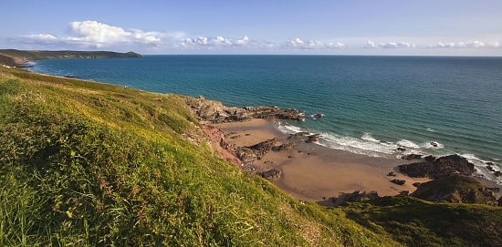
Cornish Vista • By Netkonnexion on 365ProjectExternal link - opens new tab/page

Getting the sky right is important.

With the holiday season approaching we want our holiday photographs reflect the happy memories. All too often the sky is over-white, washed out or blown-out. There are a number of techniques you can use to get the sky right, in camera and in post processing.

What are you really looking for in a good sky? Deep blues for the sky, fluffy white clouds and well defined horizons are the ideal situation. To get them like that in the camera you have to pay attention to the time of day, the type of sky, the weather and have a sense of drama. Here are some ideas to help you…

Polarizing Filter

One of the photographers important tools for sky photography is the polarizing filter. It is a glass or composite material that is set into the inner of two metal rings. The first ring screws directly to the front of your lens. The other rotates inside the screw ring. The filter itself cuts out some of the wavelengths of light. You turn the ring with the filter mounted in it so that it can be set for maximum effect. The filter action reduces the glare and haze associated with reflective surfaces like water and glass. Amazingly it also deepens the blue in the sky. So what we see in the photograph is a sky that is darkened with emphasised blues and the air has a crispness and clarity. These effects are not reproducible in post-processing software. It is invaluable to have this effect in camera and will really liven up the drama of the sky.

Critical view-line

If you gaze out across a wide open sky on a bright sunny day you will notice that the blueness of the sky is not uniform. It is a deeper blue in places and a whiter blue elsewhere. In fact the sky gets to be a deeper blue if you are facing away from the sun. It is at its deepest blue at the opposite end of the sky from the sun. So where you can, shoot with the sun at your back.

Of course having the sun at your back is not always possible. A good rule is not to let the sun be in front of you. If it is at your shoulder (90 degrees to your shot) it will still allow you to get a reasonable blueness in the sky. If you have to shoot with the sun in front of you, even if at a wide angle, the blues will start to whiten. The more you are shooting toward the sun the more the sky will wash out.

The mid-day washout

During the middle of a sunny day the sky will be at its most washed out. As the sun is at its highest at this point you should avoid taking photographs if you can. The more the sun falls toward the horizon the more the atmosphere will act as a natural filter and increase the blues at the opposite end of sky. The middle of the day is also bad for photography because the sun being overhead means that objects on the ground have little shadow around them. This gives the landscape a flat and unappealing look. Washed out skies and flat appearance at ground level makes convincing photography difficult!

Use an ND graduated filter

Neutral density filters are great. They are fun to use and give you back some of the blueness in the sky caused by over brightness. They don’t enhance the blueness like the polarized lenses. They are a way of cutting the light down so its intensity is reduced.

Without an ND filter the sky will tend to be over-bright, or the ground will tend to be too dark on a bright day. The graduated ND is an ideal tool for helping to balance the light levels. A full ND filter will reduce the incoming light right across the lens. However, a graduated ND filter allows the full amount of light to enter the lens from the lower half – which keeps the foreground bright. On the upper half of the filter (pointing at the sky) the neutral grey graduates from the very light across the middle to its darkest at the top of the filter. You place the beginning of the neutral grey on the horizon and then the grey graduates darker up the filter so the most washed out or over-exposed parts of the sky at the top of the picture are the parts with the most reduced light levels.

It is worth remembering that you can use both an ND graduated filter and a polarizing filter. However, also remember that each time you put a glass element in the line of light you will be reducing the light that can get into the camera. So remember to adjust your exposure to compensate for the additional glass.

The use of ND filters helps to bring out the clouds too. Brightness in clouds can be pretty harsh, especially if they are very dense. This tends to make them featureless. The use of ND filters for clouds (an ND 2 or 4 – the lowest filter levels) will help to reduce the brightness and enhance the contrasts in the darker parts of the cloud. This brings out its features and helps the cloud to take on a little depth.

Post processing sky enhancements

In post processing you can do a number of things to enhance your sky. However, after years of working on my skies I know that you can get better results in camera… try that first.

On trick to enhancing a washed-out blue sky is to use a saturate tool. Simply wipe the tool across the blue of the sky to deepen and lift the crispness of it. The saturate tool in most image editing applications tends to turn sky blue to turquoise blue. Don’t use full saturation. Set your saturation tool to between 10% and 20% and wipe it several times rather than one heavy wipe. With most tools/brushes it is better to use low exposure/opacity rather than be heavy handed. Not only is it more controllable but you can also build up to a reasonable blueness without over-doing it.

You should watch out that you do not wipe the saturate tool over the clouds. You will find that the clouds look white, but contain a high blue component. If you saturate them they turn blue to the eye – which looks highly unrealistic.

The trick to increasing the contrast in clouds is not the saturate tool. It is to deepen the grey of the darker parts of clouds using the burn tool. The burn tool darkens a colour by increasing its black component. Again, with the burn tool use a reduced exposure. I like to work with about 15% in clouds. Set the tool to mid-tones so the grey parts of the cloud don’t turn black. The idea is to increase the contrast not to give the clouds harsh deep lines – that would hardly match with the surrounding blue sky.

Blue sky thinking

If you really want to get the best skies then work later or earlier in the day to get lower wash-out levels in the sky. Make sure that where you can shoot away from the sun = especially toward the horizon with the sun at your back. Where brightness levels are high and you have to shoot you can reduce the wash-out with polarization and ND grad. filters. You can also post process the skies after your shoot, but this is not as easy as it sounds.

True blue-sky thinking is done before you take the shot. Deploy all the suggestions above and your skies will be blue. Have a happy holiday.

By Damon Guy (author and Photokonnexion editor)

Damon Guy - Netkonnexion

Damon Guy (Netkonnexion)

Damon is a writer-photog and editor of this site. He has run some major websites, a computing department and a digital image library. He started out as a trained teacher and now runs training for digital photographers.
See also: Editors ‘Bio’.

How to write great captions for your photographs

A caption about captions

• About captions •
A picture and caption from 365Project, a photographers social networking site.
Click image to view large
About captions – By Netkonnexion on 365ProjectExternal link - opens new tab/page

The power of the image is not just in the picture.

Often the image itself is not the main reason for displaying a picture. Sometimes there is a need for an explanation about your picture or something associated with it. Diagrams, an illustration of a point in the text, secondary ideas, are some of the many good reasons to have a photograph on display. However, to make the point clear you frequently need a caption for the picture.

In What about the title? I discussed how titles impart meaning and context about the picture. They capture an essence of the image in a short phrase.

Captions on the other hand are about good communication. The image, the title and caption together speak to the viewer conveying full meaning. So writing a good caption is essential. If you say anything in your caption that is at odds with the reason for the rest of the communication (picture/title/caption) you will confuse your viewer. So here are some ideas to help your captioning…

  • Think first… Captions like all communications need to be planned. Think about what you want to say, structure it logically, say only what is needed. Once it’s clear why you want it and what it should say, then
    write the caption.
  • Be brief… Say no more than you need. Reserve long explanations for the wider text.
  • Stick to the point… Explain the point of the picture and its relevance. Make other points outside of the caption.
  • Match the text to the purpose… Make sure that the tone of the writing is consistent with the main text, the purpose of the image and the title. If the caption is in a different style to the rest of the communication it will confuse the viewer.
  • Use appropriate caption format… Headshots might just be captioned with a name. Products may be fully captioned. For example “Useful Thingy-Widget showing rear wiring arrangement” explains the product shot. Diagrams should be captioned with a precise abstract of what they show. Detailed explanations go elsewhere.
  • Layout your caption neatly… If the text is arranged in a lopsided way, or if there is a mixture of fonts or other imbalances these will be obvious in a short caption. Try to make the layout attractive to the eye.
  • Resist repetition… If you have a picture of a cake the pointless caption, “Picture of a cake” serves only to frustrate the viewer. “A moist carrot cake is an ideal mid-morning confection”, says a whole lot more and still points out it is a cake.
  • Avoid replication… Do not simply write something in your caption from the main text. Complex explanations in the main text are usefully off-set by a succinct summary in the caption.
  • Avoid cliché… The tired or clichéd phrase in a caption will put off your reader. Try to make captions fresh, invigorating and crisp.
  • Explain or name groups… Six different widgets, three people or four piles of different beans all need to be explained. Name them, number them, explain them – whatever – but make sure the viewer knows which is which and in the correct order.
  • Be consistent… Each of the photographs you use should have a caption. Make sure they are all formatted the same, written in the same style, use consistent references (eg. Dia. 1, Dia. 2 etc) mounted in the page using the same graphical scheme. Deviations will confuse the reader/viewer and throw off their concentration.
  • Include credit, attributes, acknowledgements and links… You would feel cheated if your work was used and not credited. So afford the same courtesy to others if you are using images by other authors.
  • Fact check… Mistakes are glaringly obvious in captions because they are so brief. Check everything, of course, but be especially careful about captions.

Remember, your caption is one part of the communication. The reader sees the picture, title and caption as the full communication. So treat them as a single method of making a point to your reader/viewer. Make all three carry the same message overall. Use this diverse way to communicate with as much impact as possible. Your caption is a vital part of the overall delivery of your point.

By Damon Guy (author and Photokonnexion editor)

Damon Guy - Netkonnexion

Damon Guy (Netkonnexion)

Damon is a writer-photog and editor of this site. He has run some major websites, a computing department and a digital image library. He started out as a trained teacher and now runs training for digital photographers.
See also: Editors ‘Bio’.

Do you have an intention for your photographs?

Retired Aeroplane - Going wide really brings out certain features of a shot

• Retired Aeroplane •
Going wide really brings out certain features of a shot
Click image to view large.
• Retired Aeroplane • By Netkonnexion on Flickr External link - opens new tab/page

Consider the reason for taking a photograph…

I had cause to consider the nature of several photographs this evening. A judge was discussing the photographs in a competition. On several occasions he referred to photographs he was judging as “record shots”. This is not a negative term.

I have made several references to this type of shot in past posts. Here is a definition from the Photokonnexion Photographic GlossaryRecord Shot. This is a type of shot that you might use to remember something as it was. It is a type of shot that is a legitimate representation of the subject but without any deliberate artistic interpretation. But, there is the rub. What on earth is artistic interpretation?

It surprised me when a judge in a competition called the photograph above a record shot. I enjoyed taking this photograph. I had seen the aircraft on a previous visit to The Imperial War Museum at Duxford  External link - opens new tab/page. It is a replica of one of the wonderful fighter aircraft of World War II – a Spitfire. I had considered it for some time and had lined up this shot in my head for some weeks before my arrival. I was fortunate to be blessed with a great sky. The angle of the shot was in line with the movement of clouds in the sky. I put on a wide angle lens and took about 10 shots along the lines I had planned. I wanted to make the wing disproportionate to the fuselage to give it foreground weight and invest depth in the picture. With a wide-angled lens this would make the wing seem really wide and long.

I may not be an artist in the traditional sense. I know I tend to take a rather geometric view in my pictures. It’s my signature, my style and my pleasure. However, it is also my interpretation. In this shot I really took my interpretation to some length. The body is distorted, the wing out of proportion. The sky deliberately elongated by the perspective of the wide angle lens. But to me this view showed the plane off in a unique way and presented a powerful perspective. I think this picture is heavy on interpretation and personal vision. Call it what you will, one thing it was not, is a record shot.

So, this evening when I was considering a judges words on what he called a record shot I was suddenly reminded of my picture above. It struck me that very often the viewer reads into the photograph more than the author has to say on a particular subject. In the case of my picture above the viewer saw a straight forward representation of a great aircraft. I on the other hand saw an opportunity to display, in a unique way, the wonderful geometry that made this aircraft great – its superb flying design.

The two views, my geometric tribute and the judges record of a great aircraft, may not seem too far apart to you, the reader. Yet, to me it signalled that I had failed in my duty as a photographer to represent my vision. I had not convinced the judge that I had invested my personal view, my artistic impression, in this photograph.

As photographers we are communicating a point of view with every shot. It may be appropriate to devote time and effort to faithful reproduction, equivalent proportion and careful exactitude to create a record shot. That is a worthwhile endeavour.

It is equally important that at other times we express our interpretation of our subject in a manner that brings out our unique view, comment or observation about a subject. There are two issues to keep in mind. First, we should always have a clear vision about what we are trying to achieve with a shot. Second, we should be finding the strongest and clearest way to express that intention, lest our viewers miss the point of the shot.

More after this…

find out more...Photokonnexion tips by email
Enjoying this article? Please sign up for our
daily email service.
                                                Find out more
#11030#

Art is fickle but viewers are more fickle…

Yes, throughout the ages art has been misinterpreted. And, we must sometimes acknowledge that the viewer may not understand our point of view. You will never convey your meaning to 100% of the viewers. However, I believe that viewers have a right to expect that you make every possible effort to communicate your intention for the photograph and make your point as clearly as possible.

The difference between a record shot and an artistic impression may be a thin line. But if your photograph is to succeed there should be no such lack of clarity when conveying your communication or meaning.

By Damon Guy (author and Photokonnexion editor)

Damon Guy - Netkonnexion

Damon Guy (Netkonnexion)

Damon is a writer-photog and editor of this site. He has run some major websites, a computing department and a digital image library. He started out as a trained teacher and now runs training for digital photographers.
See also: Editors ‘Bio’.

A simple introduction to backlight

• Introduction to backlight •

• Introduction to backlight •
Various images showing backlight scenarios in the studio and outside.
Images from various artists – displayed on Google Images.

Backlight is a versatile light with great potential.

The term backlight refers to the use of a light which is projected from the back of the scene/studio onto the subject from behind. The camera is placed facing the subject. It captures the effect of the light as a highlighted rim or halo around the back edges of the subject.

The use of a backlight creates very distinct effects. The most important is the rim light around the edges of the subject. This highlighting effectively isolates the subject from the background. So it is a useful technique when the subject and background share similar colours or tones. The rim effect around the edges of the subject is especially useful for bringing out highlights and style in hair. Sometimes it is also used to imply purity or goodness after the manner of a religious halo.

Backlight can be produced either with artificial light, natural light or a combination. The sun is normally the most important light for back lighting and so in cases where sunlight is strong artificial light is often used to bring the foreground or the subjects front side out of shadow. This is fill light and provides sufficient light for a good shot of the subject without blowing out the effects of the back light.

In photographic scenes the backlight is often used to create an emphasis on the three dimensionality of the subject. Lights coming directly from the position of the camera tend to make a subject look flat because all the shadows are removed. Backlight has the opposite effect. The light halo effect at the back of the subject emphasises the depth of the subject. It can also be used to emphasis depth in the picture. By strongly highlighting the back of the subject the distance to the scenery behind the subject is revealed giving the image some depth.

Setting up an effective backlight requires some care. If the source of the light shines directly into the camera lens it will blow out and create a strong distraction for the picture viewer. Also a strong backlight can make the front side of the subject look very dark or even silhouetted. To prevent this it is normal practice to use a front light as well so the subject is bright enough to capture. Setting up a good backlight often requires getting the foreground light correct first, then putting in the backlight at around 2 to 3 stops brighter to create the emphasis.

The angle at which a backlight hits the subject can be critical. If the backlight is directly toward the camera the subject can be strongly blown out by and direct light passing around the subject. Normally backlight is applied at an angle. That way the lighting will provide a little texture on the subject and not be directed into the camera lens. It can also be used to more effectively show fashion elements like hair styles by picking out highlights, curls etc.

“Backlight” should not be confused with background lighting. The latter is where a light is used to light the background, the scenery or backdrop. Background lighting typically faces away from the camera. Backlights face toward the camera.

Backlights are used in such a large variety of ways that some practice and experimentation is needed to be able to work out the best way to use them. However, because of the intensity of the light from the back the foreground lighting is often important too. It is not unusual for multiple artificial lights to be needed in order to get the best out of backlights and to keep the balance of lighting good all around the subject.

Examples of “Studio backlighting” on Google  External link - opens new tab/page
Examples of general “backlight photography” on Google  External link - opens new tab/page

Backlight techniques are very important in photography as they have so many effective outcomes. It is certainly worth practising with your lights or even natural light to try out some of the effects.

By Damon Guy (author and Photokonnexion editor)

Damon Guy - Netkonnexion

Damon Guy (Netkonnexion)

Damon is a writer-photog and editor of this site. He has run some major websites, a computing department and a digital image library. He started out as a trained teacher and now runs training for digital photographers.
See also: Editors ‘Bio’.

Contribute A Definition?

Send us a definition of a photographic word or phrase...

Send us a definition for our list of photographic words and phrases. Simply write a clear definition and send it in. Include an original picture if you wish. Give us your name and a link to your website and we will credit your work.

How to use camera angle to change body shape

How camera angle affects body shape.

How camera angle affects body shape.
[Image taken from the attached video].

Camera angle affects body shape

How you approach your subject can significantly affect their shape. The camera height affects the relative size of parts of the body. The part of the body nearest to the camera appears largest. So the angle you take to the body can affect emphasis and shape. Your lens can also affect body shape too. These two factors in your shots can really change the view of your subject.

Basic shooting positions that show camera angle affects body shape
  • Getting down low gives your subject height and presence.
  • At waist level the angle is even across the body placing no strong emphasis on any one part of the body.
  • At eye level the head appears more significant and you can really draw out the features of the face, focus on the eyes for best effect.
  • From above the head and shoulders are emphasised and the legs are foreshortened.

From these basic positions you can also use different camera lenses. A 50mm lens is the lens that most closely matches the visual abilities of the human eye. Using one of these will help you to see the body as the eye will see it. On the other hand a wide angle lens (around 24mm) will help to bring out the emphasis of the body length. If you use a wide angle lens in portrait view from below you will tend to make your subject look statuesque – tall and grand. If you view the subject from above you will shorten the body and legs and make them look squat. These forms of emphasis have powerful impacts in pictures where you are trying to portray a persons presence. Statuesque tends to convey power and presence. Bodies that appear more compact tend to emphasis a more physical presence.

How camera angle affects the body shape – a video

The video brings out in detail the above points. The shoot is on the Bonneville Salt Flats, which is a wonderful location – even if it is flooded! The white of the salt brings out some great high contrast shots. You really can see how camera angle affects body shape.

TheSlantedLens External link - opens new tab/page (Published: 02.Apr.2013)

By Damon Guy (author and Photokonnexion editor)

Damon Guy - Netkonnexion

Damon Guy (Netkonnexion)

Damon is a writer-photog and editor of this site. He has run some major websites, a computing department and a digital image library. He started out as a trained teacher and now runs training for digital photographers.
See also: Editors ‘Bio’.

Can you write? Of course you can!
Write for Photokonnexion...

We would love to have your articles or tips posted on our site.
Find out more…
Write for Photokonnexion.

A simple lesson in photography is the main study

Are your eyes wide shut?

Most people walk around with their eyes open. But not everyone sees the same things. Do people see the things that photographers see? What is it that photographers see that is different?

The way of seeing

After years looking through a lens I did not understand that photographers see things that other people do not see. Then I began a thorough study of composition. After a while of looking around at the world with my new insight I noticed two things. First, the lens distorted the view that my eye saw. Second, the compositional elements I had learned about changed my view of the world through the lens.

As I have studied photography, and in particular composition, I have found more and more insights. My view of photography as a discipline has completely changed from my early ideas. In my photographs I see many compositional possibilities that help me view the scene in front of me. The new things I learned about gave me new ways to see. There is nothing special about this. People go through rigorous professional training for years to get insights that affect the way they think.

The extraordinary thing is that I do not find it easy to explain what I see that is different. I just know that light, colours, lines, shapes, forms, colours and tones are all things I notice now that I did not before.

There are other things I see too. When we view the world we notice things that interest us and then filter out the clutter that is of no interest. Our brains simplify the world to make it understandable. That does not happen as readily in the real world. Yet when photographers get started they try to photograph everything as if the viewer can see past the clutter. In fact, in a photograph, the clutter gets in the way of the image. Photographers learn to distill the clutter from the photograph and present the image in a simplified way.

The other thing I have learned is that there is meaning in every image. That is something that is difficult to divine. Sometimes even the photographer cannot understand their own motive for shooting a picture or articulate the meaning in it. Yet there is always some personal, emotional, social or interest-based meaning underlying the shot. All sorts of hidden messages can be imparted by the image to the viewer – often in a subliminal way. These messages are readily open to being focused on by the photographer, amplified by the setting and the composition. The meaning becomes an important part of the image.

For me there are three dimensions in photography. The length of photography is seeing the light. By seeing and understanding light we see colour, dark, shadow, form – all the manifestations of the real world. The width of photography is the simplicity we bring to our images to make them understandable. By reducing the clutter and opening up the scene in the image for our viewer we let them in to perceive the point of the image. The height of the image is the meaning. By imparting a meaning, no matter how simple, we give the image a life which is detected by our viewers.

All the things which impact on a starter in photography become a sort of white noise. So it is difficult to see the core of what goes into images. Yet these three dimensions are there in every part of our work. It may not be easy to see straight away, but look for these things and your photography will improve.

By Damon Guy (author and Photokonnexion editor)

Damon Guy - Netkonnexion

Damon Guy (Netkonnexion)

Damon is a writer-photog and editor of this site. He has run some major websites, a computing department and a digital image library. He started out as a trained teacher and now runs training for digital photographers.
See also: Editors ‘Bio’.

Ten top photography tips

Great photography comes from a few simple ideas.

When you are trying to make a great image it is the attention to the simple details that carry the greatest impact. This is a simple reminder… get the basics right and the rest will become a lot easier.

Rick Sammon’s Top Ten Digital Photography Tips


Created by PixelMagic