Tag Archives: Crop

Use implied infinity to make your shots bigger than the frame

• Passing Boats •

• Passing Boats •
Click image to view large
• Passing Boats • By Netkonnexion on Flickr External link - opens new tab/page

You can fool the brain into seeing beyond the frame…

The eye is trained to see sideways and the brain to imagine things we cannot see. The eye/brain system sees things that are peripheral to our vision – or beyond the frame.

Major compositional impact

When we see a picture containing things we expect to be extensive we make a leap of imagination. Although a picture is quite small the content takes the imagination beyond the frame – possibly to infinity. The picture above is an example. One of the boats is heading close to a substantial rocky outcrop. You cannot see it in the picture and get the impression that they are both sailing into open water. Our knowledge of the sea and the fact that we see no break in the picture we get the impression that it is clear open water.

The use of continuous patterns, open/extensive scenes and continuous lines can take the imagination beyond the frame. It makes a picture have a much larger aspect in our mind than might actually be there. The feeling of extensiveness which takes the imagination beyond the frame is down to how you crop or frame your photo.

In the next picture the stones are cropped so they are continuously cut off on the edge of the image. It gives the impression of a great expanse – a whole beach – extending beyond the frame.

Stones and shell

• Stones and shell •
Click image to view large
• Stones and shell • By Netkonnexion on Flickr External link - opens new tab/page

In fact the picture was taken on a beach so the impression is realistic and effective. However, in the next picture the roof looks as if it might extend to infinity.

• French Roof •

• French Roof •
Click image to view large
• French Roof • By Netkonnexion on Flickr External link - opens new tab/page

The lines and roof tiles give you the impression that the roof extends way beyond the edges of the frame. In fact it is cropped to look like that. The actual house edges are just beyond the frame on each side. But the implied size fools the eye.

You can also give the impression of more when you don’t have more with lots of little things. In the next picture I leave you to imagine how far the rubber bands extend either side. Do they really go far beyond the frame?

• Rubber Bands •

• Rubber Bands •
Click image to view large
• Rubber Bands • By Netkonnexion on Flickr External link - opens new tab/page

In this example the crop, and the pencil, still allows you to see beyond the frame of the picture. Yet it does seem to limit the view a bit. The fact that we normally don’t view a sea of rubber bands in our minds eye, puts limits on the extent of them beyond the frame. The pencil also seems to stop the view being truly extensive beyond the frame.

The limits of the implied expanse

The crop or framing of the picture is crucial to patterns, continuous lines and extensive scenes which open implied spaces in our images. You have to ensure that nothing intrudes into the picture to terminate the view. Had you seen the rocky outcrop in the top picture you would have had your imaginary journey foreshortened on one side of the picture. The pencil provides a limiting scale to our thinking which also foreshortens our vision outside of the frame.
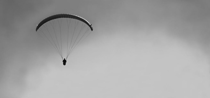
Paraglider

• Paraglider •
Implied infinity created by openness gives a great sense of freedom to a picture.

Openness

What is lovely about this compositional idea is that when we have a truly extensive potential in a scene our imagination plays wonderful tricks of escapism, freedom and openness. It can really set us free when we see a scene like this. However, it can be ruined if we put in something which limits our imaginary journey out of the scene.

Comments, additions, amendments or ideas on this article? Contact Us

By Damon Guy (author and Photokonnexion editor)

Damon Guy - Netkonnexion

Damon Guy (Netkonnexion)

Damon is a writer-photog and editor of this site. He has run some major websites, a computing department and a digital image library. He started out as a trained teacher and now runs training for digital photographers.
See also: Editors ‘Bio’.

Can you write? Of course you can!
Write for Photokonnexion...

We would love to have your articles or tips posted on our site.
Find out more…
Write for Photokonnexion.

10 ways to bring out the point of interest

"Drag bike" Selective colouring is a great way to bring out your point of interest in the shot

“Drag bike” – Selective colouring is a great way to bring out your point of interest.
Click image to view large

Focus the attention of your viewer using these great techniques.

The most important thing about your image is the part that you want your viewer to see. A great image needs to concentrate their attention and hold it in the shot.

Next time you are ready to take a photograph – pause for a second. Think about composing your picture so you direct the viewer at the most important part of your image. The ‘point of interest’, ‘focus of attention’ or a ‘focal point’ is where the viewer finds satisfaction from looking at the image. It makes sense that you use one or two techniques to point the viewers eye right at the reason you are taking the shot.

10 Techniques directing the eye to the point of interest
  • Crop: The cropped shape of the picture is an important way to help the viewers eye find the ‘point of interest’. Letterbox shaped crops help the viewers eye to run across the width of the picture; square crops help direct the reader to the centre of the shot; landscape views are so common that they help the reader be unaware of the crop; Portrait views alert the reader to the vertical things of interest. A crop is a great way to help the readers eye, especially when used with other techniques below.
  • Position: Where you place your point of interest in the shot can affect how prominent it is or how the eye is drawn to it. A good introduction to positioning is to look up the Rule of Thirds. That is a basic rule of composition that gives the eye a dynamic reason to look at the point of interest.
  • Size: A large subject or point of interest is a great way to make people look at it. Big and bold and your viewer will hardly miss it!
  • Focus: The use of depth of field is really effective. The human eye naturally sees what we directly look at in focus. So we tend to concentrate our viewing in the area of sharpness in a picture.
  • Movement blur: Capturing movement creates blur. In my picture above the bike is travelling very fast. To capture it like that I have panned my camera. The background is out of focus. The sharpness and blur create a contrast that draws the eye to the sharpness. Alternatively, you can photograph something moving that you want to become blurred as the focus of attention. Classic movement blur is often created at the fair in the evening. Fast movement with brightly coloured lights wonderfully blurs the merry-go-round in a longer exposure. The strangeness and strong colours draws the eye to the patterns.
  • Colour: Using colour is a great way to draw the eye. Strong primary colours (red, green, blue etc.) are especially good at catching the eye. One bright colour against other lesser colours also directs the eye. Contrasting colours can be a good way of highlighting a particular point of interest too. Colours are best used to make the point of interest stand out from the background.
  • Selective colour: The absence of colour in part of a picture and the selection of one colour or an object in colour is a great contrast in the picture. That difference – greyscale to colour – will strongly make the point of interest stand out. An example is the picture above.
  • Shape: The use of shape is a way to draw the eye too. Again you can use a contrast. One round object in a group of square objects really captures the attention. A strong geometric shape in a picture where there is no other strong, well defined shapes pulls the eye.
  • Pattern: Where there is pattern there is focus. Our eyes are good at picking out patterns. Sudden, clear formation of pattern in a picture where there is no otherwise clear pattern focusses the attention on the pattern. The opposite is true too. Where there is a breakdown in a pattern the eye is drawn to the difference and questions why the change or break in the pattern.
  • Lines: The eye naturally follows lines in a picture. So, you can use lines both as the actual point of interest, and as a way of pointing at the focus of attention. Implied lines can be useful in the same way. A line that strongly points to something else is another way to capture the attention.

It is important too, you are careful not to make the picture too complicated or cluttered. To much to catch the attention will have the eyes whizzing around the picture and not able to settle on your point of interest. Likewise, it is best to use just one or two of the above techniques. Too many and the eye is confused with what direction they should follow. Composing your picture is about subtle messages and directions to help the eye. The last thing you want to do is to confuse or misdirect your viewer.

By Damon Guy (author and Photokonnexion editor)

Damon Guy - Netkonnexion

Damon Guy (Netkonnexion)

Damon is a writer-photog and editor of this site. He has run some major websites, a computing department and a digital image library. He started out as a trained teacher and now runs training for digital photographers.
See also: Editors ‘Bio’.

Can you write? Of course you can!
Write for Photokonnexion...

We would love to have your articles or tips posted on our site.
Find out more…
Write for Photokonnexion.

Landscape loves – do you know why you are photographing this scene?

Do you know why you are shooting the landscape you are looking at?

Do you know why you are shooting the landscape you are looking at? If not then you will probably not make it exciting for your viewer either. Shoot for impact.
(Click the image to see large)

A landscape ‘snap’ just does not seem to cut it…

Many landscape photos are really stimulating for the author, but few other people. The problem? It’s too easy to ‘snap’ a shot that will bring back the moment. You really need to think about what will stimulate someone else when they see the picture.

One of my favourite landscape photographers once said,

Landscape photography is the supreme test of the photographer, and often the supreme disappointment.

Ansel Adams
…and he was right. Most people do not have a reason to take a landscape shot that will satisfy someone else.

Insights to landscapes

Personal perspective is all important, but it can misrepresent the situation. I studied the environment when at university, including geology. I loved landscapes and knew how to read them. I could take them apart and tell you their geo-history, rock types, erosion… well, you get it, I was a geek! I loved taking pictures of landscapes. I found them beautiful and interesting. It was many years before I realised they were interesting to me because of my geeky knowledge. I realised I was taking geeky geology pictures of landscapes. I thought they were beautiful. Everyone else just did not get it. That’s the point. You should be finding elements in the landscape that capture the scene for what is attractive and what it means to everyone, not just you.

Themes

There are a number of themes that successful landscape photography hinges upon.

As with any photo, light is the key. Great light, great attraction. Early morning, sunset, dramatic weather – they all have their place. Flat mid-day, blue sky light, not so good. But even then, combined with other composition elements you can make it work.

The angle of light is important because of the creation of shadows. They define the landscape by creating bright and dark spots which really brings out the contrast in the landscape. The camera is not as versatile as our eye and a good contrast brings out the depth in a landscape picture that we can see naturally but needs to be strong for the camera.

Drama is another theme that helps a landscape picture. Think of the primal drivers of our inner being. Sunsets, uplifting because of the promise of a new day tomorrow. Storms, threatening our existence, fascinate and drive us to shelter. Dawn, captures our hopes and fears of the unknown in the new day. We all respond to these drivers. So, pick them out.

Aesthetics, what we find stimulating and uplifting. Yes, beauty is a factor. You need to find elements in the picture that are truly attractive to everyone, not just your feeling of the moment. Don’t take a shot because of a lovely moment shared with your love. Look for the attraction for everyone in this scene and capitalise on that. Show what is attractive by using composition to focus the viewer on the subject. Take a moment to consider where to take the shot to show it best. Look all around you, consider high and low, left and right. The perspective of the shot is important.

The subject is the thing you want to show most. So make sure you find ways to bring it out. Is it the danger, the beauty, the vista, the awe? Look at the landscape and sense what it is doing for you – then hunt it down with your camera. If you know why it is stimulating you, and it is a primordial driver, then you have isolated the essence of it.
More after this…

Composition

Just taking a snap is a kind of composition – even if a negative one. Remember that you are trying to create an impact others will find attractive. So, look for compositional elements that bring out your theme and then frame the shot for them.

In the shot above I was looking for ways to draw the viewer into the picture. The essence of this shot lies in the drama and the layers of the landscape. These layers make you want to go into the shot to see how the landscape changes as you go in. They give the shot depth and invite you to see what is around the next bend in the valley.

Knowing these were the reasons for my attraction to the scene informed my composition. I wanted foreground emphasis. This lead to the capture of foreground objects giving a sense of being there. In the shot on the other side of the road I could see round the corner. The scene there lost the mystery of implied discovery. The drama in the sky drew me into the distance because of the mystery in the unseen there too. Closer to me the drama in the sky created an implied threat. That was too good to lose. So I had to take several exposures so I could capture the sky without blowing it out and the hills without underexposing them. The contrast between the two was too much for the camera to capture both at once as my eye saw it. This meant I had to think about my post-processing too, including my crop. The shot was taken so I could bring out a panorama to enhance the feel of awesomeness in the landscape. A ‘letterbox’ crop gives right-left depth to complement the depth from the contrast as well as foreground, mid-ground and distance layers in the picture.

I know there are other things that made me stand right there and create this shot. The point is that I knew why I was doing it that way. I knew what it meant to me. I knew what the drivers were that would impart meaning to others. Then I composed and shot for the post processing.

One more thing. It might not surprise you to know that this photo represents a lot of time working the scene at this location. There were about 35 pictures of the general location. More takes on the exact spot of the shot. In all, there was about 50 minutes work, with tripod, to get this one shot. A ‘snap’ it was not!

New Articles – Photographic Glossary

New definitions added to the Photographic Glossary

Over the last few posts a number of important new articles have been included in the photographic glossary here on Photokonnexion. These are…

Enjoy!

Contribute A Definition?

Send us a definition of a photographic word or phrase...

Send us a definition for our list of photographic words and phrases. Simply write a clear definition and send it in. Include an original picture if you wish. Give us your name and a link to your website and we will credit your work.

Abstract photography – what it is and how to do it

Abstract photography - great pictures and lots of fun!

'Red' - In the style of Rothko
Abstract photography can produce great pictures and be lots of fun!
Concentrate on colour, form, shape and focus for best effect.
Click to view large.

What is Abstract Photography?

“Abstraction forces you to reach the highest level of the basics.”

Alan Soffer

Abstract photography concentrates on the very simplest of components in a piece of art. Those are are known as the “Elements of Art”. They are…

  • Line;
  • Two dimensional shape (2d);
  • Three dimensional (3d) form;
  • Colour;
  • Space;
  • Tone, and
  • Texture.
Extra dimensions in abstract photography

Two extra dimensions are often found in abstract photography. One is the use of ‘movement’ – mostly through movement-blur. Perhaps, used more often is the use of focus, especially by controlling the depth of field. In addition, abstracts often incorporate “pattern”, which is a more complex structure from the “Principles of Art”.

Photo abstracts take the viewer away from knowing or recognizing the subject. Instead they invite the viewer to almost ‘feel’ the textures, forms and other elements of the subject. Often abstract photography makes the object unrecognisable as an object in its own right. Instead it directs attention to the look and feel – the essence of the object.

For a more detailed definition of Abstract Photography check this page in our Glossary…
Abstract Photography – a Definition

How to Shoot Abstracts

Abstracts are about our creativity and not about the object. The simple shot above, with its rich emotional orange, is a glass of water coloured with red dye and slightly backlit with a desk lamp. Many abstracts are created using the simplest things – often they are found around the home. Abstract photography is all about simplicity. Getting down to the basics is often the best route to a good abstract.

Using the “Elements of Art”

The list above is perhaps difficult to think about in terms of actually creating an image. However, think carefully about what you see in the frame for your shot. Often you can see these simple elements in your subject. Try to simplify your shot so that you see only one, two, or at most three of those elements. If you manage to get the image to remain simple, you will make the shot more understandable. If you also manage, through that simplicity, to capture the readers eye, you will excite the viewer. Simple components, simple connections, simple insight to a subject – all these give you effective abstract material.

Study the Elements of Art, at length. Try to see the simplicity within your frame. That is the key to developing your insight into abstraction.

Other techniques…

To help you shoot a few abstracts I have put a list of things you can try below. Try one, or a few at a time. Compare them to some of the examples in the links below the list. Reduce or remove clutter. Keep your shot as simple as possible.

  • Look for patterns – especially very close up.
  • Textures – show the ‘feel’ of surfaces and faces of an object.
  • Try unusual or unique angles.
  • Use a macro lens, macro tubes, or get really close.
  • Crop very tight to an interesting/unrecognisable part.
  • Concentrate on multiple colour variations without showing the whole object.
  • Concentrate on tonal variation – minimise colours.
  • Use long, low light exposure to bring out subtle shadow variations.
  • Use soft or hard light variations on close-ups.
  • Emphasis the ‘shape’ (2d) of an object – keep it from being recognised.
  • Exaggerate the ‘form’ (3d) of something – keep it from being recognised.
  • Concentrate on curves and rounded shapes or forms.
  • Concentrate on angular and geometric shapes or forms.

Many of these can be applied to everyday objects or common items. Once you become aware of the shapes, forms, patterns and textures in the things around you a new world opens up. So try to take one of the above and spend a few days looking at everything around you for ways to see that item. Then move on to others. Before long you will be an abstract photographer!

Damon Guy - Netkonnexion

Damon Guy (Netkonnexion)

Damon is a writer-photographer and editor of this site. He has run some major websites, a computing department and a digital image library. He started out as a trained teacher and now runs training for digital photogs.
See also: Editors ‘Bio’.
By Damon Guy see his profile on Google+.

Train your eye to see the frame

Try this for half an hour and you will gain a new insight to the frame you are working with on your camera…

I have made a template of an A4 page with a square on it. Download the ‘Frame Template’ here…

Print the page out, cut out the centre of the square. Make sure you leave the black line on the page. The black line defines your working frame.

Now the fun part. Hold the page in front of your face. Keep the black line inward, toward your eyes, so you can see a defined frame. With the paper at the end of your nose you have a wide angle view of the world approximating your camera view (at about 50mm). If you hold the paper closer you get a super-wide camera view. Hold it further away you get a restricted view. The further away from your eyes you hold the paper the longer the ‘apparent’ focal length you are using.

Now imagine you are going to take a photograph. Walk around (watch where you step!). Look at the world through the frame only. You will notice after a while that you spend quite a bit of time looking at the edges of the frame. Because you cannot see any more than the frame you are looking through you find you are training your eye to work in the frame.

Working in the frame is all about what you do with your camera. However, one of the common mistakes photographers make is not checking the frame edge. Ask yourself some questions What have I included? What should exclude? Is the edge of my photo an effective use of the frame? Does the framing complement your shot or hinder it.

It is not a mistake to forget to check you frame edges – it’s negligent! The edges of your frame are a primary compositional tool. Getting them in the right place is important. Training your eye to scan around the edges to check you have the capture nicely framed helps define your shot.

Damon Guy - Netkonnexion

Damon Guy (Netkonnexion)

Damon is a writer-photographer and editor of this site. He has run some major websites, a computing department and a digital image library. He started out as a trained teacher and now runs training for digital photogs.
See also: Editors ‘Bio’.
By Damon Guy see his profile on Google+.