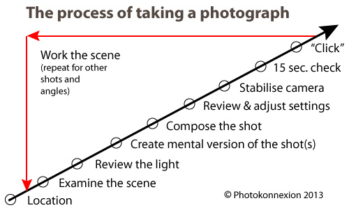
Shadows are most important in photography.
Without shadows the everyday shapes we see would be ill-defined. It’s shadows that help to give shape to the objects we view. They can also be the very essence of the picture. In this post I am going to look at different aspects of shadows as the subject of the picture. They can be extraordinary elements, message carriers, central attractions or complementary features. They are major influences in our art, sight and our everyday lives. I hope you will be inspired by shadows and appreciative of them as a strong compositional element in your photography.
What is a shadow?
Shadows help us to see. They are not an absence of light (darkness). It is the reduced light in a shadow that creates the contrasts that the eye picks out. In fact the camera does too. Where shadows are well defined, and contrast to the other light around them, we see a lot better than when there are few shadows and very bright light. Brightness makes it difficult to see things because the contrasts are absent and we can’t make out edges or three dimensions either. The variations in light intensities across an object tell us about its shape. If everything was in uniform brightness shapes would disappear.
Aesthetics and shadows
Shadow, and its counterpart light, are the medium of our vision. Decoding the light/shadow relationship is as stimulating as the pleasure of touching a sensuous surface; the electric excitement of a tantalising taste; being immersed in a powerful smell, or mellowing in the caress of a musical experience. Little wonder that as one of our five senses our understanding of light and shadow is also a deep part of our understanding of beauty and ugliness.
Seeing shadow
Of course our eyes sometimes misinterpret shadows and we make mistakes about them as with anything else. So it’s fun to consider the implications of false statements in shadow. In this first picture the shadow as the carrier of a message, but also the shadow as illusion. Shadow views of this sort bring out dark emotions and “shadowy” thoughts, but are also great fun artistically…
In his notes on this picture the author says… “I have a lot of school work hanging over me like a shadow.” The visual pun is interesting and conveys a great message.
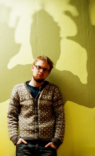
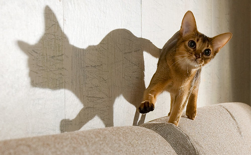
We love it when something appears as one thing and turns out as another. One of the endearing attributes of shadow is the other side of the visual story. In this next picture the lovely shape and bright eyes of this animal convey it’s essential “catness”. But the shadow is something different. The author says… “Her shadow makes me think about a French bulldog – with a tail” … shadows easily take on different meanings.
Of course shadows can be so much more than just a passive message. In this next picture the message is clear and the visual pun means so much to an English-speaking person. A clever use of shadow as the subject.
While the subject of a picture may not be the shadow there is still an important complimentary part to play by the shadow. The cobalt blue of the shadow in the next picture creates a wonderful tonality. The shape of the object is defined by the shadow, but it is the blueness that makes the statement. The author acknowledges that fact by his title…
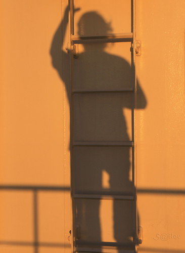
If you can write a visual story with your photograph you pull the viewer directly into the shot. In this next picture the shadow and its disembodied juxtaposition on the ladder brilliantly conveys a set of meanings that we, the viewer, impose. The interest is the simplicity of the picture and yet the complexity of the possible meanings… fireman, escapee, workman, who is he? The interpretations are endless…
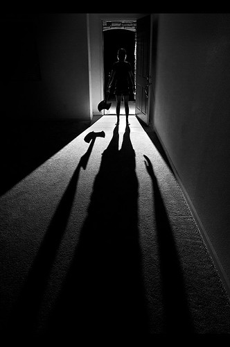
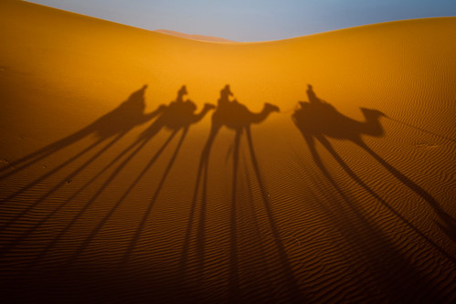
Shadow and silhouette are closely related. The dark-side of a silhouette is the result of blocked light, as is the shadow. Normally the statement made by a silhouette is in its shape. I like this next picture because the silhouette is betrayed by the darkness behind it. The hard light and low light-source has lengthened and strongly defined the shadow creating a strong subject. It has become all the more threatening because the silhouette is only partially seen. What is there – is there a threat? Are we being menaced by our imagination misinterpreting the shadow… This is a clever interplay of light and of mood. Nicely done…
Shadows can convey much more than just mood. They create a picture themselves, but in a minimalist way. The two dimensional aspect of shadow is only partially compensated for by shape. We know that we can so easily misinterpret a shadow. So it is a relief when the meaning is implied without threat or misinterpretation.
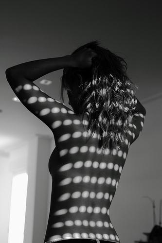
Shadows and intimacy are frequently associated. Above, the closeness of the characters shows intimacy. In the next picture the intimacy of the boudoir is so strong that the viewer is relieved by the pattern of shadows to redirect the mood.
Shadows by Pablo Miranzo.
The author says this is one of a series of pictures intended to contrast light and dark and is in black and white to simplify the composition. Oddly enough the composition is simplified by that, but complicated by the opposing mood settings. An interesting picture of mixed tensions.
The interplay between textures is important. While the shadow is a major part of many subjects, sometimes it is not the only subject. Look out for pattern shots that are uniform across the shot until you allow yourself to be drawn in. Often pattern shots have some compositional element to break the pattern, something that draws the eye. Wood grain and the subtle variations in the rhythm of its lines create micro textures and variation providing relief from the pattern, for example. It is that which draws you in.
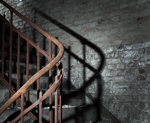
Texture is an exciting aspect of any picture. It is created by the subtle tonal variations of light and shadow at the micro-level in the picture. If you see a texture and it convinces you that you would feel the texture if you touched it then the picture has convincingly been created as an image in your mind. In this next picture the image I see is all texture. The wonderful curve of the stair rail and its counterpart, the twisted shadow, combine to create great depth in this picture. The combination gives you the feeling that you can reach in and touch… A great image.
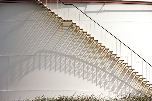
The stairs in the next image are pretty minimalist in themselves. However, the elaborate pattern of light and shadow created by them is exquisite. It is a wonderful example of how shadows transform a picture. In this case the shadows have turned the purely mechanical geometry of the stairs into a complex of pattern and curves. It is a wonderful play-off between the simplicity of one and complexity of the other…
Pulling it all together
The shadow as a subject is clearly a compositional feature. It adds to the texture of the shot too. The clever use of shadow can also add a message and/or impart mood as well. Sometimes though, it all just comes together. If you can combine mood, subject, story, composition and texture you have really made the grade. Your picture comes alive in the mind of the viewer. You have truly created an image. To do all this using just shadow is a clever and precious creation. I think this next image is one such example…
Using shadow as a subject is challenging but worthwhile photographic pursuit. Shadow gives you all the essential elements of a good photograph but supplies it with simplicity and meaning if done well. There are untold interpretations and subjects out there for you to tackle. I hope that I have inspired some new thinking on the subject.
#11030#
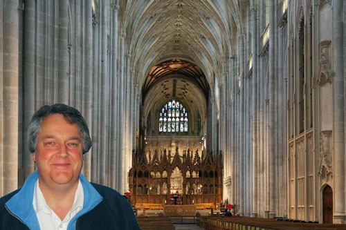
By Damon Guy (author and Photokonnexion editor)

Damon Guy (Netkonnexion)
Damon is a writer-photog and editor of this site. He has run some major websites, a computing department and a digital image library. He started out as a trained teacher and now runs training for digital photographers.
See also:
Editors ‘Bio’.


 Photokonnexion tips by email