Tag Archives: Colour

Panorama photography – an introduction

Panorama photography | Photokonnexion.com

• Panorama photography •
There are a few important essentials to think about.
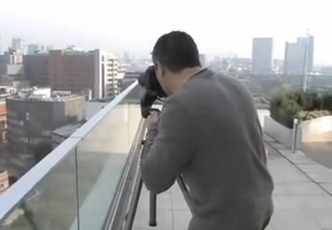
(Image taken from the video)

Getting started is easy…

Panorama photography is a great way to extend your photography skills. To make a panorama you take a whole string of shots. Then later you match them up in software and “stitch” them together to make one long image. The photographic variables are all fixed. You take lots of photos. But, only have to set the camera up once. This means you can concentrate on the scene.

Examples of panorama photography on Google images xxxx | External link - opens new tab/page

The essentials of panorama photography

Like any aspect of photography you need to have some essentials. Your camera and a lens get you started. But a tripod will give you more consistent results. It provides you with a firm platform. One that you can use to line up all the shots. A tripod is recommended because hand holding the shots can leave you with a whole bunch of badly aligned frames. Panorama photography is all about getting the full range of a scene. If you miss bits or fail to get neat alignment the image will loose its continuity. The eye is drawn a way from the image to the imperfections of the stitching.

To use a tripod properly you should also use a good tripod head. Set the camera up to get the scene you want. In this composition phase you will need to sweep through the shot. Look through the viewfinder and pan around the full scene. Get the tilt of the camera right. Have a clear idea of your sweep. Then, fix your tripod head so the camera will sweep through an arc without moving up or down. It will only pan “left <---> right” as needed. In the video you will see him using a “pan and tilt” tripod head. Once the scene is selected the tilt aspect is fixed.

Using the tripod and head means you will get an aligned sweep through your scene. This makes it easy to line up (stitch) the pictures together later. The fixed camera angles helps make alignment easy. But fixing the other settings also helps get consistent results.

Settings for the shots

There are some things that make panoramic photography easy. To get the best effect make each shot simple. Each should have settings the same as its neighbour. Wide variations of settings between shots make colours, brightness, tone and even focus create bad matches. The joins between images will show where the settings change. This disturbs the flow of the eye through the image. Here is a list of steps you go through to set up the camera – and why.

Focal length: As with the other critical settings set focal length to a fixed position. You should switch your auto-focus to manual so the focus does not change in each shot. Then, manually focus into the scene at a place that will give you good sharpness and depth. Then this should be left unchanged throughout the panorama photography sequence.

The exposure dial: Auto exposure settings change as you pan across different light levels. To avoid each frame being a different exposure use the “M”, or manual setting. Set up the exposure for the first shot. Then, keep that exposure setting through the the entire string of images. This means you will need to fix the settings for the full range of shots.

Aperture: Panorama photography is mainly about wide sweeping scenes. Landscapes are ideal. To make the scene realistic it is best to have sharpness right through the scene. Picking F11 is a good option for that. Practice your panorama photography with that F-stop to start. Once you have the techniques you can get more creative later.

Shutter speed: Hold the shutter speed fixed too. Your shutter speed depends on how you set your ISO, and the aperture too. However, don’t just think about the first frame. Study the entire scene. Is there going to be any variations in light intensity across all the shots? You want all the shots to have a similar exposure level. So do some test readings or shots with your camera light meter. Work out how much the scene varies. Avoid big light variation. It will make consistent exposure levels difficult. Look for even light across the scene. Then, find a shutter speed that will work well for all the shots.

ISO: As with the other settings, you want to hold the ISO. Choose a setting which suits the scene and ambient light overall. Fix it for all the shots.

White balance: RAW or *.jpg this is one time you MUST set the white balance to a fixed setting. If you use auto-white balance you will NOT be able to match the frames later. While white balance is generally quite stable, a colour cast from one bright reflection can significantly change the colour. That would not matter too much on one image. But it will if you have to try to match ten images each with a different white balance. That will end up giving your panorama photography a patchwork effect. Choose a white balance setting and stick with it for all the shots.

Getting the shots

Panorama photography calls on more than just scene composition and settings. Also critical is “overlap”. You want to join the images so they match. That means overlapping them in a way that allows a good join.

The skill is in picking features in your landscape you can use in the matching process. I like to use patterns or textures where possible. In the software you are going to line up each image with its neighbour. Those patterns or textures allow you to make a join look seamless. So, as you go through the scene make a mental note of where you want the join to be. Rotate the camera on the tripod for each shot. Make enough overlap each side of the frame for those points to line up. This is clarified more in the video at the end.

Landscape or portrait shots can be used for panorama photography. All the pictures need to be taken in one or the other. If you use landscape format the panorama will be very long and thin. If you use portrait format the stitched image will not be so thin. But you will need to take more shots to get the whole scene. You might choose differently for each scene. It is your choice. These choices are a key skill in panorama photography. Think carefully about your composition.

Panorama photography video tutorial

Most of the above are explained in the context of the shot sequence in this video. Panorama photography is great fun, but it does require a little thinking ahead and planning your sequence. The video should help you to fix the method and settings in your head.
What Digital Camera

Stitching the image together

There are two basic methods of stitching the final image. Again this is one of the main skills in panorama photography. You can do the work manually in an image editor. This work can be a lengthy and detailed process. Each image needs to be lined up by the patterns or textures you chose on the image as the overlaps. Then you might need to clone the images together. Bit by bit and image by image you can build up your final sequence. If you enjoy detailed image editing it is very rewarding.

The second method of joining the images is to use stitching software. There are lots of different applications available. Which one you use is a matter of personal choice. Some image editors have panorama photography stitching built in. For more advanced users there is also specialist software. These applications are available with a range of functions and prices. You should do some experiments and research to pick your preferred software.

Comments, additions, amendments or ideas on this article? Contact Us
or why not leave a comment at the bottom of the page…

Like this article? Don’t miss the next — sign up for tips by email.

Snowflakes – a source of mystery and wonder

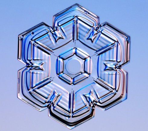
Snowflakes are intricate and beautiful.

• Snowflake crystal •
Snowflakes are intricate and beautiful. They are a source of interest to scientist – but photographers can make amazing pictures with them.
Image taken from SnowCrystals.com External link - opens new tab/page

Snowflakes are amazing!

Close up pictures of snowflakes show how intricate and beautiful they can be. And there are an infinite variety of them too. Here are a few ideas…

Some history about snowflakes

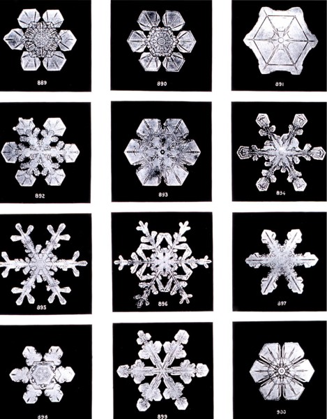
The perfect six-sided snowflake exists, but is not the only sort. Early snowflake pictures were taken by farmers’ son, Wilson “snowflake” Bentley  External link - opens new tab/page (February 9, 1865 – December 23, 1931) from Vermont. Aged 15 he was captivated by snowflakes. It started with looking down a microscope. But in 1885 he began experiments with a camera too. After struggling with the early camera technology he began to make some progress. During his life he made thousands of photos of snowflakes. His work still dominate our ideas today. In particular he was the first to claim snowflakes are unique and six sided. His pictures are also some of the best too.

Snowflake photographs by Wilson "snowflake" Bentley

• Snowflake Photographs by Wilson “Snowflake” Bentley •
Wilson “Snowflake” Bentley was famous for his snowflake photographs. Nearly a century after his death we are still using the images.

Research has shown how diverse snowflakes can be. They are not all perfect, regular shapes either. In fact according to “New Scientist  External link - opens new tab/page” (a weekly publication, UK) there are many types. The various forms are created under different conditions…

  • -2°C = Simple hexagons and star shapes
  • -5°C to -10°C columns
  • -15°C Six sided crystals (dendrites) form again
  • -22°C onward… complex plates and columns form again

Here is detailed morphology diagram for snowflakes Morphology Diagram for snowflakes - External link - opens new tab/page. It shows the relationship between the snowflakes’ type and temperature/humidity.

Snowflakes go through a range of temperature, humidity and other changes while falling. They have a unique and sometimes violent history. They clash together. They may ball-up with other flakes. It’s common for them to have multiple crystals joined in one flake. They may circulate in the clouds for long periods. They may also melt and refreeze before descending to the ground. It is not a surprise they are all so different. There is a great infographic on SnowCrystals.com External link - opens new tab/page showing snow crystal growth and the no-two-alike idea.

Capturing snowflakes on camera

You can’t easily photograph snowflakes on the ground. The overall white in a snow mass makes it difficult to distinguish individual flakes. The small size makes them a challenge too. The best approach to snowflakes is two-fold.

  • Use a macro lens or macro extension tubes.
  • Use a clean (new) long hair artists paint brush. Sable hair is best. Use a small black velvet cloth (about 500mm x 500mm) to see the snowflakes.

The aim with these is simple. Tease out individual snowflakes onto a black background. Then get in close with the lens. If you are working with a macro lens help yourself out and use a tripod.

The snowflakes themselves are easily destroyed. The trick is to use the artists brush to lift snowflakes onto the velvet. The brush and velvet have hairs that support the snowflake without damage. Be as gentle as you can to preserve its delicate nature of the crystal.

Sadly tiny ice crystals tend to go grey when on a black background surface. When shot on a dark background they are best converted to monochrome. This helps to increase the contrast and definition of the crystal.

To show the beauty of the refracted light use a well-lit background. If you can, place the snowflake onto a glass slide delicately lifting it off the velvet. You can buy Blank Slides – Microscope accessories External link - opens new tab/pageBuy microscope slides for your snowflake photos. from various places. Make sure you have left the slides to cool down to the snow temperature or the snow will melt on it.

Be sure to keep your cloth, brush and slides cold and dry. Make sure your breath is not directed at the snowflake. Even slightly raised temperature or humidity will affect the snowflake while you are trying to photograph it. More than once I have had them dissolve in front of my eyes.

If you are using an actual microscope, or if you are using a glass slide try to get some backlighting. To get the best refractive results try light at different angles on the snowflake. The best results are not necessarily when the light is directly from below. The angled light tends to create contrasts on the snowflakes. This brings out light and dark as well as some aesthetic colourations from refraction through the crystal.

For your interest here is an amazing camera-microscope…

Celestron Dual Purpose Amoeba Digital Microscope – Blue External link - opens new tab/page
This an affordable and well reviewed digital microscope. It will do detailed images direct from your computer. It’s a photography tool which provides an opportunity to develop your macro skills. Hours of fun too!

Masterful shots

One of the acknowledged masters of the art of shooting snowflakes is Kenneth G. Libbrecht External link - opens new tab/page. He’s a professor of physics who researches crystal growth. He also runs the SnowCrystals.com External link - opens new tab/page website. There are wonderful resources on the site including a “how to guide” External link - opens new tab/page and many hints about photography and equipment. There are some wonderful galleries of images External link - opens new tab/page. There is also a section on how to grow your own snowflakes. Although, the latter was a bit more complex than I think I would go… but who knows. People in this field seem to get obsessive about it. Snowflakes are extraordinarily beautiful.

Other sources of snowflake inspiration…

For a huge range of inspiring snowflakes images check out this search page on Google: Snowflakes photography  External link - opens new tab/page

Comments, additions, amendments or ideas on this article? Contact Us
or why not leave a comment at the bottom of the page…

Like this article? Don’t miss the next — sign up for tips by email.

Damon Guy - Netkonnexion

Damon Guy (Netkonnexion)

Damon is a writer-photographer and editor of this site. He has run some major websites, a computing department and a digital image library. He started out as a trained teacher and now runs training for digital photogs.
See also: Editors ‘Bio’.
By Damon Guy see his profile on Google+.

Rare black and white pictures – great examples

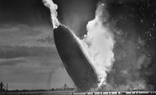
Rare historical pictures in black and white

• Rare historical pictures in black and white •
Great pictures go beyond the capturing of great events…
These are excellent examples of monochrome photography too.
[Image from the slide presentation]

Quality black and white photography is an art.

Early photography taught us there is more to an image than conveyed by colour. Black and white Photography can be emotionally powerful and visually satisfying. Sometimes colour reduces that impact.

Why is there so much impact in black and white?

The use of colour has seduced the eyes of the users of modern media and screens. The realism is amazing and the quality excellent. What people forget is that colour can reduce your awareness to the meaning in a picture. It is all too easy to lose the impact of a story when the picture is so vivid.

The underlying impact of an image is more powerful with simple presentation. Black and white or monochrome images simplify the message beautifully. They create a stark reality in an image. That reduces distractions and focusses the eye on the story.

This is a great lesson for modern photographers. Reduce the image down to a simple, powerful message. Make sure it also has great visual impact. Add a great story and you have captured the attention of the viewer.

What makes black and white visually powerful?

Here are some things to consider when thinking about making a black and white image…

  • Try to use a wide contrast range from darkest blacks to whitest whites.
  • Make sure that the darkest and brightest areas of the picture are not too large or they will distract from the greyscale in between.
  • Try to ensure there is a good spread of different greys between the darkest and brightest.
  • Using only deepest black or whitest white will tend to be too harsh for the eye except where there is a good pattern for the eye to follow.
  • Harsh shadows from hard light will distract the eye. Look to use soft light and graduated shadows.
  • Try to include as much detail as possible to bring out the subject of the image.
  • Work hard to bring out textures. This will throw up the subject without distracting the eye. It will help develop depth too.
  • Be especially sensitive to layers in the image (foreground, mid-ground and distance). Low levels of texture and poor layering will make the image look flat and lifeless.
Some great examples of successful black and white images

As you go through the great images in the slide show below consider the points above. You will find food for thought for your own black and white images.

Want to see regular historical black and white images?

As a lover of black and white pictures I signed up to Retronaut  External link - opens new tab/page. This great site is not exclusively about black and white images, but most of the historical material there is of that type. I get a daily email with some great images. It’s pretty instructive because black and white images are a personal interest. Why not give it a try? Enjoy.

Comments, additions, amendments or ideas on this article? Contact Us
or why not leave a comment at the bottom of the page…

Like this article? Don’t miss the next — sign up for tips by email.

Netkonnexion

Damon Guy (Netkonnexion)

Damon is managing editor of Photokonnexion.com with professional experience in photography, writing, image libraries, and computing. He is also an experienced, webmaster and a trained teacher. Damon runs regular training for digital photographers who are just starting out.
See also: Editors ‘Bio’
By Damon Guy :: Profile on Google+

A quick and simple method to make brilliant water droplet images

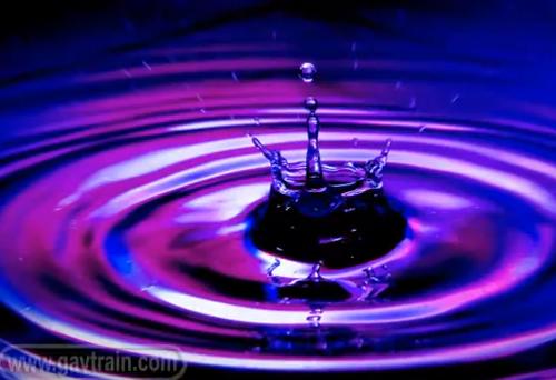
water droplet

• Water Splashes •
The most beautiful scenes in the world include water. Here you can make your own water droplet.
(Image taken from the video)

The close-up world of the water droplet – endlessly fascinating

The captivating thing about water is that it is ever changing and creates a sense of magic in every scene. When you get in close some simple techniques make wonderful images.

How to photograph water droplet impacts

Ever enthusiastic Gavin Hoey takes us through the simple process of creating wonderful water droplet photos. Colour, light/shade and magic water droplet sculptures are the result.

The best bit about this is that you can make these wonderful photos yourself. It is very easy and great fun. When I first did this I spent hours of time on it and got lost in a world of wonderful colours and effects. There are three things to remember that will help you make this a personal and effective shoot…

  • The more shots you take the more great effects you will see.
  • Background colour should be varied. I’ve used wrapping paper to brighten colours.
  • The angle of the camera can affect your shot (not mentioned in the video).
  • Try different camera heights with respect to the water.

After yesterdays blog, the way you see it is about your style. Don’t look for “new”, look for you!

This is a short video (six minutes 50secs), but one that will give you hours of fun and excellent images.
Gavin Hoey  External link - opens new tab/page

No removable flash? Read this: Off-camera flash. It’s a great introduction and recommends an affordable flash unit.

Comments, additions, amendments or ideas on this article? Contact Us
or why not leave a comment at the bottom of the page…

Like this article? Don’t miss the next — sign up for tips by email.

By Damon Guy (author and Photokonnexion editor)

Damon Guy - Netkonnexion

Damon Guy (Netkonnexion)

Damon is a writer-photog and editor of this site. He has run some major websites, a computing department and a digital image library. He started out as a trained teacher and now runs training for digital photographers.
See also: Editors ‘Bio’.

Visual toolbox for photographers

Sharpen up your creative photography…

It’s easy when starting photography to over emphasis the importance of gear. In fact it’s ‘photographers eye’ that really makes the difference. Your vision and insight into a scene are critical to producing a wonderful image.

Sage advice from a world master

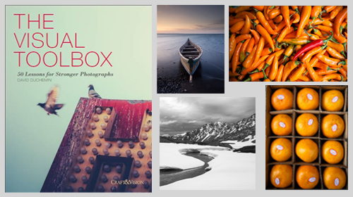
The Visual Tool Box by David duChemin is all about the skills of composition. He goes into depth around the background ideas which help you look at a scene. The ultimate success in photography is to make your image a pleasure to view. Aesthetics rule – it’s as simple as that. This book is dedicated to teaching you the tools you need to develop the ‘eye’.

David duChemin says,

These are the lessons I wish I’d learned when I was starting out.
The Visual Tool Box by David duChemin

This is my kind of book. He writes superbly, in simple, readable form. His examples are excellent and the pictures are just amazing. But most of all the book is organised for learners to extend their knowledge in easy, well structured steps. This book is all about putting new tools in your photographic tool box and it achieves that with an ease that any beginner will find a joy.

Composition

The book is packed with examples of the sort of compositional ideas that really work – for anyone. Just look at some of the topics covered…

  • Manual
  • Optimize Your Exposures
  • Master the Triangle
  • Slower Shutter Speed
  • Learn to Pan
  • Use Intentional Camera Movement
  • Use Wide Lenses to Create a Sense of Inclusion
  • Learn to Isolate
  • Use Tighter Apertures to Deepen Focus
  • Use Bokeh to Abstract
  • Consider Your Colour Palette
  • Lines: Use Diagonals to Create Energy
  • Lines: Patterns, Lead my Eye, Horizons
  • See the Direction of Light
  • Light: Front Light, Side Light, and Back Light
  • Quality of Light: Further Consideration
  • White Balance for Mood
  • Light: Reflections, Shadow, Silhouettes, Lens Flare
  • People
  • Experiment with Balance and Tension
  • Use Your Negative Space
  • Juxtapositions: Find Conceptual Contrasts
  • Orientation of Frame
  • Choose Your Aspect Ratio
  • Use Scale
  • Simplify
  • Shoot from the Heart
  • Listen to Other Voices (Very Carefully)

And there is plenty more content to complement and extends these ideas. What’s not shown in a list is the excellent and sage advice throughout the book. I will let David duChemin have the last word…

Pace your-self. Anyone can master a camera; that just comes with time. It’s the other stuff — learning to think like a photographer — that takes so much work and allows this craft to become the means by which you create art.
The Visual Tool Box by David duChemin

And it is thinking like a photographer that you will quickly learn from reading this book.

How to buy this great book

This book was originally published as an ebook. However, it is no longer available in that form. The book has moved into the real world. It will be available on Amazon as a Paperback From 31 Mar 2015.
The Visual Toolbox: 60 Lessons for Stronger Photographs (Voices That Matter)You can per-order the book from Amazon.

Comments, additions, amendments or ideas on this article? Contact Us
or why not leave a comment at the bottom of the page…

Like this article? Don’t miss the next — sign up for tips by email.

Damon Guy - Netkonnexion

Damon Guy (Netkonnexion)

Damon is a writer-photographer and editor of this site. He has run some major websites, a computing department and a digital image library. He started out as a trained teacher and now runs training for digital photogs.
See also: Editors ‘Bio’.
By Damon Guy see his profile on Google+.

Review your own photographs

Low flying aircraft

• Low flying aircraft •
Click image to view large
• Low flying aircraft • By Netkonnexion on Flickr External link - opens new tab/page
Every picture has its merits. However is there enough in the picture to interest and invigorate the attention of your viewers? Sometimes, like this picture, if you don’t have a point worth making then you should not really bother with it.

A picture is a wonderful communication.

But like speech if there’s no point there is no impact. To help you see if you have made a great picture here are some guiding points.

We are going to consider…
• What you are communicating:
• Presentation:
• Camera technique:
• Technical Quality:
• Visual Awareness, Visualisation, Seeing and aesthetics:

Looking critically at your own picture

When you make a picture your previsualisation of what you want to achieve is critical to the outcome. If you don’t know what you are trying to make how can you make it convincing? So try to have a mental image of what your picture it going to look like when you make it. If you can see the image before you make it you should have a good point in mind – a reason for making it. All too often snappers see something and just ‘snap’. That being the case, few of the images will have real meaning or impact.

When looking at your own picture you must see if there is really something there. Are you really saying anything? Are you really communicating with the viewer of your picture? Or, is what you have just made only a simple picture? To have real impact is to create in the viewers mind an image. An image that means something to them. So look at your picture and honestly ask yourself what is the viewer going to get from it? What will it mean to them? If you find that you have really said something in the picture then the first criteria for success has been passed.

To this end you should consider how successfully each of these things has contributed to the success of the image…

  • Personal input: have you understood and connected with the subject
  • Appropriate communication the message, mood, ideas, and information you want to pass to your viewer
  • Complementary use of the photographic media (mounting, projection, printing, texture of print etc.)
  • Appropriate imagination and creativity / suitable timing for the shot
What about the other things?

• Presentation: It is important to have a good presentation for your picture. Have you edited out distractions and sensor/lens spots, removed the errant sweet rapper littering the foreground etc. In other words, have you done the little tidying up tasks that make the image stand up as clean representation of your original vision for it? If it is a print, is it well mounted in a non-distracting way. Is the printing immaculate or are there streaks and spots; over-run and smear.

• Camera technique: Is the sharpness the way you want it – deliberate softness is fine as long as that is making an artistic point in a way you intended. Is the depth of field right for the composition? Have you emphasised the point or simply missed the point. Is the digital noise too high, or the contrast too low. What you are looking for here is to see if your prowess with the camera has come through. Did your technique work or were there any errors or mistakes that detract from the delivery of your point? Some of the other things to consider are…

  • Viewpoint to the subject – exciting, interesting, different, right?
  • Choice of lighting – does it complement or complete the subject or is it at odds with your point?
  • Accurate focusing – accurate choice of focus for the subject.
  • Appropriate quality and choice of exposure.
  • Suitable use of depth of field (aperture).
  • Appropriate shutter speed for the subject (and shot timing).
  • Highlights and shadows (ensuring detail is retained)
  • Appropriate quality and choice of exposure – does the balance of light and dark complement or detract from the subject?
  • Is the quality of the light effective or bland; does is make a statement or is it of little consequence?

• Technical Quality:
In this category you should consider exposure, colour and tonal control…

  • Absence of processing faults (dust, spots, hairs, processing artefacts, image damage by sharpening etc.)
  • Appropriate adjustments of colour temperature; hue, saturation, colour balance etc.
  • Appropriate tonal use and control of the range of tones.
  • Good image finishing: removal of distractions, removal of abrupt or discordant features.
  • Appropriate use of levels, curves, colour management, filters, overlays etc (post processing)

In this category you are looking to make sure that the image is digitally developed properly. Is the exposure even or has it been obviously enhanced and changed. Is the light effective to make the point or has the exposure not been fine tuned. It is easy to take a picture, but all these thing go into making an image. Think about what you are trying to achieve and does this picture achieve it with its colour and technical delivery/

• Visual Awareness, Visualisation, Seeing and aesthetics:
Do you think that your shot, the one you have in front of you sees anything different? Are you reporting what you saw or expressing a point, message, communication, feeling… does this picture have IMPACT?

  • Is the composition, design and cropping of the image an effective aesthetic construction?
  • Appropriate simplification (minimising complexity and clutter)
  • Distractions / intrusions should not divert the viewers eye
  • Good use of light, mood, texture and colour
  • Good use of masking/manipulation where appropriate
What you are doing…

Each time you want others to look at your picture you want to impress them, to lift them, to… well, get out your message or point for the picture. The type of questions I have asked above are aimed at getting you looking at your images with a critical eye. If you are honest, you will find that none of your pictures will be satisfactory in all of the above. But if you find you are gradually improving your standard of delivery you will see that the above get closer to ideal with every new picture. Critically reviewing each picture before you publish print or show it to other people helps make sure you are producing something worth showing.

You won’t be right every time. But you will see as you develop, your comments will begin matching those of other people. You will than have a benchmark that tells you if your work is measuring up to peoples view of it. Or, more importantly to see if your picture is measuring up to your original vision of how you wanted the shot.

Comments, additions, amendments or ideas on this article? Contact Us
or why not leave a comment at the bottom of the page…

Like this article? Don’t miss the next — sign up for tips by email.

By Damon Guy (author and Photokonnexion editor)

Damon Guy - Netkonnexion

Damon Guy (Netkonnexion)

Damon is a writer-photog and editor of this site. He has run some major websites, a computing department and a digital image library. He started out as a trained teacher and now runs training for digital photographers.
See also: Editors ‘Bio’.

Avoid funny colour casts in your holiday pictures

White balance - grey card

White balance – grey card

Unnatural indoor colours?

Holiday time – out comes the camera and most daytime shots are great. However, indoor shots often get a funny colour cast. Odd yellowish, greenish or blue tones have appeared. The reason? Auto-white balance problems. The condition is curable.

Auto-white balance problems

Outdoors the auto white-balance function works reasonably well. But not in all cases. Auto-white balance aims to iron out colour casts in your photography. The problem is that the camera frequently gets it wrong. There are two main places that can happen…

  • Out of doors when there is a lot of one particular colour around (eg. lots of sky blue; orange/red sunsets or snow)
  • Indoors when there are artificial lights illuminating the scene (ordinary domestic lights, fluorescents and bulbs).

When a lot of one colour appears in your shot. The camera assumes that too much of one colour is a problem. So, it shifts something called the colour temperature toward a neutral grey colour. This takes out the colour cast.

Intentions ruined

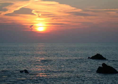
If you intended to capture that colour cast (from a sunset for example), the auto-white balance mechanism will ruin your shot. Typically blue skies and white snow tend toward grey. And, the real classic, lovely orange and red sunsets look pink, cartoon-like and flat instead of saturated. Orange and reds are particularly badly affected. So if your sunsets look cartoon pink/grey instead of saturated fire-orange you need to adjust your auto-white balance.

Auto white-balance fail!

• Auto white-balance fail! •

Cartoony pink-grey skies. The auto-white-balance function has colour shifted the orange/red tones toward greys.
Click image to view large
• Auto-white-balance fail! • By Netkonnexion on Flickr External link - opens new tab/page

Artificial light also creates a colour cast. Often the auto-white balance cannot properly adjust for this. The result is odd yellowish, blue or greenish tones in the picture where you did not see them yourself at the time. These also require an adjustment to your white-balance.

Why is there a problem?

Mainly the problem arises because we have made an adjustment in our heads without noticing. Most of the time we compensate for these colour casts and don’t see them. In fact, once we realise there is such a thing as a colour cast we can train ourselves to see it. We certainly see the heavy red colour casts of evening and early morning light. If we look carefully we can also see the yellows and blues from domestic lights – although less strongly.

Remedies

There are two possible ways to tackle the situation…

  • Compensate for colour casts by using a camera pre-set.
  • Correctly set the white-balance so it records the natural colours.

DSLRs have reasonably good pre-sets to tackle well known colour cast issues. On most cameras you will find white balance settings something like these below. The notes explain details…

  • Auto – The cameras best-guess colour match for what it senses. OK most of the time. Poor when there is a predominance of a strong colour.
  • Tungsten – (bulb icon) indoor, tungsten incandescent lighting using bulbs. Cools the colours – often bluish. This setting helps remove blues to warmer tones.
  • Fluorescent – for use under fluorescent lights – will tend to warm up the colours.
  • Daylight/Sunny – (sun icon) indicates the ‘normal’ white balance (may not be present if this is the default setting).
  • Cloudy – (cloud icon) Adds a warmer, yellowish colouration.
  • Shade – This light is cooler (bluer) than sunlight. Shade mode warms the colours a small amount.
  • Flash – (lightening icon) Stark and cool, flash desaturates towards blue. Flash setting compensates with a slightly warmer yellowish tone.
  • Custom – You do a little procedure to get an accurate setting to suit the situation.
Accurate colours

Colour accuracy is important. You really do want a bright blue sky or white snow or saturated red sunsets. The problem is that the pre-sets are averaged out for the “types” of situations encountered. The pre-sets will change the colours from dull flat colours to more representative ones. For example more saturated sunsets will be captured if you use the cloudy setting. However, to get it right you need to adjust the custom white balance.

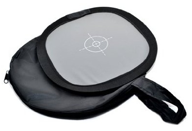
Setting the custom white balance is simple. The camera does most of it. You need a “neutral grey card”. This is simply a card or piece of material set at an average grey colour, normally at 12% grey, which matches the cameras accurate shade for neutral. You can buy these quite cheaply at most camera stores. (See: Range of photographic grey cards).

• The Lastolite Ezybalance •

  • collapsible; durable
  • wipe clean; very light
  • 12% grey; 30cm wide

An easy to use grey-card system. White on one side, grey on the other. The card doesn’t crease, the sprung border stretches the material tight. The card collapses into the supplied case, slipping easily into your camera bag. A great accessory to ensure colour accuracy in your pictures. You should not be without one.Spacer image

To set custom white-balance

It’s easy to set the white balance. However, there are lots of variations for how different cameras do it. Therefore it’s essential to use the right procedure from your manual. To get ready…

  • Place the card about 30cm/12 inches in front of your camera.
  • Zoom in or out to make the grey card fill the frame.
  • Now follow the camera manual “custom white balance” instructions.

To ensure complete accuracy you must do this procedure in the ambient light in which you will be shooting. This is the light the camera will sense and compare to the grey on the card.

More after this…

find out more...Photokonnexion tips by email
Enjoying this article? Please sign up for our
Tips by email service.
                                                Find out more

Shooting with RAW vs. *.jpg

I am sure lots of you are saying, “But I shoot with RAW and this is unnecessary”. OK, that is partly true. You can, with RAW format files change the white balance in the post-processing. Here are two reasons you should NOT do that…

  1. It is time saving to get as much right in the camera as possible. I like to spend my time shooting not computing!
  2. I have rarely met anyone who can remember colours so accurately that they get the post-processing colour and temperature balance right. I like to get them right in-camera as accurately as possible. Then I can safely change them later if necessary.

RAW format is excellent – you have complete control over colour temperature and hues. However, if the picture is wrong from the start, RAW is only as good as your own memory or colour awareness. Artists of many years may be able to remember colours accurately. Very few others can. Beginners especially have very poor colour memory/accuracy. So, use RAW, get it right in-camera – then do your artistic processing from a solid colour-base you know is accurate.

Compensation and accuracy

While both compensation for colour casts, and accurate representation of colour casts both rely on white balance there are differences in how they are treated. Strong colours or a strong colour bias through the picture needs some special treatment. Think about the two different methods above and practice them.

Comments, additions, amendments or ideas on this article? Contact Us
or why not leave a comment at the bottom of the page…

By Damon Guy (author and Photokonnexion editor)

Damon Guy - Netkonnexion

Damon Guy (Netkonnexion)

Damon is a writer-photog and editor of this site. He has run some major websites, a computing department and a digital image library. He started out as a trained teacher and now runs training for digital photographers.
See also: Editors ‘Bio’.