Tag Archives: Rule

The Rule of Odds – Uneven Composition

The rule of 'odds' - a rule grounded in our concepts of pattern and chaos.

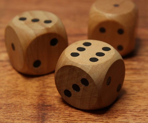
The rule of ‘odds’ is grounded in our concepts of pattern and chaos. We find it easy to pick out a pattern. If the pattern is broken or shows anomaly it is more interesting. The eye is drawn into the picture. Odd numbers are just a little off the comforting pattern of evens. They draw the eye too. Click image to view large.

It’s a little ‘odd’ – but ‘even’ is not as interesting!

The rule of odds relies on the human sense of pattern to capture the attention the viewer. Our brains work well with pattern. We see pattern in almost everything in the world. So it is natural to see it as a central part of composition. When there are small groups of objects or people the rule of odds becomes a valuable attraction for the eye.

Why does the rule of odds work so well? There are several reasons. The eye is pleased by symmetry. Evenness represents symmetry. It represents balance… it’s about plainness and organization. On the other hand an odd number steps out of the realm of organization and plainness. When we see an odd number it is natural and compelling for our eye to seek the missing component to even it up again. We look into the picture to try and satisfy the pattern.

Some pictures, like the one, above obviously have nothing in them to fulfill evenness. There is no fourth dice here. However, the number three creates another simple pattern. The Triangle is also attractive to us. Placed in a position that creates a triangle three objects form an implied shape that attracts the eye. It is symmetrical, yet it is odd.

The rule of odds is not just about ‘threes’. The eye is drawn to odd numbers in small groups where we can see the oddness of objects at a glance. Five, seven, even nine are all numbers that pull the eye toward them. Once objects become too numerous to be immediately and obviously odd in number the appeal is lost. The eye does not search to fulfill the pattern. So the rule of odds works because of the simplicity of low numbers – it relies on quick recognition of the situation to draw the eye into the picture and keep it working to find the balance.

The rule of odds plays out its role in composition in many ways. If you are looking to make a bigger impact then find a way to place an odd number of objects into your picture. An odd number provides more interest, more reason for the eye to search the picture. Remember, the ultimate aim is to draw the eye of the viewer into the shot and keep them looking and finding interest.

By Damon Guy (author and Photokonnexion editor)

Damon Guy - Netkonnexion

Damon Guy (Netkonnexion)

Damon is a writer-photog and editor of this site. He has run some major websites, a computing department and a digital image library. He started out as a trained teacher and now runs training for digital photographers.
See also: Editors ‘Bio’.

Warning! Are You Breaking the Rules of Composition?

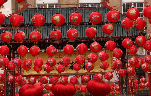
Colours, like most things, are interpreted by cultural convention.

Colours, like most things, are interpreted by cultural convention. Such conventions are not really rules. They exist as guidelines and to help us be understood by others.
Lanterns at Chinese New Year


In art the use of the term ‘rules’ is of limited use. Generally, nobody goes to jail for breaking the rules of art. There are however, perfectly acceptable ‘conventions’. Although they may overlap, these conventions are broadly of two kinds. They could be:

  • The established viewpoints of those who sign up to a particular school of art or come from a particular culture. This is a way of ‘seeing’ or interpreting the world through ideas.
  • The conventions that represent a way to describe how humans respond to their body and senses. These are guidance to artists based on observations of our behaviour as biological organisms in a physical, measurable world.

Photographers, as artists, are free to accept or disregard both these approaches. ‘Rules’, in art, are accepted by convention alone.

Cultural conventions and the viewpoints of a particular school of art are important. Western art is in contrast to many of the Eastern, Oriental conventions in art. In Europe the colour red is strongly associated with love, romance, anger and perhaps baudyness or seedy places. To be ‘in the red’ is associated with financial ruin or debt.

In Chinese culture, by contrast, red is associated with good luck, friendship and wealth. It symbolizes good fortune, joy and happiness. Red is found everywhere at festivals and especially the Chinese New Year and family gatherings. Red is associated with traditional and financial gifts. The colour is taboo at funerals as it represents happiness. To the Chinese, red is a different concept to the view that Westerners take.

How you use a colour imparts different meanings in your photographs. Context is important to conveying meaning through colour. Cultural background is important to the interpretation of the colours you use. Context and culture are different things in art. They can of course overlap too!
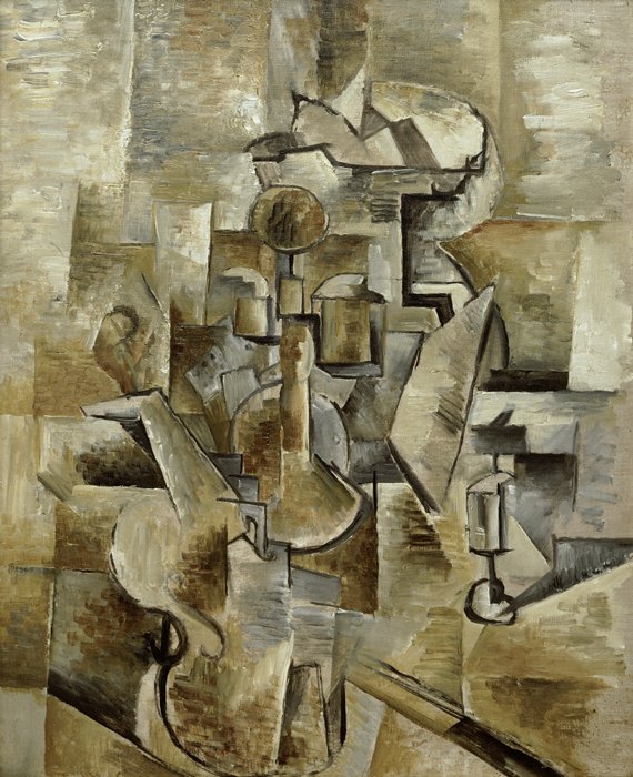
Violin and Candlestick by Georges Braque, A pioneering Cubist. (Wikipedia)

Violin and Candlestick by Georges Braque, A pioneering Cubist.
Click to see Cubism on Wikipedia

While culture affects the way an artist works, so do the various schools of art. For example ‘Cubism’ is the an artistic approach pioneered by Pablo Picasso and Georges Braque. Subjects are broken down into angular and abstracted forms. A new sort of art results, displaying depth, space and surfaces in ways not seen in the real world. People who sign up to this interpret the world through the Cubist view – deliberately ignoring the ‘rules’ which reflect our understanding of reality like perspective and depth.

What are the rules of composition? The ‘Rule of Thirds‘, ‘Golden Ratios’, the rules of perspective, the principles of art… and many others are really just guidelines. We accept them by convention because they help us to make sense of the world and the art we view. They have two important foundations. First, many things we see in the world we can measure or verify. Secondly, if people around you respond to and understand something then that shared convention helps you to communicate with them artistically. These two things are important. Together they help people understand art.

Well known rules, like the ‘Rule of Thirds‘, have an accepted success in the visual arts because they produce pleasing, artistic results. The concept of having a picture slightly off-balance (to the thirds) seems to make a picture more interesting, dynamic and realistic. Things in nature are rarely perfectly visually balanced. Putting something on a ‘third’ is a good guide to being more ‘natural’.

Knowing that people share cultures and approaches, or apply measurable, verifiable rules is important. It allows us to understand what is going on and helps us to interpret things – like your picture and other art. Knowledge of something does not destroy it’s effect. It helps us to interpret it. Consequently, we accept and discuss these ‘rules’ as if they were powerful and absolute.

We are NOT slaves to these rules and conventions. Sometimes the symmetry in something is worth pointing out. If you have spotted a beautiful bridge your photo of it is a testament to lovely design, a beautiful setting, a symmetrical aspect, a wonderful geometry… whatever you feel about it. You do not have to make the picture conform to the ‘rule of thirds’. If you think the symmetry is worth highlighting, then use a symmetrical position. Break the rule! Throw away the convention.

The same disregard can be said of cultural conventions. If you step outside those conventions you introduce humour, disquiet or discomfort in your viewer. That disquiet can be an important form of emphasis or a message to the viewer. By breaking the rules you can speak very powerfully to your viewers.

The only understanding we have of the world is through our own senses and ideas. If it makes sense to you then fine… just do it. When it comes to art, sometimes the rules help to make things work. They even make the art understandable and sometimes impactful. Break the convention, the rule, the expected, or the norm and you could well be creating something new, emphasising a different approach. This can be equally, or more artistically effective than sticking with convention.

Know the rules… be prepared to break them. It can provide a new perspective for your viewers.

By Damon Guy (author and Photokonnexion editor)

Damon Guy - Netkonnexion

Damon Guy (Netkonnexion)

Damon is a writer-photog and editor of this site. He has run some major websites, a computing department and a digital image library. He started out as a trained teacher and now runs training for digital photographers.
See also: Editors ‘Bio’.
Rule of Thirds

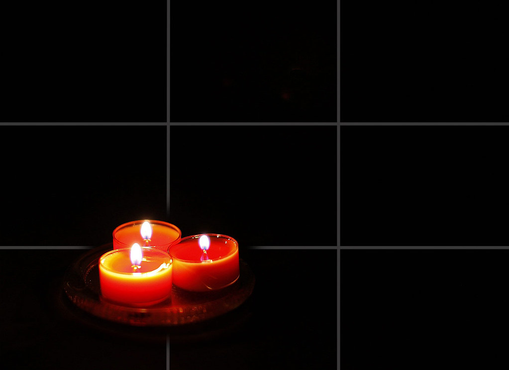
'The gentle glow before bed'. A composition using the Rule of Thirds.

'The gentle glow before bed'.
A composition using the Rule of Thirds.
Click to view large.

What is the Rule of Thirds?

Just about everyone who starts out in the visual arts learns this ‘rule’. Not that it’s actually a rule – more of a guide really. Photographers are no exception, the “Rule of Thirds” is here to stay as a way to help you improve your pictures. The idea has been around since it was first recorded by John Thomas Smith in 1797. It’s not a precise mathematical formulation. It is a visual guesstimate… a convention of good visual placement. Painters, photographers and in more modern times, graphic artists, recognise that the rule of thirds helps you to appreciate a picture or design if the rule is applied.

How does it work?

As you can see from the candle photograph above the picture is over-laid with an imaginary grid of four lines. Together the grid-lines divide the picture into nine equal parts. I have faded-out the lines where they intersect with the main subject of the picture. This shows how the subject is placed relative to the intersection. It is the intersections that form the most attractively placed points. However, the full length of the lines themselves carry appealing visual qualities when used to place elements of your picture.

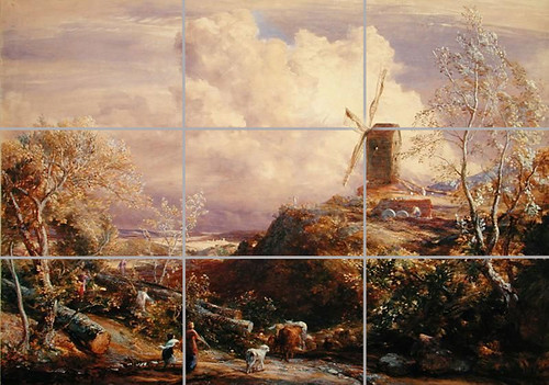
In the picture below I have laid the ‘Thirds’ grid over a picture by the famous English Painter, John Constable. He was a keen user of the rule and it can be seen in many of his pictures. The visual experience is enhanced by the use of the Rule.

Windmill on a Hill with Cattle Drovers. By English painter John Constable

Windmill on a Hill with Cattle Drovers. By English painter, John Constable. The picture demonstrates that the old masters recognised the importance of the Rule of Thirds.
Click to see a larger view.

You can see many features of the picture that conform to the ‘Rule’. At the bottom of the picture an adult and a child drive cattle. The first vertical line goes between them. As important elements Constable has placed them on the third. However, follow the line up and you notice the line traces the leading edge of the huge cloud in the sky. The important windmill is placed exactly so that the centre of the sails, the spindle, is placed on the intersection of the thirds (I have faded the intersection for visibility). You will also notice that the same horizontal windmill line cuts across the top of the tree on the left hand side of the picture. This implied line balances the picture nicely in that plane. The lower horizontal line also creates a third. It cuts both the trees at the point where the trunks split. The result is an implied line across the picture, creating a psychological balance.

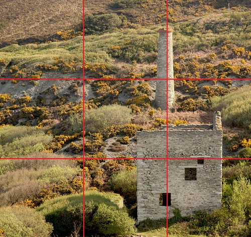
In the next picture the tin mine chimney is placed on a third. In this picture the line itself is the key to the location of the main subject on the third. There is no significant object that is appropriate for putting on the intersection.

Blue Hills Tin Mine, Cornwall, UK.
The mine chimney is shown on the 'third'. Click to see large.

This composition works because the picture is relatively uncluttered and the single most important structure acts to pull the eye to it. This is why the Rule of Thirds works. Placing the main picture element in the dead centre, the eye would go straight to it. The picture would be weakened because there is no reason to be drawn into the picture once we are visually satisfied with the main object.

We have a natural tendency to find symmetry and look for the important item in the centre. No central main feature and our eyes hunt the picture taking in the whole. Inevitably we are drawn to the thirds when a significant object is there. There is still a pleasing, and yet unbalanced symmetry, on the Thirds. The rule of the Thirds works because the eye is pleased with the symmetry, yet realises a visual tension from the off-centre displacement. We are drawn into the picture because of this dynamic.

How do we use the Rule of Thirds?

In almost any picture the eye or eyes of an animal or human are a very significant point. We are programmed to look to the eyes first. If you want to succeed with the Rule of Thirds consider putting an eye on one of the intersections. A nice sharp eye, especially with a nice catchlight (white reflective sparkle), is always a significant point which draws the viewer into the picture.

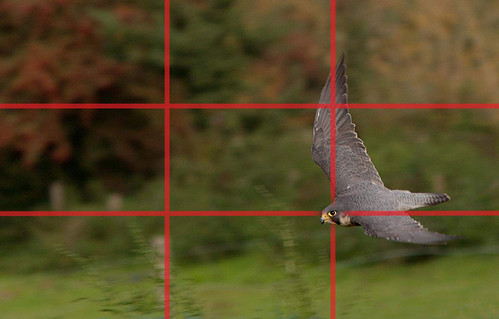
In the next picture I tried to find two elements that help the placement. The eye is placed on one of the intersections. The upper wing of this swoop forms a long element along the line of the vertical. The picture is slightly balanced the other side by the fence post behind the left vertical line. It is blurry because the peregrine falcon at the bottom of its swoop is moving at about 200 kph (approx. 120 mph). Obviously, panning to take this shot was too fast to compose for the rule. So in this case the shot is cropped into the Rule of Thirds afterwards. Most image editor applications like Photoshop, Elements, Coral Paint etc. have crops with the rule of thirds grid built in. So it is easy to crop the shot to match the rule.

A peregrine falcon swooping and showing the strong features of the Rule of Thirds.

A peregrine falcon swooping and showing the strong features of the Rule of Thirds. Try to place the eye on one of the intersections. This helps to balance the shot.
Click to see large.

Of course it is better, where you can, to compose in-camera for a shot. This saves on the post-processing. Fill the screen with your composition and use the grid or focus points to line up the elements for the Rule Of Thirds. It takes some practice, but it is worth doing. If your composition has a natural thirds symmetry you have probably got a strong image. Look for points of interest for the intersections and lines or bigger features to match a thirds line with… like a horizon, major feature, sea/land line and so on.

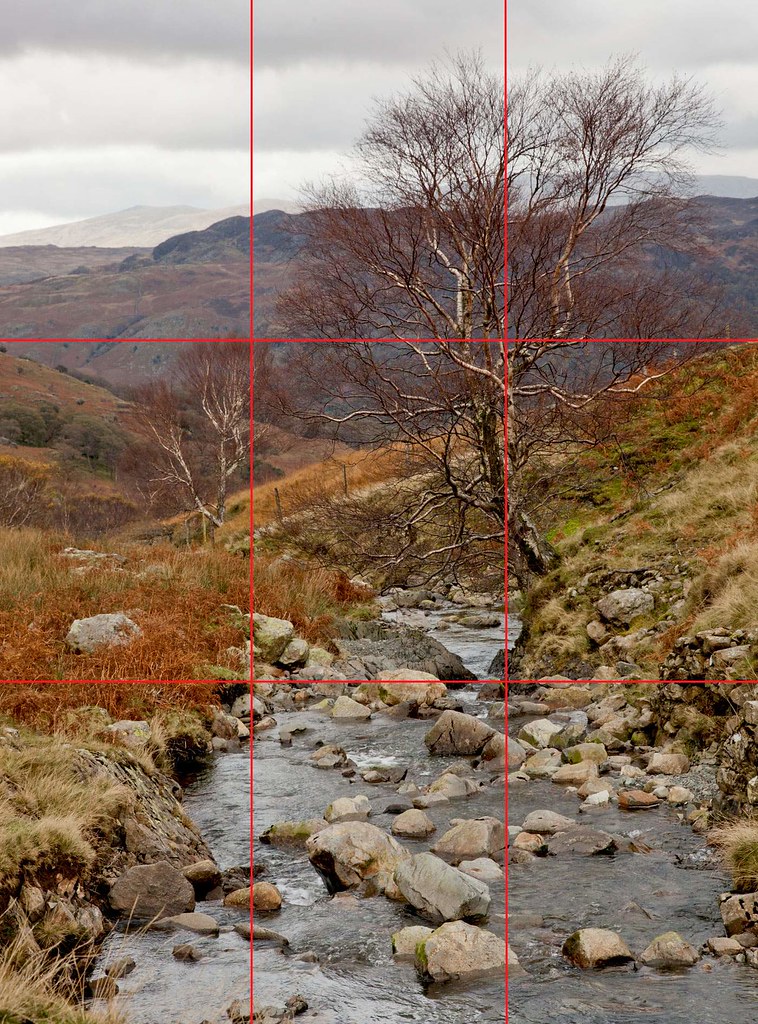
In the final picture I have used the upland brook and the tree to be the major features on the third. The second tree down the brook a bit is nearly on the third. It serves to demonstrate that although the shot is not perfectly in line with the grid, it still works. The eye is not able to assess the situation to absolute accuracy. We are aiming to make the shot fall into thirds as nearly as possible. It still works even though it is slightly off the thirds. Don’t be slavish – the rule is a guideline. It is not a mathematical imperative!

Honiston Pass in the English Lake District, UK.

Honiston Pass in the English Lake District, UK. While the main feature is on the third, the minor feature which balances the picture is not quite on the other third. The picture works because there is still symmetry - it is close enough.
Don't slavishly follow the Rule of Thirds.
Click to see large view and no grid.

The Rule of Thirds is a convenient convention to help us compose a pleasing shot. It works because the eye searches for symmetry and finds it pleasing when it exists. If you can compose to the Thirds you will be more likely to have an impact and draw the viewer into your picture.

Have fun with this composition ‘rule’. It works, allows great creativity and it pleases the eye.

By Damon Guy (author and Photokonnexion editor)

Damon Guy - Netkonnexion

Damon Guy (Netkonnexion)

Damon is a writer-photog and editor of this site. He has run some major websites, a computing department and a digital image library. He started out as a trained teacher and now runs training for digital photographers.
See also: Editors ‘Bio’.

Can you write? Of course you can!
Write for Photokonnexion...

We would love to have your articles or tips posted on our site.
Find out more…
Write for Photokonnexion.