Directing and posing seem to be two opposite ends of the photographic spectrum. Yet, they share a very close relationship. Successful images usually break the barriers because of both directing and posing. At least, more so than the rest of the day-to-day fluff that floats on the photographic wind.
In successful images directing and posing must share an intimate relationship.
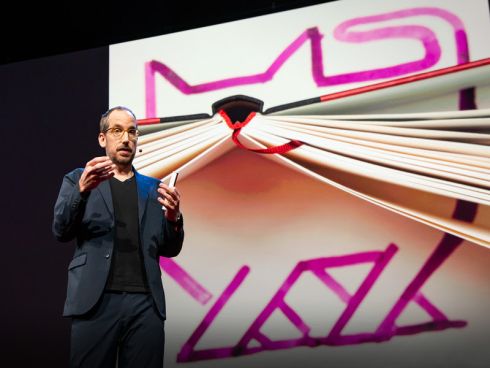
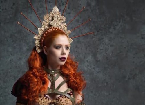
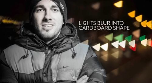
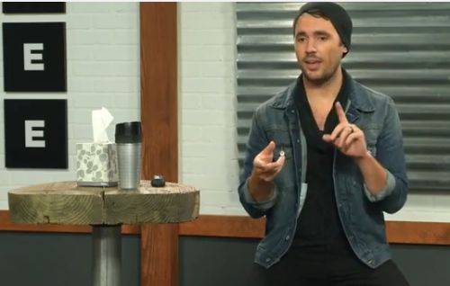
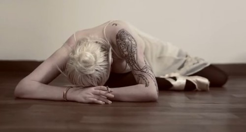
Image taken from the video below.
Directing and posing – the meanings
It is interesting that the meaning of posing rests more on misrepresentation than action. Here is what I mean…
Posing; posed; verb – to pose…
- To assume a particular attitude or stance, especially with the hope of impressing others: “He likes to pose as an authority on literature”.
- Presenting oneself insincerely: He seems to be posing in all his behavior.
- To assume or hold a physical attitude, as for an artistic purpose: to pose for a painter.
Dictionary.com :: Seen: 03/10/2018
These definitions of posing are mostly about how the subject represents themselves.
On the other hand, directing is more about the power behind the action…
Directing; verb – To direct.
- To manage or guide by advice, helpful information, instruction, etc.: He directed the company through a difficult time.
- Regulating the course of; control: History is directed by a small number of great men and women.
- To administer; manage; supervise: She directs the affairs of the estate.
https://www.dictionary.com/ :: Seen: 03/10/2018
In this definition we are in no doubt where the driving force comes from.
So, is the rift between these terms a real one for a photographer? Yes! And, the division often separates the successful photographer from the rest.
A common mistake…
When I teach portraiture classes, the most obvious gap in knowledge is not about the photography. It is about the connection between the people involved. Amateur photographers, and some professionals, rely on the subject to come up with the posing strategy. They take the passive and weak attitude that the posing person knows how to present themselves for the photo the photographer has in mind. This approach leaves the directing in the hands of the subject of the portrait. Worse, the subject is posing to meet your goals, but they probably don’t know what they are! Regardless, the subject is probably the least qualified person to steer the outcome of the photograph. So, do not let your subject misrepresent your vision of the image.
Have a goal before you start
It pays to have at least an idea of what you want to photograph. Too many photogs put themselves in front of a subject (person or object) and hope that they have the right photographic technique to capture it. Success relies mostly on luck with this approach.
On the other hand, the stronger approach is with the photographer that has a concept to depict. They research it and set it up. Success becomes a matter of visualisation and fulfillment. There are two steps there that the passive photog misses. First, they don’t do any visualisation and research before starting. Secondly, they just react to the scene, not direct it or manage it to ensure photographic success.
why do photographers often fail to direct?
In short, I think there are several reasons…
• Practice: The successful photographer has had enough practice to know that the passive point-and-shoot method is too haphazard and error-prone. The passive photog does not drive for a result.
• Fright: Most self-taught and developing photographers have not learned to direct and, so, do not recognise its value. They are frightened to “take control” of someone else (the subject). Directing requires them to drive for the result and be the instigator of the outcome. This is an extrovert approach. However, it is a big step to take for the unpracticed – or at least they think so. Actually, it is the path to success.
• Lack of knowledge: The reluctant, passive photog is an example of a great educational irony. They think they should not do it because they don’t know how to go about it. However, they won’t even begin to know about it unless they experience it. In fact, the way to get past the problem is to simply push past it – have a go! Just do it! You will learn by your mistakes and feedback.
Directing and posing have a dynamic connection
To step outside of the meanings quoted above, we should be more bullish, more participatory, more inclusive, more descriptive. Directing drives the subject and the poses. However, it is only through co-operation and joint understanding can the posing be effective. Success depends on you, the photographer, breaching the divide between the traditional meanings of directing and posing.
Directing is an extrovert activity. That does not necessarily mean that its for bullies. Instead, to succeed, we need to grasp the bull by the horns. To direct is to articulate an outcome. Make it clear that the poses you work with are the ones that fit the goal you are trying to achieve. Work with the sitter to jointly get the posing outcome that will make the best shot.
Directing and posing flows from participation and inclusion
Be more participatory. As photographers we need to interact with our subject – not just react to them. Talk to them, know them, live a part of their lives for a few minutes. Listen to them, but know what you want to achieve. Then work with your subject bringing out the advantages they have just told you about. The best poses are those that show the character of the person. They have the character, you do the interpretation through your direction. Directing and posing come together through the cooperation and participation of both photographer and subject.
Be more inclusive. Once we are involved and communicating with our sitter or subject we can cooperate with them to achieve our goal. That is the previsualised goal we set ourselves before the shoot. Often what we want out of the shoot is a reflection of what your subject wants too. Include them in your vision. They will understand and perform the pose better if they are included in the discussion leading to it.
You will not succeed in a shoot where you alienate, annoy, ignore or destroy your subject. Generally, your shoot stands a greater chance of success when you view the whole process as one of teamwork between the photographer and the person you are framing.
Directing and posing – the moral of the story
Be the driving force. See the goals, articulate your vision. Always bring your subject along with you. The dynamic connection between you will enable you to bring out the character of your sitter, open up the subject and pick the best approach possible.
From feedback, I have found that learning to engage through directing and posing gives students a big boost in their development. If my students come away from a portraiture session thinking, “I must try directing, I must try directing!”, then I know they will be on the way to making great images. Remember, not all your shots will be a success. Nevertheless, you stand more of a chance of some good hits if you push for what you want to achieve but also involve your subject.
A quick video
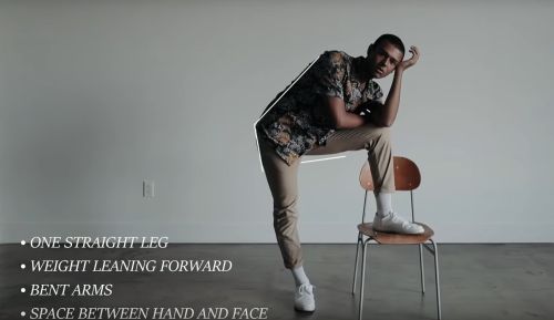
Directing and posing often does need a degree of knowledge and understanding or practice and experience on the part of the director. In this video short, you can see some of the issues that the photographer has considered prior to the shoot. The lines and captions show the previsualisation in the shot. The photog works with the subject to produce an outcome that is both unique and empathizes with the character of the subject. It is a quick video, but worth thinking about on several levels. While watching, think of the directing aspect, the posing aspect and the actual poses that are being struck.
Comments, additions, amendments or ideas on this article?
Contact Us or leave a comment at the bottom of the page…
Like this article? Don’t miss the next — sign up for tips by email.
Photokonnexion Photographic Glossary – Definitions and articles.

Damon Guy (Netkonnexion)
See also: Editors ‘Bio’.
See also: Profile on Google+.